Category Archives: appliqué

Red/Green or Green/Red?

In my last post I showed my thought progression in auditioning red and green circles for the center of my Dresden Neighborhood mini quilt. My final decision (or so I thought) was a green circle, which I really liked after adding a smaller red circle on top of it. Here’s a reminder of what that looks like:

One of my friends from Quilt Camp came out strongly in favor of red so I took another look. I still felt the red by itself was too bold but I hadn’t thought about placing a smaller green circle on top of it. When I did, I really liked it too:


Now I can’t decide which one I like better. Here are the two possibilities side-by-side:

(You will surely notice how different the background fabric looks in the two photos. They were taken on different days in the same spot in my sewing room, with weak afternoon light coming in a south window. Depending on the time of day and weather, the colors can look so different.)

I’d love to know which one you prefer!


Posted in appliqué, table topper, update, wall hanging, wonky Dresden neighborhood | 16 Comments

A-doorable!

The doors are on my wonky Dresden Neighborhood mini quilt:

I cut the strips for my doors a little taller than designer Kim Lapacek’s pattern calls for. That’s because my house fabrics are pretty busy and I wanted to tone down the prints with some longer strips of solid fabrics — or at least fabrics that read as solid. In fact, there’s only one solid, the true red.

The next decision? What to use for the circle that goes in the center. First I auditioned a scrap of the solid red:

I liked it but felt it was too strong. Maybe one of the red prints would work better? I cut a circle out of a scrap and stuck it on:

As much as I like this print (one of my favorites from Corey Yoder’s “Holliberry” line), it seemed to add to the busy-ness of the prints rather than calm them down.

Next I tried one of the greens:

Okay, this is more like what I had in mind. (And you shouldn’t be surprised. Green is my favorite color, after all.)

But then I wondered:  how would it look with a smaller solid red circle on top of the green one?

Oh, yeah! I’m liking this a lot. As Henry Higgins would say, “By George, I think she’s got it!”

But guess what else I’m seeing? A big green button on top of the red circle. Maybe even a smaller red button on top of the green one. What do you think? Can you see it too?

One of the pleasures of working on a project like this is letting it evolve. Each quilter who makes this charming pattern (Dresden Neighborhood by Persimon Dreams) winds up with a unique project, totally subject to the whims and preferences of its maker.

Now that I have a plan, I’ll inset a red circle into a larger green scrap and turn that scrap into a circle so that I can applique it (by hand) into place. Then I’ll be ready to add the batting and backing and turn it into a quilt sandwich.

Working on this project is making me smile. Always a good thing on a cold and rainy January day!


Posted in appliqué, table topper, update, wall hanging, wonky Dresden neighborhood | 5 Comments

Happy New Year!

Happy New Year, friends and treasured blog followers! I’m popping in to say hello and point out the stitching around the roofs on my wonky Dresden Neighborhood mini quilt:

It’s still under construction but you can see the rest of the neighborhood here.

I used a simple straight stitch to outline each roof, using my open-toed walking foot so I could easily see every stitch as it was being made:

The threads I used — light green, red, and medium gray — were chosen to blend with the roof fabrics rather than offer contrast. The effect is very subtle but gives the roofs in my wonky little neighborhood a nicely finished look.

Thanks for stopping by on this first day of 2022!


Posted in appliqué, table topper, update, wall hanging, wonky Dresden neighborhood | 5 Comments

Up on the Rooftop

My Dresden Neighborhood homes now have roofs over their heads. I just finished fusing 20 slightly wonky roofs in place. But before I show you, take a look at the “before” photo, with the dresden blades attached to the background fabric:

Who doesn’t love polkadots?! I especially love them when they’re scattered randomly across fabric. They add an extra touch of whimsy, don’t you think?

Now for the roofs:

(That’s a circle of freezer paper in the middle, put there just to cover the raw edges.)

Next up: stitching around each roof. I used a heavy duty fusible on them so I’ll use a straight stitch around the edges of each roof rather than a decorative stitch. Doors and windows get fused on next. Hmmm, wouldn’t it be fun to use buttons for some of the windows? I have some really neat vintage buttons that might find their way onto the finished quilt . . .


Preparing to teach a class on this pattern (Dresden Neighborhood by Persimon Dreams) has given me an excuse to play in my sewing room. (As if I needed an excuse!)

Since this is my second version of Dresden Neighborhood — you can see my first one here — I’m going to try out some new ideas (buttons being one of them). As designed, this mini quilt finishes at 24″ square but I’m toying with the idea of making it round. To that end I cut my background fabric about 31″ square. We’ll see where that takes me after I’ve finished decorating the houses.

For crafters and quilters in the area who might be interested in my class, clicking here will take you to the class information page at Montavilla Sewing Center in Lake Oswego.


Posted in appliqué, table topper, update, wall hanging, wonky Dresden neighborhood | 3 Comments

A Pearl of a Quilt Guild

One week ago today I was in the small town of Dayton, Oregon (population 2,668) giving a presentation to a brand new quilt guild, the Willamette Valley Quilters. My talk was about the making of this quilt, Give Me the Simple Life:

Give Me the Simple Life, made by Dawn White, quilted by Kazumi Peterson (2019)

It’s my version of Hazel’s Diary Quilt, designed by Shelly Pagliai and featured in her book A Simple Life: Quilts Inspired by the ’50s. The making of this quilt, including my struggle/journey to become proficient at needleturn appliqué, was well documented in my blog during most of 2018 and 2019 so no need to revisit it here. I got to revisit it, though, while preparing for my presentation. It was great fun to go back in time, so to speak, to tell the guild members the story behind the quilt.

The Willamette Valley Quilters held its first member meeting last month, that’s how new the guild is. Here’s a photo of the founding members from the guild’s website:

And here’s a photo of most of them at last week’s meeting:

There’s something special about this photo. Do you see it? In addition to wearing tee-shirts with the Willamette Valley Quilters logo on it, everyone in the picture is wearing pearls! Peggy Gelbrich, the guild’s first president (she’s third from the left), told me the board hopes to make it a tradition. Isn’t that a lovely idea?

The leaders of the guild could not have been kinder or more welcoming when I arrived to set up for the meeting, and it was a delight to interact with them and their members. So thank you, Willamette Valley Quilters!


Posted in appliqué, needleturn appliqué, update | 4 Comments

Embellishment

“Something more.” That’s what one of my sampler blocks needed. Here’s the “before” shot:


I started with Cluck Cluck Sew’s No Point Star design (a free pattern!) and set it on point. I really like this block but as I pointed out in my last post, it wasn’t quite holding its own with the other sampler blocks made to date:


I decided to embellish the block with a flower fussy-cut from my focus fabric, seen here:

Now take a look at the block with the flower appliquéd in the center:

Better, yes? I’m especially liking that touch of green in the very middle of the blossom.

Here’s a shot of the embellished block with its companions:

I think it’s safe to say it’s holding its own now.


Posted in appliqué, Block of the Month (BOM), Quilt-Along, sampler quilt, update | 5 Comments

A Gift Beyond Compare

I received the most wonderful gift in the mail last month, this striking quilt made in 2004  by Lee Fowler:

Lee was an incredibly talented quilter and crafter who was only 54 when she died of cancer in 2013. I didn’t meet her until 2009 so I had the pleasure of knowing her for only four years but she touched my life in many ways. I greatly admired her intellect and talent, and I loved her goofy sense of humor.

The quilt you see above is named Rolling Star Revisited. It was designed, pieced, appliquéd, and quilted by Lee. Here are a few detail shots, starting with a single rolling star:

Each star measures 15″ from point to point; the entire quilt measures 58″ square.

Lee was an accomplished longarm quilter. She did hand-guided quilting without a stitch regulator. Here you can see some of her beautiful free-motion quilted feathers:

The circles in the center of each star are hand-appliquéd using the needleturn method as is the reverse-appliquéd border:

You must be wondering how I came into possession of this treasure. Well, in early December I received an email from Lee’s husband Rick, now remarried and living in another part of the state. Rick wrote that he and his daughter Liz were on a mission to send Lee’s quilts out into the world where they could be “loved, cherished, and above all used,” and asked if I would like to have one. He included photos of 16 quilts. I replied immediately, telling Rick I would be thrilled to own one of Lee’s creations and that it had taken me all of two seconds to identify the quilt I would love to have.

Rolling Star Revisited arrived a few days later. Doesn’t it look wonderful on the back of my couch?

This is actually the second quilt Lee made using the Rolling Star block (hence the Revisited part of this quilt’s name). Her first version, made with Depression-era reproduction fabrics, was featured as a pattern in the September 2005 issue of Quilter’s Newsletter Magazine:

Lee had found a circa-1930s newspaper clipping of the block and drafted her own pattern. It’s a challenging project with curves and set-in seams; the directions include sewing the curved pieces by hand or by machine. One of these days I might make a single block just to test my skills.

By the way, this isn’t the first time one of Lee’s quilts has graced my couch. I was one of  two dozen friends who helped Lee complete her last quilt, a magnificent version of Pickle Dish. I wrote about that here. Rick dubbed us “the Pickle Dish Gang.” The quilt was displayed at Lee’s memorial service and afterward it was circulated to each member of the group to have in her own home for a month. It was my turn in 2015:

2015-08-07 13.20.25

I wrote about that here. It was such an honor to have one of Lee’s creations in my home, however temporarily. And now! Now to have one of her quilts as my very own . . . You can understand why I consider Rolling Star Revisited a gift beyond compare. It will be loved, it will be cherished, and it will be used.


Posted in appliqué, free motion quilting, home dec, needleturn appliqué, update | 5 Comments

Tutorial: Making a Perfectly Round Quilt Label

Most of my quilts sport round quilt labels on their backs. My go-to “pattern” to make a round label is a compact disc, which measures 4⅝” in diameter. It seems to be the perfect size to contain all the information I want to put on a label. I described my method in a couple of posts earlier this year but not with great specificity. That’s why I decided to write a detailed post about it.

This tutorial is a companion to my most recent tutorial on printing quilt labels on fabric. Whether you write your labels by hand or create them by computer, you can follow the directions below to make a perfectly round label.

(By the way, I first wrote about my method of using compact discs to make quilt labels in 2012. Back then I was writing my labels by hand. I’ve streamlined the label-making process since then and have also moved to creating labels on my computer rather than printing them by hand. If you are writing your labels by hand, you can follow steps 1-5 of my 2012 tutorial and pick up the finishing process below.)

My labels are made with quilter’s cotton. I use fusible interfacing on the back because I like to “baste” the label in place by lightly fusing it to the back of the quilt before appliquéing it in place by hand. You can also use non-fusible interfacing and simply pin the label in place to appliqué it.

Supplies
⦁ quilt label printed on fabric (or quilt label hand-printed on scrap of fabric at least 6½”square)
⦁ scrap of light to medium-weight fusible interfacing at least 6½” square (I use Pellon 911FF)
⦁ compact disc
⦁ #2 pencil with a very sharp point
⦁ temporary marking pen or pencil (I recommend the Frixion erasable gel pen)
⦁ pinking shears

Step 1. Print a test copy of your computer-generated label on a sheet of paper. In my example I have created two labels on one page using two different typestyles so I can decide which one I like better after seeing it printed on fabric:

You might prefer to create just one label and center it on the page.

Step 2. Find the midpoint of the label by measuring the longest line and dividing by two, then by measuring from the bottom of the top line to the bottom of the last line. In my label below, the midpoint is the top of the stem on the letter “d” in the word “Portland.” Using a sharp #2 pencil, mark the center with a small dot.

Center the hole in the middle of the compact disc over the dot you marked. Draw a complete circle around the disc:

This gives you a preview of what your finished label will look like. If your circle is slightly off, erase the lines and redraw.

Step 3. Print your label onto fabric:


Step 4. Determine which label you plan to use and trim excess fabric. I decided to use the top label so I measured 6½” from the top of the fabric before making the horizontal cut:

My label is 8½” wide — more than it needs to be — because it’s the width of a piece of paper. A label that’s been hand-printed need not be wider than 6½”.

Step 5. Fusible interfacing usually has a bumpy texture on the fusible side whereas the non-fusible side is flat and smooth. On the flat, non-fusible side of interfacing fabric trace around the compact disc:

This is your stitching line so make sure it’s dark enough to see clearly. You can use a pencil like I did or a Frixion pen.

Step 6. Lay the interfacing over the label fusible side down and center it. You should be able to see the lettering clearly through the interfacing:

The circle you drew on the smooth non-fusible side is on top. When the label is turned right side out, the bumpy fusible side will be on the outside.

Step 7. Pin the layers in place:

I like to put pins in the 3, 6, 9, and 12 o’clock positions first, adding four more pins evenly spaced. The thinner the pin the better because you want the layers to be as flat as possible.

Step 8. Using a small stitch (2.2 on a computerized machine or about 12 stitches to the inch), sew all the way around the circle, removing each pin as you come to it. Go five or six stitches beyond where you started so you don’t have to knot the thread:

First Light Designs tip: Make sure you are using an open-toe foot on your sewing machine that allows you to see the needle going in and out of the fabric. You need to stitch precisely on the drawn line. If you stray even a stitch or two off the line your label won’t be perfectly round. Any sharp points in stitching will be visible when the label is turned right side out.

Step 9. Trim around the label with pinking shears. Notice that the inside point of the pinked edge is just a few threads from the stitching line:

First Light Designs tip: If you don’t have pinking shears, trim around the label a generous 1/8” from the stitching line. You can probably get away with a scant 3/16” but a quarter of an inch is too much. Clip from the outside edge almost to the stitching line all around the label; the clips should be no more than a quarter of an inch apart.

Step 10. Pull the interfacing away from the label fabric and make a small snip in the middle. Cut across the middle of the interfacing to within a half-inch or so of the edges:


Step 11. Turn the label right side out. From the back side of the label run a softly pointed tool around the stitched line until the label attains its round shape:

In the photo above you see a white point turner (also known as a bone folder) and a multipurpose quilter’s tool called That Purple Thang. Both tools work well for turning a round quilt label. So does a long fingernail.

Your label is now ready to be attached to the back of your quilt.

First Light Designs tip: After determining where you want the label to go — but before lightly fusing it in place — use a ruler aligned with two outside edges to make sure the lines on the label are parallel with a bottom edge.

Step 12. Fuse the label to the quilt lightly — enough to hold the label in place but not enough to completely melt the fusible. Use a press cloth and make sure to use the iron temperature specified by the directions that came with the fusible interfacing. You don’t want to scorch the label!

Allow the label to cool and appliqué it in place by hand:

And there you have it: a perfectly round label securely attached to the quilt.

Be sure to let me know if you have any questions!


Posted in appliqué, quilt labels, tutorial, update | 6 Comments

Printing Quilt Labels on Fabric: A Tutorial

Back in May — doesn’t that seem like a hundred years ago? — I wrote about a method I discovered quite by accident of printing computer-generated labels on fabric. It requires only two items: fabric and fusible interfacing — no freezer paper involved. I described my method and promised to write a proper tutorial on it. Here is that tutorial. Better late than never, right?

I’ve written this tutorial in two parts. Part 1 is all about getting the fabric ready. Part 2 is about creating the label on your computer.

Part 1, Preparing the Fabric for Your Label

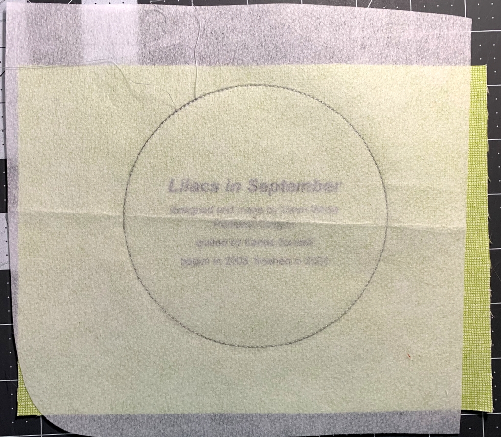
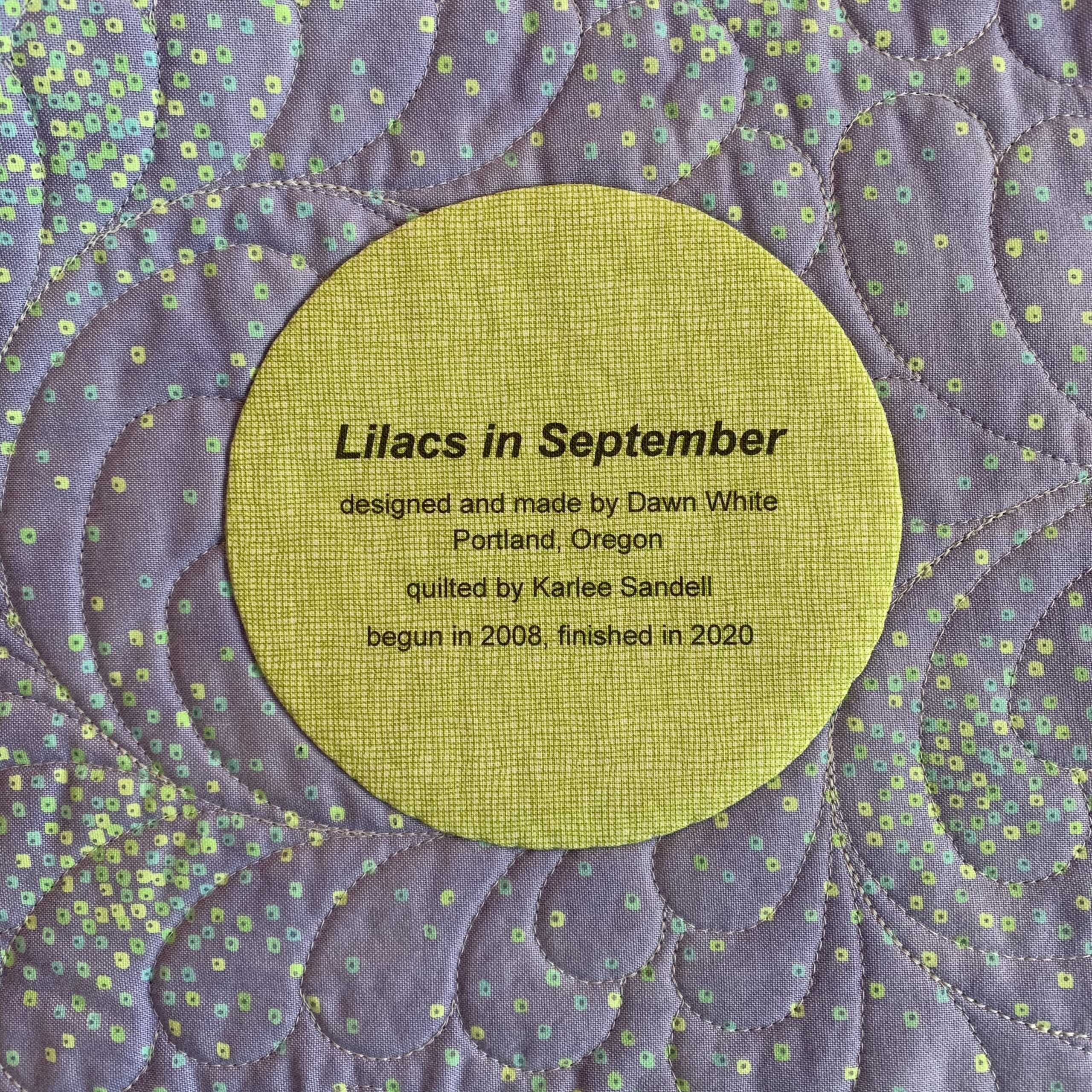
Step 1. Choose a fabric for your label that allows the type to show clearly. The fabric can be a solid or tone-on-tone print in a light to medium-light value. You might also be able to use a printed fabric — perhaps one you used in your quilt – if it’s not too busy or too dark in value to make the printed label hard to read. I’m illustrating this tutorial by making a label for my most recent UFO finish, Lilacs in September, using a medium light spring green fabric with a crosshatch design.

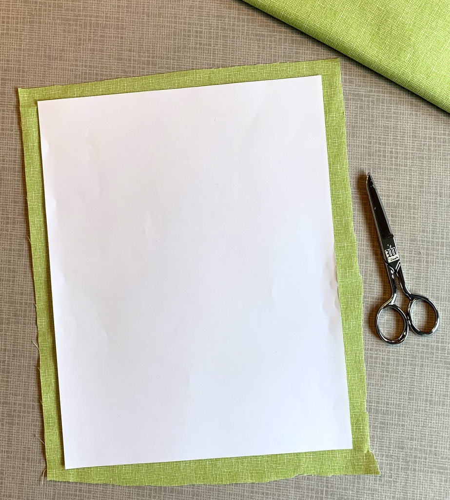
Step 2. Cut the label fabric about ½” larger all around than a printed page. In the United States the standard paper size is 8½” x 11” so you would cut your fabric about 9½” x 12”. It doesn’t have to be exact. I just lay a piece of paper on top of my label fabric and cut around it with scissors:

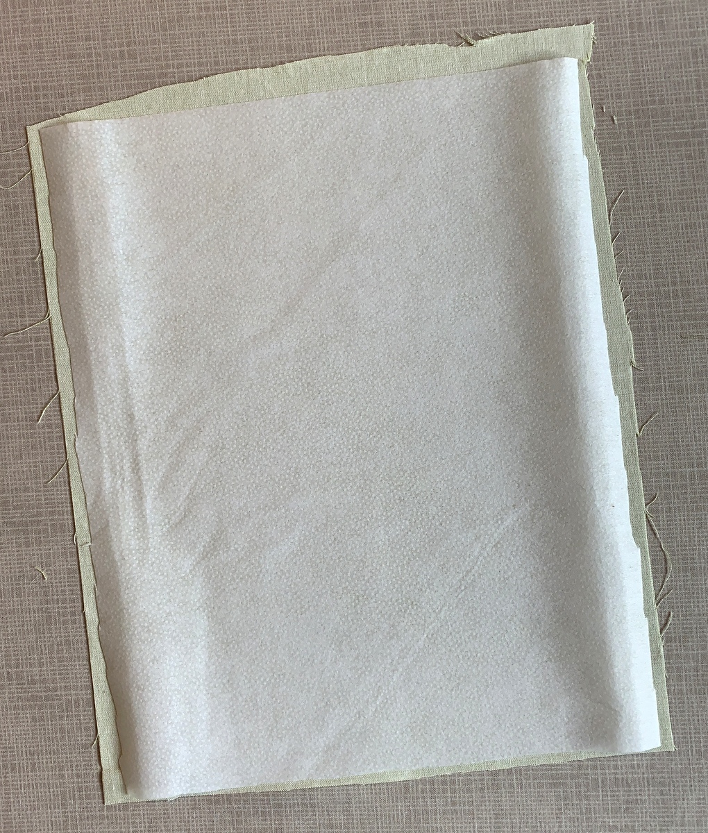
Step 3. Choose a featherweight or lightweight fusible interfacing. I use Pellon 911FF (the FF stands for featherweight fusible) for most of my labels but other brands will work equally well.

Step 4. Cut the fusible interfacing slightly smaller than you cut the label fabric. I do this the same way, by laying a piece of paper on top of the interfacing and cutting around it with scissors:

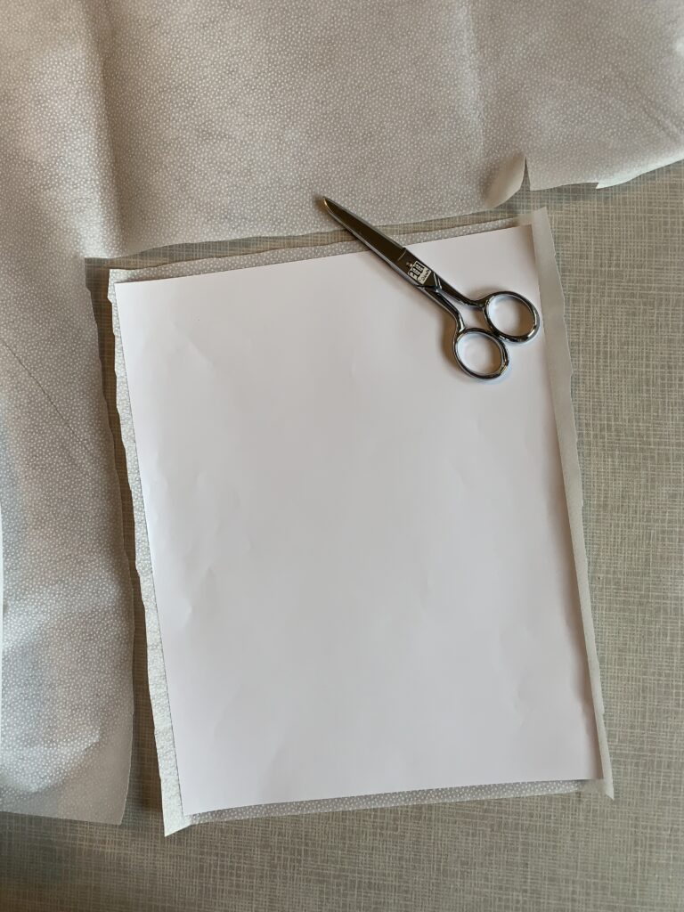
Cutting the interfacing slightly smaller assures that you won’t accidentally fuse it to your ironing board cover when you iron it to the label fabric. No need to ask me how I know that . . .

Step 5. Place the fusible side of the interfacing on the wrong side of the label fabric, making sure none of the fusible extends beyond the edges of the label fabric . . .

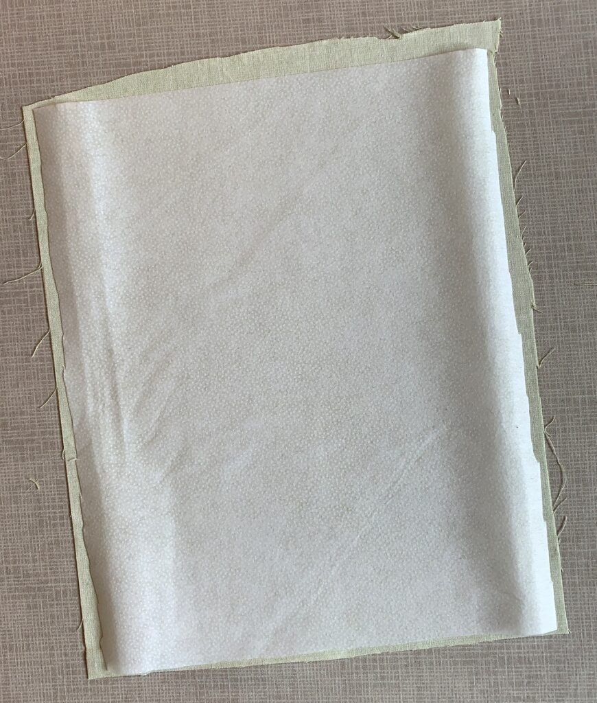
. . . and fuse in place following the manufacturer’s directions.

Step 6. Place the fabric on your cutting mat interfacing side up. Trim to 8½” x 11”:

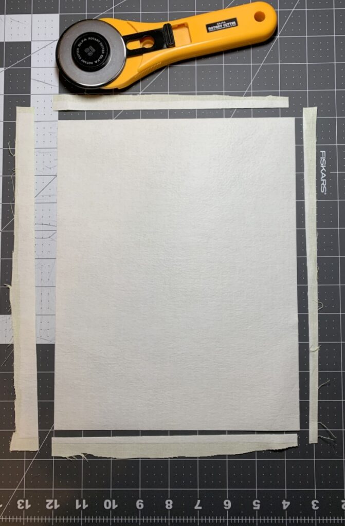
Make sure your cutting is precise because the piece of interfaced fabric needs to fit perfectly in the paper tray of your inket printer.

Step 7. Place the fabric in your printer’s paper tray. (Make sure you know whether the fabric side needs to go in the tray right side down or right side up, as it varies from printer to printer. It goes right side down in my HP Office Jet Pro 8620.) Now print the label:

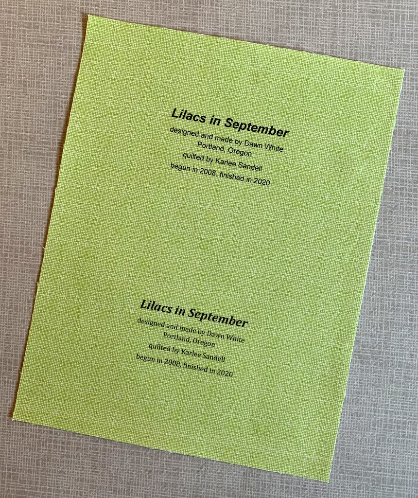
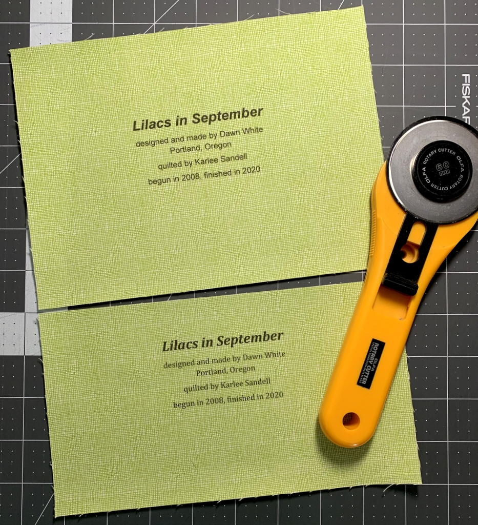
Voilà! It should slide out of the printer just as if it were a piece of paper. (You’ll notice I put two labels on my page; I’ll explain why in Part 2.)

One more thing to do:

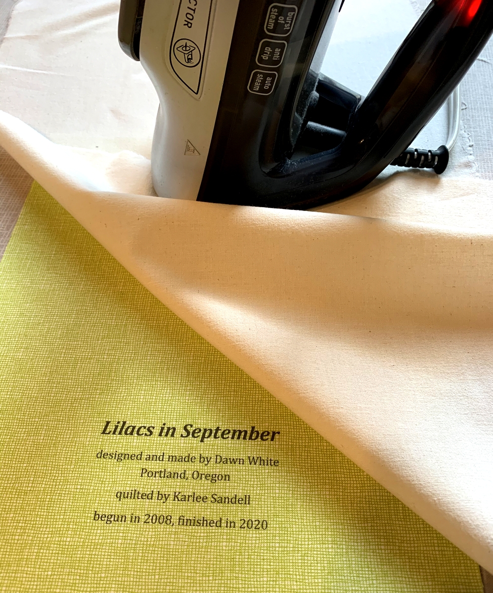
Step 8. Heat-set the ink on the label using a press cloth and plenty of steam:

This helps to keep the ink on the label from fading with repeated washings. Irons vary widely so let me caution you not to have the iron too hot as it may scorch the label, even with a press cloth on it. I like to set my iron on medium high and, with the press cloth on top, steam the writing on the the label for 10 seconds. I let it cool and steam it for 10 more seconds.

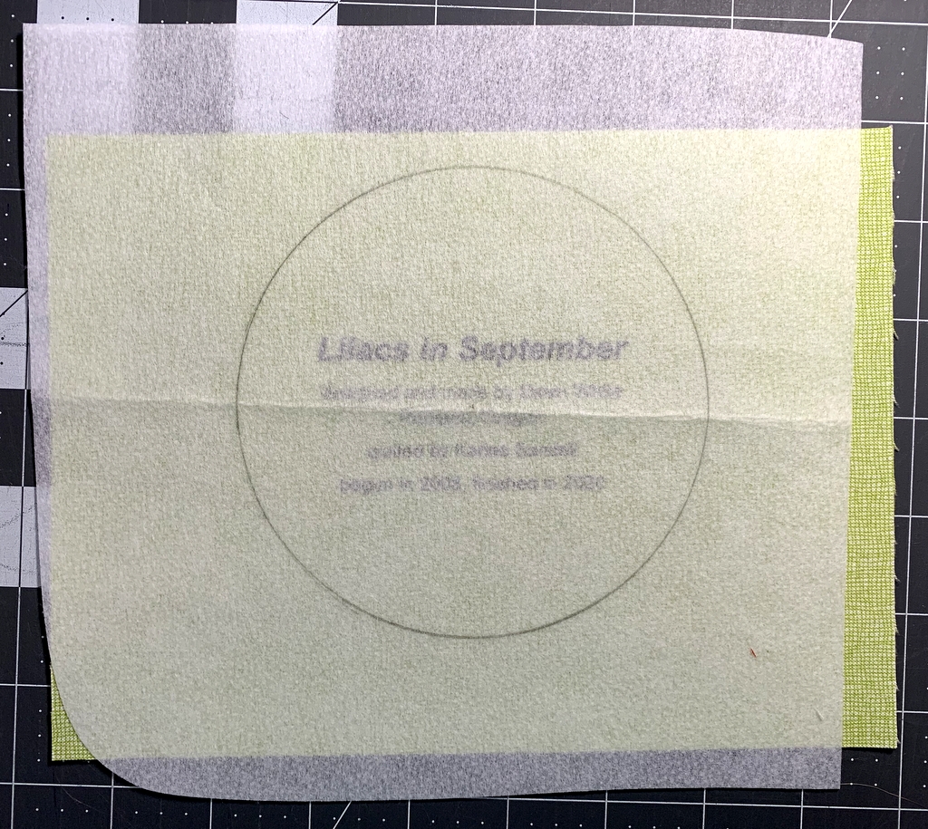
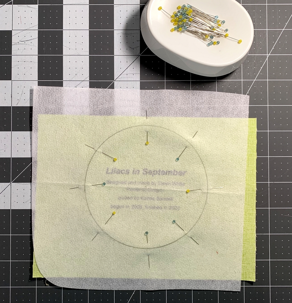
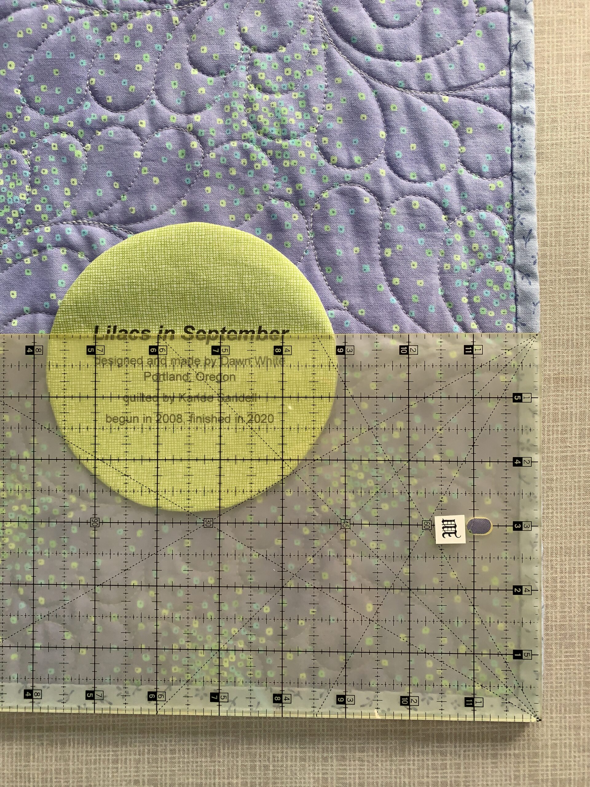
Now you’re ready to finish your label and attach it to your quilt. You’ll see in Part 2 below that I like to make my labels round but yours can be any shape you want. Squares and rectangles are popular and easy because all you need to do is turn and press the raw edges under ½” or so and stitch the label to the quilt.


Part 2. Creating the Label on Your Computer

Step 1. Open up a new document on your computer and type the information you want to include about your quilt. What you put on your label is entirely up to you. At a minimum I always include:

the name I have given my quilt
my name
my city and state
the name of my quilter (if I didn’t quilt it myself)
the year of completion

Notice that each line is centered.

If my quilt is an original design I might say “designed and made by Dawn White.” If the quilt was made from one of my own patterns I might include the name of the pattern or say “designed and made by Dawn White of First Light Designs.”

If my quilt was made using someone else’s design, I always credit the designer:

If I tweaked someone’s design, added my own design elements, or significantly changed construction techniques, I might add a line such as “based on (pattern) by (name of designer)” or “inspired by (name of designer)”:

Step 2. Determine the point size and typeface of your label. The point size refers to the size of the type, e.g. 12 point, 14 point, etc. The typeface refers to the design, or style, of the lettering. Most word processing programs offer dozens of typefaces to choose from. On my computer these typefaces are called “theme fonts.” (Did you know that font is the French word for face? Now doesn’t the word typeface make more sense?)

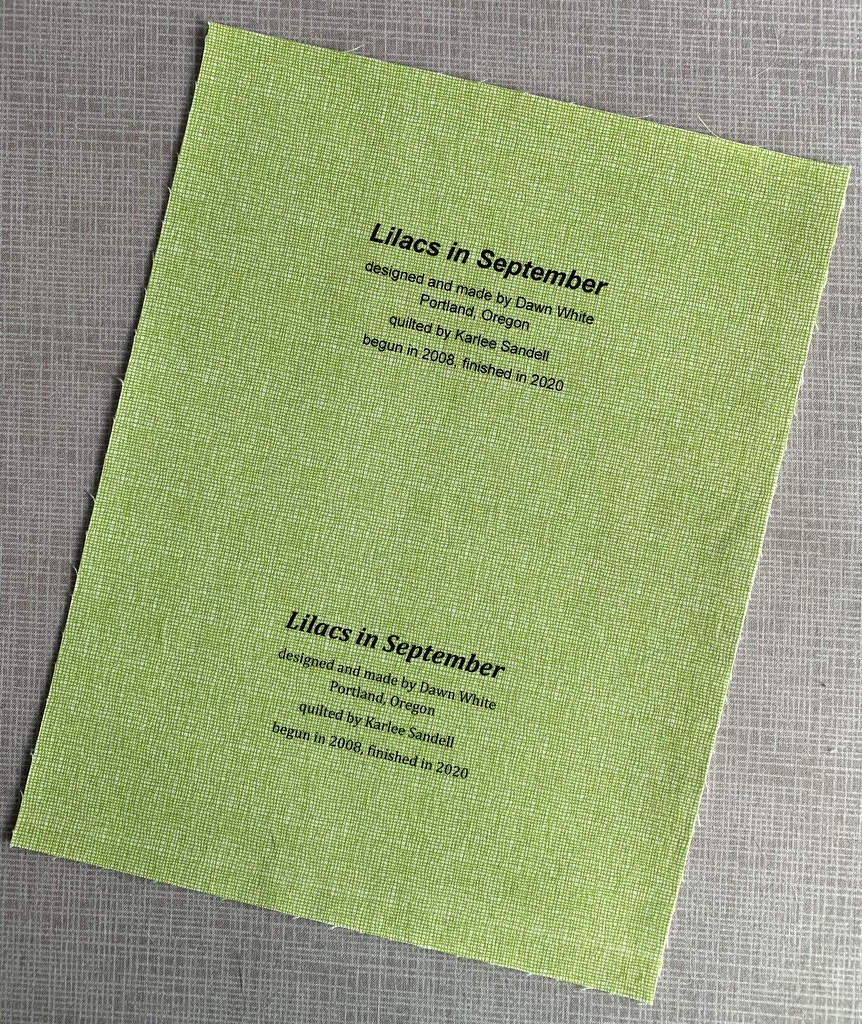
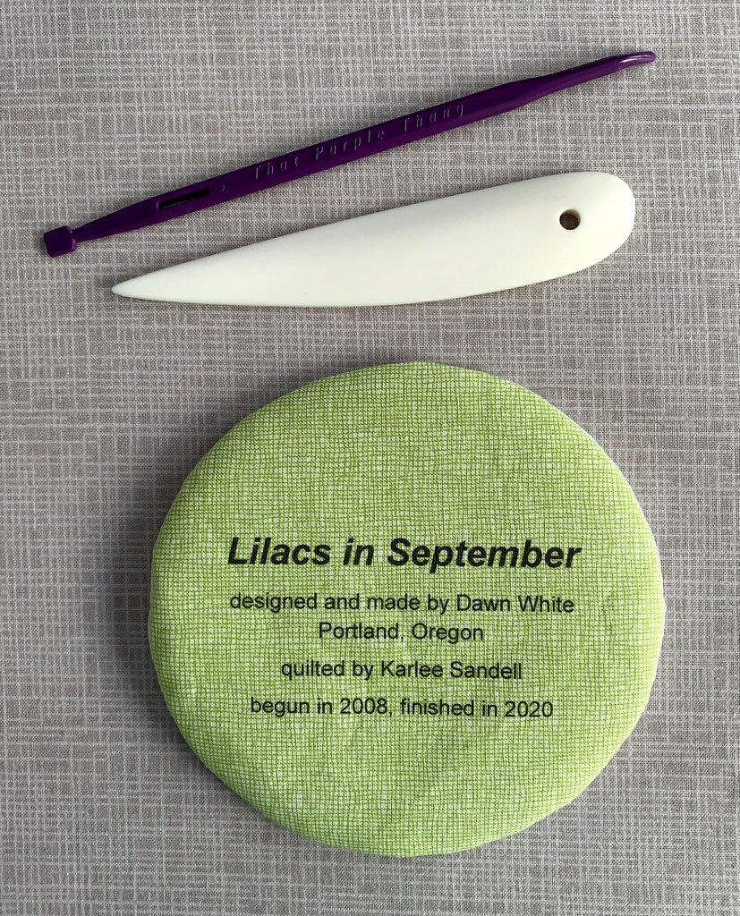
The point sizes you choose depend on the size and shape of your finished label and how much information you want to include. My label for Lilacs in September has five lines of copy. I put the name of the quilt in 24 point boldface and italic. The lines underneath are in 14 point. I auditioned a sans serif type face called Arial and a serif typeface called Cambria. Both labels fit on one page so I could make my final decision on which one to use after this page was printed on fabric. (Putting two labels on one page is just an option, of course. You could create one label and center it on the page, which would give you a lot of flexibility in deciding later on the shape of your label.)

Step 3. Save your document.

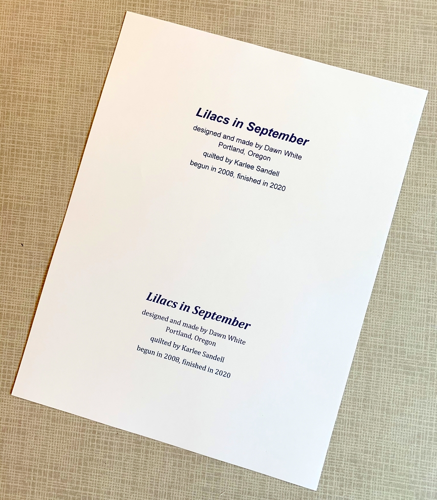
Step 4. Print your label on paper. This gives you a good sense of what the label will look like printed on fabric. Here is my label for Lilacs in September, printed with black ink:

If you have a color printer you can experiment with different colors of ink. Print the labels on paper first to test the depth of color. You may find the ink doesn’t look quite as dark or as vivid on fabric as it did on paper.

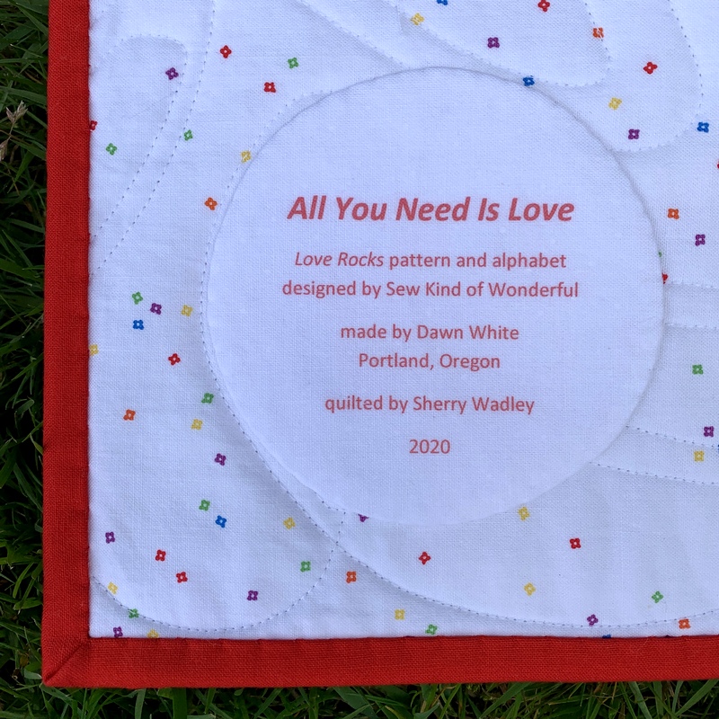
I used red ink on my label for All You Need is Love:

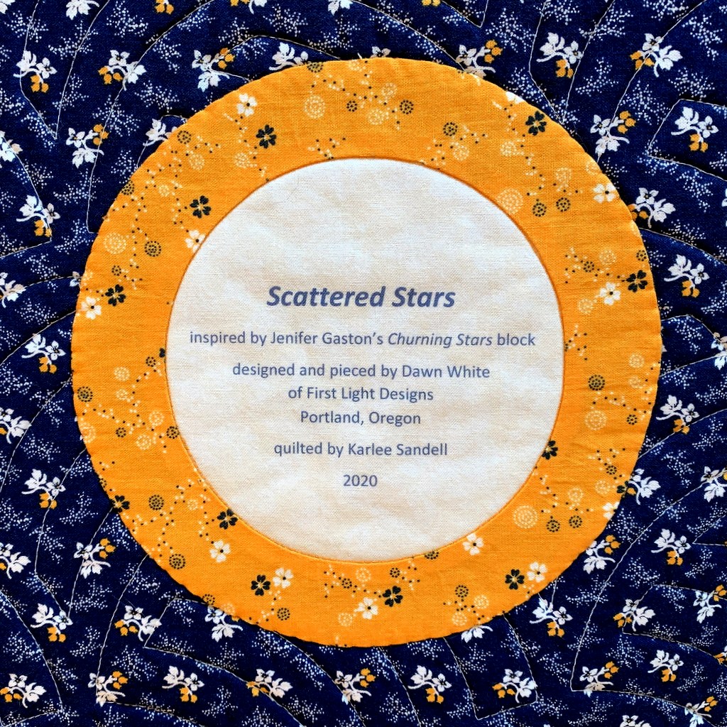
Take another look at the label for Scattered Stars, my cheddar and indigo quilt. I used indigo ink which turned out to be not as dark as I was expecting but I still chose it over black:


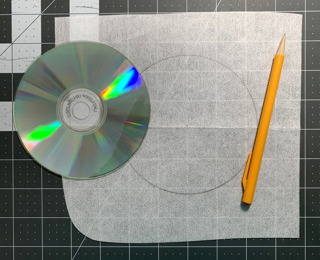
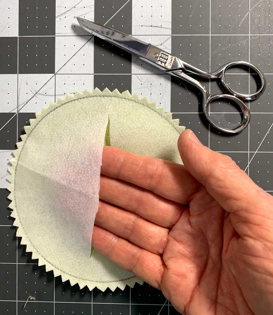
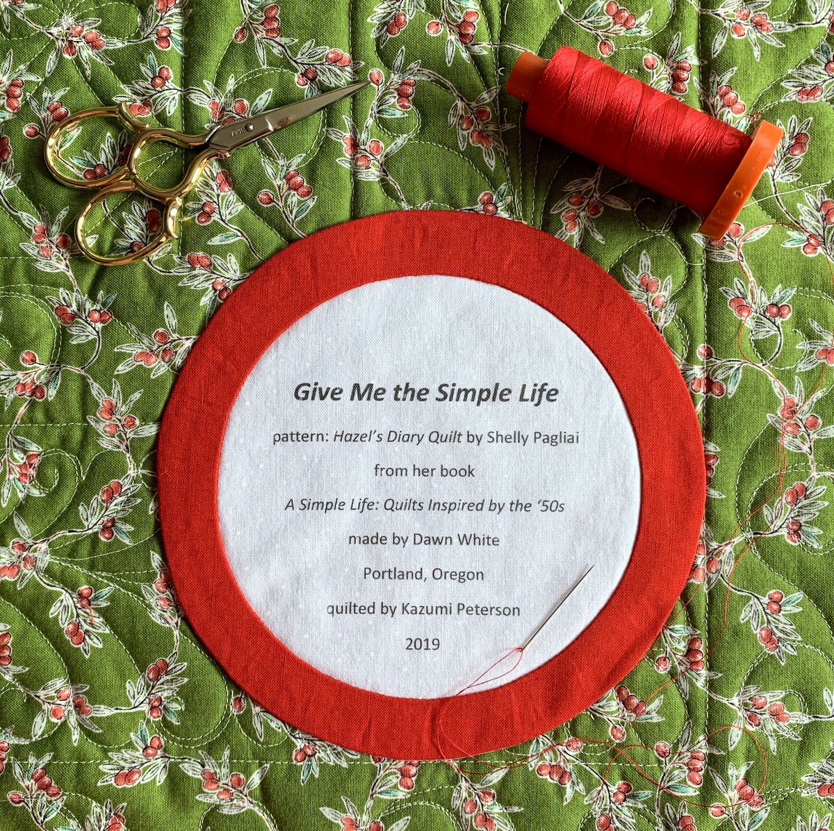
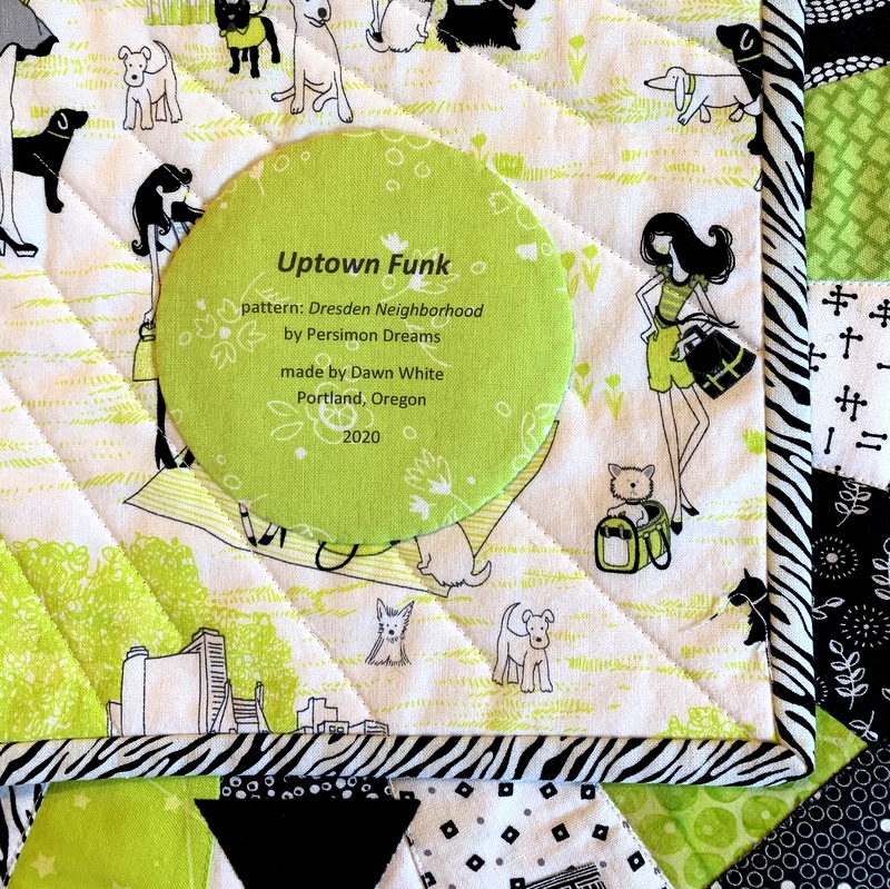
Most of my round labels are made using a compact disc as a pattern. A CD measures 4⅝” in diameter so a label with a few lines of text fits inside that circle nicely. My label for Give Me the Simple Life has eight lines but still fits inside the compact disc pattern size:

The addition of the red ring made the label finish at about 6″ in diameter.

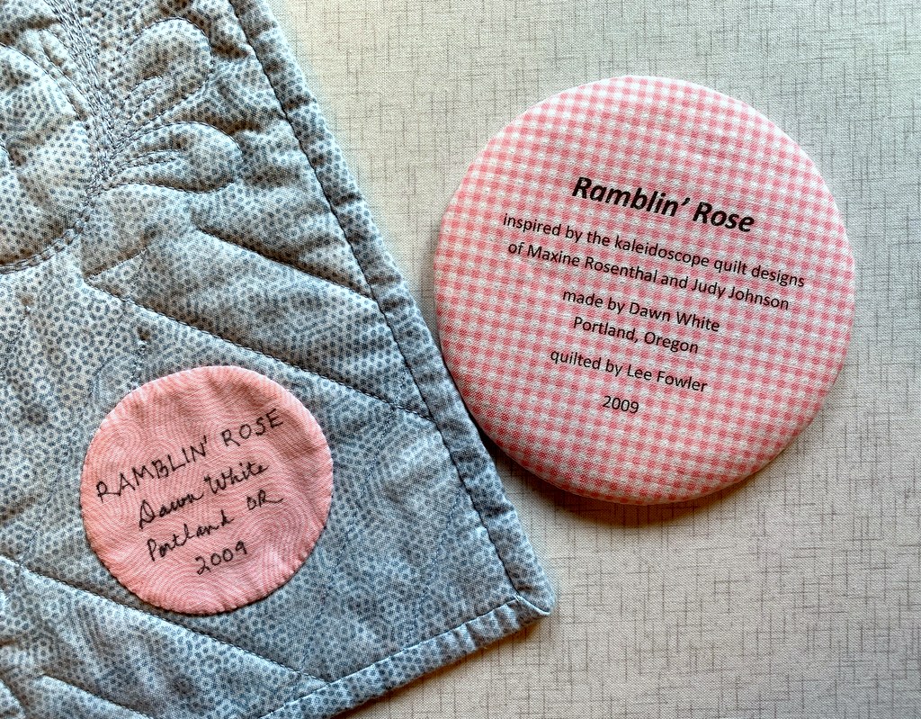
Below is a computer-generated label I made in May to replace a label on Ramblin’ Rose, made several years ago. I had omitted two significant pieces of information — the inspiration for my quilt and the name of the longarm quilter — and wanted to correct those oversights. In the photo below the original label is still on the quilt, about to be removed and replaced with the one on the right:

I used to write all of my labels by hand, a time-consuming endeavor. Creating them on the computer and printing them directly onto fabric has turned out to be quick and easy — and rather fun to do. I don’t think I’ll ever go back to hand-printed labels.

I hope you find my tutorial helpful. Be sure to let me know if you have any questions. As always, thank you for visiting First Light Designs!


Note: I followed up this tutorial with a new one, posted Nov. 6, about how I make my round labels using a compact disc. You can find it here.


Posted in appliqué, cheddar and indigo, Churning Stars quilt block, Hazel's Diary Quilt, quilt labels, tutorial, update | 9 Comments

Signing On

A few weeks ago Shelly Pagliai of Prairie Moon Quilts made a request on her blog for signature blocks for a quilt she is planning. She wants to make a very large quilt out of very small blocks — they will finish at only three inches! Here’s my block:


I’ve never met Shelly but I’m a big fan. In some ways I feel like I know her. She is the author of this book . . .

. . . which includes the instructions for Hazel’s Diary Quilt, pictured on the cover.

I was lucky enough to see Shelly’s original quilt on a trip to Paducah, Kentucky in 2017:


Her quilt inspired me to make my own version, Give Me the Simple Life, completed in 2019:

While working on this quilt I was struggling with a particularly difficult needleturn appliqué shape — if memory serves it was a very small five-pointed star — so I dashed off an email asking for advice. Shelly answered my email quickly and offered a suggestion that helped immensely. I’ve always been grateful.

Since I’ve made one of her quilt designs I thought it would be fun to make a block for her signature quilt. Other than the size of the block, Shelly’s only requirements are that the background fabric be a bright color and the signature portion be solid white.

I chose one of the bright yellow prints I used in Give Me the Simple Life for the background fabric. I don’t have a solid white in my stash so I used the wrong side of a very tiny white-on-white dot fabric for the signature portion. It happens to be the same white fabric I used for the background in Give Me the Simple Life (although I used the right side!). I’m pretty sure it will pass muster.

Soon my little block will be winging its way from my home in Portland, Oregon to Shelly’s home in Wien, Missouri 1,863 miles away. And who knows? Maybe in a post-pandemic world I will get to meet her.


Posted in appliqué, Hazel's Diary Quilt, needleturn appliqué, update | 9 Comments