Reach for the Stars: Final Layout
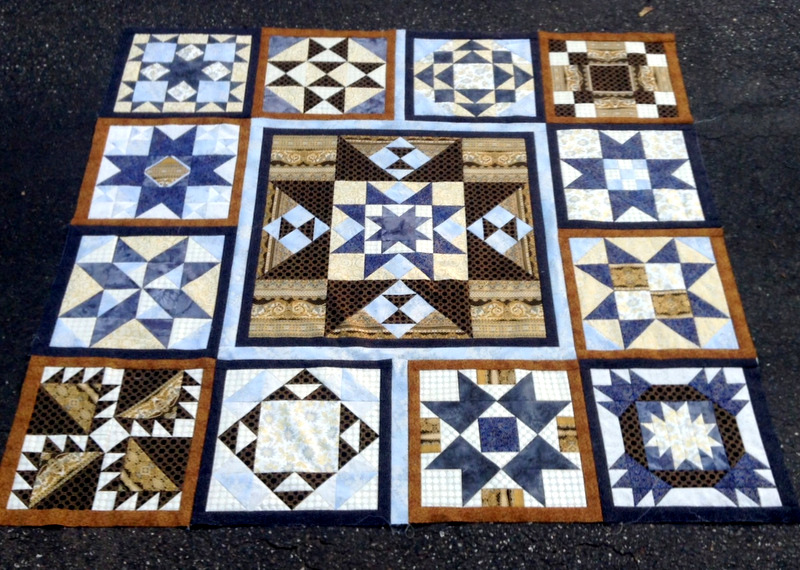
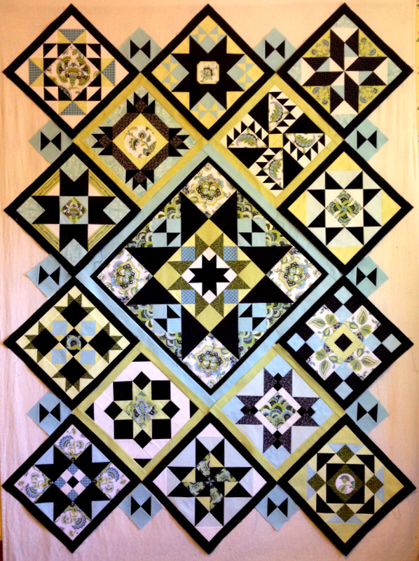
When I showed you my completed Reach for the Stars blocks in my post of Aug. 18, I thought I had settled on a layout. Here’s a photo from that post:
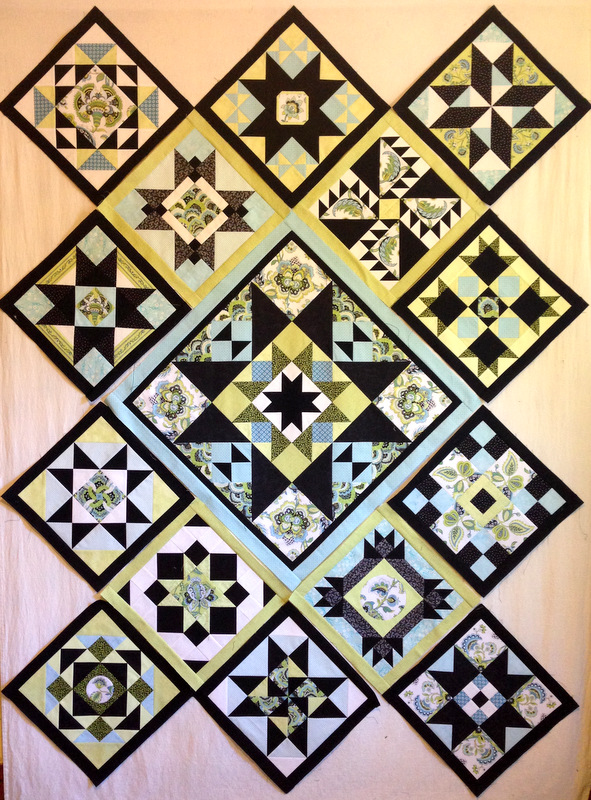
Nope. I changed a few blocks around:
Now it seems the heavier blocks — the ones that seem to fill up more space in the block, if you know what I mean — are more balanced, and I’m pleased with the distribution of greens and blues in the background. I’m so certain of this layout that I am ready to sew my blocks together!
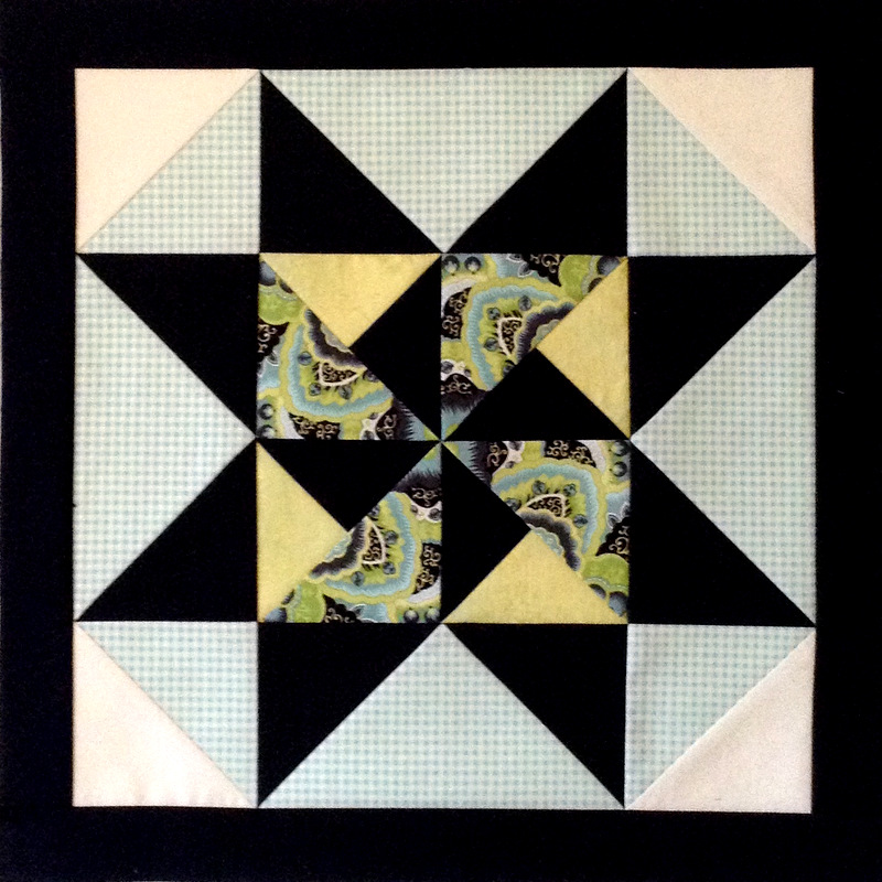
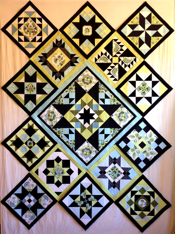
I did discover a bit of a design dilemma after starting to make the setting triangles. They all contain a small hourglass block the same size as the ones in the center medallion. Terry Krysan, the designer of Reach for the Stars, calls for the hourglass blocks to be placed horizontally on the top and bottom of the quilt and vertically on the sides. Here’s what that looks like on my top:
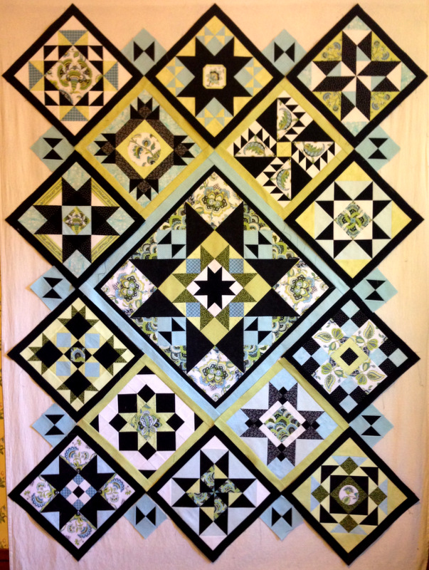
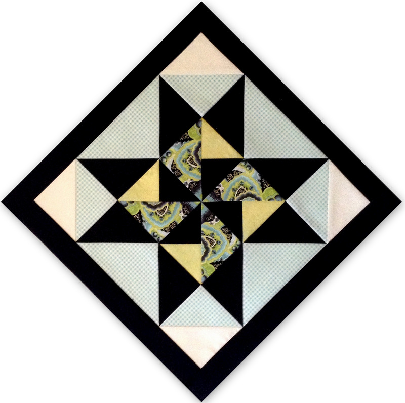
But I like the look of those hourglass blocks placed horizontally on the sides:
This is the kind of design decision I can easily obsess over. My friends know what I mean.
I’d love to know what you think. Here are my two choices, side by side.
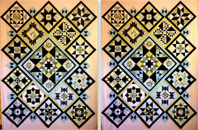
Which look do you like better? If you’re so inclined, please tell me why. It’s very easy to leave a comment!