
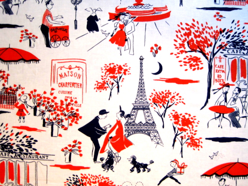
The photos in yesterday’s post didn’t do justice to Gay Paree, the new Michael Miller fabric I just used in a kaleidoscope table runner. Gay Paree is a novelty fabric featuring slightly abstract scenes of Paris. There’s a young couple sitting at an outdoor café, a little girl buying flowers from a street vendor, another vendor selling baguettes, and a nun feeding birds. There’s also a smartly dressed woman walking her dogs — poodles, of course — near the Eiffel Tower and a sailor kissing his sweetheart by a fountain. A whimsical panorama indeed:
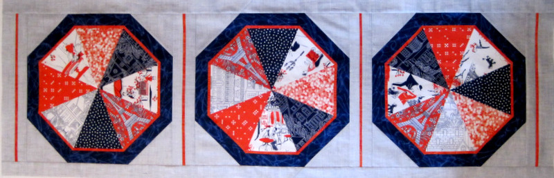
I fussy-cut six different images from the fabric and inserted them randomly, two to a block, in my table runner:
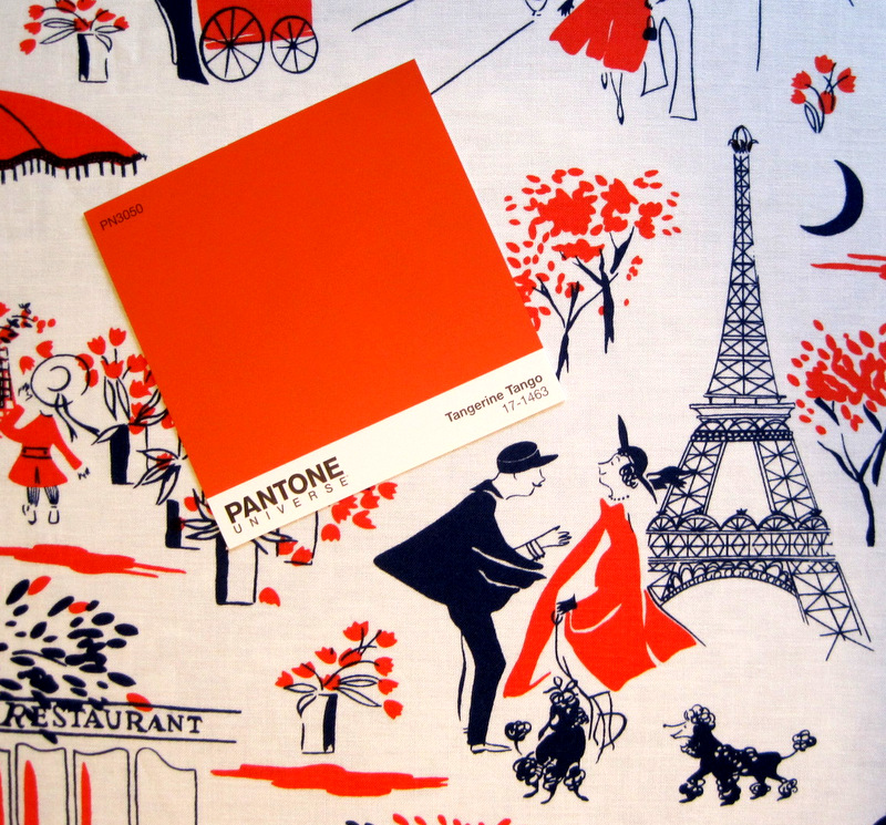
You may be wondering what this Gay Paree fabric has to do with Pantone. Do you know about Pantone? It’s an American corporation best known for its standardized color reproduction system, known as PMS (Pantone Matching System). The system is used in a variety of industries where accurate color reproduction is really important — printing, of course, but also in the manufacture of paint and fabrics.
Every year Pantone declares a “Color of the Year,” which guides consumer-oriented companies — think florists, fashion designers, fabric manufacturers — in product design and future planning. I happened to be in a paint store the other day and stopped in front of a Pantone display, which featured the three most recent Colors of the Year. The 2012 Pantone Color of the Year — Tangerine Tango — was the very shade of orange-y red in my Gay Paree fabric! Take a look:
It just so happens that Gay Paree comes in two other colorways: a bright emerald green and a vibrant orchid:
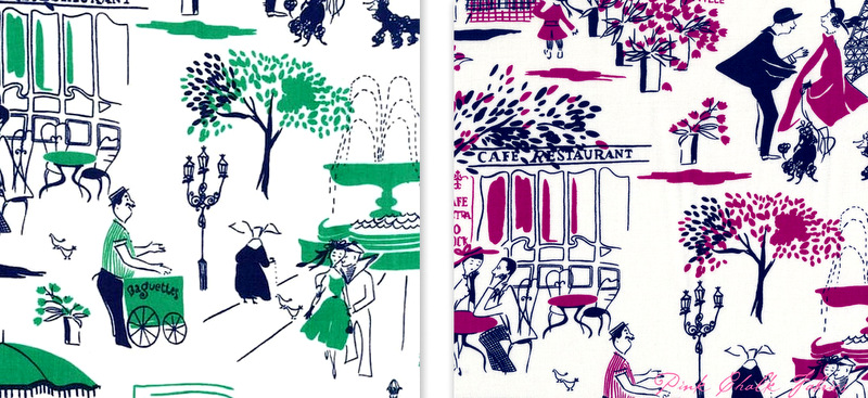
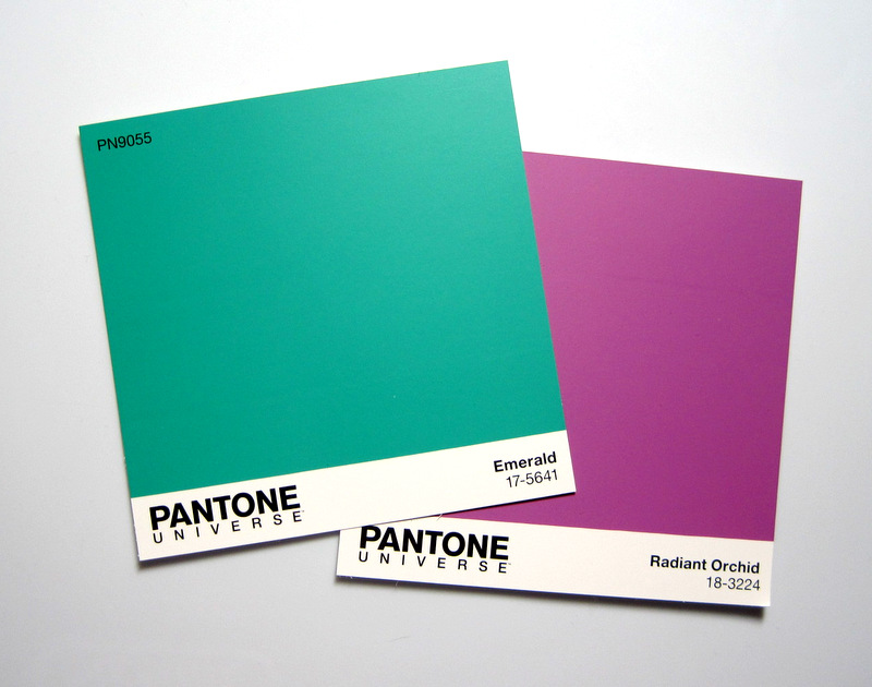
And it also just so happens that Pantone’s Color of the Year for 2013 is Emerald and 2014’s color is Radiant Orchid:
Coincidence? I think not! Savvy marketing? Mais oui!
Lovely. I really like those Paris scenes — brightens all the runner.
Well, there you go… you can make something in the Radiant Orchid colorway and enter it in the contest. You have a few weeks so get going!
Fondly, your Pantone Challenger
I just might take you up on that, AnnMarie!
Please do! You already have a great design.
Too bad I didn’t use the orchid Gay Paree fabric! (But I do love the orange.)