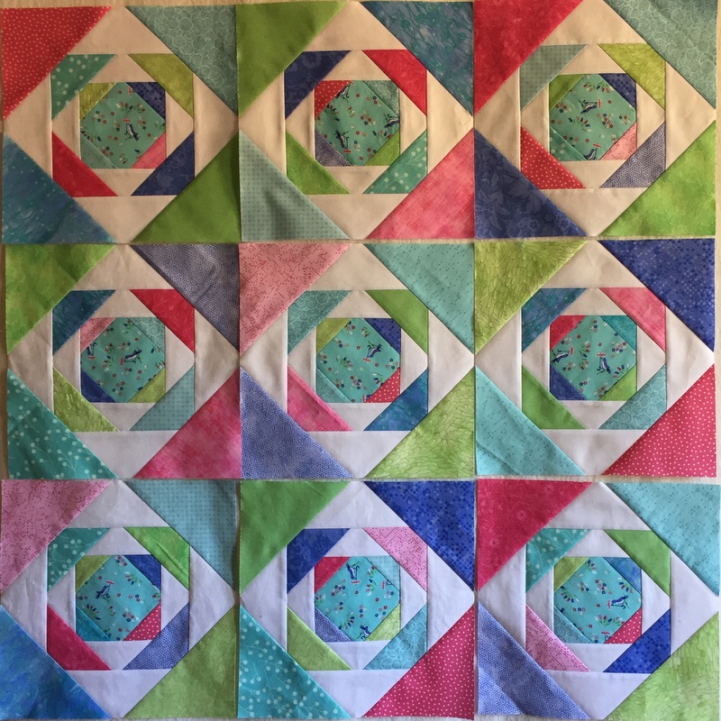
A funny thing happened when I got a few more blocks made for the baby quilt I’m making from Karin Hellaby’s Pineapple Plus book. When I put the blocks up on my design wall, I wasn’t loving what I was seeing:

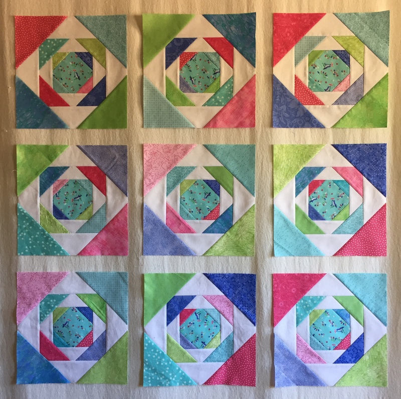
No matter how I turned them, the deepest of the blue and pink fabrics seemed too intense. I was going for a softer look. When the blocks were spaced out on my design wall I liked the effect a lot better:

“Ah, yes,” thought I. “What this quilt needs is some white sashing strips.”
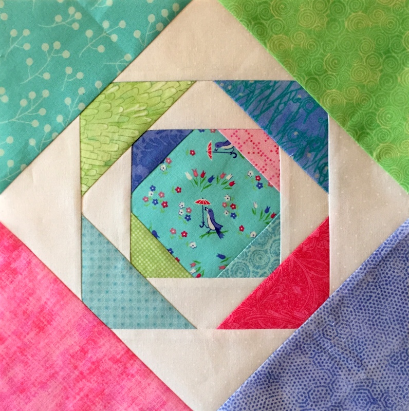
Then I thought of those darling little birdies in the centers of the blocks:
 The birdies are scattered over the fabric every which way, which is why I didn’t fussycut them to begin with. I like the fact that no matter which way you turn the quilt, you see some birdies right side up.
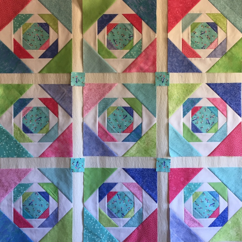
I realized they were just the right size for the intersections of my sashing strips:

I wound up fussycutting a few after all. They’ll look really good against the crisp white background fabric. I like where this is going now, don’t you?

Genius
Yes I do like the way this is going! I love the colors you have chosen. I happen to be making Pineapple blocks myself right now, but mine are all in Civil War repro fabrics. What a contrast to yours!
Yes, an improvement.
That’s why you’re the pro!
Love it!
When I saw the first picture, I thought, what’s not to like? Then I saw the second picture and thought, now I get it! But when I saw the third picture, I was in love!! Gosh Nubs, you push the envelope to perfection.
Just love it, Dawn! The blocks really show off with the spacing. Brilliant!
XO Peg