No, that’s not a typo. It’s Currant with an “a,” not Current with an “e” as you might expect. Let me tell you how I came up with the name Currant Affairs for my newly finished quilt.
It started with the name of the fabric line: “Black White and Currant 5” by Color Principle for Henry Glass & Co Fabrics. The fabric company came out with four previous versions of “Black White and Currant,” all featuring beautiful prints in black and white accented with the deep currant red you see above. I’m not sure how I missed the first four lines but when #5 came out I scooped up the border print and a larger Jacobean floral that has already found its way into another quilt top (still a Work-in-Progress).
The black and white and red fabric reminded me of a riddle from my childhood, which you may recognize if you are Of A Certain Age:
Question: What’s black and white and red all over?
Answer: A newspaper.
The real question, you see, is “What’s black and white and read all over?”
It’s just the kind of wordplay that appeals to this English major. When I was a kid, black and white were the only colors of a newspaper. Colored ink didn’t start appearing in newspapers until the 1970s.
In one of those thought progressions that begin with one image and end with a different one, my brain traveled from a newspaper to Current Affairs, a regular part of the social studies curriculum in my youth in which my classmates and I delved into the stories behind the headlines in the local newspaper. “Current” morphed into “Currant” (I can’t resist a good pun) — and I had my quilt name.
Nowadays many young people don’t pick up a newspaper to find out what’s happening in the world. The latest news (or some version of it) is available on their smartphones with the tap of a button or swipe of a finger. Me? I’m old fashioned. I want to hold a newspaper in my hands when I read the news in the morning. I want to read a book by turning real pages and I want to smell the ink on those pages.
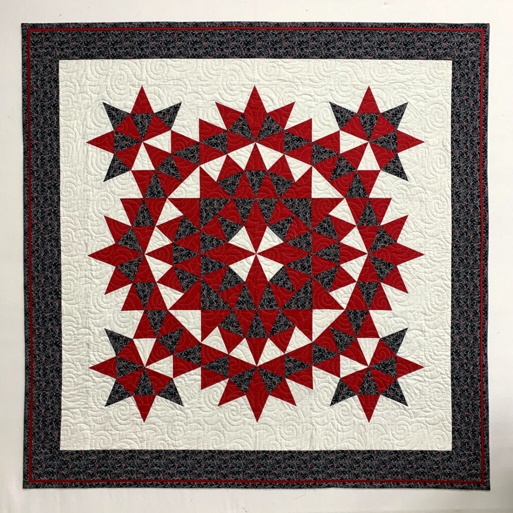
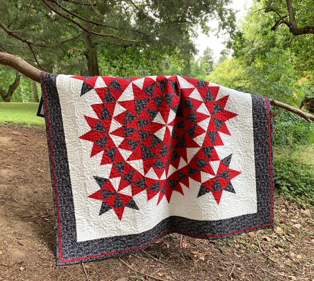
But I digress (and I’m sounding like an old fogey in the process, aren’t I?). So let’s get back to my quilt. Here are a couple of pictures of Currant Affairs taken in lovely Laurelhurst Park this afternoon:
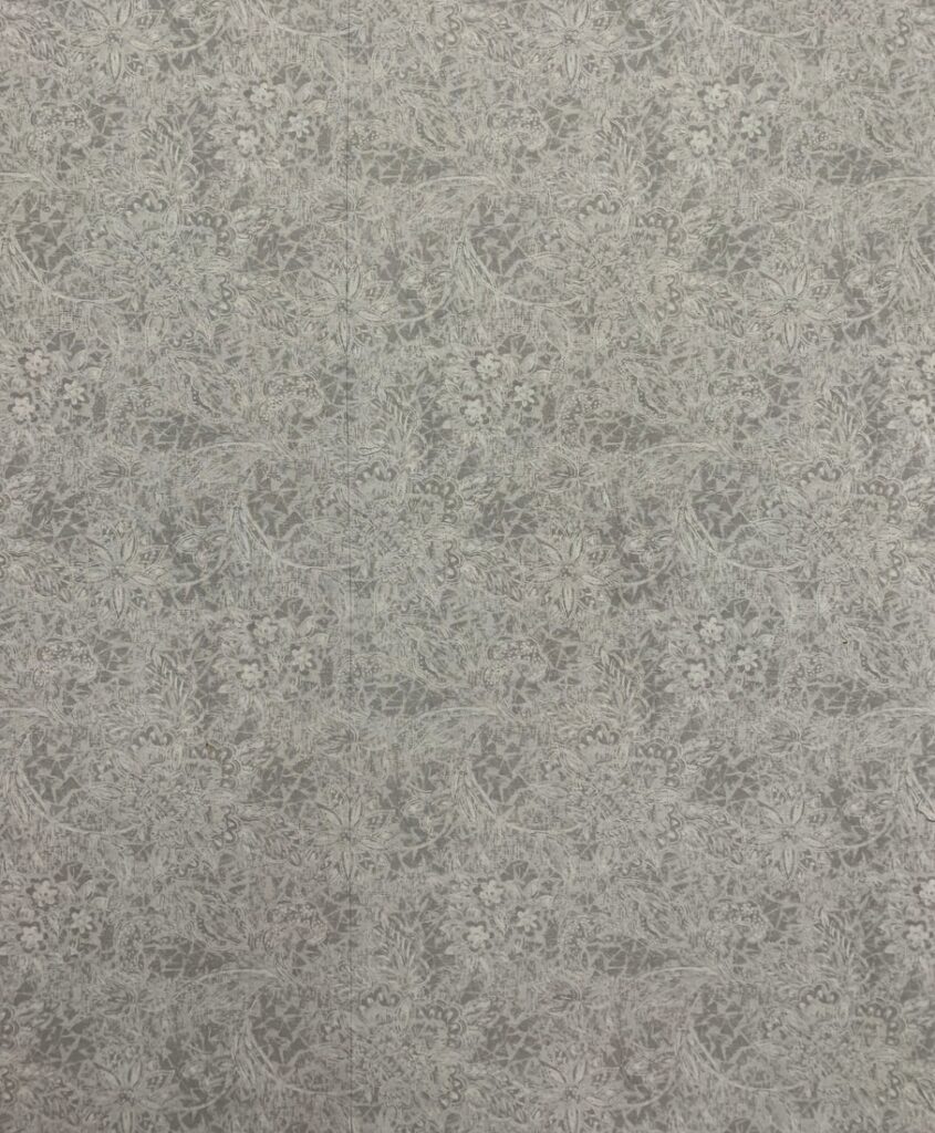
The back is very simple: two pieces of a subtle light grey floral print sewn together and a light grey with white polka dots added along the bottom. It wasn’t necessary but I matched the seams of the floral print. Can you spot the seam?
It’s really hard to see in that photo. Here’s a close-up of the backing before it was quilted:
The seam is about two-thirds of the way over running vertically. Can you see it now?
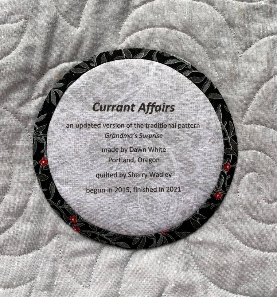
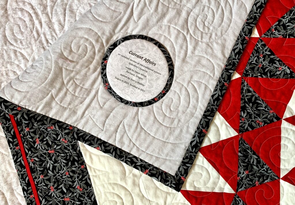
Here’s a look at the label followed by a close-up:
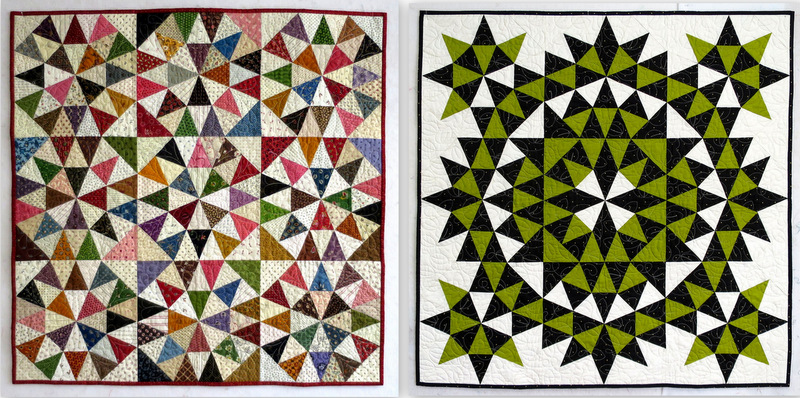
 This quilt was started six years ago in a class taught by Joyce Gieszler. Her book Then and Now Quilts (Kansas City Star Quilts, 2014) had come out the year before and this design, Grandma’s Surprise, was one of the quilts featured in the book. On the left is Joyce’s traditional version and on the right is one of her updated versions that inspired my fabric choices:
I added a border to make my quilt a bit larger, and then I decided to add a flange and binding treatment that visually extends the outer border:
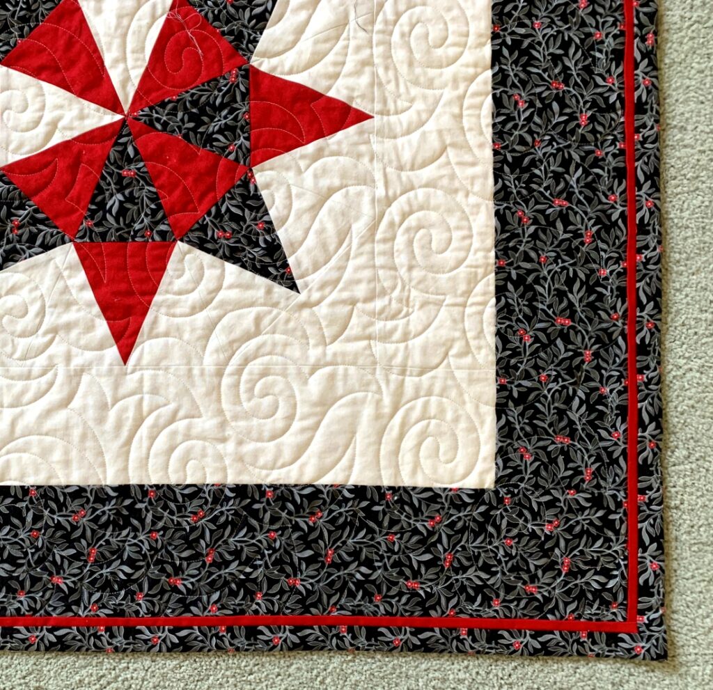 With the addition of the border, Currant Affairs finishes at 66″ square.



Beautiful, I love reading your posts.
Love the name – it’s perfect! And, those matched seams – perfection personified.
Love how you think of puns to use in naming of your quilts. Thank you for reminding me to make an invisible seam in the backing of my quilt. This quilt turned out very nicely. I am sure the quilt enjoyed its field trip for on location pictures. Have a great day creating your next masterpiece.
Love the quilt, Dawn! And the title! Suzette
Beautiful
So pretty! And I love your choice of names. You have a gift for that :). I also like your photos on the bench, as it gives a better sense of scale. A lovely finish!