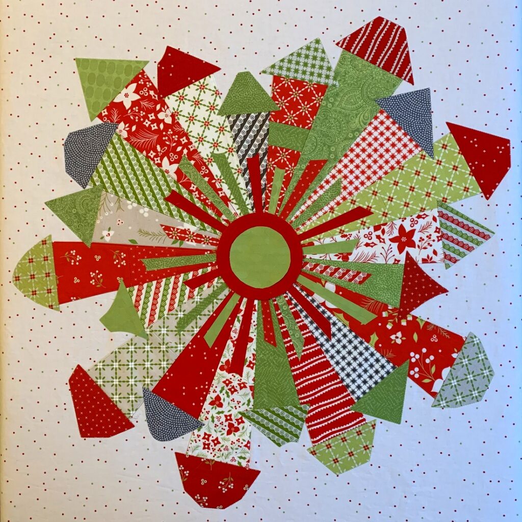
In my last post I showed my thought progression in auditioning red and green circles for the center of my Dresden Neighborhood mini quilt. My final decision (or so I thought) was a green circle, which I really liked after adding a smaller red circle on top of it. Here’s a reminder of what that looks like:
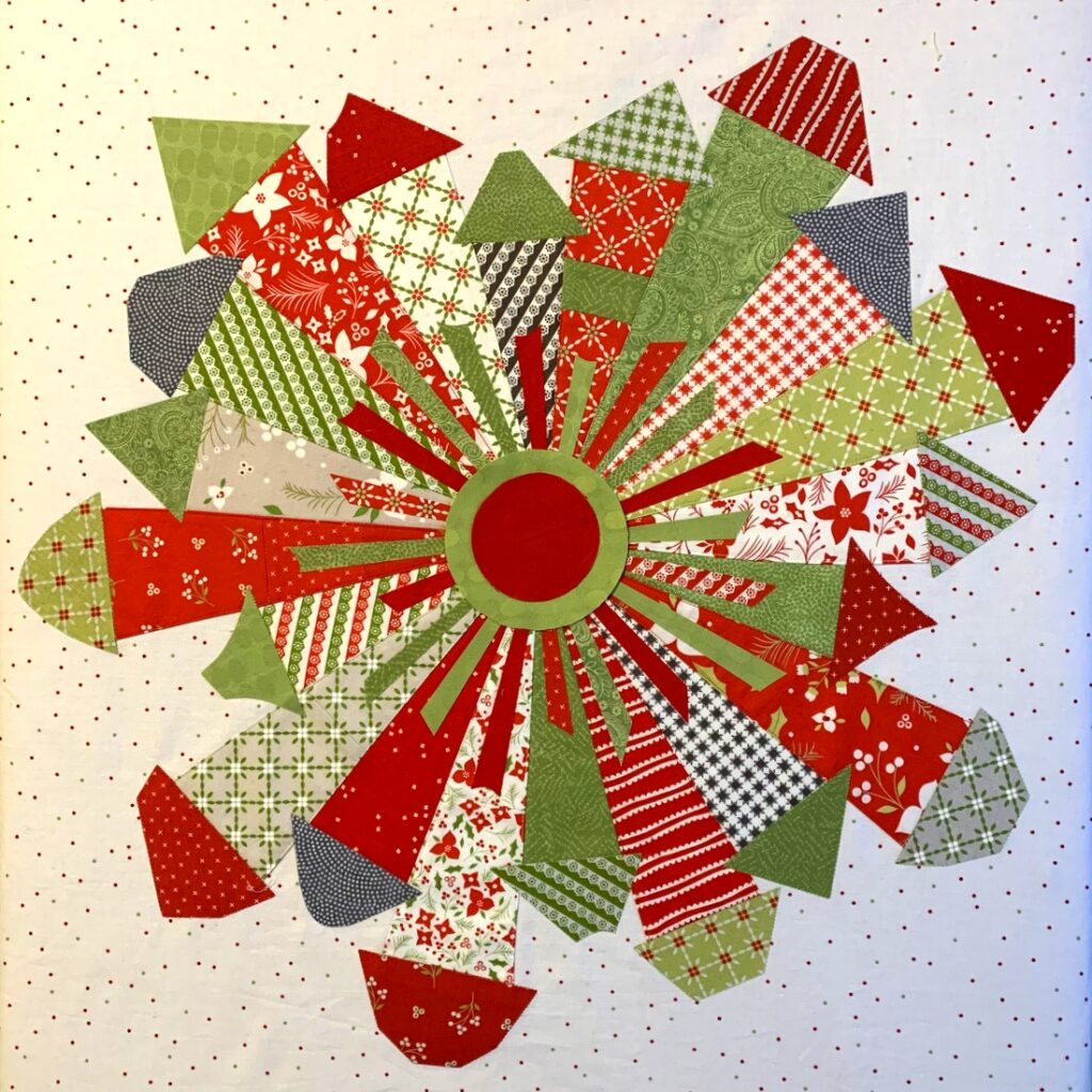
One of my friends from Quilt Camp came out strongly in favor of red so I took another look. I still felt the red by itself was too bold but I hadn’t thought about placing a smaller green circle on top of it. When I did, I really liked it too:

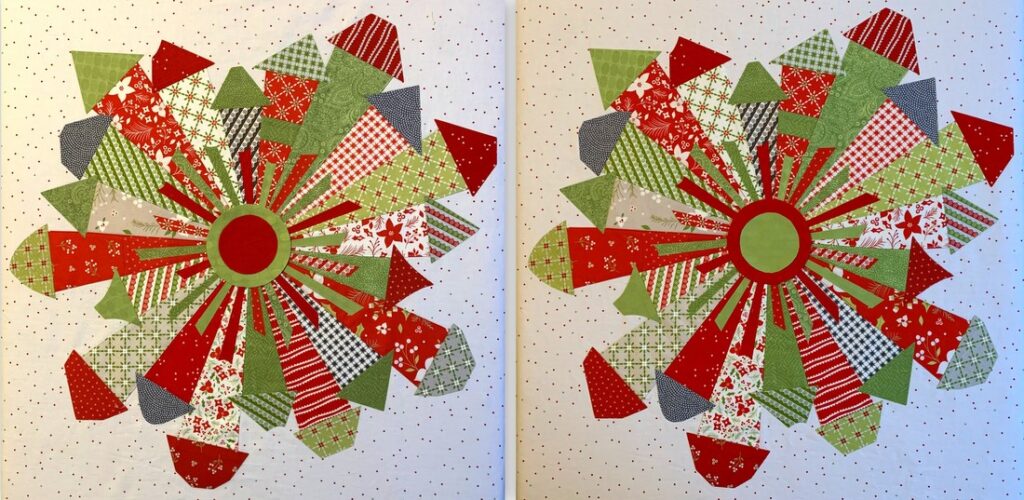
Now I can’t decide which one I like better. Here are the two possibilities side-by-side:
 (You will surely notice how different the background fabric looks in the two photos. They were taken on different days in the same spot in my sewing room, with weak afternoon light coming in a south window. Depending on the time of day and weather, the colors can look so different.)
I’d love to know which one you prefer!


Hi! I like the green with the red center, feel it pulls the eye IN to the center of the village, whereas the green center seems to take the eye out. My two cents is all! hygge, Suzette
Well, how can we possibly vote until or unless you also audition the button that would go in the middle of each one? If that is not what you will do, then for me, the red center reads like a cherry and the green center reads like a green olive. Thus, I vote for the red center! 🙂
Beautiful Dawn. Either one you choose will be glorious and amazing but my eye is drawn to the one with the predominantly red center. (heart eyes all day long) 🙂
For what it’s worth, I prefer the green on red. I think it is more subtle and makes the red doors look like light rays so my eye moves around the houses. My eye gets stuck with the red on green center circles.
I really like them both! But since you want me to pick one, I’d say the green circle.
Oh my, both are great! I favor the red outer circle with the green inside circle.
I like them both, but my favorite is the green center.
I like the red on green but both are great!
I prefer the one with the red circle on top of the larger green circle, tho both are very nice.
I really like the red center with a circle of green around it. This pattern is so much fun! Sorry I am not in the area to take your class.
I’m of no help. I waffle back and forth. I don’t think you could go wrong with either one.
Either is beautiful, but I like the red outer circle with green center – it seems to draw my eye out to the houses.
Hi Dawn, I really prefer the red circle with the green around it. Amazing what a difference a small color change can make. What a festive piece.
Dawn, I like the red center. Funnily enough, the red calms the piece down where the green stands way out. I guess it depends on your central button, as an earlier commenter suggested. It’s really a sweet town….arden
I like the red center best! I love your town. Hugs,
I prefer the green with red on top. Both look great, though!