I’m making headway (albeit slowly) on my version of Reach for the Stars, the queen-size sampler quilt featured in Quilter’s Newsletter magazine. Directions for the quilt, which contains a center medallion and 14 blocks, are unfolding over the course of seven issues.
If you’ve been following my progress you’ve already seen my center medallion flanked by my first seven blocks:
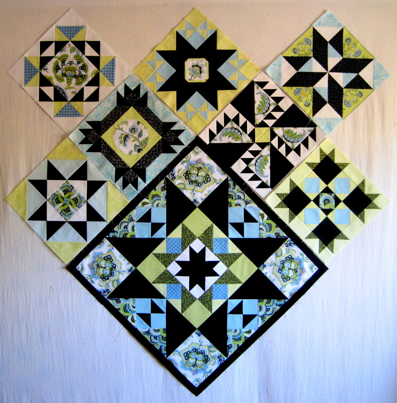
This morning I was ready to sew the segments of Block 8 together. There they were, up on my design wall:
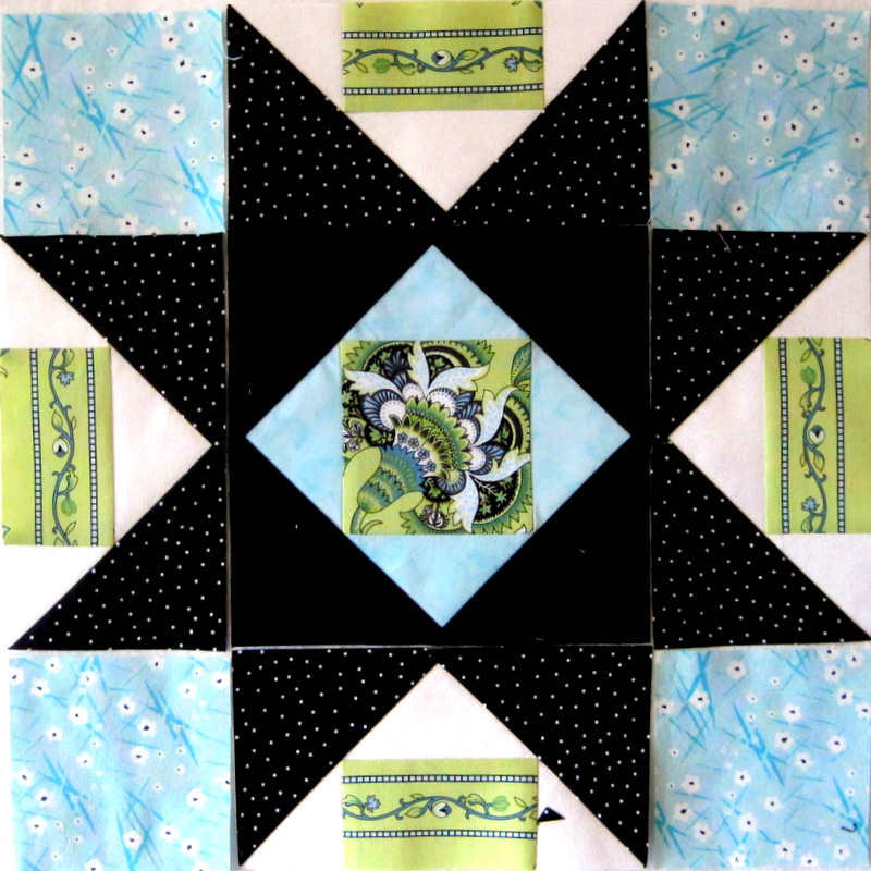
I had followed designer Terry Krysan’s original block design shown here:
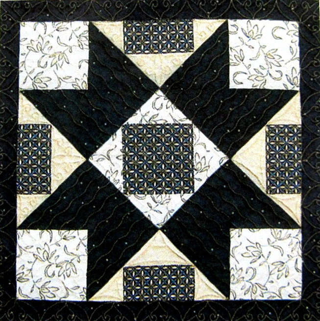
My thought was that the four rectangles on the outside of the block would look good made from one of my two focus fabrics, the one that features a border stripe. But the more I looked at my block components, the more I thought something wasn’t quite right. Hmmm. How would it look if I extended the stripe to the outside edges of the white triangles? I folded a piece of the striped fabric across the top part of the block . . .
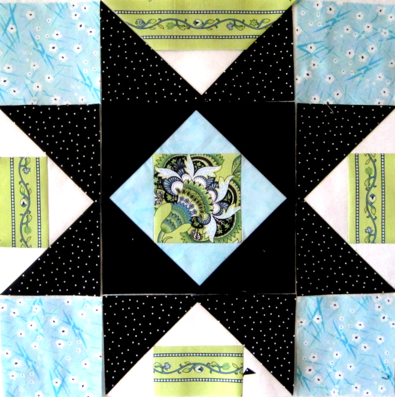
. . . and I liked what I saw. I’m so glad I made the decision to make new flying geese units before I sewed the block together.
Now Block 8 is done:
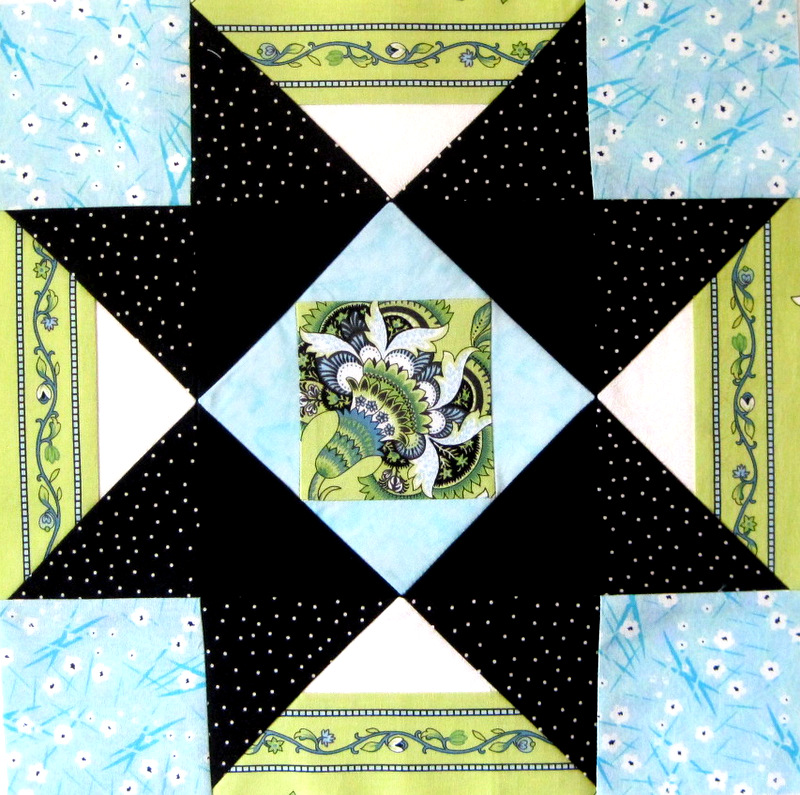
Here it is on point, as it will be in the finished quilt:
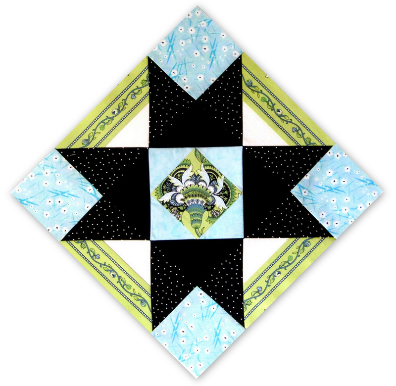
I really like the way the striped fabric looks on the diagonal. Sometimes a quilt just tells you what it wants!

stunning!
Wow! You have a wonderfully discerning eye. Your block is beautiful. Linda
I agree — you’ve improved Terry’s design, even though it was fine.
Hi Dawn,
Love the change you made! This is going to be one very stunning quilt!
Again, you nailed it! Love the change you made, it makes more sense to me too. Sandy
Oh yes, your revision is a perfect choice for your fabrics just as Terry’s choices were so right for her fabrics. You quilters leave us mere mortals in your creative dust!