When I showed you my completed Reach for the Stars blocks in my post of Aug. 18, I thought I had settled on a layout. Here’s a photo from that post:
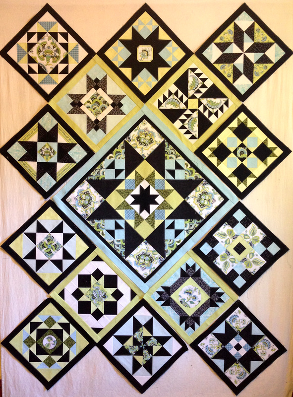
Nope. I changed a few blocks around:
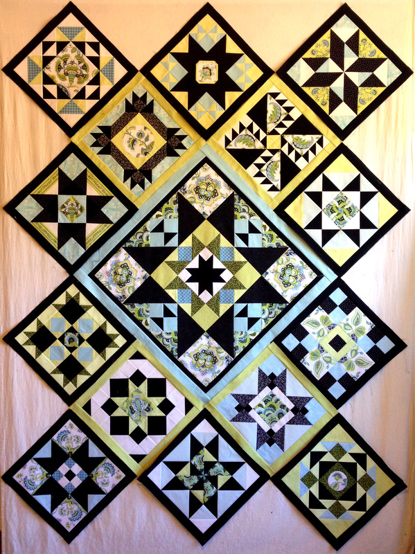
Now it seems the heavier blocks — the ones that seem to fill up more space in the block, if you know what I mean — are more balanced, and I’m pleased with the distribution of greens and blues in the background. I’m so certain of this layout that I am ready to sew my blocks together!
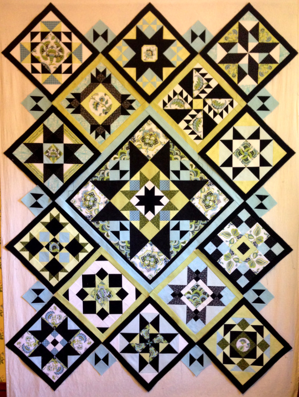
I did discover a bit of a design dilemma after starting to make the setting triangles. They all contain a small hourglass block the same size as the ones in the center medallion. Terry Krysan, the designer of Reach for the Stars, calls for the hourglass blocks to be placed horizontally on the top and bottom of the quilt and vertically on the sides. Here’s what that looks like on my top:
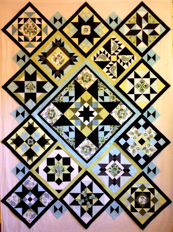
But I like the look of those hourglass blocks placed horizontally on the sides:
This is the kind of design decision I can easily obsess over. My friends know what I mean.
I’d love to know what you think. Here are my two choices, side by side.
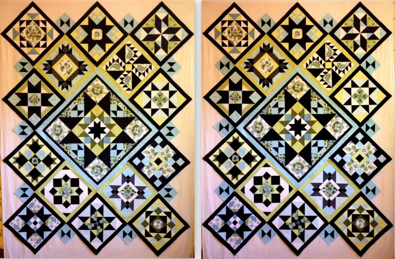
Which look do you like better? If you’re so inclined, please tell me why. It’s very easy to leave a comment!

There’s something more restful about the uniformity of the horizontal
placement. I like it! Sandy
I like them laying down. All the same direction. I like unity.
I like the horizontal best, too. There is a lot going on in a sampler quilt, and keeping them all horizontal anchors the other designs better. 🙂
I like the horizontal side pieces – it just seems to be better balanced.
I vote horizontal. I just like how it looks better.
I like the look of the one on the right. Seems better balanced to me.
I like the right side. It feels calm and unified.
Love the quilt!
horizontal for sure! Your quilt is really lovely.
Horizontal . . . Just feels right 🙂
Dawn,
The horizontal hourglass is my preference. The total look is more soothing and calming; perhaps because they play better with the hourglass blocks in the center medallion when horizontal. It is beautiful.
Glancing at the two layouts, my eye prefers the one on the left although either is beautiful. The vertical seems to add more “twinkle”. This quilt is a masterpiece ! Can’t wait to see in person,
Peg
I like the vertical placement myself, for no apparent reason other than first impressions. It is very subtle and both are great. Beautiful results! I can’t wait to catch up to you!
All the same (horizontal)
I love the setting on the left!
Wow Dawn!
You have been busy! Your quilt is incredible! I like the vertical one best. I think it has more pazazz.
But both layouts are gorgeous. Either one would be great! If you get bored, I have a few blocks that need to be put together! Ha Ha! I can’t wait until I have as much done as you do.
I think that I like the left layout because the hourglass blocks bring your eye into the middle.
Hi Dawn, I like the vertical hour glasses on the side, here’s why – the ones in the center block are diagonal so they rotate around the block. I like the movement of this and think the vertical position mirrors this better. It makes the whole look like the hour glasses are spinning around in the design. You ask for ‘my’ 2 cents – there it is. 🙂
Beautiful Quilt Aunt Dawn!
At first, I preferred the uniform look of the right hand layout with all of the hourglass blocks horizontal. Then I physically rotated my laptop to see how both quilts appeared on a different axis. The left quilt with the vertical hourglass setting looks better in my opinion when the quilt is rotated. Take a look with both options rotated 90 degrees. You might change your mind. The left one does bring the eye towards that beautiful center diamond.
First of all, I did not notice the hourglass blocks in the original design you have been following, but I absolutely love the way they tie the blocks together making a truly stunning result!
Solely for the reason that my eye prefers linear, I would vote for the horizontal placement; however, I thought Gary’s comment was interesting so perhaps you should consider how you will use/display it (i.e. as shown or rotated) before deciding.
By the way, if I were you, I would pick a room in your house and redecorate it specifically to showcase this quilt – it is really that spectacular!!
I like the horizontal placement of the hourglass. Just seems more balanced.
Congratulations on a beautiful quilt.
Horizontal is much more peaceful to the eye – definitely!
The left layout draws the eye around the quilt instead of stopping at each line. That means there is more apparent movement. But that is my thought, and I’m sure you will do what sits best with you. Beautiful quilt any way you look at it! This critique is sent with love.
Hi Dawn, so nice to see you at the Pine Needle today. I’m quite behind on my Reaching for the Stars quilt, but I think I will be able to catch back up now that the kiddo is back in school and the cooler weather is returning.
My eye is more attracted to the left (vertical) placement. It seems to pop more, but both versions are pretty darn stunning!
Hi! I think that you have done an amazing job! To share all of the different layouts for everyone to see and comment on takes a leap of faith! Your fabric selections are very fresh and work beautifully with the pattern! Thank you for sharing your perspective of my original quilt! All the Best!! Terri Krysan