
I’ve finally added Framboise to my Quilt Gallery. I’ve learned that one way to keep your patterns current is to make new versions in updated fabrics. I didn’t do that here, though. I used fabric that’s been in my stash for some time (Hydrangeas and Raspberries by Holly Holderman for Lake House Dry Goods) because I knew it would make a striking 4-Patch Wonder quilt. I actually put these blocks together early last year. It’s taken me this long to finish the top and get it backed, quilted, bound, labeled and photographed.
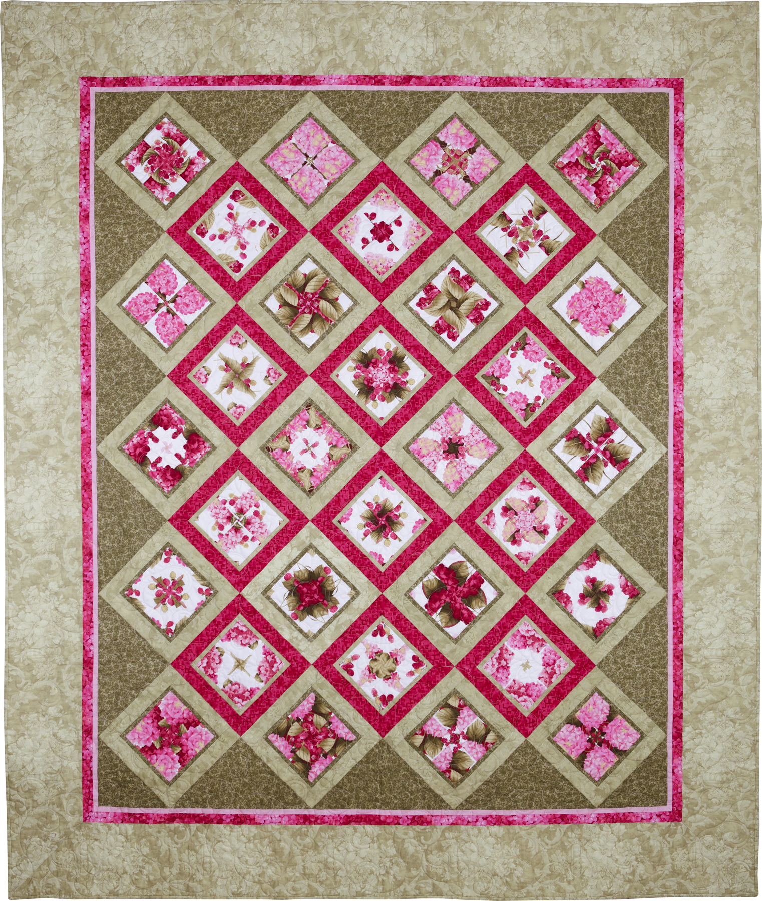
I wish I had documented the process of arranging the blocks on my design wall. I usually start by putting my favorite block in the upper left hand corner but sometimes I have to move it for the sake of balance. Here’s a close-up of my favorite block, which wound up in the upper middle center of the quilt:

Framboise was quilted by Melissa Hoffman. I asked Melissa to choose an edge-to-edge design with vines, leaves and scrolls and to use a light pink and green variegated thread. The effect is soft and subtle, just what I wanted. Here’s a better look at the motif:

I usually play around with leftover blocks on the back but I was in “get ‘er done” mode at the time so all I did was add a strip of the original focus fabric:

You can’t see it in the photos but the white background on the Lakehouse fabric has a secondary design that is very lightly frosted. It adds a glow to the quilt that I love. The rest of the backing fabric is a pastel batik that I’ve had for quite a while. Here’s a closer look at the quilting on the back:

Naming this quilt did not come easily. A host of alliterative titles came to mind – Blossoms and Berries, Berries and Blooms, even a pun on the Bloomsbury Group. In the end I decided on Framboise (raspberry in French) on the basis that it refers not only to the berry but to the color of the hydrangeas.
Beautiful Dawn. Very soft colours. I wish I could have taken some of your classes while I was in OR, but maybe next time. I bought your pattern, and a book and fabric for the fractured images. See if I can make it.
Take care.
Merethe
thank you, Merethe! I was hoping to see you again while you were in Oregon. Let’s get together on your next trip!
This is lovely!! But I am partial to purples, pinks and greens. Love the raspberries and hydrangeas, the fact it is on point, the quilting, the backing – well you get it I love it all 🙂 Thanks for sharing
Love the colors in this top! And Melissa is great, isn’t she? I just sent off two new tops to her a few days ago, and can’t wait to see what she does with them.
Very pretty ~ love the name, the quilt itself looks like it could live in Paris! It feels so good to get those quilt tops finished!!
It’s beautiful, Dawn!