
 I have a few more Georgie Quilt blocks to share with you. Not as many as I would like because something important happened in Portland, Oregon this week to keep me out of my sewing room. Can you guess what it was? Spring finally arrived! The Dear Husband and I have been taking advantage of the sunshine and warm temperatures (in the 60s, 70s, and even 80s) to work in the front and back yards cleaning up the flower and vegetable beds in preparation for planting. There’s a lot more to do but we’re off to a good start.
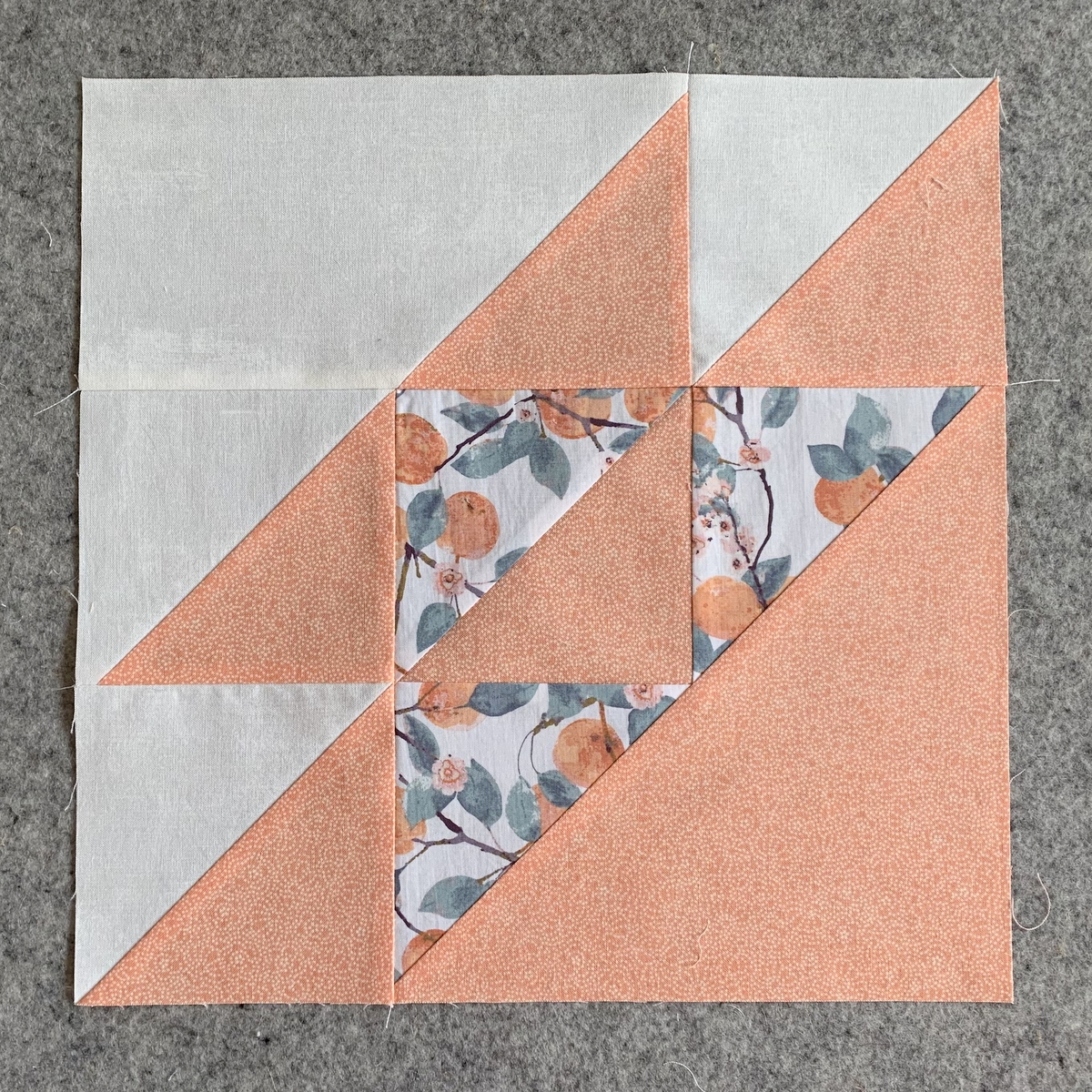
Here are my latest quilt blocks:
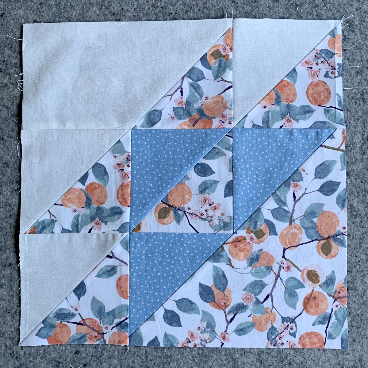
 Each one of these blocks has an identical twin because I’m making two at a time using the Cat’s Cradle XL ruler by Creative Grids.
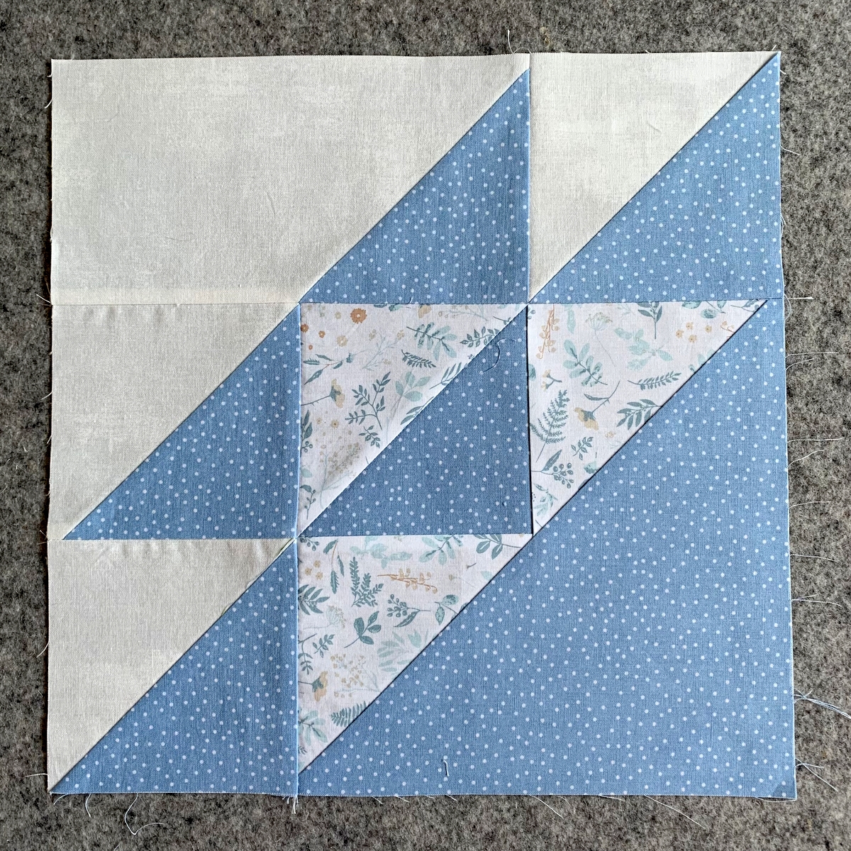
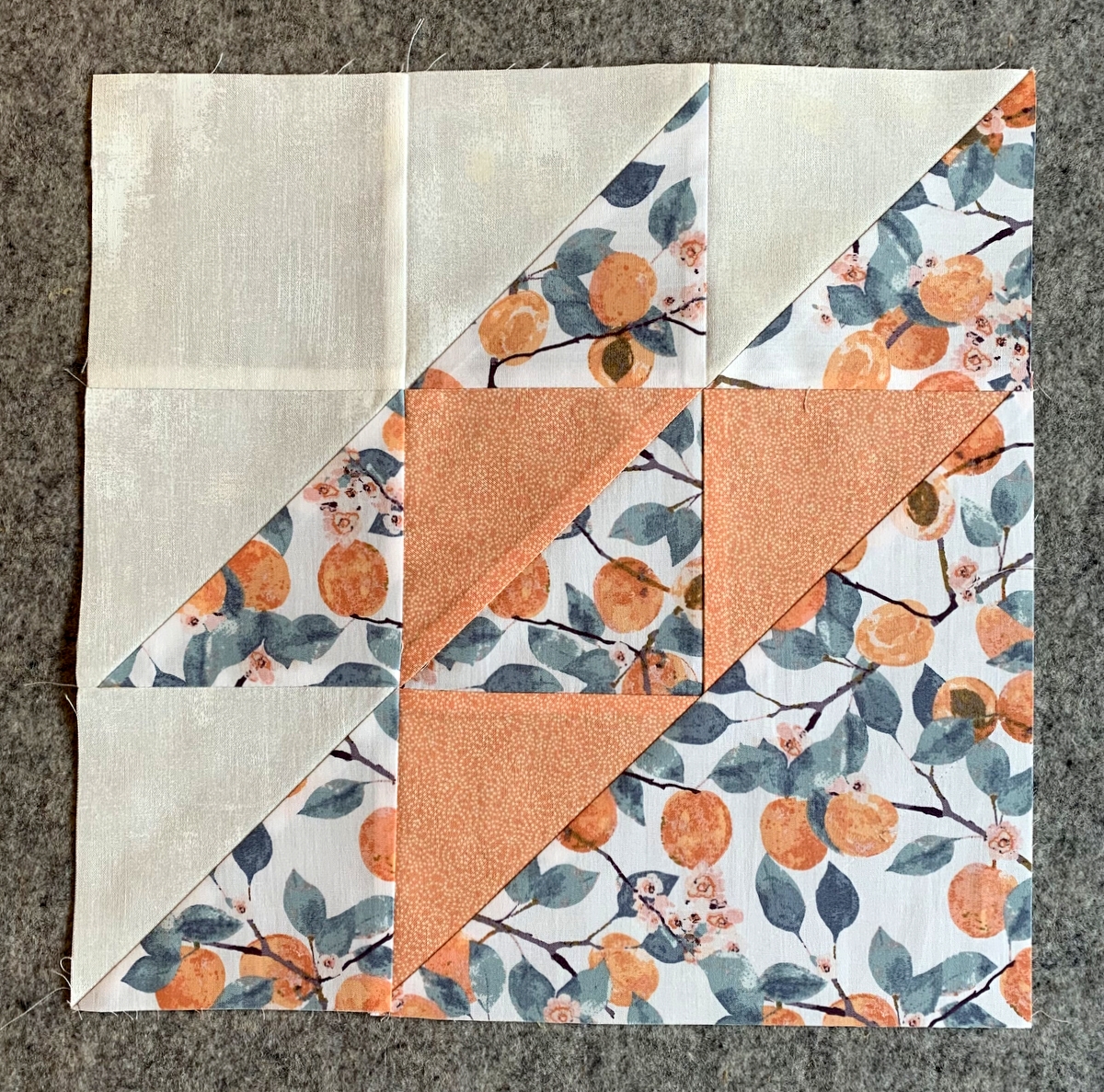
I wound up remaking Block 1:
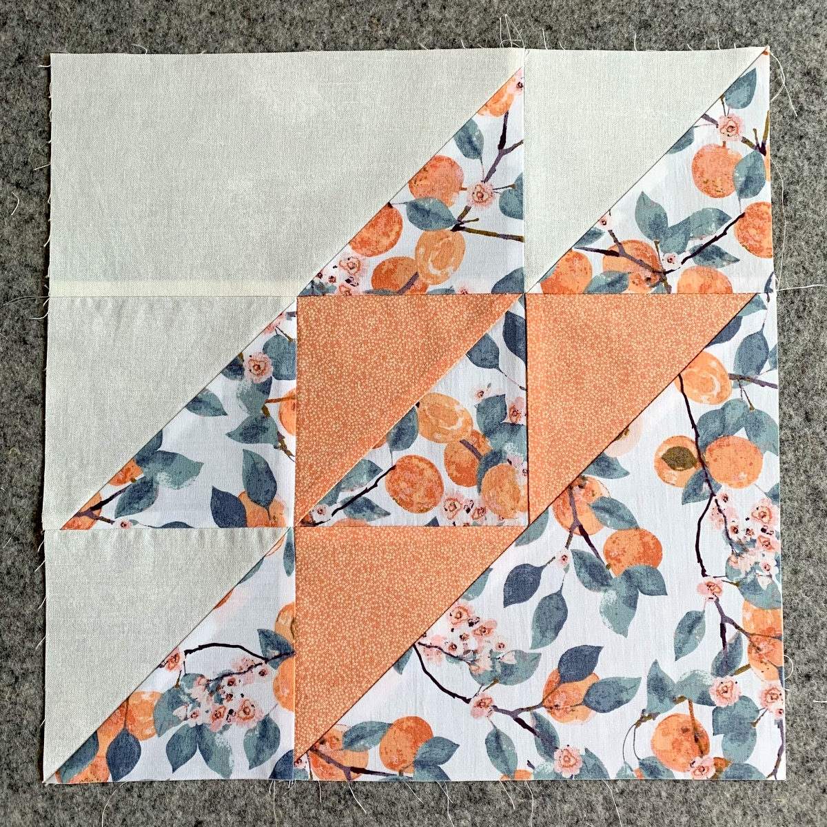
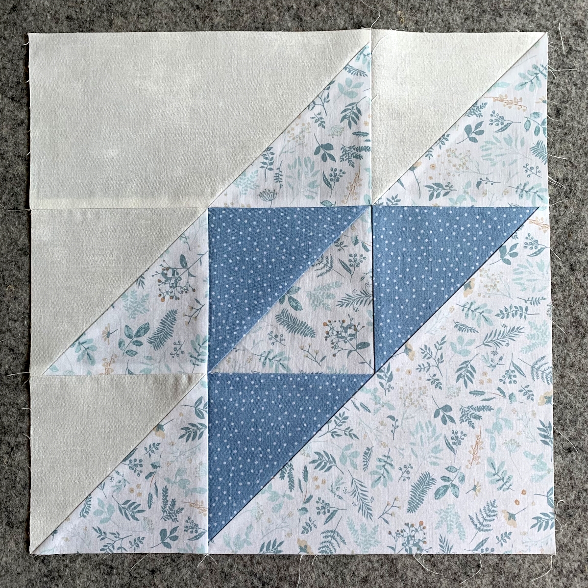
Why, you ask? Two reasons: One, I eliminated a seam in the upper left corner. See Version 1 here:
Two (and this is the more important one), after making my first block with the Grunge fabric that I described in a previous post as a “creamy white,” I realized that the fabric has a slightly yellow cast to it. The white in the “Mindscape” fabrics I am using is a very soft white, which is why I didn’t choose a bright white background fabric.
Much to my delight, I discovered that the wrong side of the Grunge fabric is missing that yellow cast and has the additional advantage of being a bit softer in terms of visual texture. You may not be able to tell from the photos but there’s a definite difference.
I’m up to 14 blocks and confess I’m at that stage where I’m starting to doubt my choice of fabrics and pattern. (Does this ever happen to you?) I’ve put the blocks up on my design wall and am asking myself the usual questions. Are these fabrics and the ones I have introduced from my stash going to work as well as I thought? Is there too much contrast between the values? Do the fabrics do justice to the pattern, and vice versa?
This project is a bit out of my comfort zone. I need to trust that my version of the Georgie Quilt, which is less scrappy and more muted than the quilt on the pattern cover, will look just fine when I’m done. Fingers crossed.
I think the fabrics are just beautiful & can hardly wait to see the finished selection of blocks!
Well, dear Nubs, let us see your design wall! You have the most eager followers who would probably love to weigh in! 😉
I have total faith that it will be great. Everything you do turns out great.