
The first 14 leaves have been appliquéd on the center medallion of my version of Hazel’s Diary Quilt:
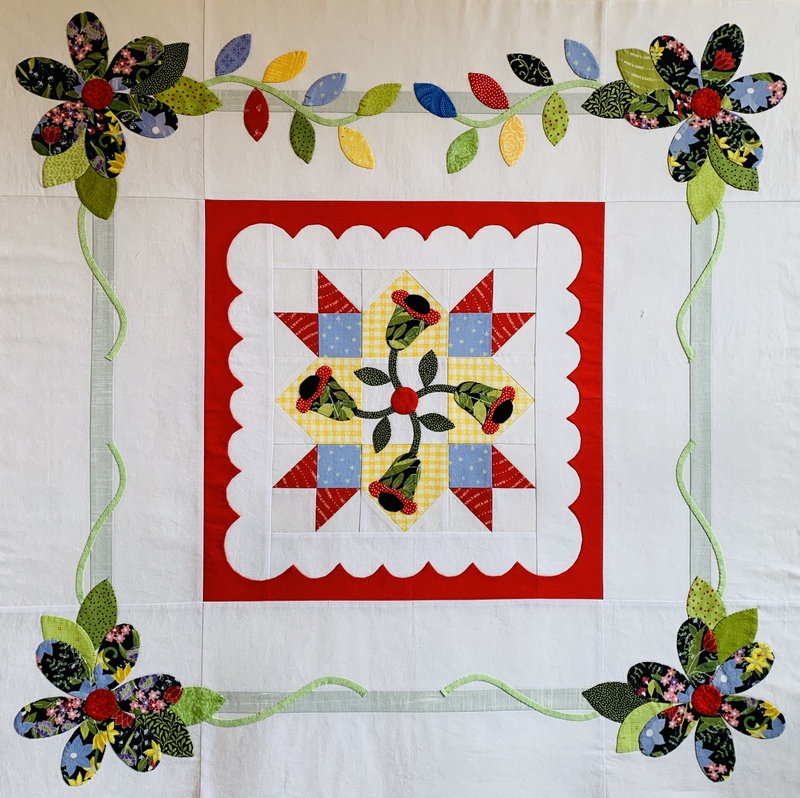
My, what a difference they make! They add motion and color to what is already a pretty lively block. Since I used a large floral for my four corner blossoms, I’m using smaller prints for the leaves so they don’t compete too much with the flowers.
I realized early on that I would have to be very careful with color placement of the leaves, all because of one particular block, Coal Miner’s Granddaughter:
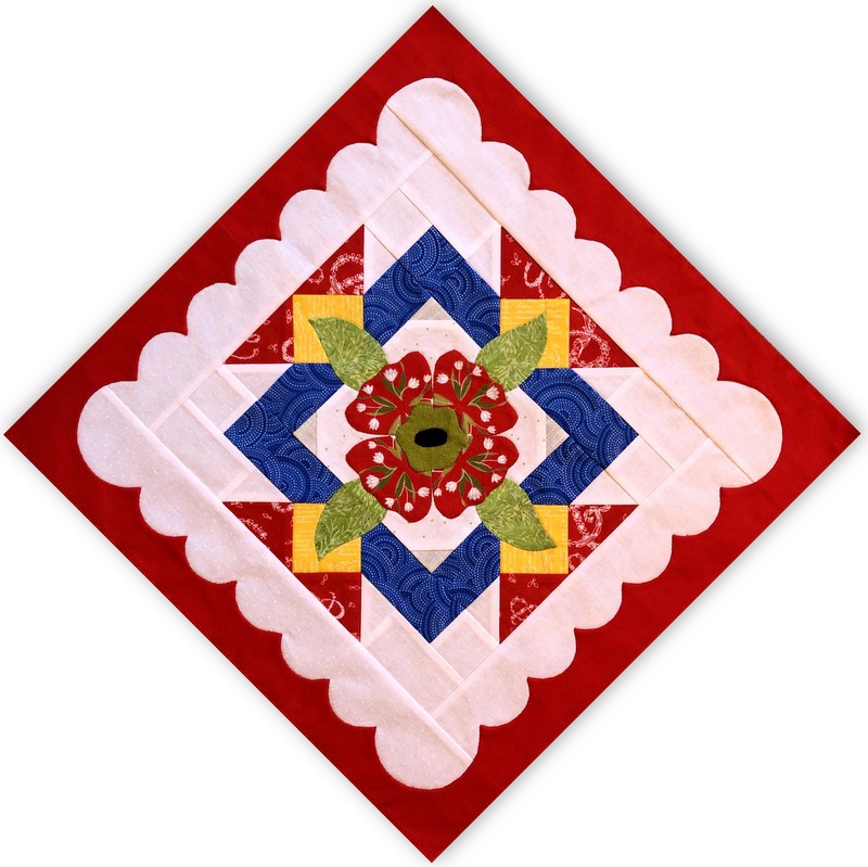
This was the third block I made and at the time I was very concerned that the medium blue I had chosen was too bright. (I actually considered making a new block but I worked so hard on that appliquéd flower in the center that I was bound and determined to keep the block in my quilt!)
When it came time to lay out the eight blocks that surround the center medallion I deliberately put the bold block on the lower left side, hoping to minimize its impact:
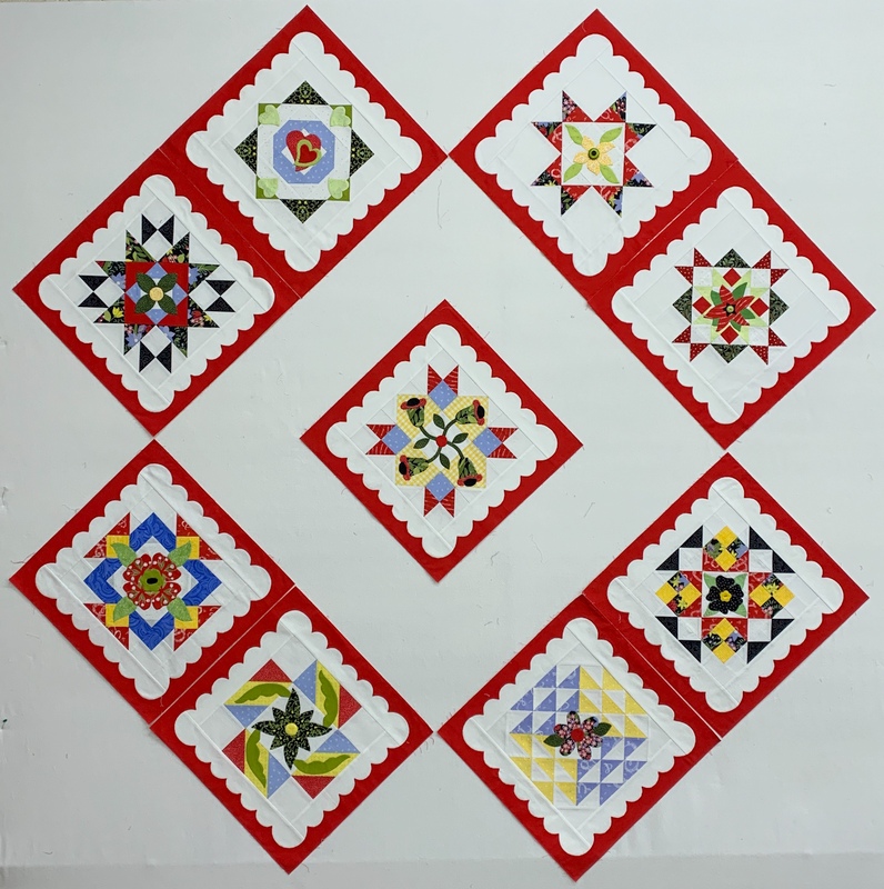
The obvious solution would have been to put the bold block in the center medallion but I reserved that spot for my favorite block, Fair Weather. My thought was to use smaller spots of the bright blue fabric elsewhere in the quilt to balance the bold block.
Here’s the center medallion with the leaves on the remaining three sides pinned into place . . .
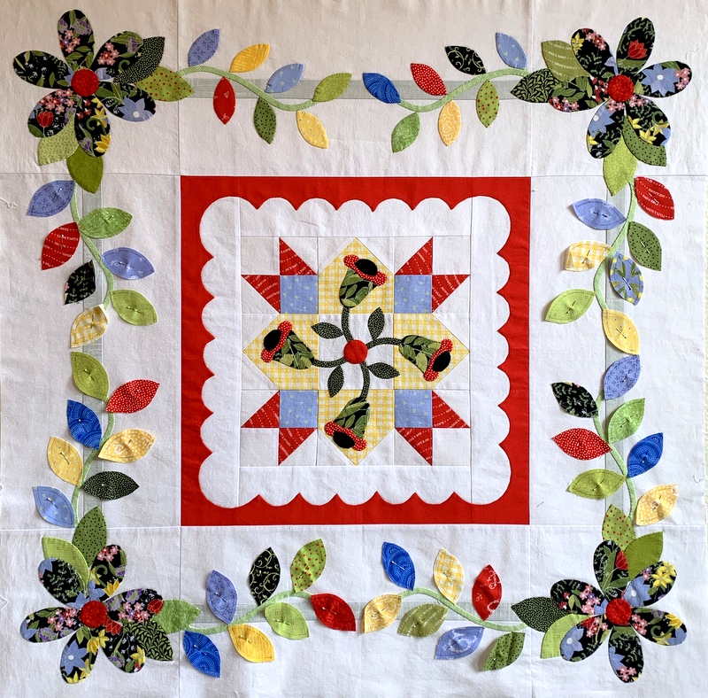
. . . and here it is on point surrounded by the outer eight blocks:

You’ll see a bit more of the bold blue in the setting triangles (still to come) which include 2″ finished squares set on point. So what do you think? Is my strategy working?
It looks fantastic, great colors!
This quilt is EPIC!
Yes, you chose well. Can’t wait to see it.
It is absolutely gorgeous! What a treasure!
I agree with Diane! Absolutely EPIC!
Absolutely beautiful and a true masterpiece. This is such a labor of love and your colors are perfect. I think that the blue is a good color for a pop in your piece and as I looked at the final picture was wondering how it would look if you took that one block and placed it on the top right …just to see if it brought eye up and then down ? Love your piece and can’t wait to see it finished.
Thanks for sharing!
It is stunning!
It’s going to be a fabulous quilt! Beautiful appliqué; the addition of the leaves makes such a difference, and I think using the blue in the leaves really helps the other block “belong” nicely. Beautiful work!
By the way, Nubs, I love this blog post’s clever title!
It’s beautiful!
This quilt is stunning! You’re a very talented person and I’m so proud of you!
Stunning and beautifully executed. I am wondering the same as Gail. Maybe moving the blue to the top right would work.
Yes, show us how the blue on the top right would work. As is laid out, you have no blue up there.
Dawn, it is absolutely stunning! You have such an eye for color placement and balance. It is truly spectacular already. The final product will be a treasure.