. . . is better than no progress at all, right?
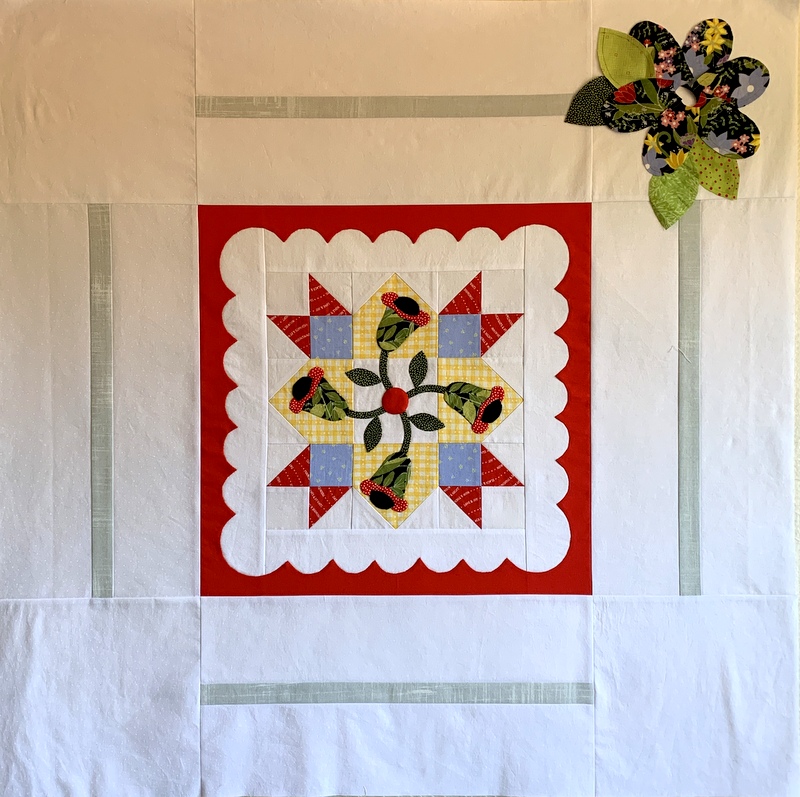
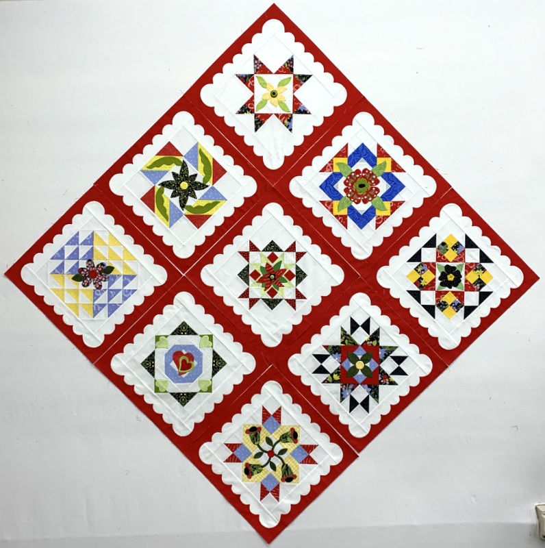
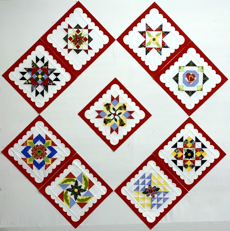
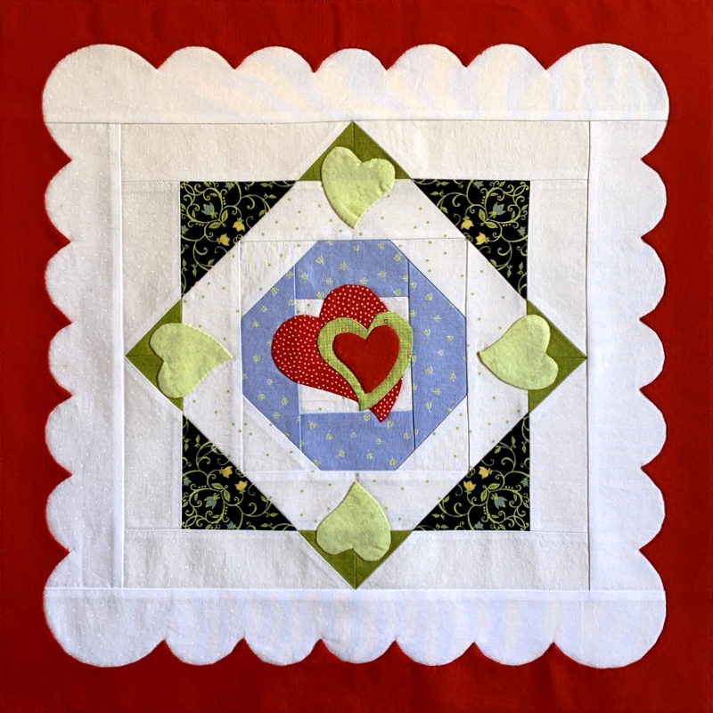
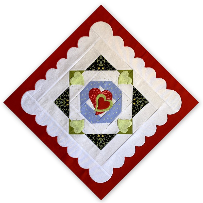
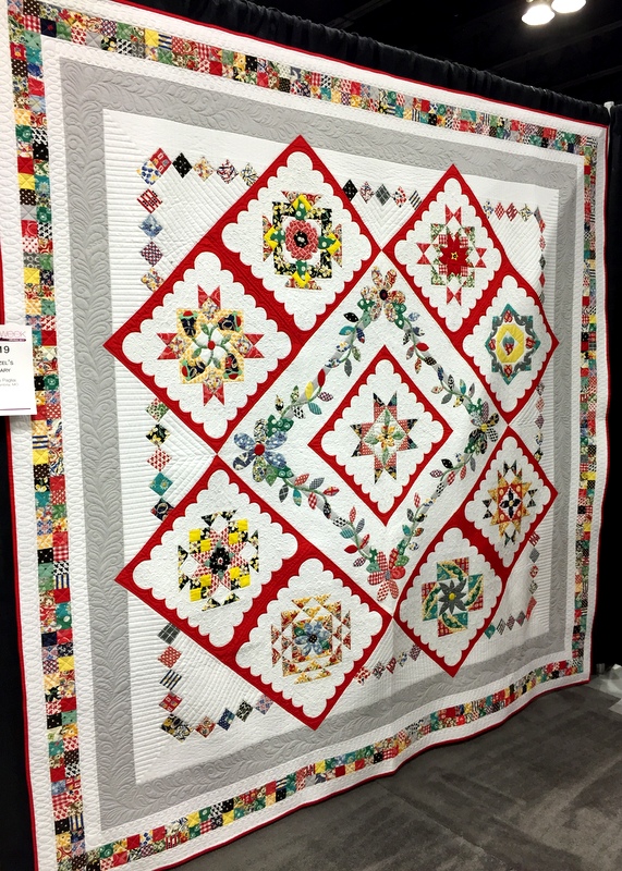
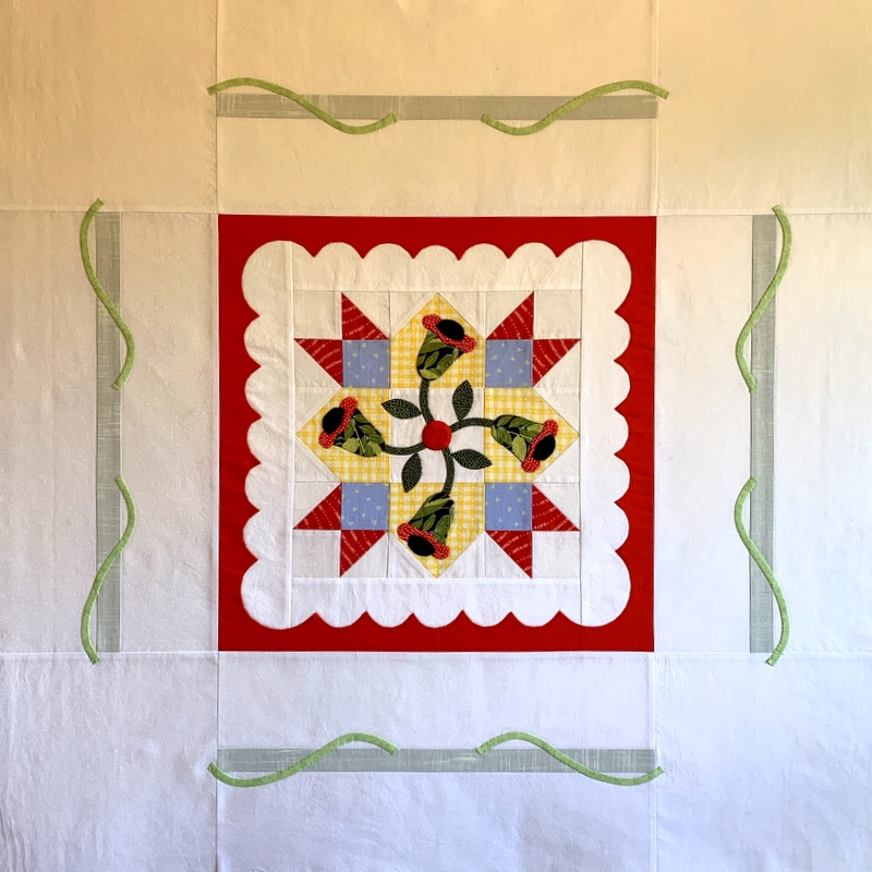
I got the vines appliquéd onto the outer strips of the medallion on my Hazel’s Diary Quilt:
These vines are not needleturned. Instead I used a method by Suzanne Marshall I read about a few years ago in Quilters Newsletter Magazine in which fabric is pressed and basted before being cut into skinny strips. It worked really well: the bias edges of my vines were crisply pressed with no distortion at all, which made stitching them in place quite easy.
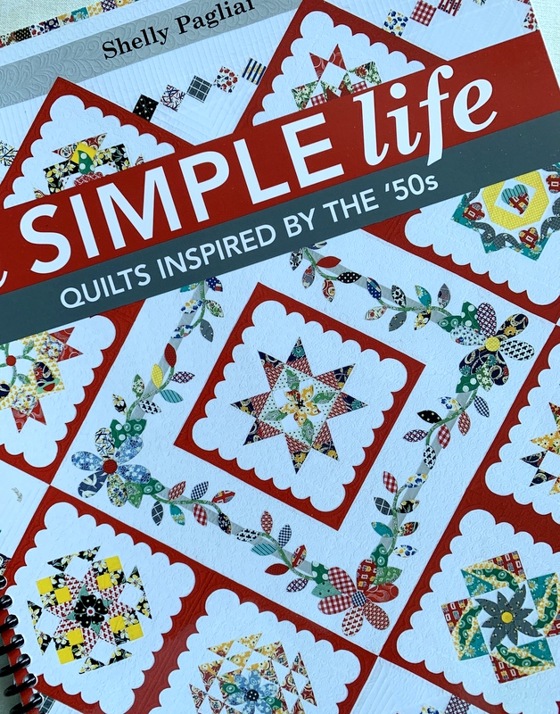
I suppose a very experienced stitcher would be able to eyeball the placement of the vines just by looking at designer Shelly Pagliai’s placement diagram (from her book A Simple Life: Quilts Inspired by the ’50s). I had to draw a section out on graph paper to make sure I had the curve of the vine just right:
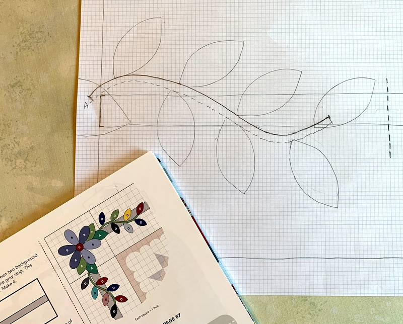
My drawing was to scale so I just laid the medallion on top of the paper, lined up the design, and traced the upper edge of the vine.
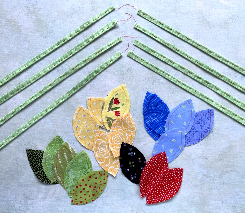
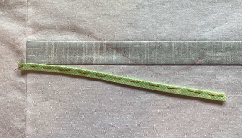
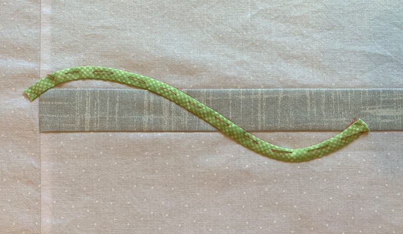
Here’s an 8½” length of vine ready to be pinned into place. You can just barely see the line I drew to mark the top of the vine:
Here’s what the bias strip looks like from the back:
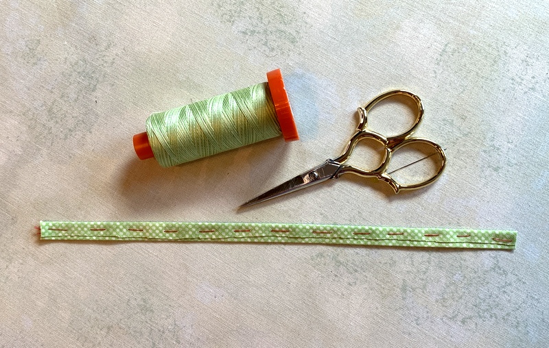 (The cut edge you see was trimmed after the basting stitches were put in place.)
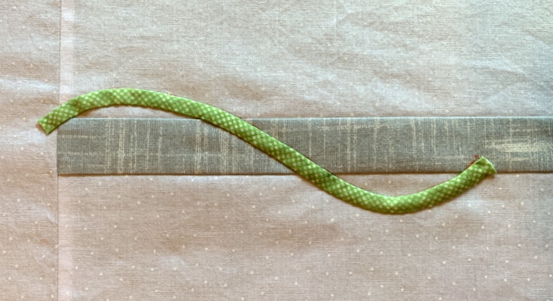
Here’s the vine stitched into place before the basting is removed . . .
. . . and here is the finished bias strip in place, awaiting final pressing:
If you’re interested in learning more about Suzanne Marshall’s technique, look for the April/May 2016 issue of Quilters Newsletter. I also discovered a pdf file available online from americanquilter.com that includes appliqué tips and a photo page describing Suzanne Marshall’s bias strips method; it’s the sixth and last page of the pdf.
Now that my vines are in place, I have four six-petal blossoms and 72 leaves to appliqué by needleturn. Onward!