Say what??
You know it would take something major to keep me out of my sewing room.
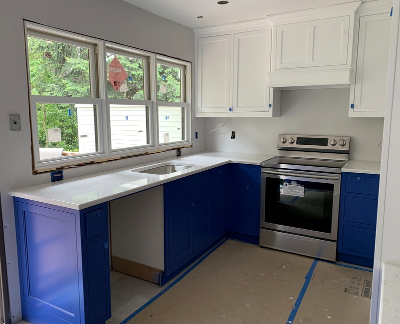
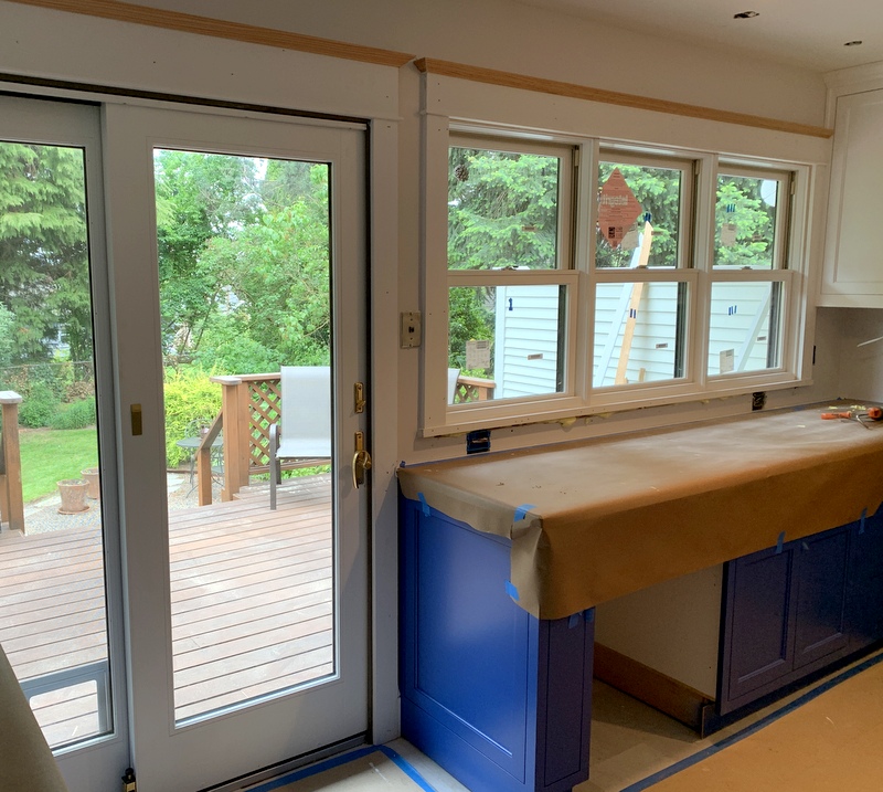
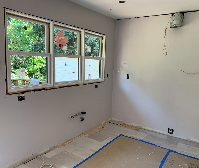
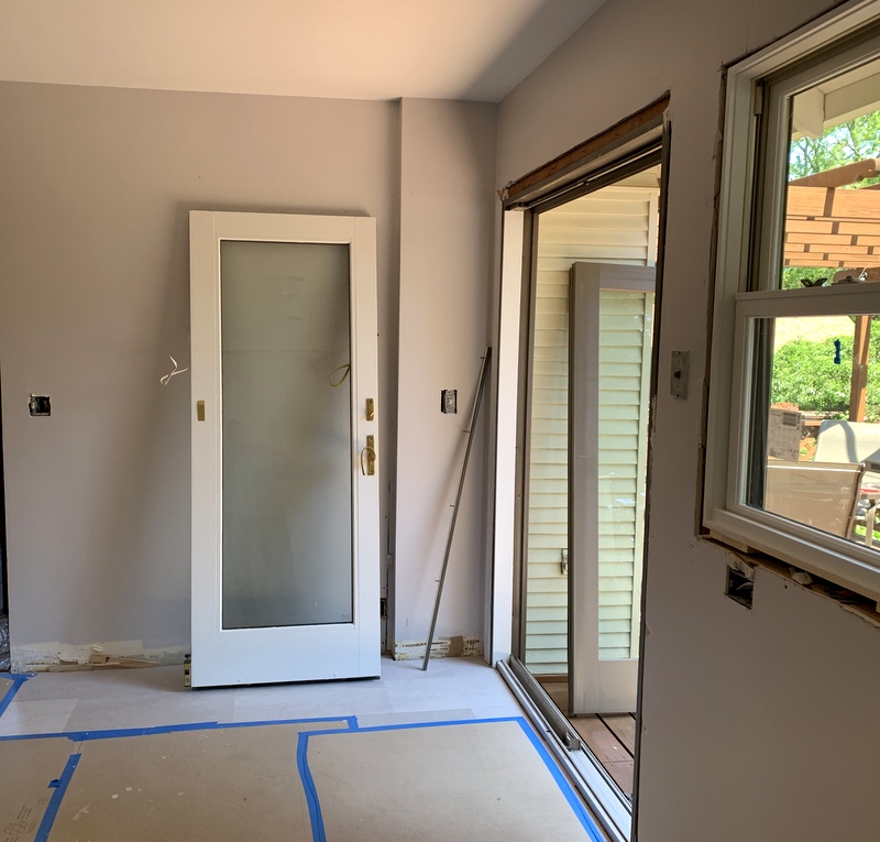
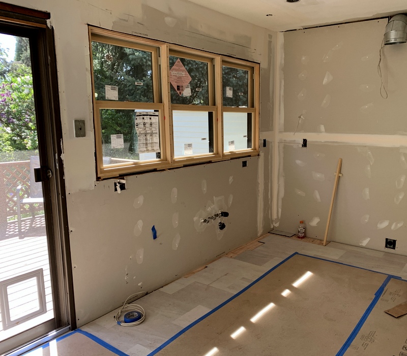
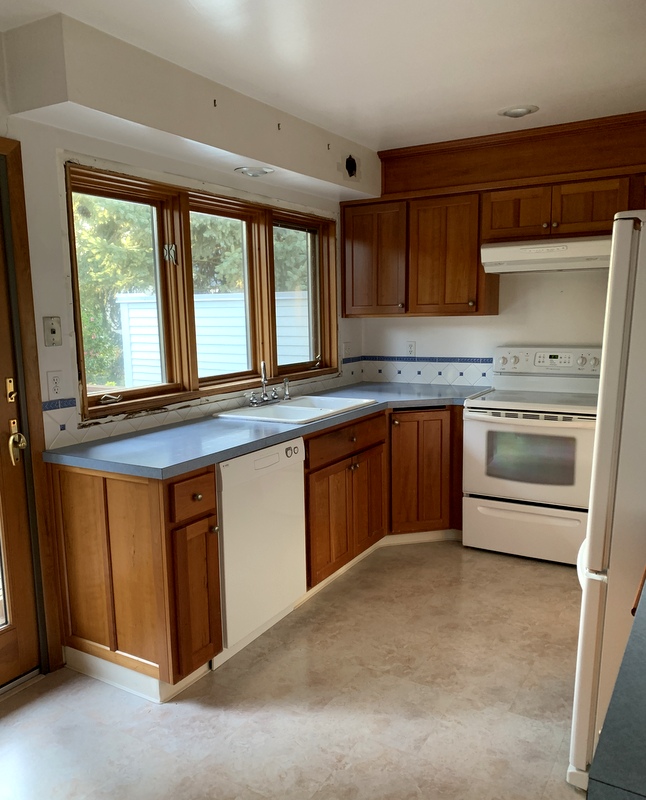
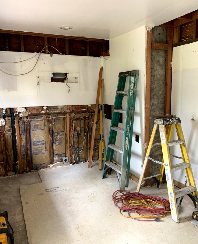
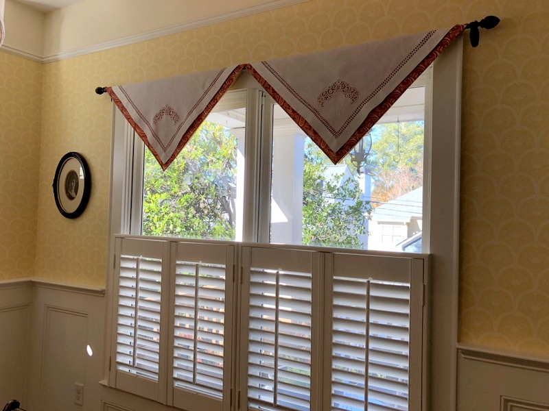
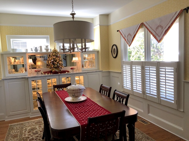
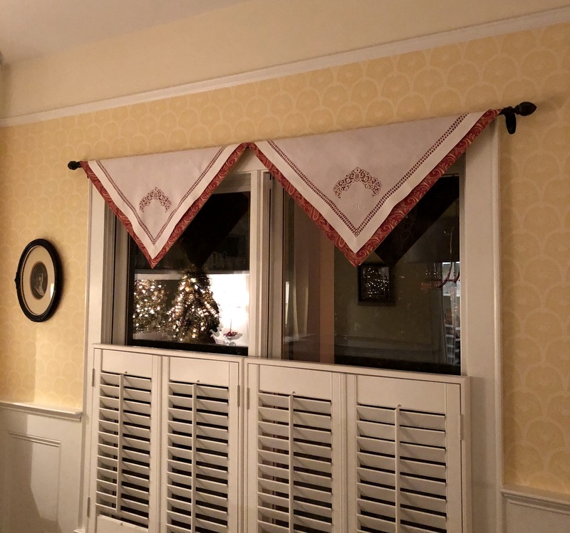
For the last few weeks I’ve been distracted by a looming project: a major kitchen remodel. It all started with the decision to replace three windows that look out onto the back yard. The windows were installed in 1985 and while they have held up very well given their age, they are now cloudy.
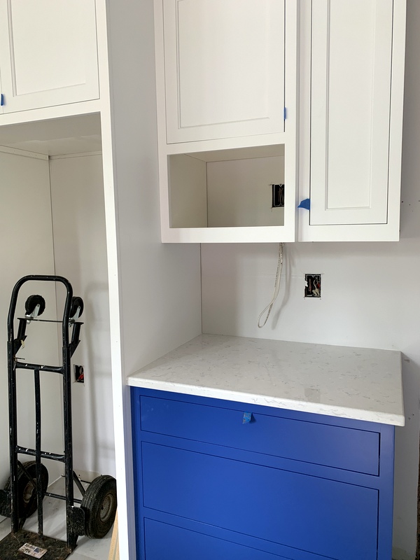
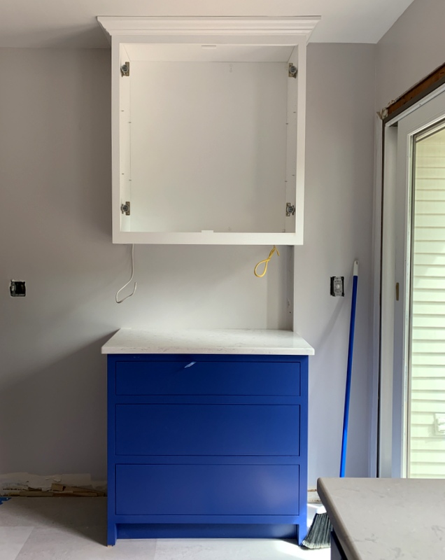
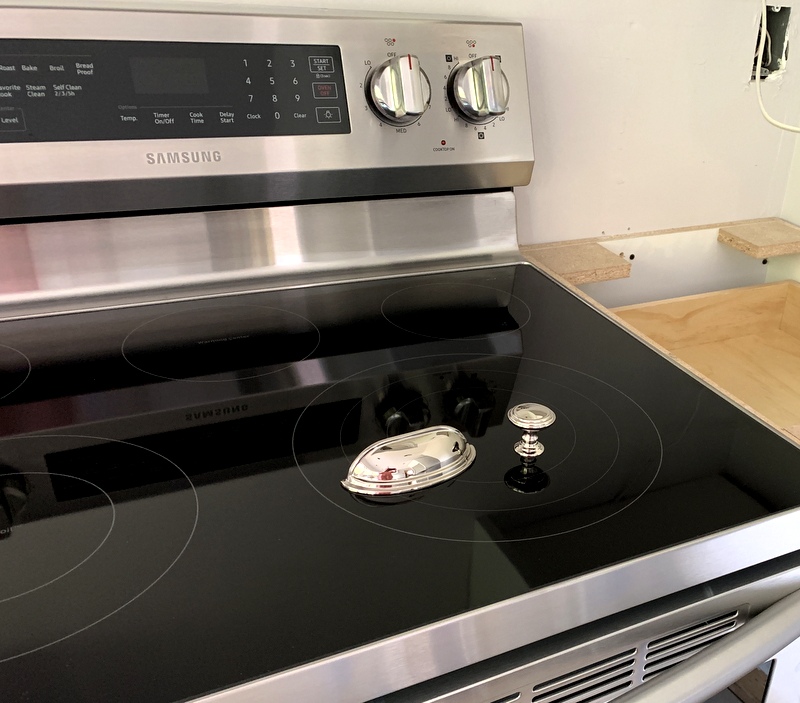
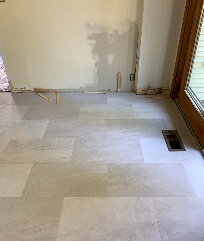
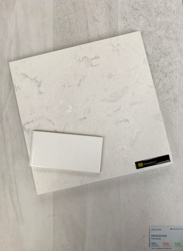
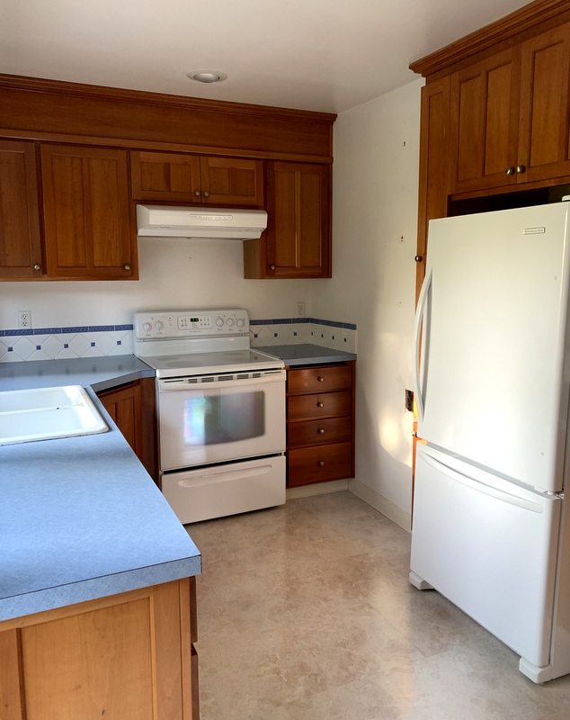
Replacing the windows would require redoing the tile backsplash around them. Might as well replace the counters at the same time. I’ve been wanting to replace the laminate counters we have now with quartz. And oh yes, the flooring has plenty of dings in it from dropped knives so it’s due for an overhaul. The refrigerator is fairly new but the stove and dishwasher are nearing the end of their life expectancy so this is the ideal time to replace them.
You see where this is going, don’t you? It’s the domino effect.
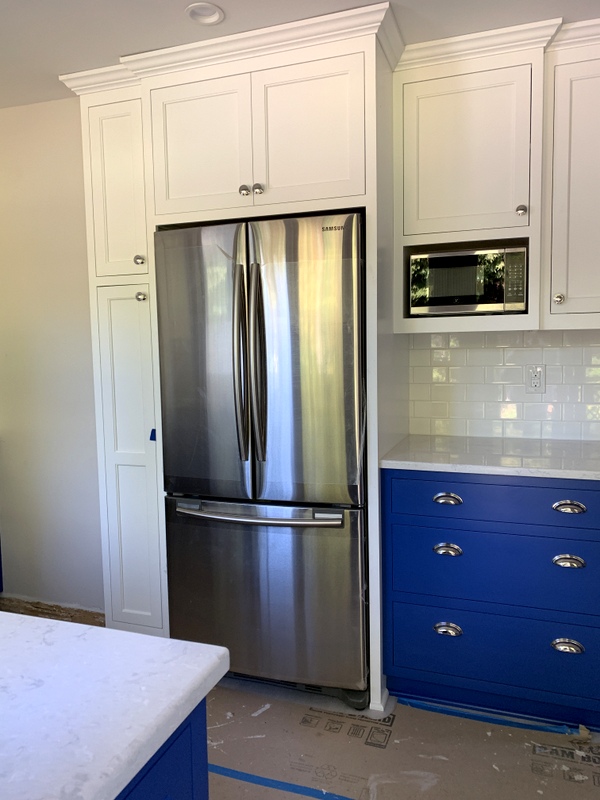
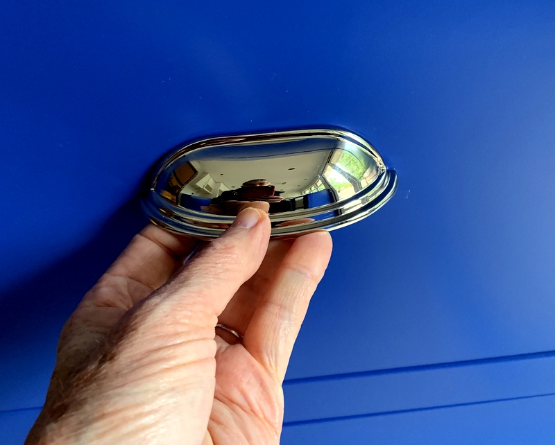
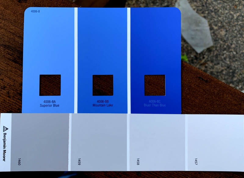
I had really hoped to keep the kitchen cabinets as they’re only 20 years old. They are made of cherry but the stain has not held up well. In fact, the finish is completely gone in places from too much scrubbing, especially around the knobs. I’m afraid the original stain wasn’t applied very well and I haven’t been careful enough in maintaining it.
I looked into having the cupboard doors sanded and restained but they would not match the rest of the cabinetry, which has darkened over time. Having the cabinetry painted was an option but in the end I decided against it.
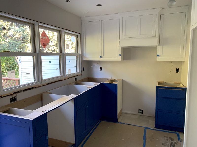
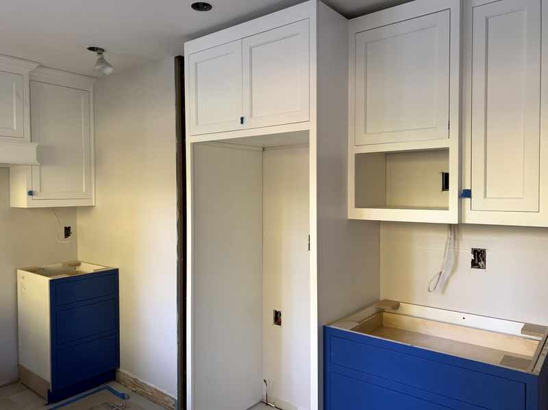
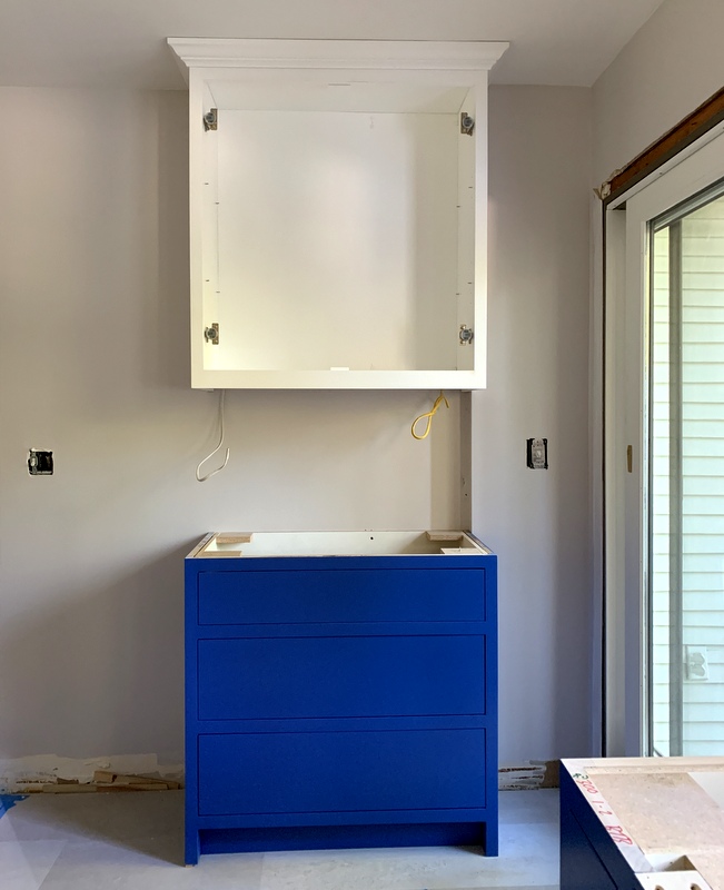
Going with all new cabinetry adds considerably to the final price tag but it means we can address some design issues. It also means that everything in the kitchen will be updated at the same time, an important consideration when it comes to selling the house down the road.
Far down the road, I trust. The Dear Husband and I have lived in this house our entire married life, almost 38 years. While I hope we have many more years here, it seems prudent at this stage of our lives to be thinking about what will make our house more attractive to potential buyers. The return on investment for kitchen remodels is quite high — around 80% according to some websites — so the DH and I took a big gulp and decided to go for it.
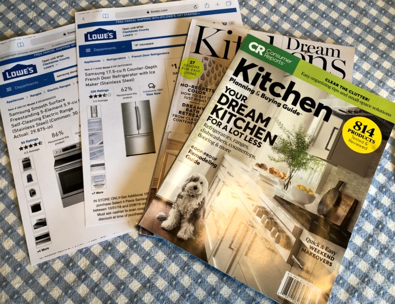
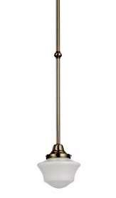
I’ve been poring over kitchen design magazines and photos on Houzz.com, walking the aisles at appliance stores, reviewing options for flooring, counters, backsplash tile, pendant lights — and lying awake at night thinking about it all. Usually when I can’t sleep my mind wanders to quilt projects. You see how distracted I’ve become.
I wonder how many kitchen remodels start with replacing one thing and end with a complete overhaul. In our case there’s a second domino effect. I’ll tell you all about it soon.

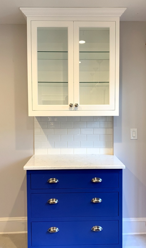
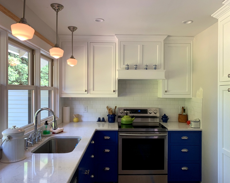
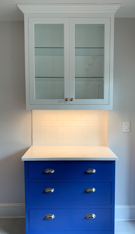 The Dear Husband scoffed when I initially told him I wanted under-cabinet lights. Guess who really loves them now?
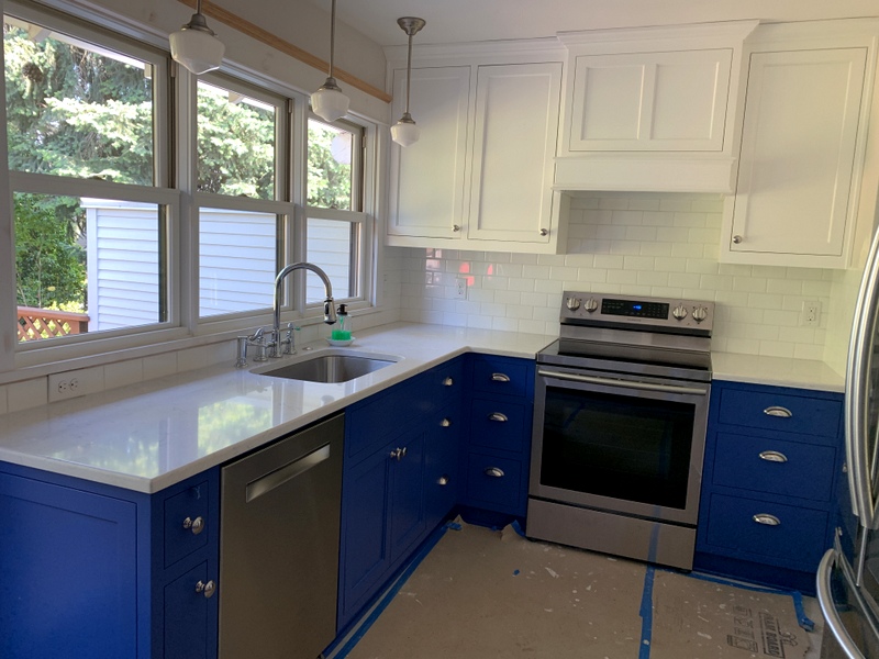 Looks pretty spiffy, doesn’t it? Did you happen to notice that red glow on the backsplash under the cabinets to the left of the stove? It’s the reflection of my next door neighbor’s red patio umbrella. That’s how much shine those backsplash tiles have.