Update: Cheddar and Indigo


The best way to describe progress on my Churning Stars quiltis “intermittent.” I’ve not spent much time in my sewing room recently. Over the weekend, though, I did find the time to make a few more big blocks — the ones that will finish at 18″ square. Take a look:

A pattern of green and yellow colors with white background

A pattern of green and yellow colors with white background

A pattern of green and yellow colors with white background
Last month I discovered that a seller on Etsy had a Layer Cake of “Cheddar and Indigo,” the fabric line from Penny Rose Studio that launched this project. Even though it was not a bargain, I snapped it up because a) fabric from this line that came out in 2015 is virtually impossible to find now, and 2) I really wanted more of these background fabrics:

A pattern of green and yellow colors with white background

If I’m very careful in cutting up these 10″ squares, I’ll be able to maximize the number of blocks that contain the fabrics as background.

Curiously, I was able to find a lot of almost every cheddar and indigo print from the line — I started looking three years ago — but only two of the six light background prints, the ones you see on the left:

A pattern of green and yellow colors with white background

I’m especially fond of the smaller of the two background prints. Good thing, as I have plenty of it. And I have enough of the other prints to make at least one more cheddar and indigo quilt. Even though I’ve practically just begun working on this one, I’m already auditioning patterns for a second one.

Is this normal behavior (for a quilter) or am I obsessing?


Posted in cheddar and indigo, Churning Stars quilt block, update | 7 Comments

Throwback Thursday: Square Dance (2014)


Throwback Thursday already?? It seems impossible but we are in the final week of January, Week 5 (and Year 5) of my 10-year-lookback at quilts. I started with 2010 at the beginning of the month and now I’m up to 2014.

In Square Dance you see my interpretation of the classic Twist block. Every Twist quilt I’ve ever seen features a solid fabric in the center of each block and two fabrics for the lattice. My version incorporates a lovely folk art floral in the center of each block and 12 fabrics in the lattice — four each of rose, green, and purple:

A pattern of green and yellow colors with white background
Square Dance, 55½” x 64½” (2014)

It was quite a challenge getting the balance of fabrics just right but I was very pleased with the outcome.

The beautiful quilting by Melissa Hoffman of Fiddlestitches is hard to see so here’s a close-up:

A pattern of green and yellow colors with white background

I remember Melissa telling me she had to wear a headlamp to stitch the free-motion filigree design in the interior of the quilt. Black thread on solid black fabric: what a challenge that must have been!

Square Dance is one of my quilts in rotation on the back of the couch in our living room. In fact, it’s there right now, and I managed to get a shot just now while the sun was briefly shining:

A pattern of green and yellow colors with white background


Posted in free motion quilting, home dec, snowball blocks, Throwback Thursday, update | 4 Comments

Throwback Thursday: Honeymoon in Paris (2013)


Here we are at Week 4 of Throwback Thursday, in which I’m looking back at quilts I’ve made over the last 10 years. By coincidence, my choice for 2013 is, like last week’s pick, a design by Sew Kind of Wonderful using the Quick Curve Ruler.

The pattern is Metro Rings, which I believe is Sew Kind of Wonderful’s #1 seller.Here’s my version:

A pattern of green and yellow colors with white background
Honeymoon in Paris, 56″ x 75″ (2013)

This quilt was so fun to make! Instead of laboriously sewing individual curved pieces together for the rings, you sew strip sets and then cut them into curves. I used a variety of black and white fabrics, several of them French-themed. The quilting motif I chose included fleur-de-lis, another nod to France:

A pattern of green and yellow colors with white background

Honeymoon in Paris was beautifully quilted by Debbie Scroggy. The French-themed fabrics, combined with the fact that the pattern is based on the traditional Double Wedding Ring block, led me very easily to the name of the quilt.

Little did I know how significant the title would turn out to be!

You see, during the following year my dear friend Lisa received a proposal of marriage from her longtime beau, James. The proposal was followed by a lovely garden wedding and — you guessed it — a honeymoon in Paris. This quilt was destined to be Lisa’s. My sister Diane is the one who introduced me to Lisa and together we gave this quilt to Lisa and James as a wedding present.


Posted in family, Paris, Quick Curve Ruler, Throwback Thursday, update | 6 Comments

To Dye For


I made a new Churn Dash block the other day for the quilt I’m currently working on using fabrics from the line called “Cheddar and Indigo” by Penny Rose Studio. Because these fabrics have been out for five years, I don’t have a full set of the line and am lacking light prints for the background. I’ve filled in with cream tone-on-tone prints from my stash.

Imagine my delight when I stopped by an LQS (that’s Local Quilt Shop for you non-quilters) the other day and happened upon two fat quarters of a light print from a different Cheddar and Indigo line, this one by Nancy Gere for Windham Fabrics. A perfect addition, I thought. After making my block I thought it looked just fine . . .

A pattern of green and yellow colors with white background
. . . until I put it up on my design wall in the company of some other blocks:

A pattern of green and yellow colors with white background

I had thought the new background fabric was creamy but it looked positively snowy white against the other blocks. What to do? I wondered if I could tea-dye the fabric. I’d never done it before but how hard could it be? After a bit of research on the Internet, I approached my task.

First, I found the widest shallowest bowl in my kitchen, one that was big enough for the block to lie almost flat on the bottom:

A pattern of green and yellow colors with white background
After removing the block, I plopped one tea bag in the bowl and filled it halfway with boiling water. I let the teabag steep for 90 seconds, then fished it out of the bowl when the water was a nice light brown. In went the block for a timed tea bath of three and a half minutes:

A pattern of green and yellow colors with white background
I could have let it steep longer but I wanted just a bit of color. I figured I could always dip the block a second time if it wasn’t dark enough.

After removing it from the bowl I plunged it into a bowl of cold water to which I had added a couple tablespoons of white vinegar (a tip from the Internet, intended to set the dye so it wouldn’t wash out when laundered). When the block was dry I gave it a good pressing . . .

A pattern of green and yellow colors with white background and put it back up on the design wall:

A pattern of green and yellow colors with white backgroundCan you see the difference? It’s very subtle but unmistakably a better match with the other backgrounds.

Here’s a look at the block before and after:

A pattern of green and yellow colors with white background

Mission accomplished! Now I just have to tea-dye what’s left of the two fat quarters so I can make some more blocks.


Posted in cheddar and indigo, Churning Stars quilt block, update | 7 Comments

Throwback Thursday: Marta’s Quilt (2012)


Continuing my look back at quilts I’ve made over the last 10 years, we come to Week 3 and this baby quilt I made in 2012 for my great-granddaughter Marta:

A pattern of green and yellow colors with white background

This is the first of 11 quilts I’ve made using the Quick Curve Ruler designed by Jenny Pedigo of Sew Kind of Wonderful and one of her very first patterns, Urban 9-Patch. The fuchsia diamonds in the interior of the quilt were my additions to Jenny’s design.

Three of the fabrics are from the “Party Dress” line, Portlander Mo Bedell’s debut line for Blue Hill Fabrics. Lucky me, I still have a few pieces from the line that I’m saving for other projects.

Marta’s quilt finished at 47″ square. I quilted it myself and bound it in the same fuchsia fabric (polkadots!) used in each block:

A pattern of green and yellow colors with white background

Did you happen to notice one of the blocks is different from the others?


Posted in baby quilt, family, Quick Curve Ruler, Throwback Thursday, update | 4 Comments

I Swear . . .


. . . I could make Churn Dash blocks till the cows come home.

A pattern of green and yellow colors with white background

The Churn Dash really is one of my very favorite traditional blocks. It’s right up there with stars of any kind — note the Sawtooth Stars above. Last year I spotted a quilt called Churning Stars in a book by Jenifer Gaston (Primitive Style) with this combo of Churn Dash blocks inside Sawtooth Star blocks and was instantly hooked.

I made a couple of test blocks back then, dipping into my collection of cheddar and indigo fabrics from Penny Rose Studio. Then nothing until Quilt Camp in November, when I made a few more blocks. Since then I’ve picked up a few fabrics from other lines to add to the mix.

I stole a few moments last week to make a handful of blocks, all destined to be part of a bed-size quilt. I’m not working with a pattern. I’m just making blocks in different sizes, ranging from the 3″ blocks you see in the upper right corner to the 18″ block in the lower left corner. I’ll play around with them on my design wall when I have enough to make a quilt.

This is my idea of fun! What’s yours?


Posted in cheddar and indigo, Churning Stars quilt block, update | 6 Comments

Throwback Thursday: I Love Paris (2011)


I’m taking a look back at some of the quilts I’ve made over the last 10 years, showing one every Thursday.

Last week I showed you Dianthus, a quilt I made in 2010. This week I’m featuring I Love Paris, made in 2011:

A pattern of green and yellow colors with white background
I Love Paris, 58″ x 64″ (2011)

The owner of the quilt shop where I was teaching at the time handed me a Lil’ Twister acrylic ruler by CS Designs and asked me to make something with it. This quilt was the result.

And the name? Theheart-shaped design, the Eiffel tower, Paris map and French poodle fabrics . . . what else could I call this quilt but I Love Paris? Even the white background fabric has hearts on it, and there are different heart motifs in the quilting (beautifully done by longarm quilter Melissa Hoffman of Fiddlestitches).

Here’s a closer look at the fabrics and the quilting:

A pattern of green and yellow colors with white background

I wish I still had this quilt. A few years ago I sold it (reluctantly) to a family friend who wanted to give it to his girlfriend. He’s now married to someone else. Do you suppose the former girlfriend kept it?

Happily, some of the fabrics used in I Love Paris are still in my stash. I have no desire to make another quilt using the Lil’ Twister ruler but I would love to make another black-red-white quilt featuring the same fabrics.

In keeping with the theme, I made a heart-shaped label:

A pattern of green and yellow colors with white background

One of the first tutorials I posted on my blog when I launched it in 2012 was for I Love Paris. Just in case you’re thinking of whipping up your own version in time for Valentine’s Day (a mere five weeks away), you can find the tutorial here.

Thank you for stopping by on Throwback Thursday!


Posted in Paris, Throwback Thursday, tutorial, twister, update | 2 Comments

First Finish of 2020: Kitchen Valances


A pattern of green and yellow colors with white backgroundThis project falls squarely in the “why on earth did it take me so long to get it done?” category. After all, last year’s major kitchen remodel — faithfully documented on the pages of this blog — was essentially completed by the end of August. (You can see one of my last posts about the kitchen here.)

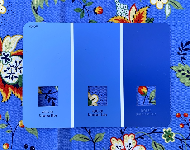
The only thing left to complete the remodel was making valances for the three new windows. I already had the fabric, a vibrant Jacobean floral that had been in my stash for a few years. The fabric (from the “Breath of Avignon” line designed by Sandy Klop for Moda) inspired my choice of paint color for the lower cabinets:

A pattern of green and yellow colors with white background
I also had a picture in my mind’s eye of what the valances would look like. No simple ruffled valances like I’ve made before. I liked them well enough but this time I wanted a more tailored look.I envisioned valances that curved upward from the sides with an inverted pleat in the middle made with contrasting fabric.

Since I had covered the back wall of the glass-fronted cabinet with yellow fabric . . .

A pattern of green and yellow colors with white background

. . . I decided to use fabric in the same shade of yellow for the pleat. And for extra pizzazz, I decided to insert a navy blue flange between the pleated part of the valance and the top band.

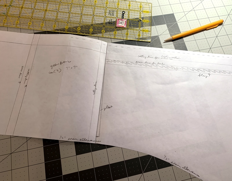
After taking very careful measurements, I drew up a pattern on freezer paper . . .

A pattern of green and yellow colors with white background. . . and proceeded to fashion the first valance.

Alas, it was not a success:

A pattern of green and yellow colors with white backgroundFirst of all, I measured incorrectly; the valance wasn’t wide enough. You’re not supposed to see the end of the spring tension rod at the top of the window. Second, when the valance was placed at the top of the window, you could see the bottom of the pleat. That was not the look I was going for. Third, instead of folding the ends of the upper band in to make a rod pocket, I sewed the ends shut. (What on earth was I thinking?) In order to audition the valance on the window, I had to add a sleeve on the back.

The valance isn’t a keeper but it was very useful as a prototype. With some valuable input from my sister Diane, I nixed the pleat and changed the flange from navy blue to yellow.Here’s a close-up of the updated flange:

A pattern of green and yellow colors with white background
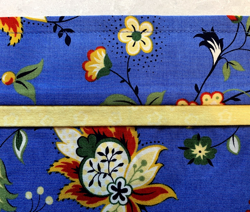
Can you see the pattern of tiny little flowers? It’s very subtle.

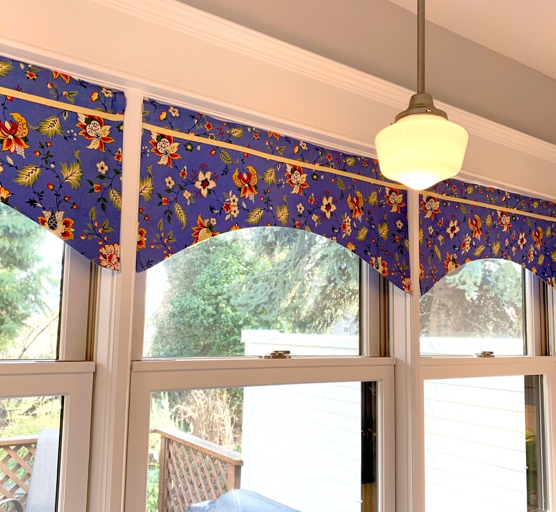
I’m much happier with the look of the yellow flanges:

A pattern of green and yellow colors with white backgroundI fussycut the second and third valances to match the design on the first, simply because I thought it would look better than having each valance cut at random from the focus fabric.

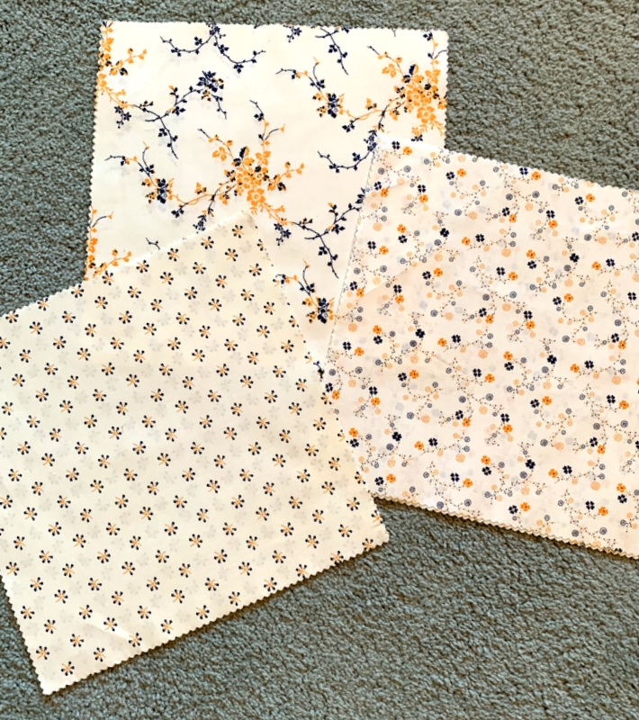
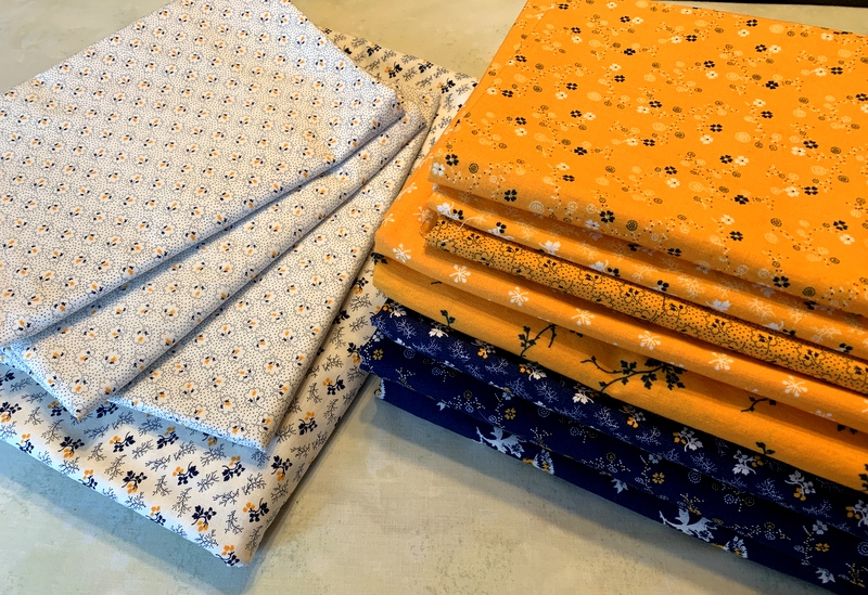
The lining of the valances is a blue print pulled from my stash:

A pattern of green and yellow colors with white background

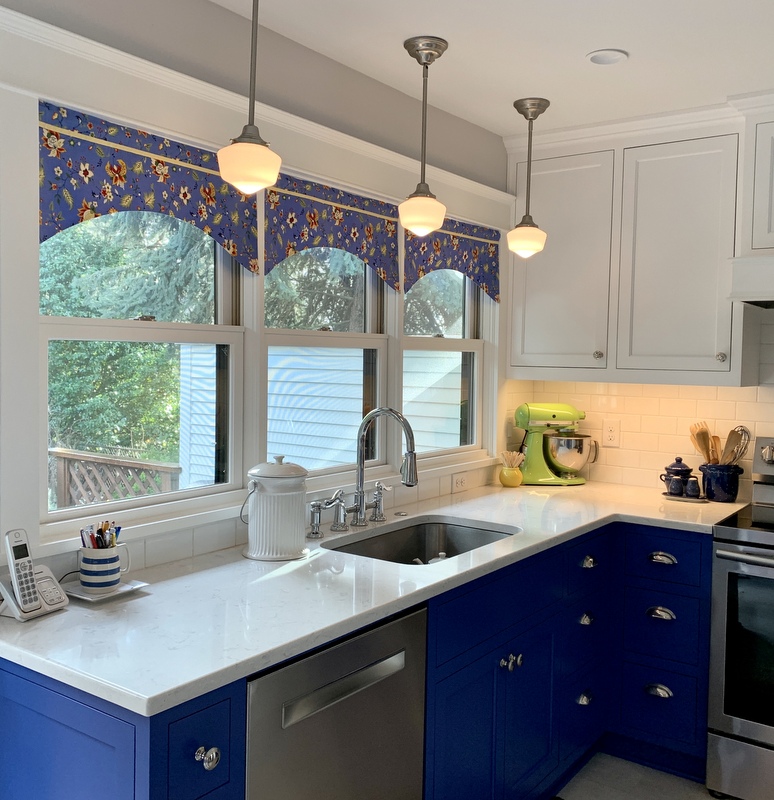
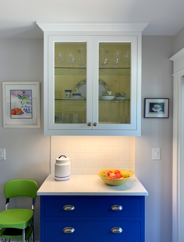
Before the valances went up, the globes of the pendant lights blended into the white woodwork. I really like the way they stand out now. Here’s what the kitchen looks like at night:

A pattern of green and yellow colors with white background

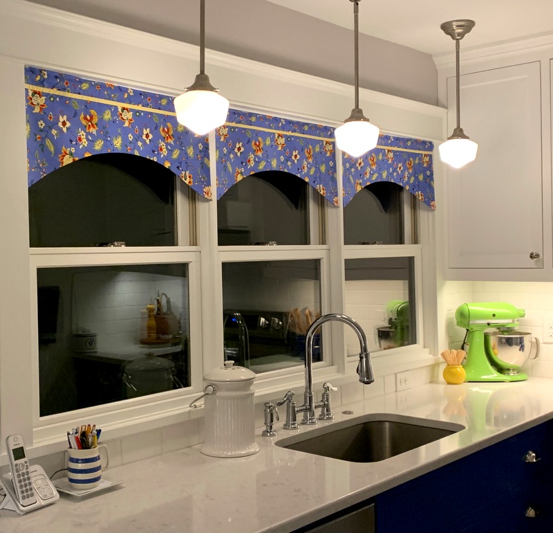
I can now declare the kitchen remodel officially complete. One of these days I’ll do that “before and after” post I promised last year.


Posted in family, home dec, kitchen remodel, update, valance | 10 Comments

Throwback Thursday: Dianthus (2010)


First things first: Happy New Year!! Can you believe it’s 2020?

I’m taking a look back at some of the quilts I’ve made over the last 10 years, starting in 2010. (I got the idea from Thelma at Cupcakes’n’Daisies who posted on Instagram yesterday with photos of 10 gorgeous quilts she made between 2010 and 2019. Check out her beauties atinstagram.com/thelmacupcake.

For 2010 I chose this quilt, Dianthus:

A pattern of green and yellow colors with white background
Dianthus, 57″ x 67″ (2010)

The pattern is 4-Patch Stacked Posies by HD Designs. I had recently discovered the four-patch kaleidoscope block and was having great fun investigating the possibilities with other fabrics and other settings. Here you see a large strip of the focus fabric as well as the blocks that didn’t make the cut for the front of the quilt:

A pattern of green and yellow colors with white background

I quilted this one myself and I don’t mind telling you I was a bundle of nerves during the process. Here are a couple of close-ups:

A pattern of green and yellow colors with white background

A pattern of green and yellow colors with white backgroundI used a variegated thread of green and lavender. The color variation is very subtle, which is just what I wanted.

Why the name Dianthus? The fabric is a gorgeous melange of blossoms including tulips, hydrangeas, and carnations. Dianthus is the Latin word for carnation. The quilt wound up at the home of my twin sister, Diane. ‘Nuff said.

When Diane’s grandson Edward was a baby, the quilt was used in his bedroom at her home:

A pattern of green and yellow colors with white background
Edward is now 10 years old. (How did that happen?) He’s still a frequent overnight visitor but as you might imagine his room looks very different today. The crib has been replaced with a trundle bed, for one thing.

And the quilt?Nowadays it’s folded at the bottom of the bed in the first floor guest room and is often pulled into service for a lap quilt while watching TV. The 57″ x 67″ size makes it a good candidate for that.

Thanks for stopping by on this second day of the New Year. Do come back for next week’s Throwback Thursday to see a quilt I made in 2011.


Posted in 4-Patch Wonder, baby quilt, family, faux-kaleido quilts, free motion quilting, home dec, kaleidoscope quilts, Throwback Thursday, update | 4 Comments

Christmas Pillowcases All Year ‘Round


Now that Christmas is over, I can show you the pillowcases I made for my twin sister Diane and her husband Ed:

A pattern of green and yellow colors with white background
The cases are made for a king size bed so they measure a generous 20″ x 33″. I am so in love with that floral fabric; it’s from a 2010 line for Henry Glass Fabrics called “At Home for Christmas” designed by Heather Mulder Peterson of Anka’s Treasures. It’s been in my stash for years. Knowing I would be using most of it, I scoured the Internet looking for more and even contacted Heather to see if she still had some in her shop; alas, it is gone.

I confess it was really hard to cut into that fabric but I knew that pillowcases made from it would look wonderful in Diane and Ed’s master bedroom:

A pattern of green and yellow colors with white backgroundThe colors are Christmas-y but the prints are not, making the pillowcases appropriate for use all year round.

I had one other thing in mind when I chose the fabric. In the picture below you can just get a glimpse of a quilt on the wall:

A pattern of green and yellow colors with white background
It’s Midnight in the Garden, one of my very favorite quilts, made from my pattern 4-Patch Wonder:

A pattern of green and yellow colors with white background

I gave the quilt to Diane for her 60th birthday a few years ago and I get to see it whenever I travel to Georgia to visit her. I figured the pillowcases would complement her quilt very nicely. And they do, don’t they?!


Posted in 4-Patch Wonder, family, faux-kaleido quilts, home dec, kaleidoscope quilts, roll-it-up pillowcases, tutorial, update, wall hanging | 10 Comments