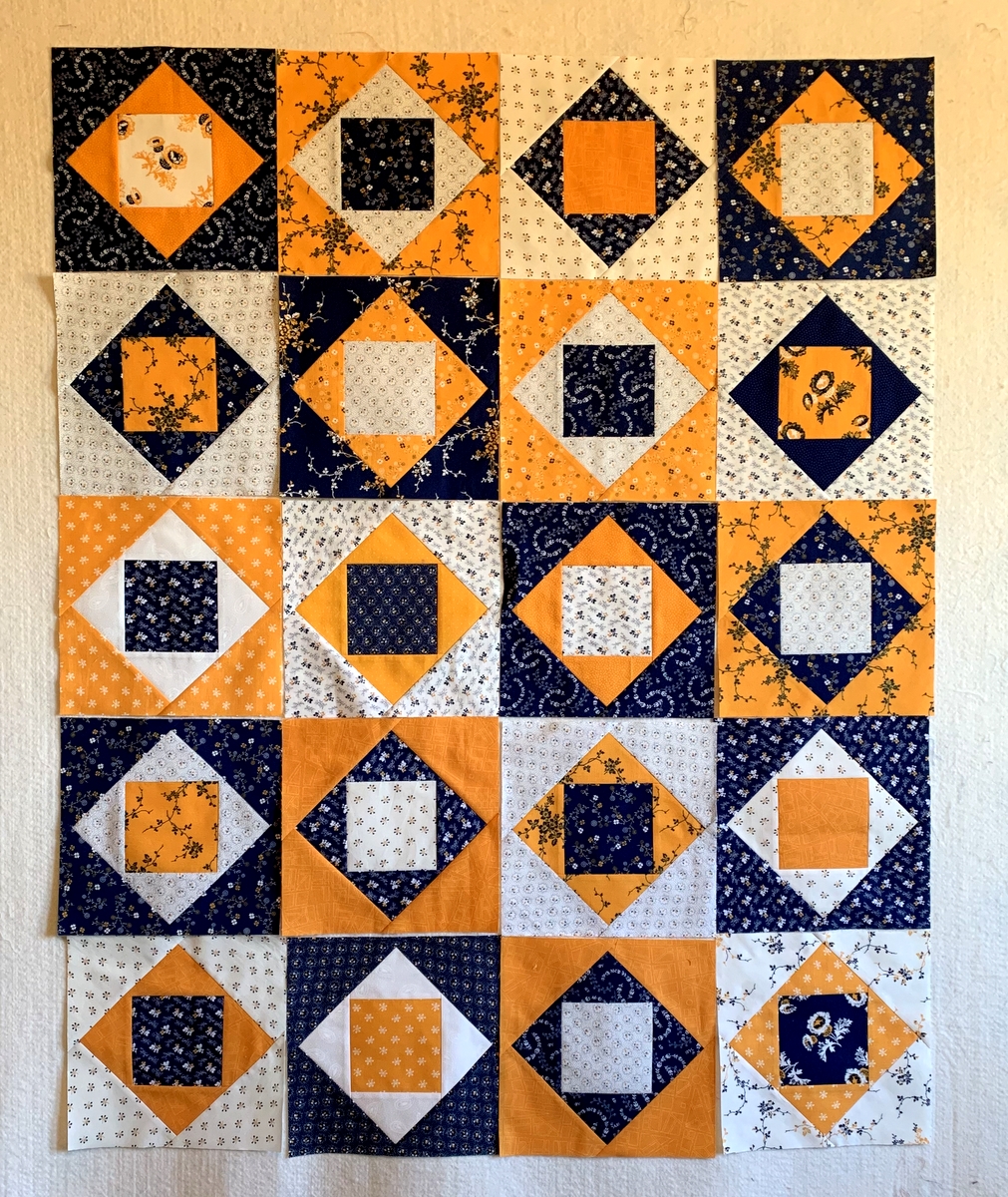
August Anticipation
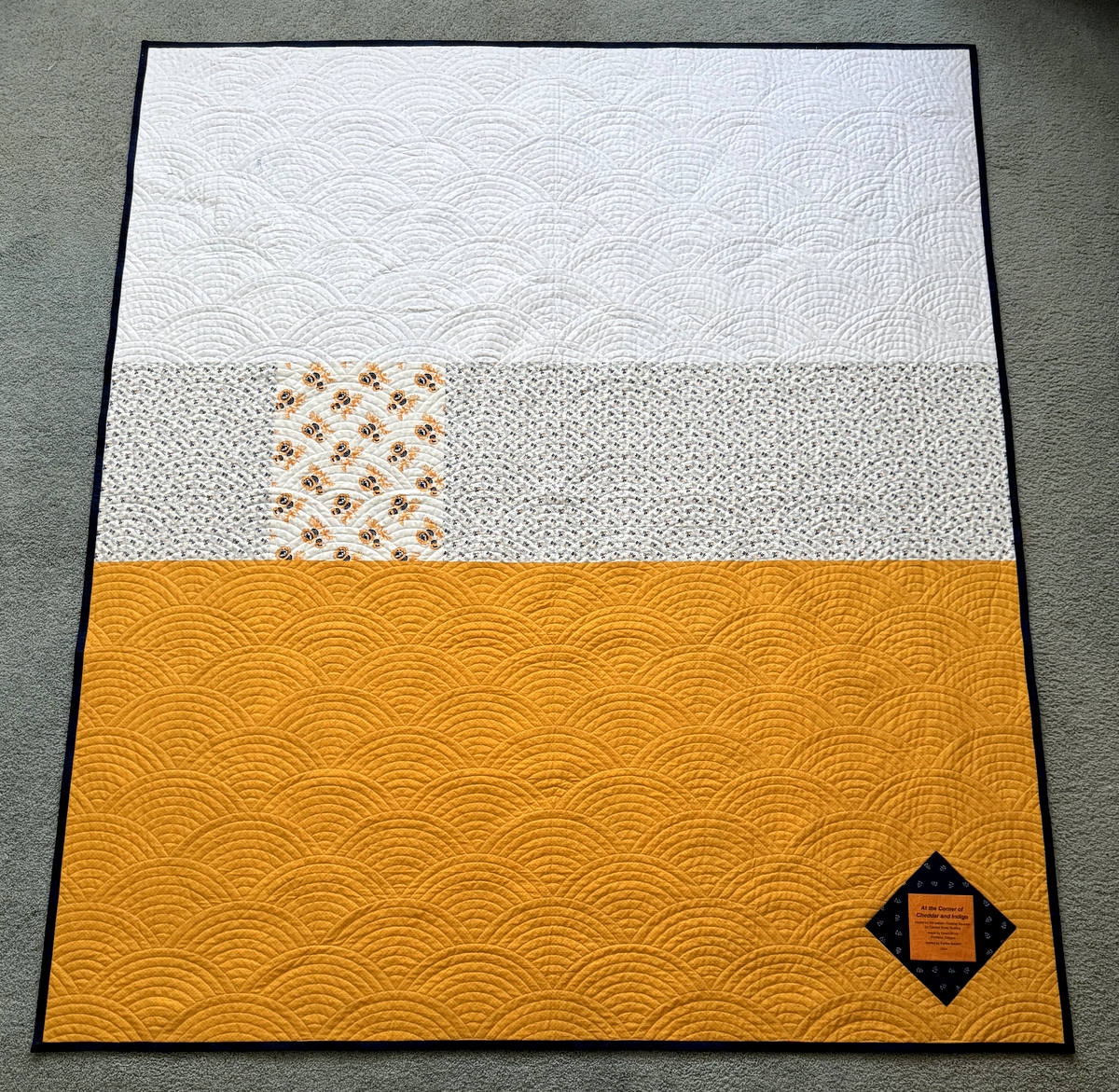
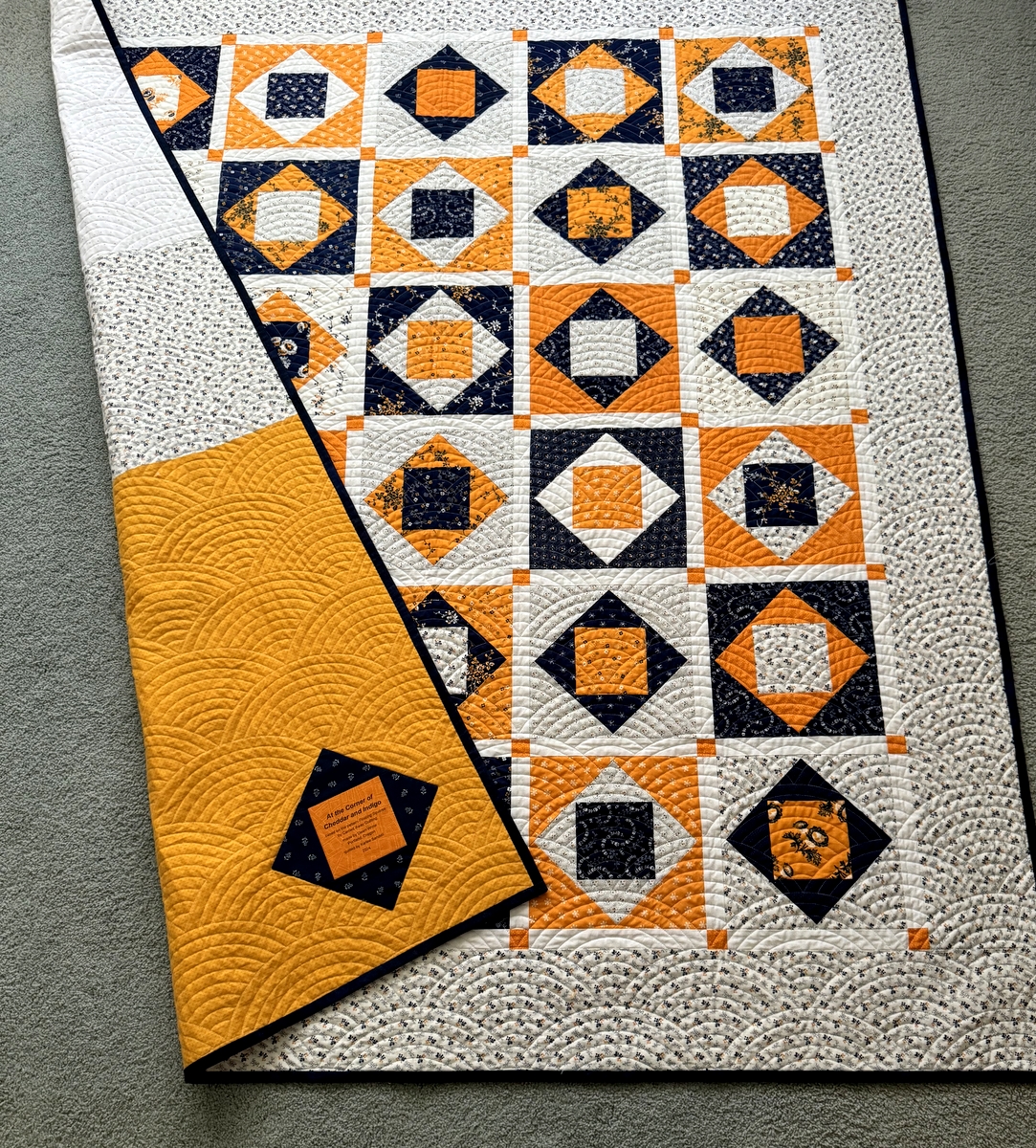
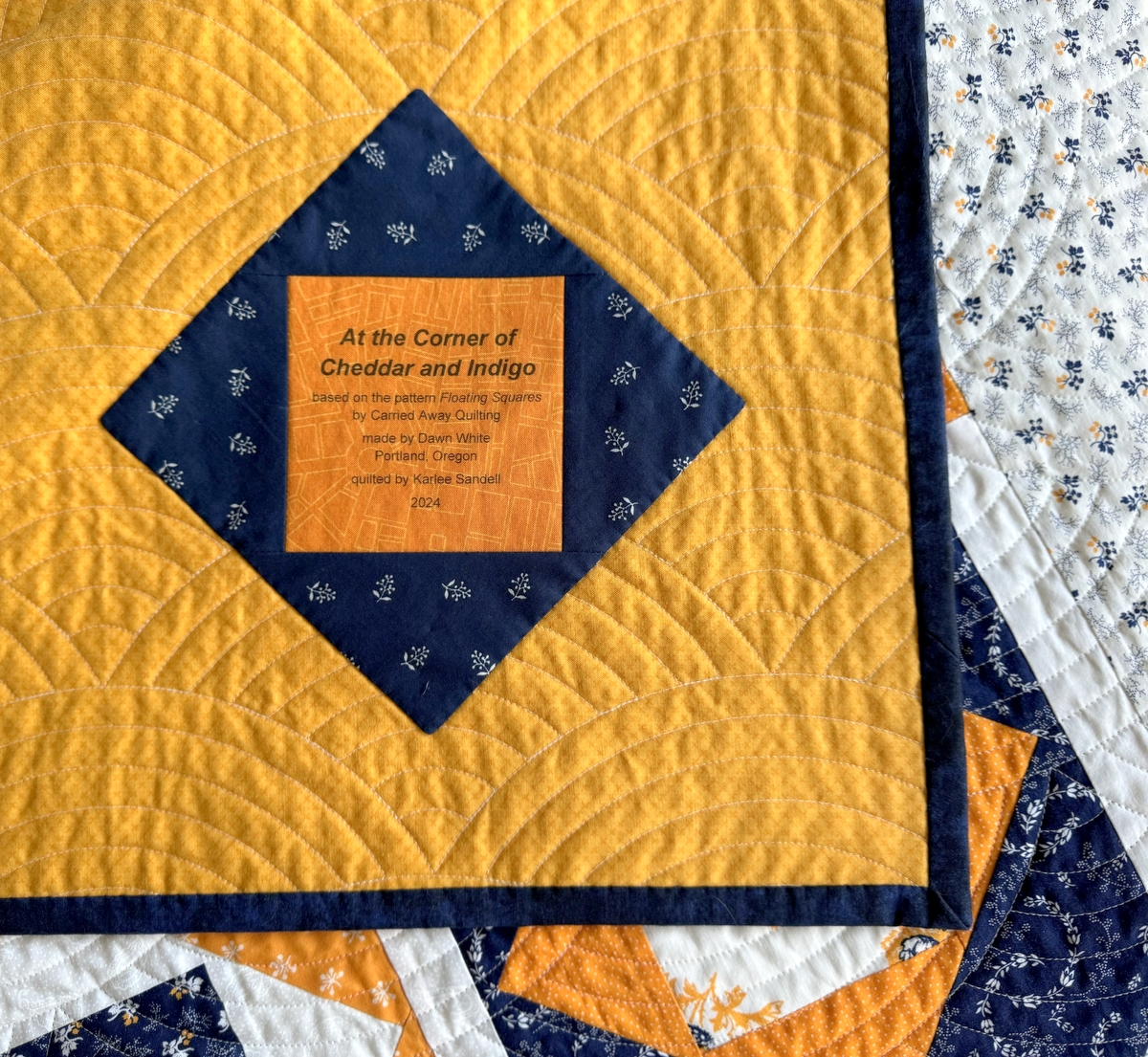
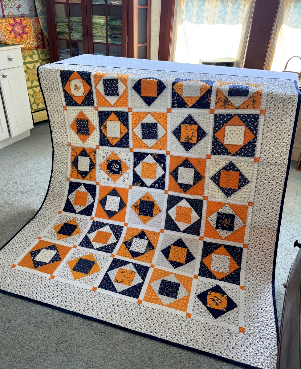
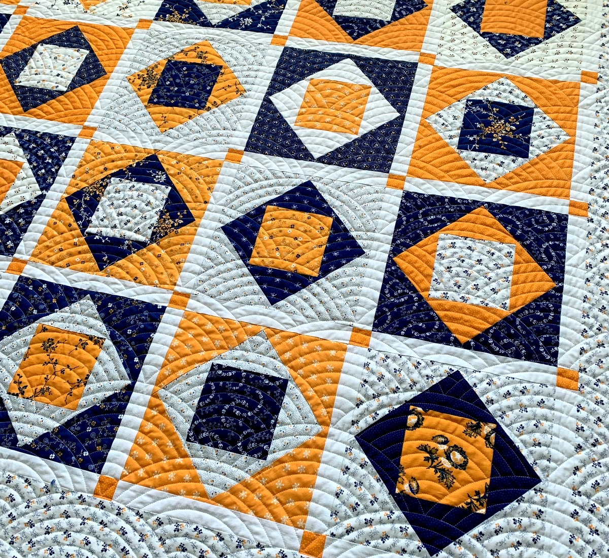
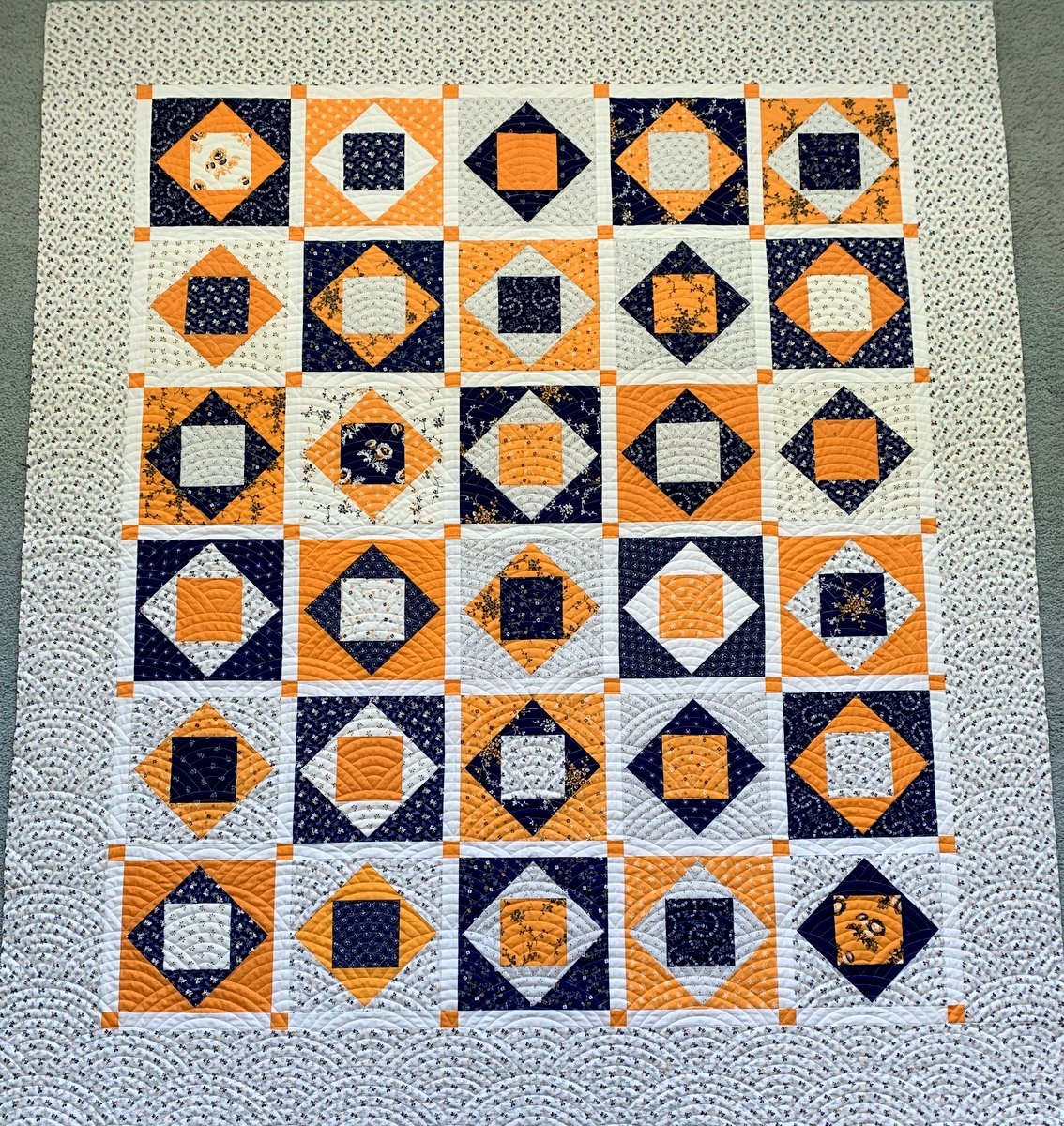
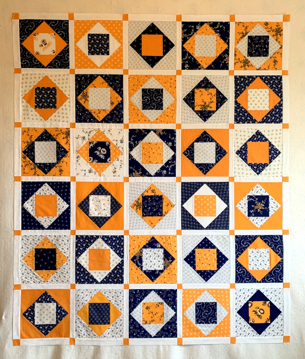
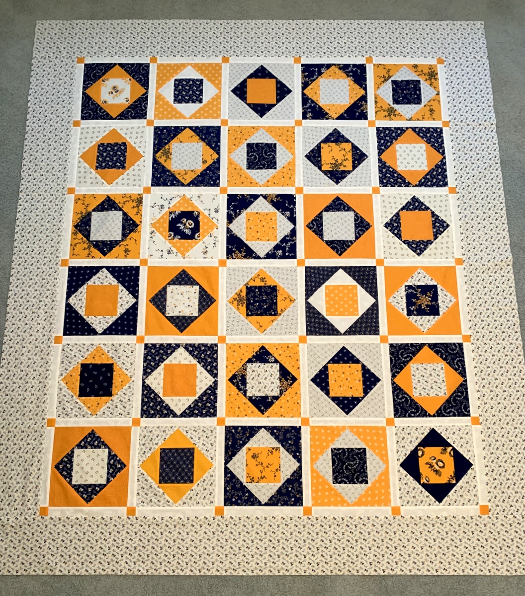
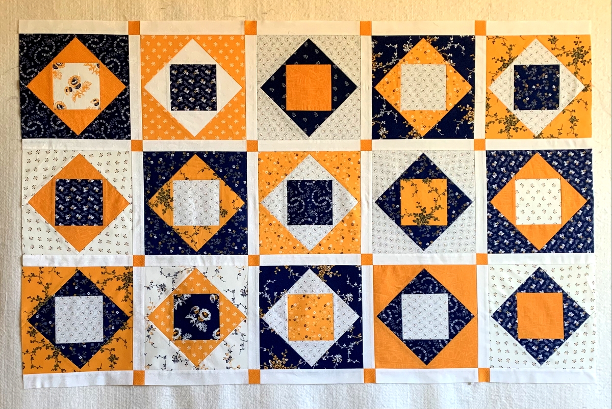
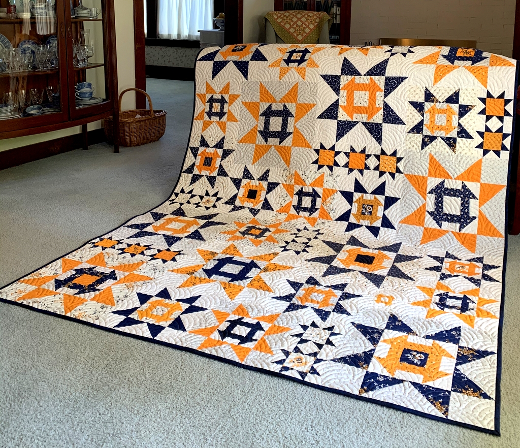
Once I finish a quilt top, I am always eager to piece a backing so I can get both top and backing off to be quilted by a professional longarmer. In the case of the Picnic Quilt top, based on the free pattern Ribbon Box and completed at the end of June, making a backing got put on the back burner while I bound and labeled At the Corner of Cheddar and Indigo. Because of gardening and other household duties, that took up most of July.
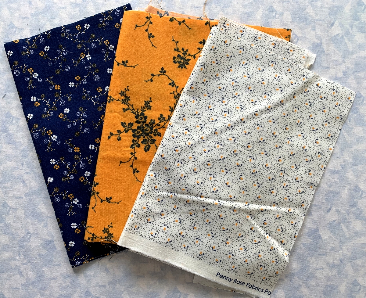
And now here it is August already! What do I have to show for it thus far? Nada. Zippo. Ah, but I do have plans . . . not for a backing for the Picnic Quilt but for another brand new version of Ribbon Box, this one featuring my precious horde of fabrics from Mo Bedell’s debut fabric line “Party Dress,” which came out in 2010.
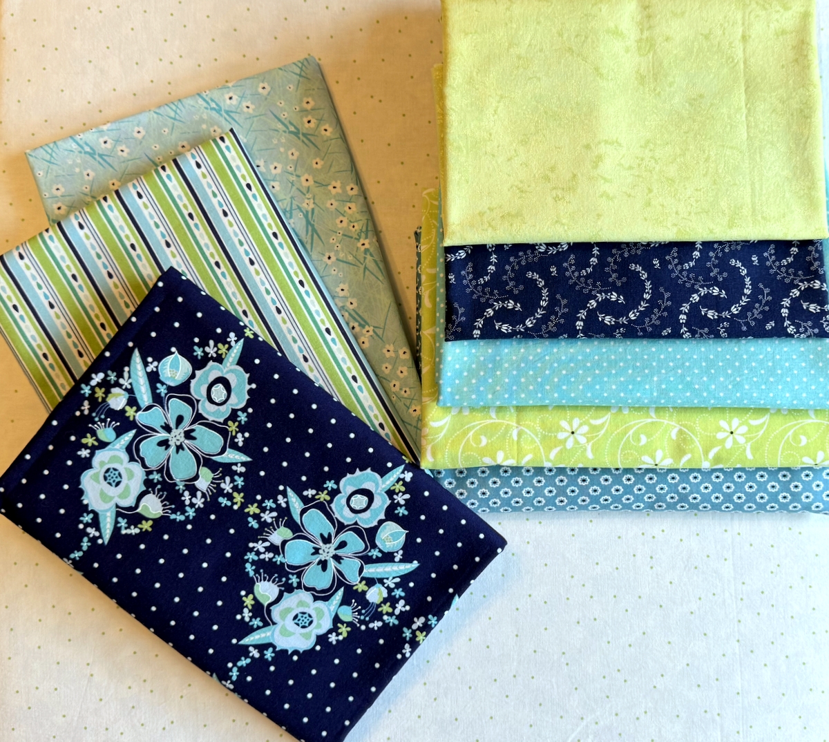
I bought several pieces from the line when it first came out but these three fabrics are the ones that will appear in my newest Work-in-Progress (WIP):
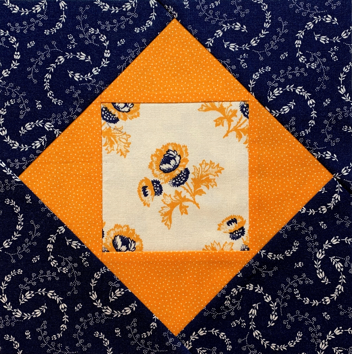
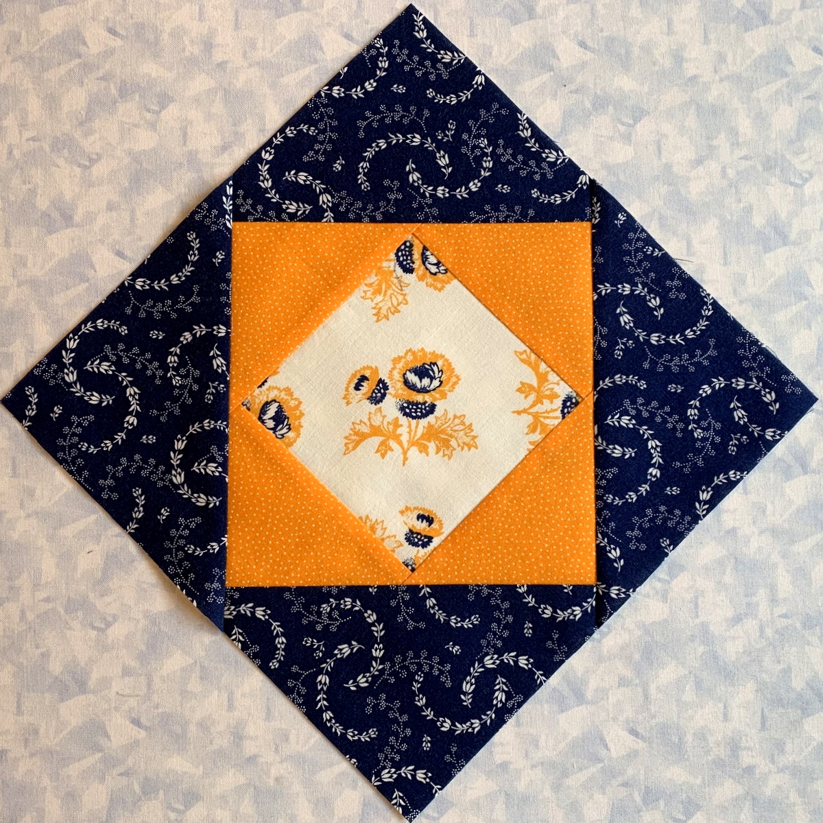
 The center fabric is obviously the main focus fabric. Isn’t it gorgeous? And the aqua fabric on the right has appeared in more than one of my quilts.
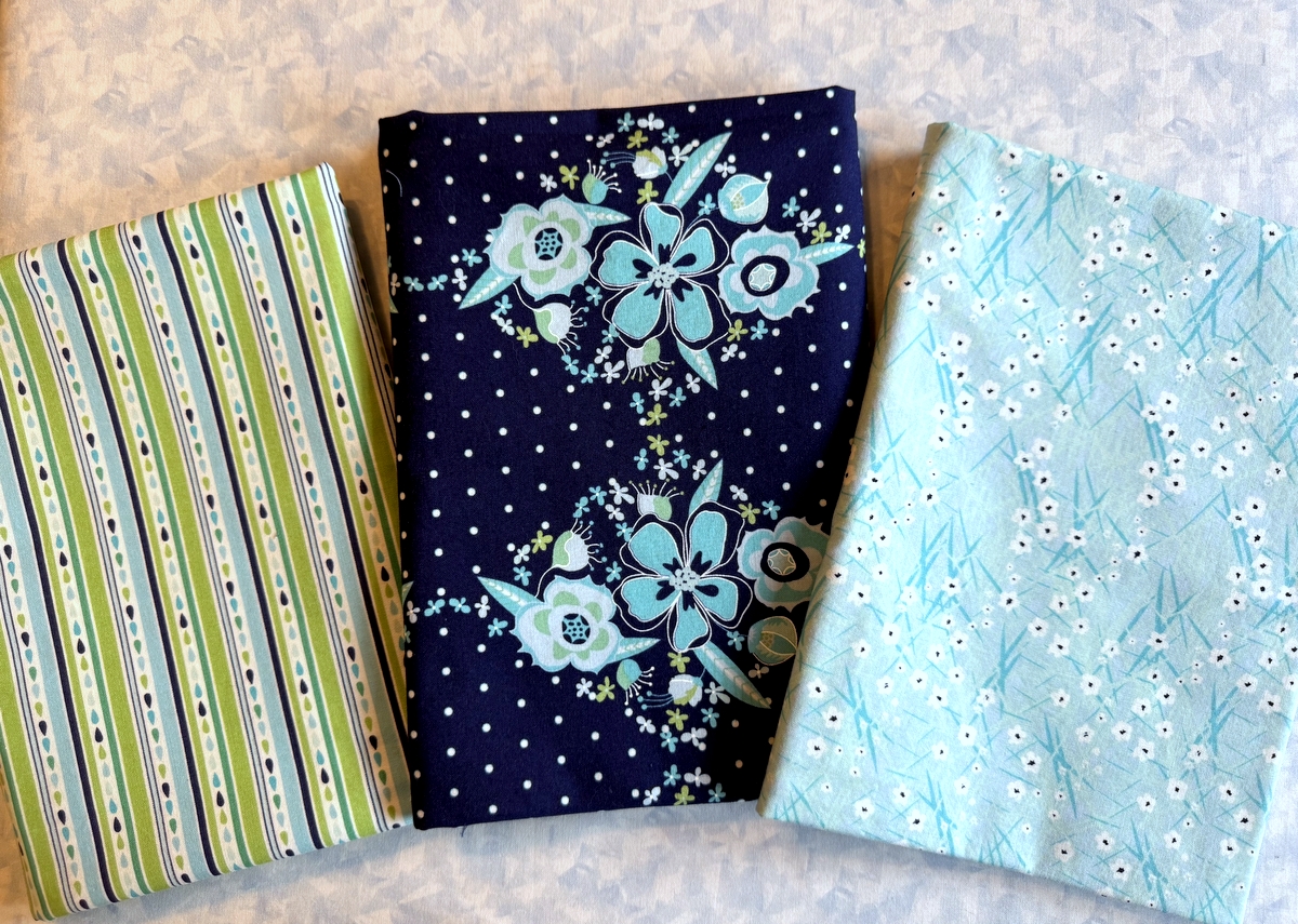
The pattern calls for eight prints. Here are the remaining five, all pulled from my stash:
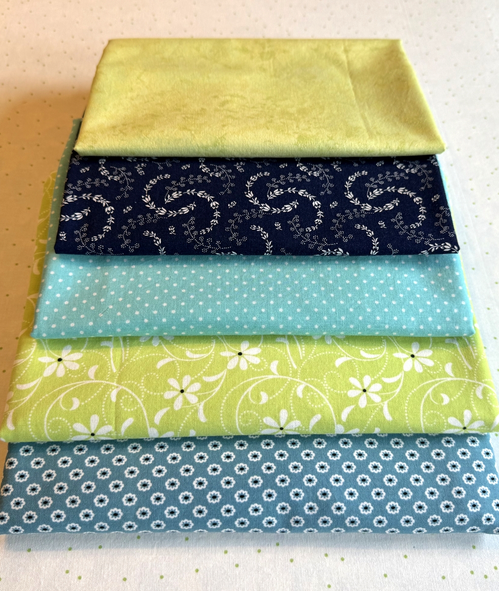
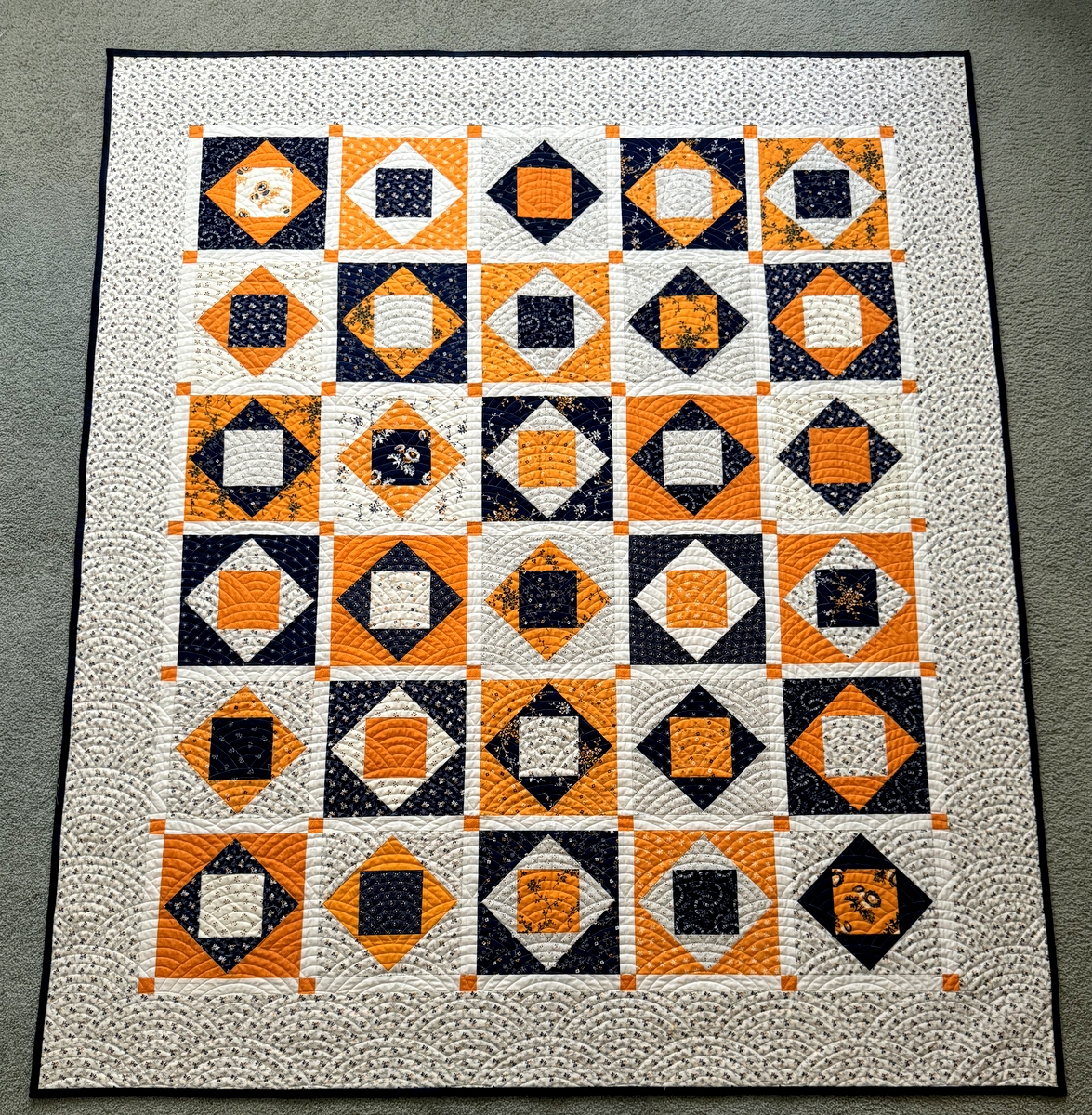
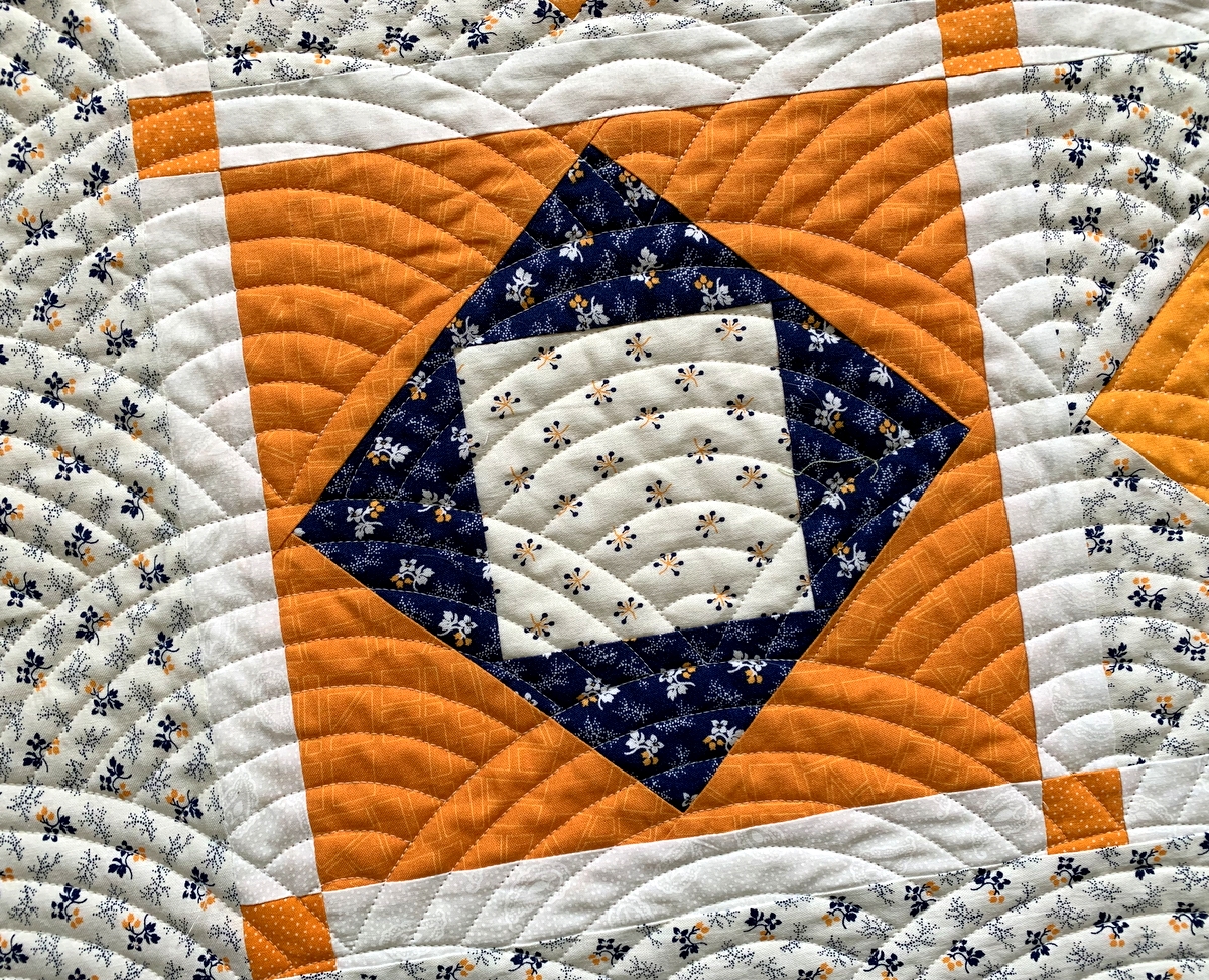
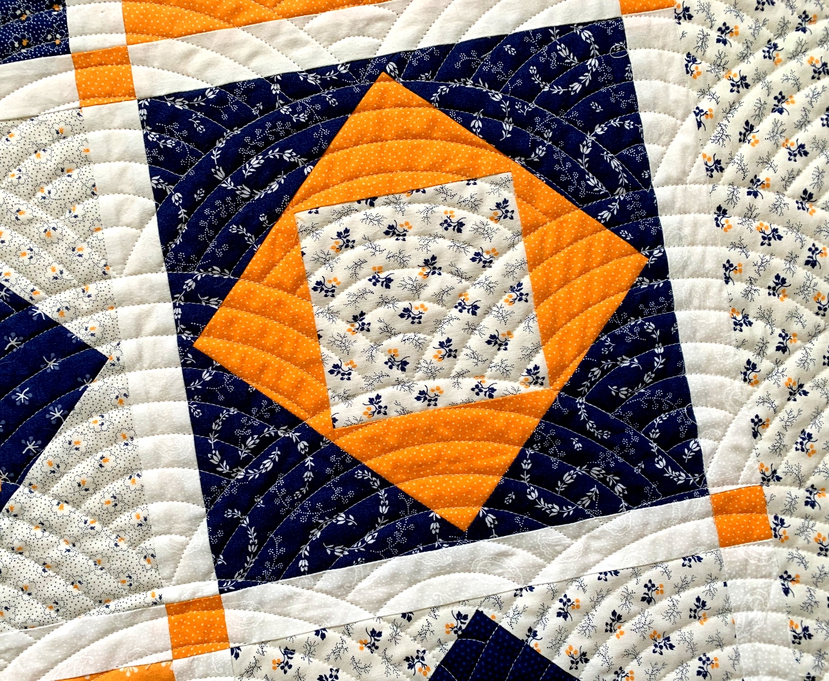
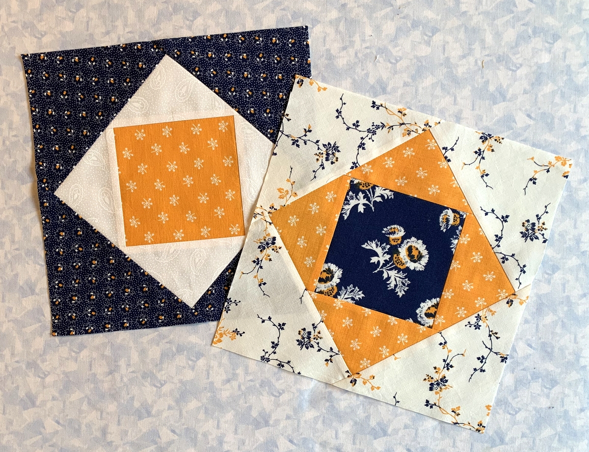
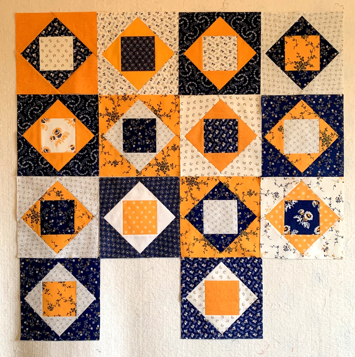
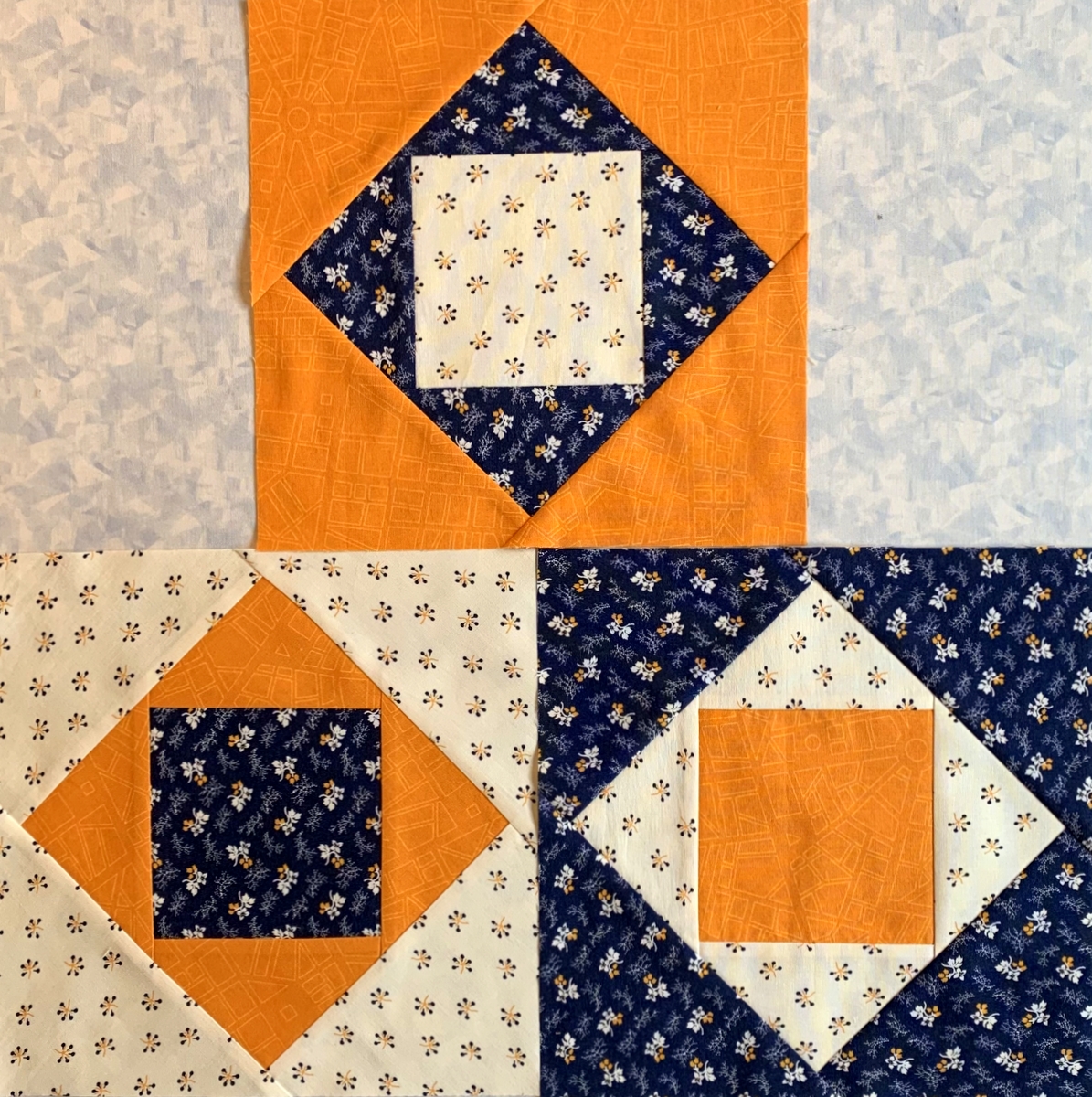
Astute readers will recognize the navy and white print from my recently completed cheddar and indigo quilt. It was the only navy print in my stash that matched the navy of the focus fabric. It’s a vintage print and I will be very sorry when I’ve used the last of it.
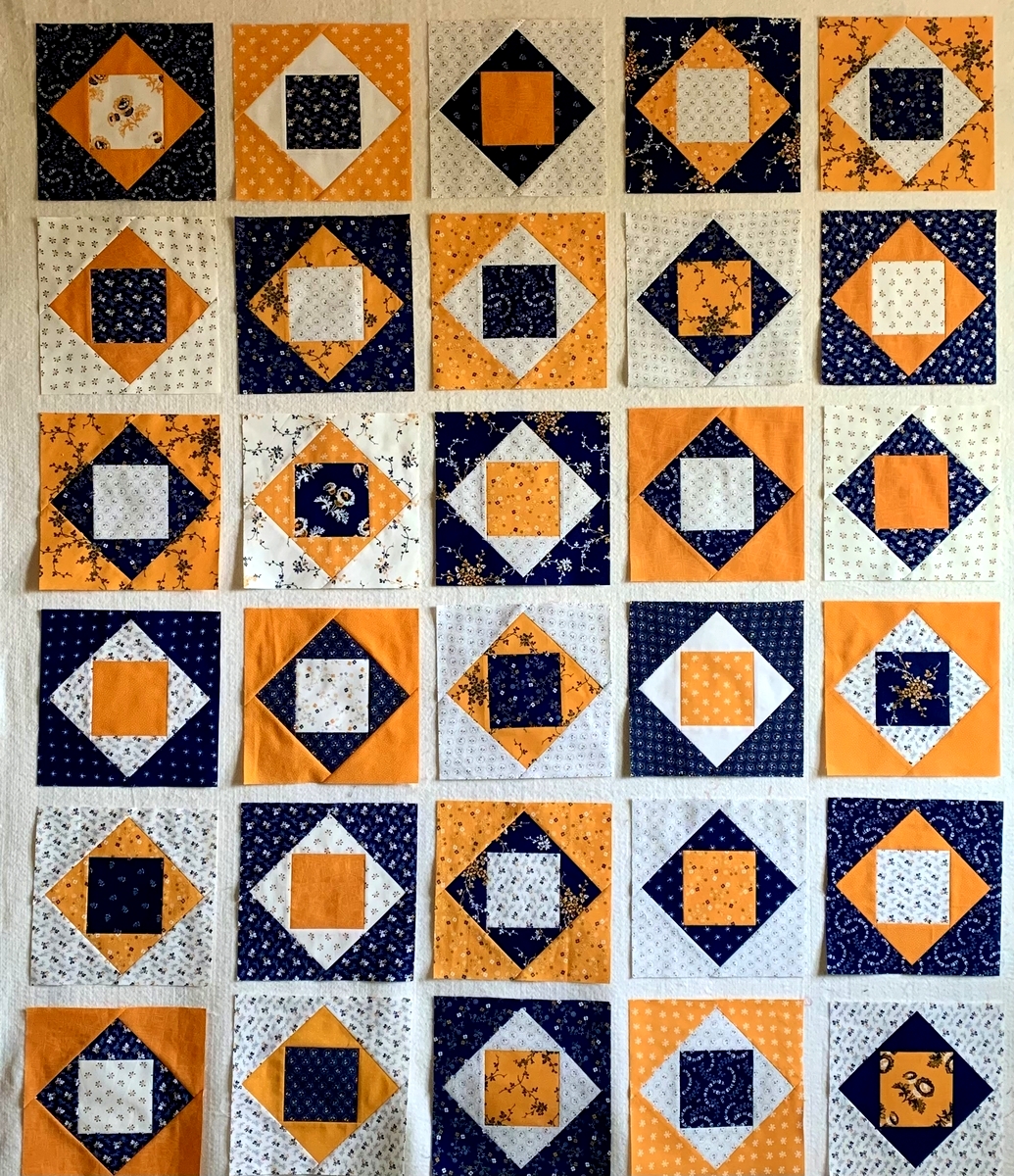
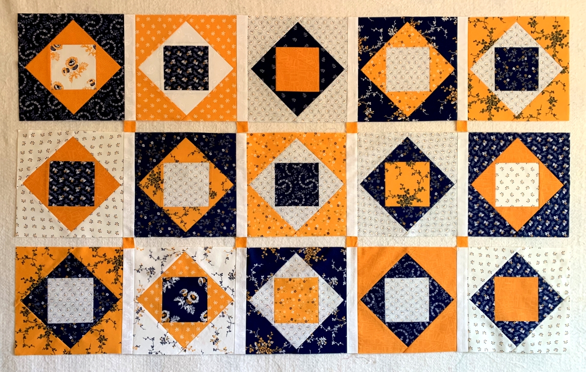
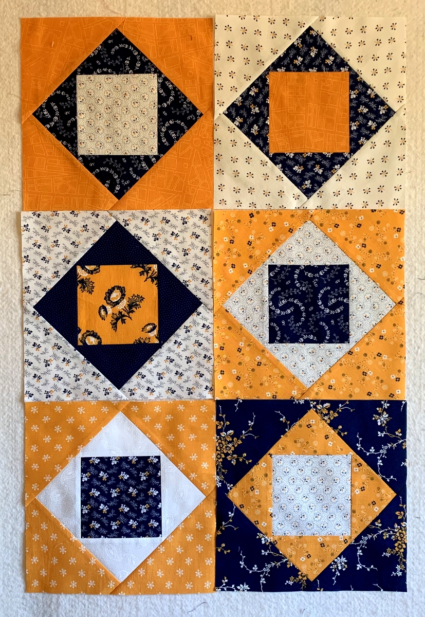
Here are the eight prints all together:
 Did you notice the green on white polkadot fabric the prints are resting on? That’s my background fabric, one of Lori Holt’s “Seasonal Basics” for Moda. It’s one of my all-time favorites for quilt backgrounds. I have it in at least three colorways and love it for its versatility; it looks great in both traditional and modern quilts.
August is shaping up to be a very busy month. The Dear Husband and I have a couple of road trips planned, my twin sister Diane is arriving in one week for an extended visit, and the garden continues to demand attention daily (not just weeding and watering but harvesting!). I have also been working on a PowerPoint presentation for an upcoming quilt guild meeting that I’m excited about. All this to say that I may not get much sewing done this month — but it’s all good. If the best I can do is duck into my sewing room from time to time to pet these fabrics, I will be a happy quilter.
P.S. For those of you interested in making your own version of Ribbon Box, I haven’t forgotten my pledge to pass on what I learned while making my first version. Quoting from an earlier post:
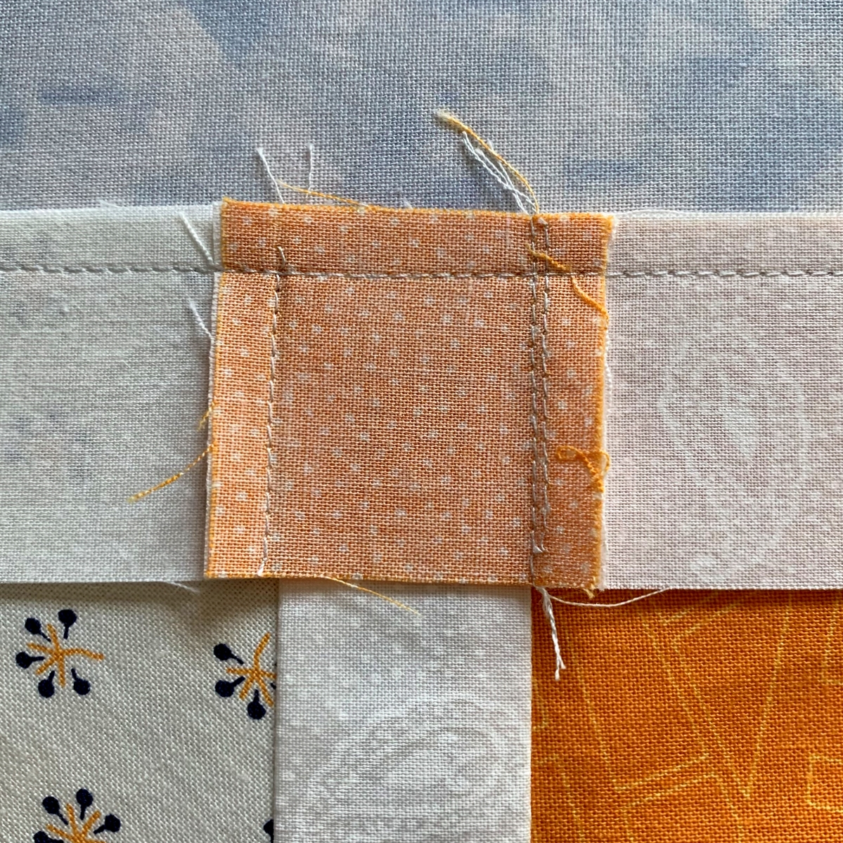
“In my previous post I mentioned making changes to the way the quilt is constructed. It has to do with sewing the quilt together in sections rather than in strictly horizontal rows. It enabled me to eliminate 17 seams! I’ll tell you all about it in my next post along with some important considerations regarding fabric choices, cutting instructions, and arranging the ribbons. If I ever make the pattern again — and I just might! — I will surely be keeping these considerations in mind.”