Giveaway Extended!
 I’ve decided to extend the giveaway celebrating my 10th blogging anniversary (aka my 10th Blogiversary) through Saturday. I’ll be out of town for a few days so it makes sense to wrap things up after my return. If you meant to register for my giveaway (announced on my blog on May 1) and let it slide, you have a second chance.
I’m in Portland, Oregon so you can enter up until midnight Saturday, May 14, Pacific Daylight Time (PDT). Winners will be announced on Sunday. The giveaway is open to both domestic and international visitors to my blog.
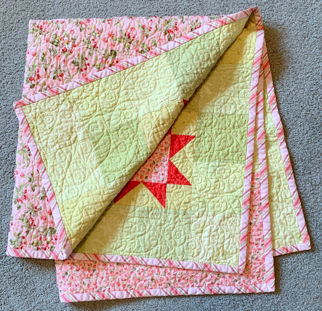
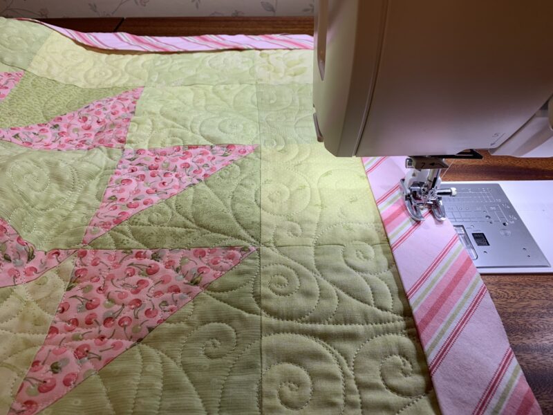
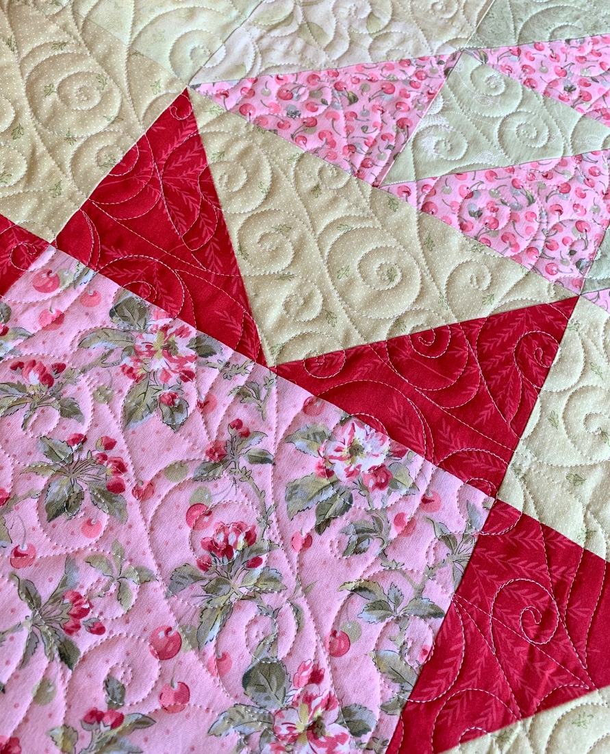
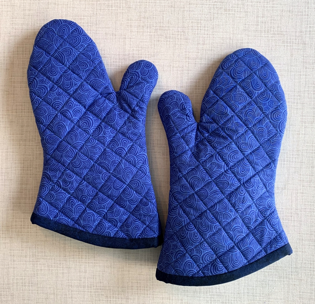
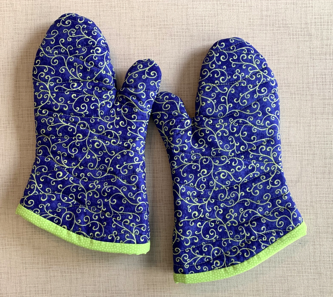
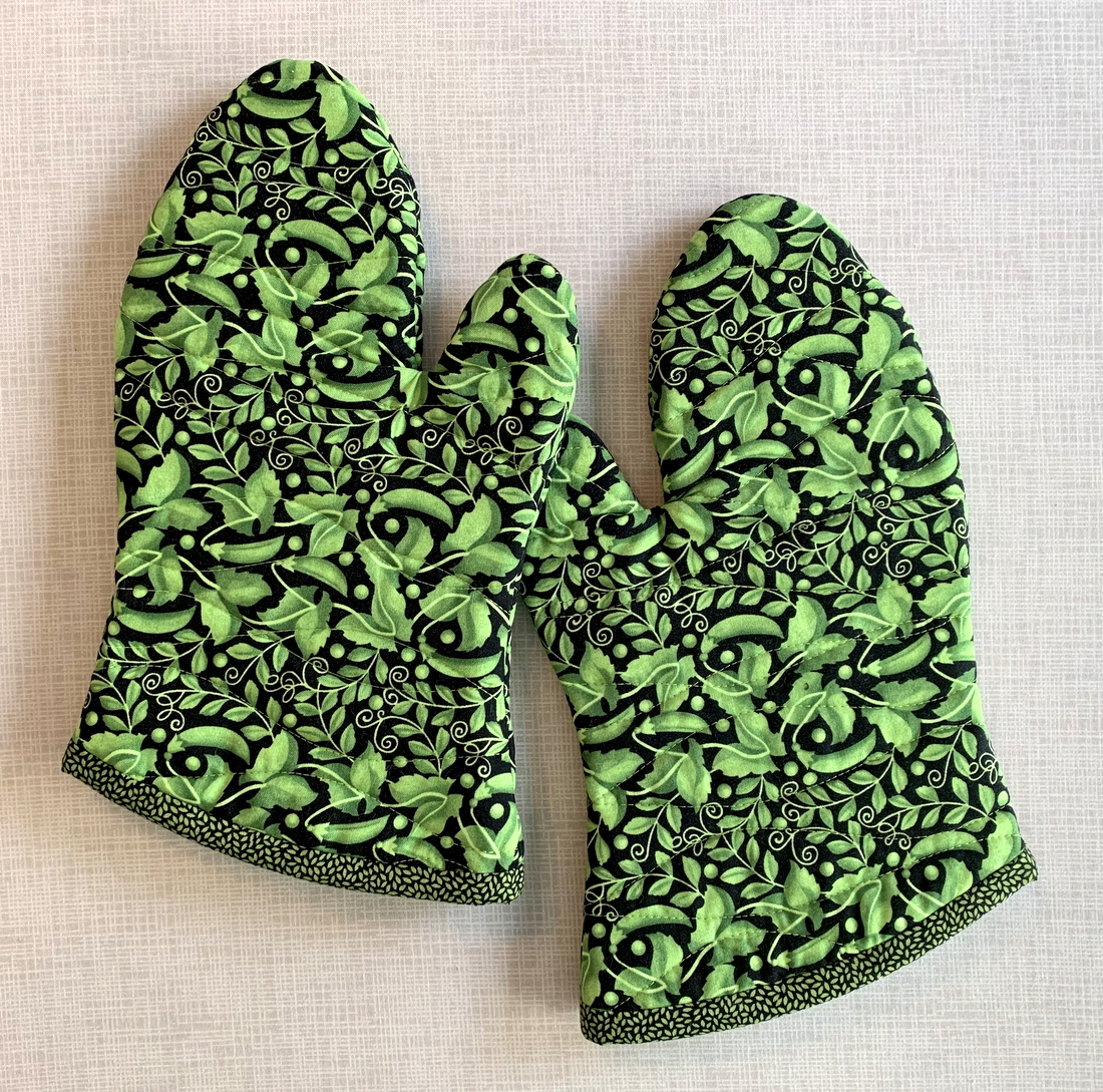
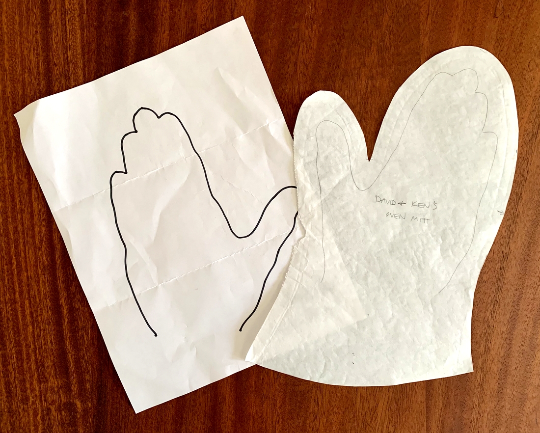
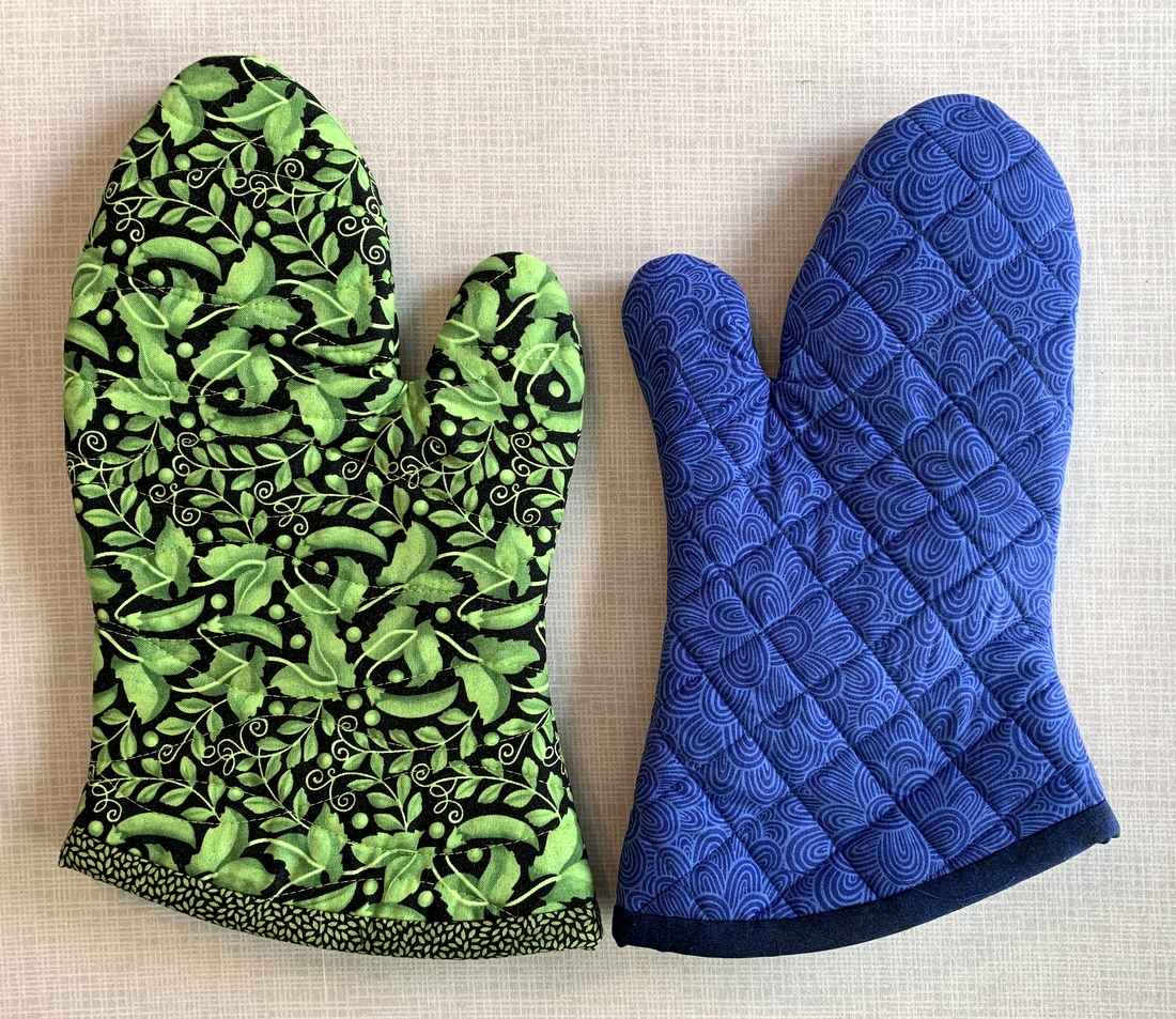
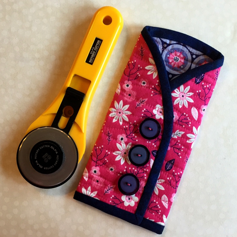
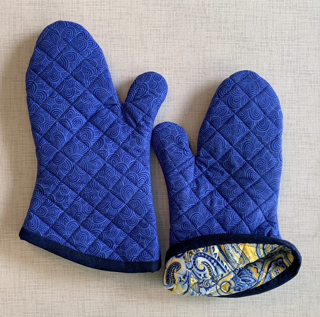
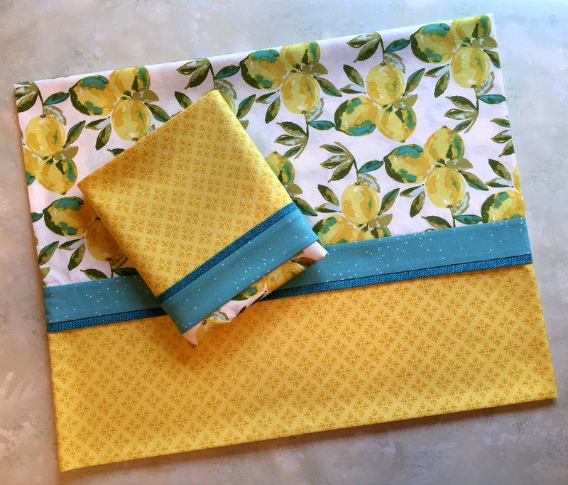
I’m giving away three prizes made by me – a rotary cutter coat (pictured above), a pair of oven mitts . . .
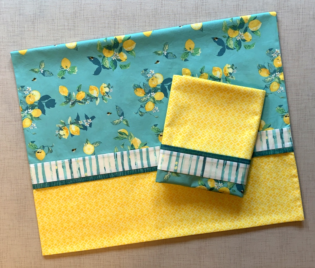
. . . and a pair of standard or king size pillowcases:
But wait – there’s more! The winners get to pick the item they prefer — and the fabrics. I’ll find out what colors they like and give them some choices. If the handmade items I’m offering don’t appeal to you, think about them as gifts for friends or family members. Oven mitts, in particular, make great gifts. There’s even a hashtag for that: #ovenmittsmakegreatgifts.
To enter the giveaway, all you have to do is go to this post and respond in the comment section to the question: “What is your favorite color combo?” It’s been fun to see the responses so far, many of which mirror the color combos near and dear to my heart.
I’m sorry to say I’ve spent precious little time in my sewing room of late. What could possibly take me away from My Happy Place? The answer: the White House Garden. I have been helping the Dear Husband get our front and back yard ready for planting. I have to be honest: spending time in the garden is at the very bottom of my list of things I want to do. But we’ve had such a cold and soggy spring in Portland that I feel I have to help the DH take advantage of the (fairly) dry and (partly) sunny days to make up for lost time.
My DH moves a bit slower than he used to so I’m stealing time away from my sewing room to help him do the thing that makes his heart sing. I will always be a reluctant gardener but . . . I must confess: there is a great deal of satisfaction to be gained from getting a few feet of land freed of weeds, an overgrown bush trimmed back, a lawn and leaf bag filled and hauled to the curb. I just don’t want to make a habit of it!
I’ll be back on Sunday with the names of the winners. Good luck!
P.S. Instructions for all three prizes are included in the Tutorials page on my website, which you can find at this link.