In Praise of Single-Fold Binding (A Tutorial of Sorts)


Double-fold quilt binding (also known as French binding) is clearly the standard in quiltmaking. I’m here today to sing the praises of single-fold binding, an option you may not have considered before. Most quilt reference books don’t spend a lot of time on single-fold binding other than to point out its recommended use on quilts with curved or scalloped edges where the goal is less bulk in the binding.

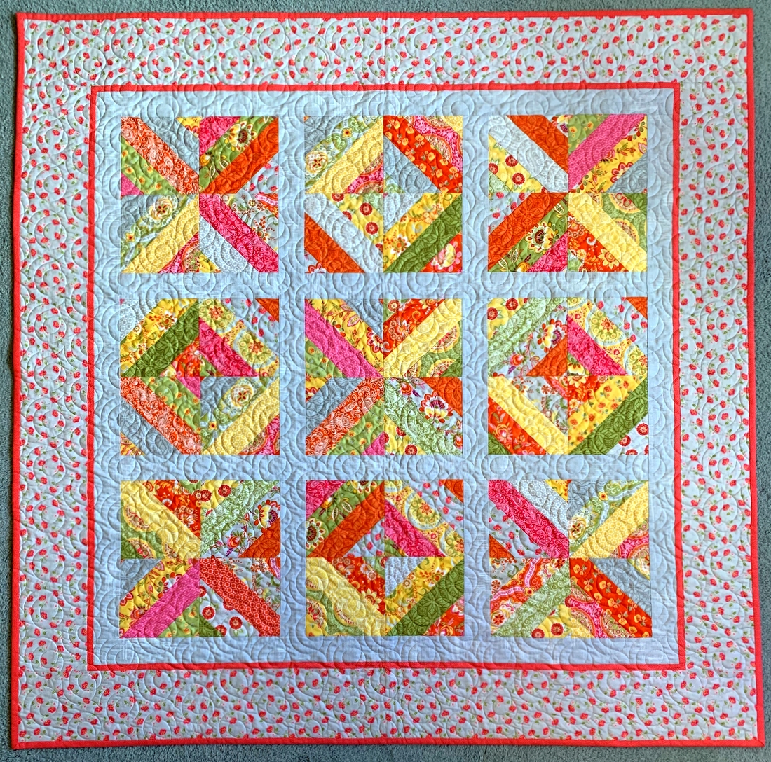
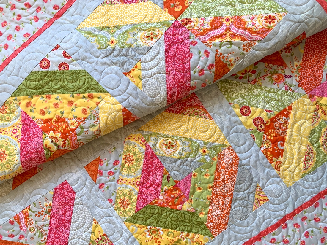
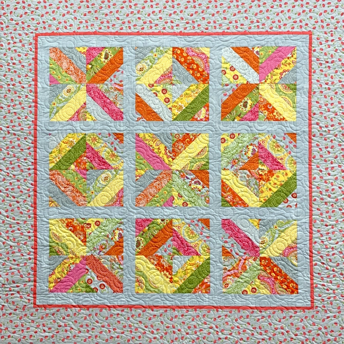
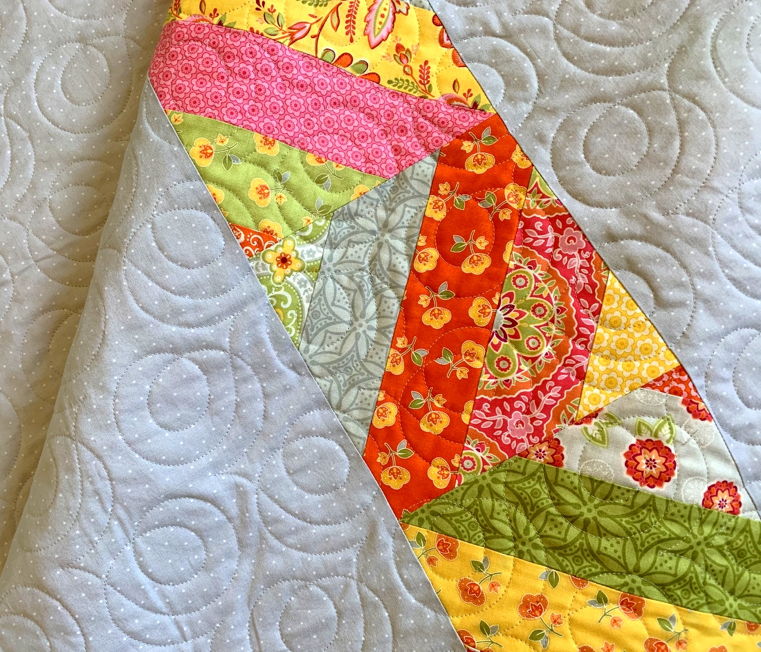
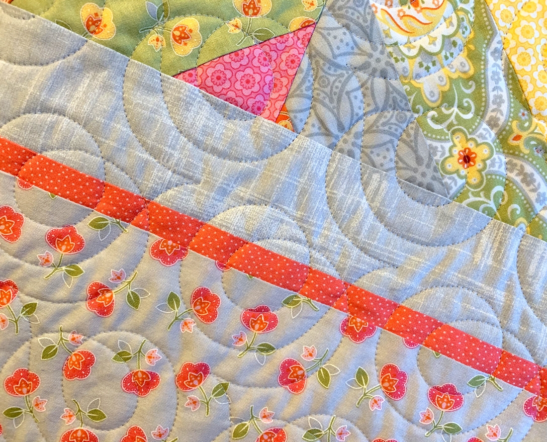
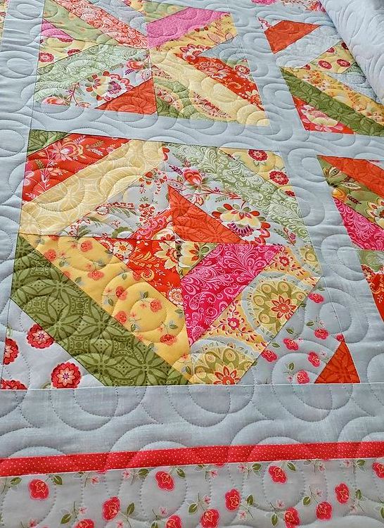
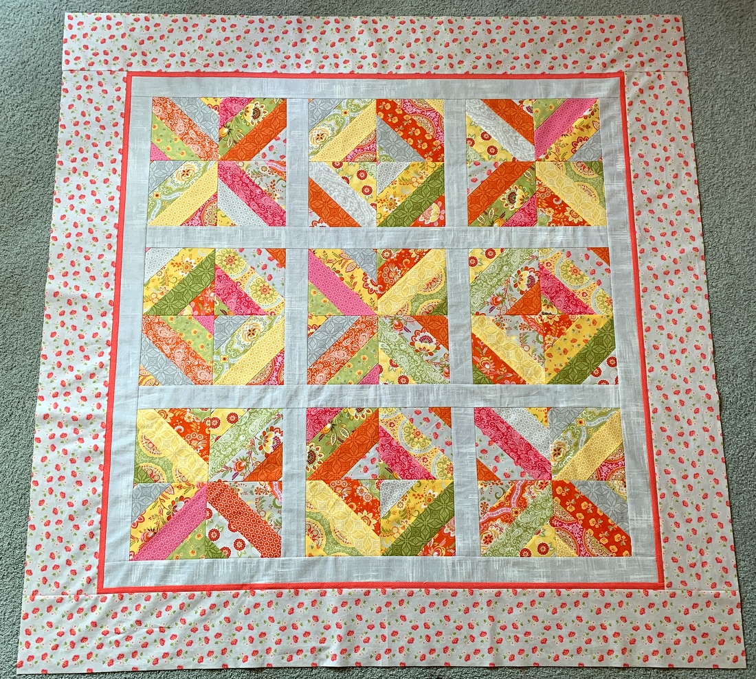
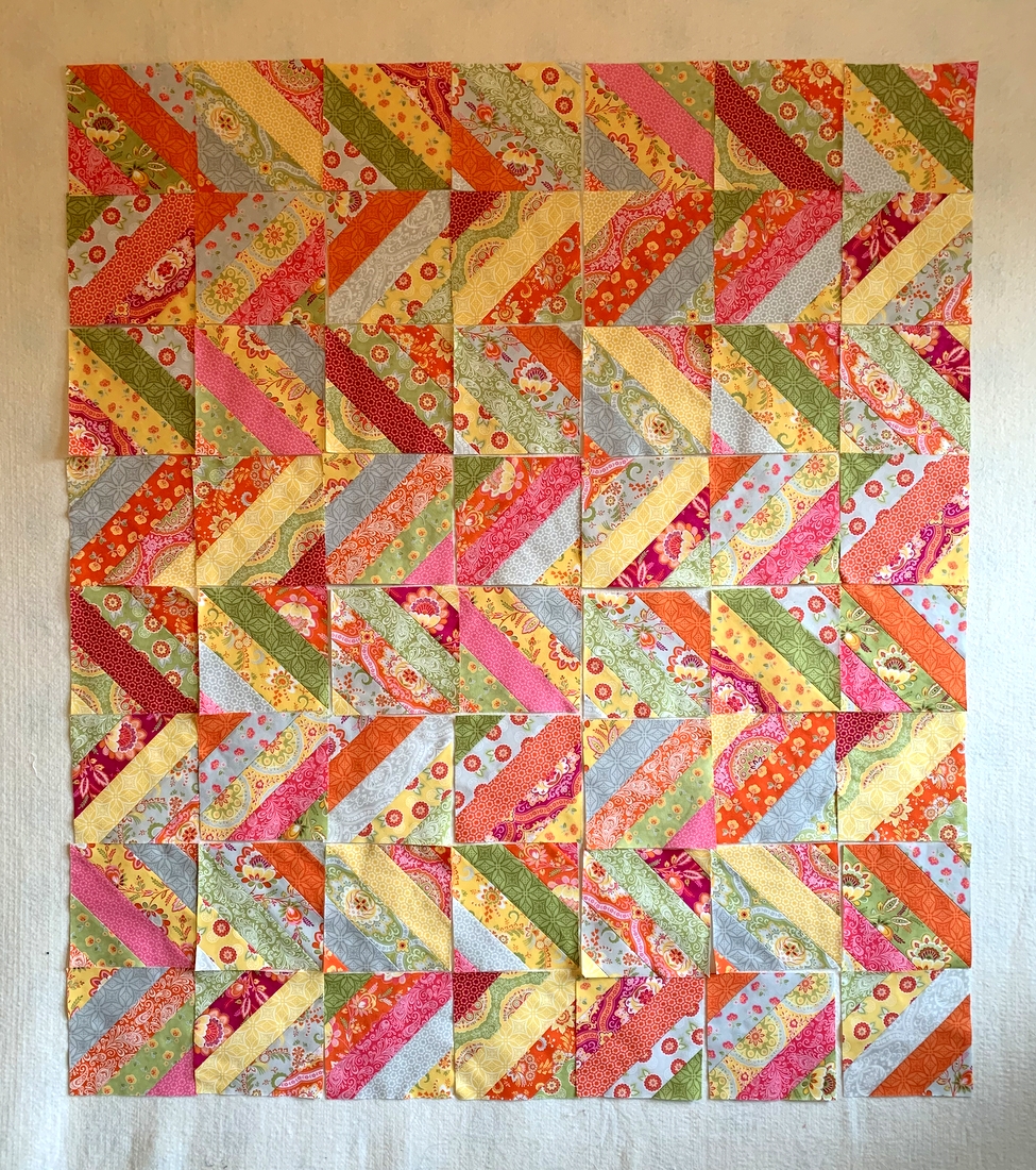
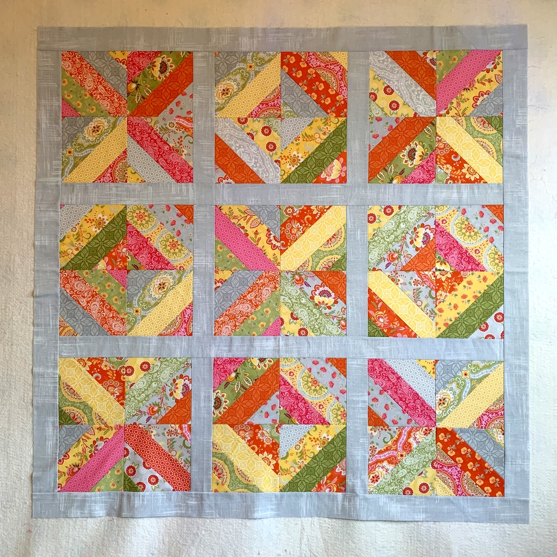
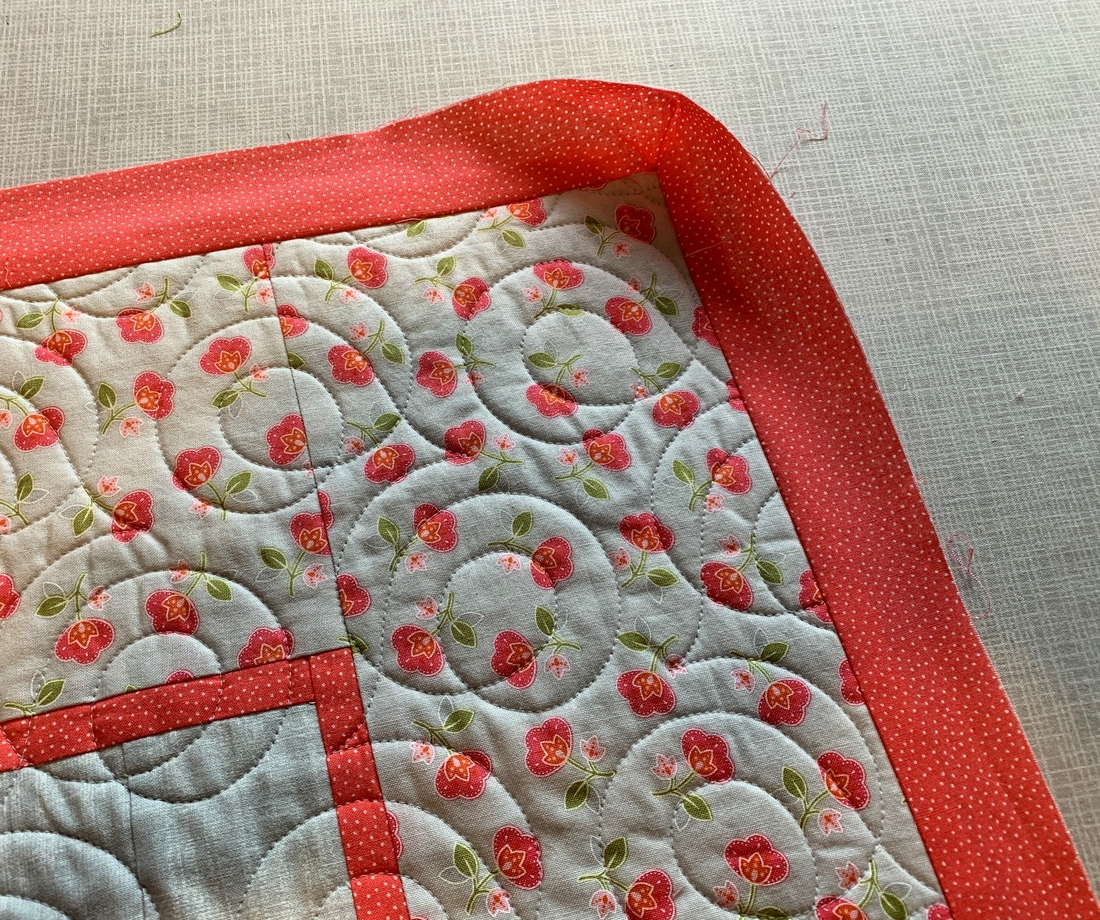
And that’s the one huge advantage of single-fold binding: it’s less bulky, meaning it lies flatter, and that’s especially noticeable on mitered corners. Here’s a look at mitered corners on my latest quilt, Tea Time on High Street:

A pattern of green and yellow colors with white background
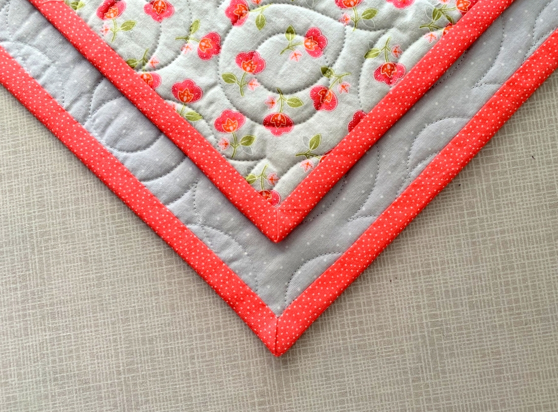
Nice and flat, right? That makes it a terrific option for art quilts and wall hangings.

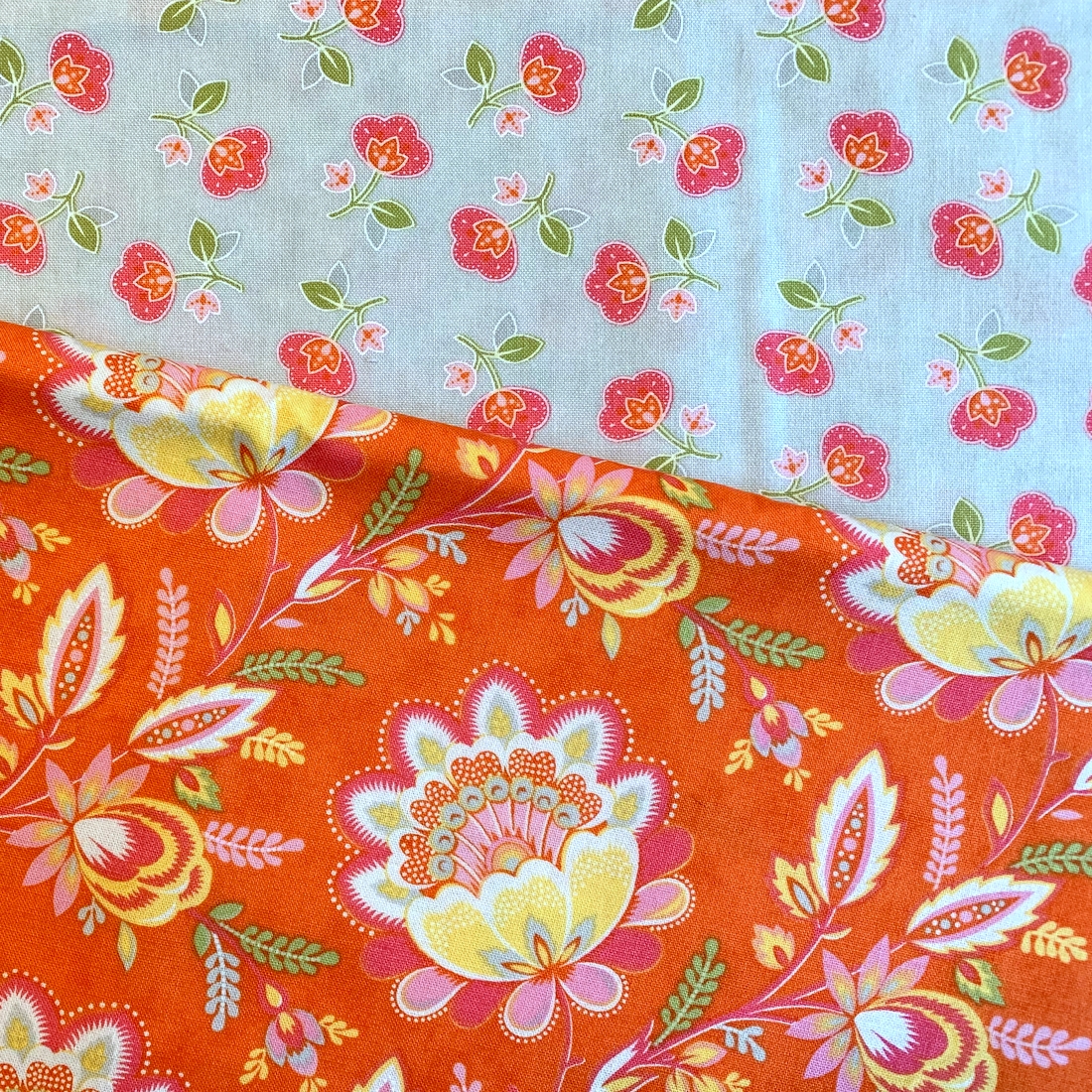
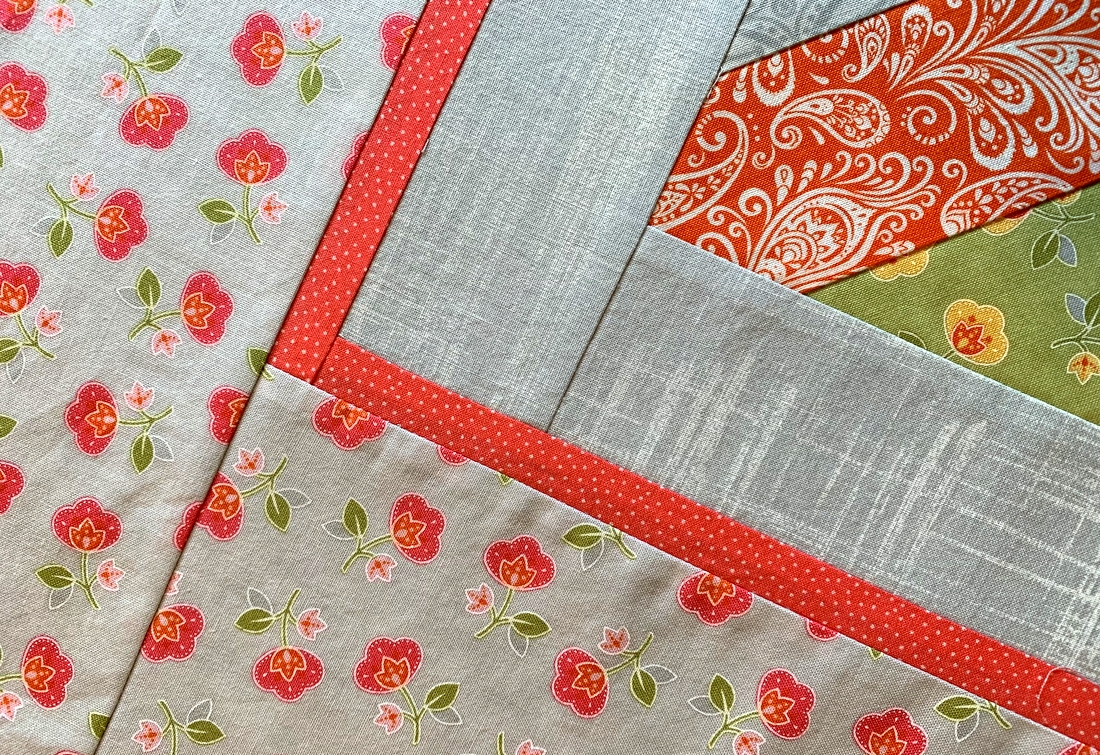
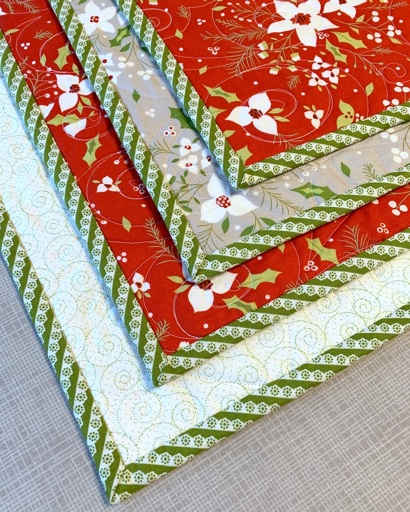
It’s also a good choice for quilts that will be gently used or not handled frequently. Think about quilts that come out for display at certain times of the year, usually for special holidays, such as the Fourth of July, Halloween, or Christmas. I used single-fold binding for the first time on my recent quilt ‘Tis the Season, which you can tell by the name is tied to the holiday season:

A pattern of green and yellow colors with white background

Are there any disadvantages to single-fold binding? Well, yes. It isn’t as durable, as there are fewer layers of fabric wrapping around the outer edges of the quilt. With double-fold binding, there are four layers of binding on the front of the quilt and two on the back. With single-fold binding, there are two layers of binding fabric on the front and two on the back. That may not seem terribly different but consider that there is only one layer of fabric going around the outside edge of a quilt with single-fold binding whereas with double-fold binding there are two layers.

Another possible disadvantage is that if you were to use light colored binding on a dark quilt or use dark batting, there’s a chance of shadowing on the outside edge of the quilt.

You have to think about how a quilt will be used before deciding on whether to use single-fold or double-fold binding. I would definitely put double-fold binding on a baby quilt, for example, as I would want that quilt to be loved, used, and dragged around by the recipient until it was completely worn out. I would also use double-fold binding on a bed quilt or lap quilt that was going to be laundered frequently. For almost any other quilt, I would consider single-fold binding.If you decide to try single-fold binding on one of your next quilts, I predict you will like it.

The first question you might ask is: what’s the formula for determining the width of binding strips? I consulted three reference books, each of which had a different formula! I think this one is the best:

finished width of binding x 4 + ¼”

— for ¼” finished binding: cut strips 1¼” (¼” x 4 + ¼”)

— for â…” finished binding, cut strips 1¾” (â…” x 4 + ¼”)

— for ½” finished binding: cut strips 2¼” (½” x 4 + ¼”)

Caveat: the loft of the batting can affect this formula so be sure to test on a quilt sandwich made from layered scraps and your batting before cutting binding strips.

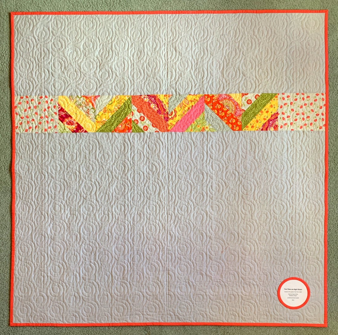
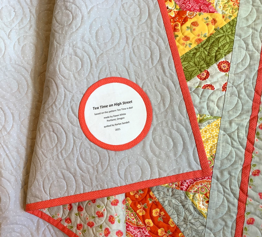
The procedure for applying single-fold binding is quite similar to double-fold but there are a few differences.I’m going to walk you through the steps using Tea Time on High Street as an example.

Having decided on ½”-wide binding, I tested on scraps. Much to my surprise, I found that cutting my strips 2″ wide instead of 2¼” and sewing a scant half-inch seam gave me the ½” finished width I wanted. (On a subsequent test using 1¼”-wide strips for a ¼” finished binding, my results were spot on.)

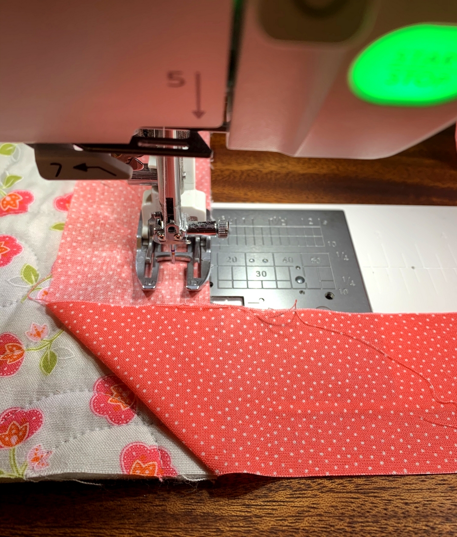
In the photo below, my 2″ wide binding strip is aligned with the raw edges of the quilt, right sides together. I’m using my open-toed walking foot, which feeds the layers evenly and allows me to see the needle going in and out of the fabric. I stop stitching about 3″ from the bottom edge of the quilt. . .

A pattern of green and yellow colors with white background. . . and fold the binding strip to the right at a 45Ëš angle, making sure the bottom edge of the binding strip is even with the bottom edge of the quilt before finger pressing the crease:

A pattern of green and yellow colors with white background

When I open up the binding strip I can see where I finger pressed it. Using a sharp #2 pencil or a removable marking pen, I make a small dot on my stitching line just above the pressed crease:

A pattern of green and yellow colors with white background

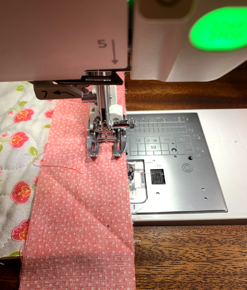
Then I sew down to that dot, knowing I can go absolutely no farther than the dot before backstitching a few stitches. I can even stop a half-stitch before the dot. I do that to make sure that when I start stitching down the second side, there’s no chance my sewing lines will intersect. If they cross each other by even one stitch, I won’t get a properly mitered corner.

Next I fold the binding strip straight up, just as you would for double-fold binding . . .

A pattern of green and yellow colors with white background
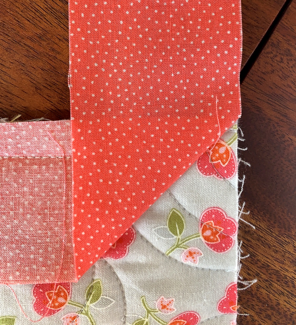
. . . and then straight down, also just as you would for double-fold:

A pattern of green and yellow colors with white background

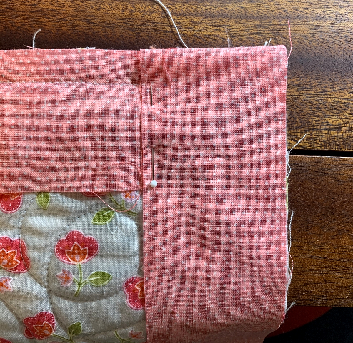
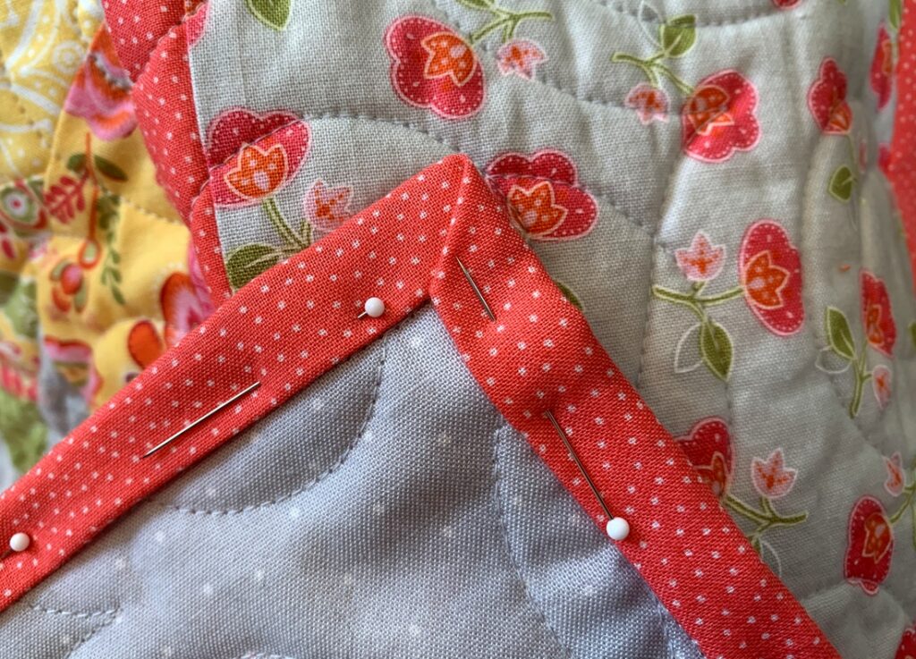
Did you notice that pin on the left edge of the binding where two layers of fabric must be perfectly aligned? I keep that pin in when I sew the next seam because it holds all of the layers in place to prevent shifting and it’s not in the way of any foot I might have on my sewing machine. (In fact, I leave that pin in until I am ready to form the miter and pin the binding in place.)

I work my way around the quilt, forming the other three miters, and finish the fourth side of the binding by sewing the beginning and ending tails together with an angled seam and finishing the seam between the two lines of stitching. (There are several ways to finish the tails of quilt binding so I’m not going into that here.)

From the right side of the quilt I press the seam toward the outer edges, avoiding the corners:

A pattern of green and yellow colors with white background

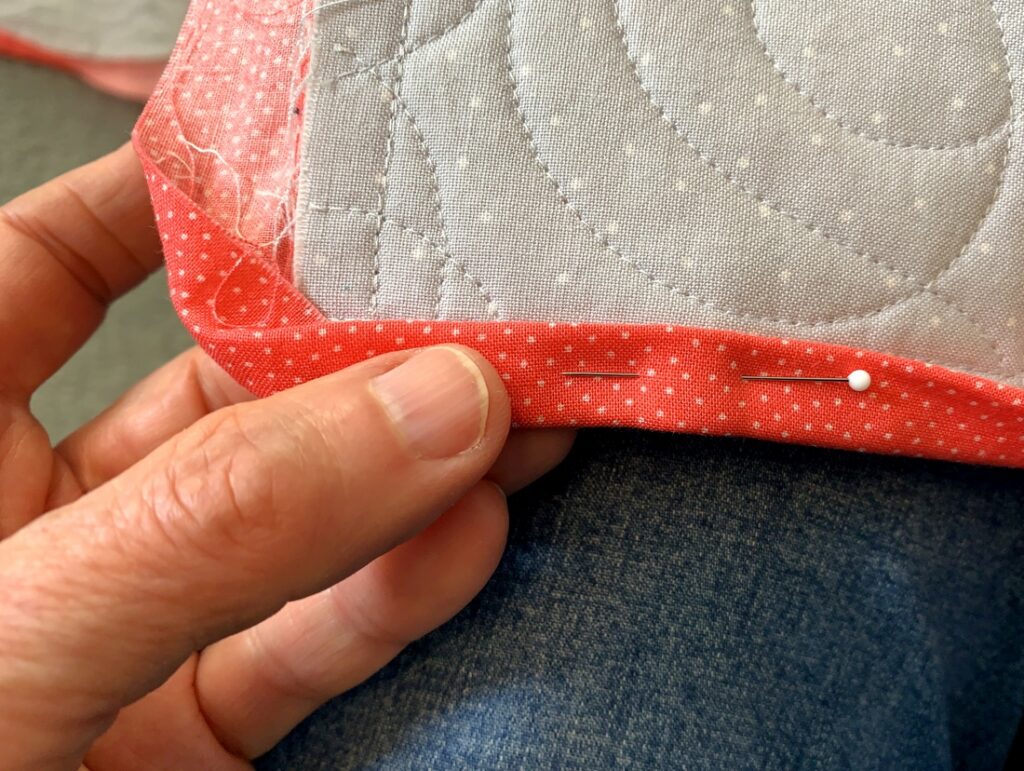
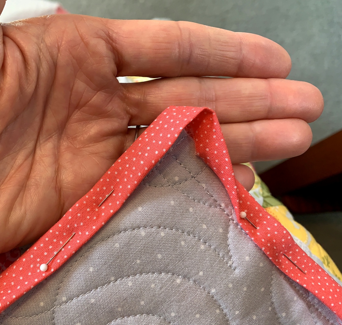
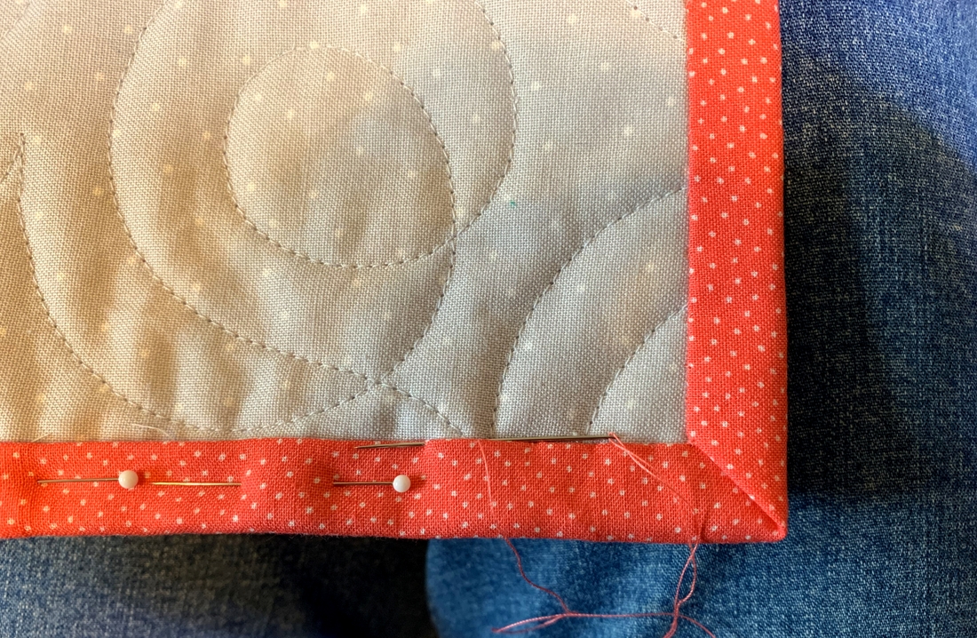
Starting about 2″ from a corner, I bring the raw edge of the binding up to the edges of the quilt, forming the first fold . . .

A pattern of green and yellow colors with white background

. . . and then fold it once again so that the folded edge covers the line of stitching. Then I put a pin in to hold the binding in place:

A pattern of green and yellow colors with white backgroundI rotate the quilt and do the same thing on the second side:

A pattern of green and yellow colors with white background
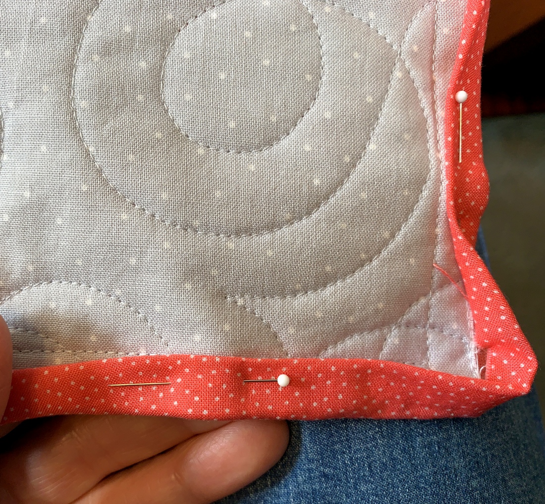
With the raw edge turned under, you can see how the corner is getting ready to be mitered:

A pattern of green and yellow colors with white background
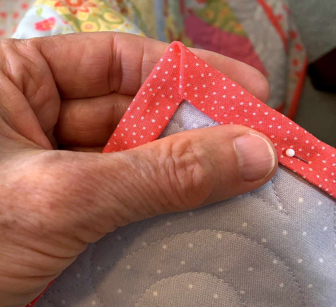
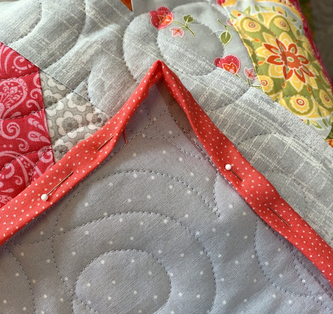
You can form the miter from either side. I usually try it both ways and pick the one that looks best:

A pattern of green and yellow colors with white background
On this corner I tried it both ways and neither side lined up just right. See how the right side overlaps the left side by a couple of stitches?

A pattern of green and yellow colors with white background

It was an easy fix, though. I just opened up the corner . . .

A pattern of green and yellow colors with white background

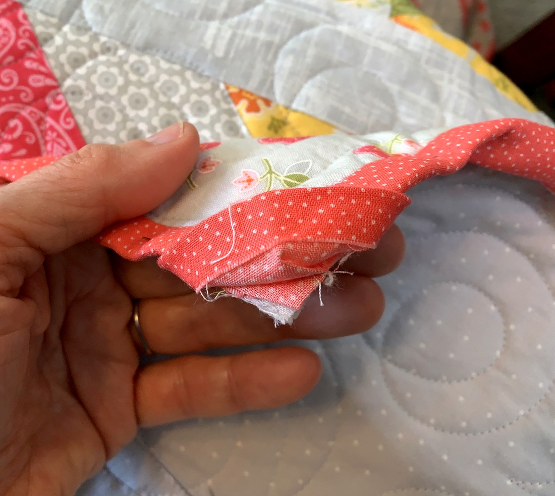
. . . and adjusted the fold a tiny bit. This time the miter came together perfectly:

A pattern of green and yellow colors with white background

And now I’m reading to tack the binding down:

A pattern of green and yellow colors with white backgroundSome people don’t enjoy this aspect of quiltmaking but I find it both relaxing and satisfying.

Please let me know if you have any questions about single-fold binding. And if you do give this method a try, I would love to hear about your experience.

I’m ending this post with a shoutout to my friend Pam Raby of lovedtopieces.com who first brought single-fold binding to my attention. As I told Pam after trying it out with ‘Tis the Season, “It’s a game changer!”


Posted in single-fold binding, update | 6 Comments

Oven Mitt Breakthrough


A pattern of green and yellow colors with white backgroundFor those of you wondering whatever happened to that oven mitt tutorial I promised a couple of months ago, I have an update for you. I actually started working on a tutorial back in January but got hung up working on instructions for applying the binding.

Each set of oven mitts I’ve made since making my own pattern in December has been nicely finished but applying the binding has been a process best described as “fiddly.” My goal has been to figure out a way to apply the binding for a neat finish that can be effectively illustrated in a picture-heavy tutorial and be easy enough for a confident beginner to follow.

To that end I’ve been experimenting with different widths and different ways of joining the ends. I’ve tinkered with single-fold and double-fold binding. The results have been acceptable. But ease of construction? Not so much. “There has to be a better way,” I kept thinking.

The other day I had a “what if?” moment. Yesterday I tried out my idea. I was on the right track but took one wrong turn. I tried again today — and it worked! The result is the set of oven mitts you see above.

Isn’t that fabric cute? It reminds me of a Valentine card I received as a kid that had peas on the outside. Inside was the message “Peas be my pod-ner.”

I have the perfect person in mind for these oven mitts. She’s Irish and loves the color green as much as I do. She reads my blog so I’m betting she’ll figure out these are for her. I’m planning to visit her next month but don’t want to wait that long to give them to her. If I get them in the mail tomorrow, she might get them by St. Patrick’s Day.


Posted in family, oven mitts, single-fold binding, tutorial, update | 7 Comments

It’s a Wrap: Tea Time on High Street


A pattern of green and yellow colors with white backgroundHere it is! Tea Time on High Street is officially finished — pieced, quilted, bound, and labeled. Today was an absolutely beautiful day in Portland, with the temperature almost reaching 60. I took some photos outside late this afternoon, hoping to capture the true colors in the quilt. It’s amazing how the colors shift depending on the time of day and the amount of light hitting the surfaces. The gray may look cooler in some photos as a result.

Here’s the back of the quilt (an indoor shot):

A pattern of green and yellow colors with white background

For the label I made an inset circle using the dotted fabric of the binding as my background and then enclosed it in a larger circle:

A pattern of green and yellow colors with white background

Did you notice that the ring around the label is the same width as the accent strip and binding? All part of the plan.

To sum up:

Tea Time on High Street measures 55″ square.

It’s based on the pattern Tea Time in Bali by Larene Smith but doesn’t follow it exactly.

The pattern calls for strip sets to be sewn into tubes, then cut into triangles that open up to form bias-edged squares.

I started with a Jelly Roll: 402½” strips of fabric from “High Street,” a line of fabrics designed by Lily Ashbury for Moda Fabrics.

Karlee Sandell of SewInspired2Day quilted it with an edge-to-edge design by Urban Elementz called “Soho.”

I’m really happy with the way this quilted turned out!


Posted in single-fold binding, update | 4 Comments

High Tea


Are you ready for more shots of my latest quilt, Tea Time on High Street, now that it’s back from the quilter? I can’t wait to show you!

A pattern of green and yellow colors with white backgroundAlthough initially unsure about this quilt as I was putting the blocks together (I really struggle making scrappy quilts), I have come to love it more every step along the way.

Take a look at the quilting motif:

A pattern of green and yellow colors with white background

Doesn’t it remind you of swirls of steam coming up from a hot cup of tea? That may be a bit of a stretch but it tickles me to think of it that way.

Here’s a look at the trimmed quilt, now measuring 55″ square:

A pattern of green and yellow colors with white background

I appreciate how the loops and swirls soften the straight lines in the quilt. It was quilted by Karlee of SewInspired2Day with an edge-to-edge design called “Soho.” I asked Karlee to use a pale grey thread so the quilting would blend into the background. The scale seems just right to me, adding texture without being too busy.

For the backing I sandwiched a row of leftover blocks between a pale grey polkadotted fabric from my stash. The grey fabric reads as a solid and really allows the quilting motif to stand out without being overpowering:

A pattern of green and yellow colors with white background

Confession: I had to stifle the impulse to head to the fabric store for some yellow fabric, which would have been my first choice for the backing. I could have used several smaller pieces of yellow from my stash but the front is so scrappy I wanted the back to be calm.

Here’s a close-up:

A pattern of green and yellow colors with white background
Now it’s on to the binding and label. If you’ve been following my progress on this quilt, you know I’m going to bind it in the same bright coral dotted fabric I used as a narrow border:

A pattern of green and yellow colors with white background
I think it will frame the quilt nicely. Even though there’s a lot of grey in this quilt, it still has a happy feel. And wouldn’t you feel happy if you were sipping tea at a stylish tea shop on High Street in London?


Posted in update | 12 Comments

Tea Time on High Street: Quilting in Progress


Here’s a sneak peek at the quilting on my latest quilt, Tea Time on High Street. After seeing a photo of a quilt Karlee at SewInspired2Day quilted with the motif “Soho” by Urban Elementz, I asked her to use it on my quilt, with what I think are spectacular results:

A pattern of green and yellow colors with white background

Karlee posted this shot on her Instagram account this afternoonand I nearly swooned! The lines on my quilt are so angular that I wanted something with loops, and this pattern is just what I was looking for: modern and a little edgy, with the added bonus of being a design with uniform spacing that would tame the bias edges on all those blocks.

My quilt will be ready to pick up tomorrow. I can hardly wait to see it! You can be sure I will be posting more photos as soon as the quilt is back in my possession. I’m thinking it needs to be bound in the same tiny dotted print I used in that half-inch contrast border. Yes?


Posted in update | 4 Comments

Tea Time on High Street


And just like that, I have a finished quilt top:

A pattern of green and yellow colors with white background

I am loving it with the addition of the borders! I started with a half-inch strip of a print from my stash that is not part of the “High Street” line and then added a six-inch strip from the line that was not intended for the border at all.

Let me explain.

After starting this quilt with a Jelly Roll — 40 2½” strips of the entire “High Street” line of fabric — it occurred to me I might want to add borders. Having no yardage on hand, I did a search of the Internet and came up with one of the large florals that I thought would be perfect. I also found a small-ish floral print on a grey background that I thought would work nicely on the back. (I felt really lucky to find any yardage at all because “High Street” was very popular when it came out several years ago; there’s not much for sale anywhere now.)

Here’s a close-up of the two pieces I found:

A pattern of green and yellow colors with white background

Mercy! Given how busy the interior of the quilt turned out to be, can you imagine what it would look like surrounded by that large tangerine floral? Let’s not even go there!

When I auditioned the grey floral, I was amazed to see that it actually calmed down the busy-ness of the interior. At least that’s how it seems to me. Do you agree?

Here’s a close-up of the half-inch accent strip:

A pattern of green and yellow colors with white background

It reads as a solid from a distance but up close you can see it adds a subtle touch of texture against the striations in the grey containment border and the blossoms in the outer border.

The quilt top, now measuring 56½” square, is based on the free pattern Tea Time in Bali by Larene Smith. Initially I was toying with the idea of naming my quilt Ice Cream Social because the fabrics remind me of rainbow sherbet and fruit sorbets. They still do but the name doesn’t seem to fit anymore with my revised layout. What do you think of Tea Time on High Street?


Posted in update | 9 Comments

Quick and Easy? Think Again!


Let me start this post by telling you this is not the final layout of my current work-in-progress:

A pattern of green and yellow colors with white background

What was supposed to be a quick and easy quilt top has taken me the better part of two weeks — mainly spent in moving blocks around on my design wall. Making the strip sets and cutting them into blocks was indeed quick and easy — and really fun, as this line of fabrics (“High Street” by Lily Ashbury) was quite delightful to work with.

Instead of arranging my blocks like the original design, Larene Smith’s Tea Time in Bali, seen here . . .

A pattern of green and yellow colors with white background

. . . I opted for a “streak of lightning” setting, the one you see at the top of this post. After playing around for quite a while with the arrangement, I called in the Dear Husband for a second opinion.

“Well,” he said after a long pause, “it looks very modern.”

“Hmmm, yes. But it looks so . . . busy,” I said. “I’m just hoping the yellow and light grey strips give the eye a place to rest.”

“They don’t,” he replied. “There’s no place in this quilt for the eye to rest.”

He was right, of course. At that moment I knew I had to come up with another plan, one that would include some negative space. The first thing I tried was breaking the blocks into columns:

A pattern of green and yellow colors with white background

That seemed like a step in the right direction, giving me chevrons rather than streaks of lightning.When I rotated the photo I liked the effect even better:

A pattern of green and yellow colors with white background

But I wasn’t there quite yet. Chatting on the phone with my sister Diane about my setting troubles, she asked me to text her photos and after seeing the one directly above she suggested breaking the blocks up even more. That got me to this point:

A pattern of green and yellow colors with white background

I liked where this was going. My blocks were now more like the ones in the pattern layout, with each set of four blocks looking like an X or an O. But those dark purple prints were bothering me. I removed them and added strips from some of the blocks I didn’t use:

A pattern of green and yellow colors with white background

Ah, now that’s more like it!

Now on to the sashing. It was easy to envision white sashing just by looking at the blocks up on my design wall but I was leaning toward light grey, thinking it would add to the modern vibe I was going for. Into my stash I dove, coming up with some strips already cut that were originally planned for another project:

A pattern of green and yellow colors with white background

The fabric, “Painter’s Canvas” by Laura Gunn for Michael Miller Fabrics, actually looks rather silvery, with random striations going in both directions.

Right now this quilt measures 45″ square. I could declare it a done deal and get it ready to be quilted but there are a couple more things I want to try. . .

I hope you’ll check back to see the outcome.


Posted in family, update | 5 Comments

JBB Accessories


A year ago at this time I had just finished teaching a class at Montavilla Sewing Center on the one and only Junior Billie Bag, which I like to call “the quintessential quilter’s tote.” I wanted to test my idea for a new Junior Billie Bag Accessories class and had offered my students a bonus class on making four accessories to go along with their newly finished totes.

My idea was to have the students do advance work on all four projects and then finish them up in the space of a four-hour class. Good thing the class was a freebie, as it turned out I had vastly underestimated the time it would take to complete each project. Fortunately, by the time class ended the students were well on their way and would be able to complete their projects at home.

I was making accessories along with my students in order to demonstrate some of my tips and techniques so I too went home with unfinished projects. One year later, my accessories are finally finished:

A pattern of green and yellow colors with white backgroundAt the top is a 4″ x 4″ x 4″ fabric box, which makes a wonderful threadcatcher. On the bottom left is a tool caddy based on the Travel Case pattern by Pearl Pereira of P3 Designs. In the middle is a little scissors case, and on the right is a rotary cutter coat.

I selected the fabrics you see above because they go so well with a Junior Billie Bag I made a couple of years ago for my dear friend Vickie R.:

A pattern of green and yellow colors with white background
Naturally these latest accessories were made with Vickie in mind, and I am happy to say they are now in her possession.

Here’s a look at the inside of Vickie’s tool caddy:

A pattern of green and yellow colors with white background
I made some modifications to the original pattern, adding a fourth pocket and making the case a little less wide (I’ll explain why in just a bit). The 6″ x 8″ mini cutting mat made by Olfa fits perfectly inside the case. Vickie will choose which of her tools she wants to put in her case; I put some of my own in just for this photo shoot:

A pattern of green and yellow colors with white backgroundAs you can see, it holds a lot! Mine is loaded with even more.

The reason I made the travel caddy a bit narrower than the pattern calls for is to make it fit better in this hard plastic brochure holder:

A pattern of green and yellow colors with white background

With the flap turned back, all of Vickie’s favorite tools will be right at her fingertips and easy to see. (A huge “thank you” to my guildmate Becky B. for introducing me to the brochure holder.)

That class in February 2020 was one of the last ones I taught before the coronavirus pandemic brought a screeching halt to in-person classes. I miss teaching so much and will savor the day when classes resume. There’s a list of quilters who want to make their own Junior Billie Bag, and I trust some of them will want their own suite of accessories to go with it. If so, I will be ready for them!


Posted in Billie Bag, Junior Billie Bag, rotary cutter case, tote bags, tutorial, update | 8 Comments

A Happy Surprise


A few weeks ago I came across this vintage needle case that had been tucked away for years in a project bag in my sewing room closet:

A pattern of green and yellow colors with white backgroundFinding it was a happy surprise because I had completely forgotten about it. I’m pretty sure it was an estate sale find, maybe dating back to the 1990s.

I don’t know if the needle case is knitted or crocheted (maybe both?) but I can tell it was skillfully crafted. It’s about 4¾” wide and 4¾” long, not counting the loop. You can see how beautifully made it is. Take a peek inside:

A pattern of green and yellow colors with white backgroundThe fabric on the back is a very finely woven cotton, perhaps a sateen, in a geometric print:

A pattern of green and yellow colors with white backgroundBoy, would I love to have a piece of that in my stash.

At first glance my needle case may look like a strawberry but you know what I saw when I came across it? A heart! That’s why I decided to wait till Valentine’s Day to write a post about it.

And now Valentine’s Day is almost upon us. We’re snowed in, as it happens. Not to worry. Knowing that snowfall was expected this week, I made my weekly grocery run earlier than usual and laid in a small supply of champagne and chocolate caramels which I will happily share with the DH:

A pattern of green and yellow colors with white backgroundI’m ready!


Posted in family, update | 7 Comments

A Couple of “Aha” Moments


After sewing the second of eight strip sets for my current Work-in-Progress, I had a small “aha!” moment (although maybe it should be called a “duh!” moment). You’ll remember from my last post that I’m working with a Jelly Roll, in this case 40 2½”-wide strips of fabric from Lily Ashbury’s “High Street” line . . .

A pattern of green and yellow colors with white background

. . . to make a quilt called Tea Time. The pattern by Larene Smith describes a clever way of sewing strip sets into tubes and cutting the tubes into triangles which open up to yield squares. The squares are then joined together to make a scrappy quilt.

Each strip set is made with five fabrics. Because of the manner in which the triangles are cut after being sewn into a tube, the blocks come out in one of two ways. The first way is a block containing (predictably) five strips, with the middle strip running through the center of the block, like this one . . .

A pattern of green and yellow colors with white backgroundI’m calling the ones cut this way the A blocks.

The B blocks contain six strips, because the middle strip gets cut in half and each half ends up on the outer edges of the block. There’s a seam bisecting the block, like this one:

A pattern of green and yellow colors with white backgroundInitially I had been quite spontaneous in choosing my strip sets, just wanting to make sure each set had a pink, yellow, orange, green, and grey strip. I assumed that the strip in the number 3 position would be in the middle of the block. It is — but as you can see from the photos above, that applies to only half the blocks. It didn’t dawn on me right away that the fabrics in the 1 and 5 positions would wind up in the middle of the block in the other half. Hello!

Armed with this new knowledge, I took a second look at my arrangement of remaining strip sets — in particular the fabrics in the 1 and 5 positions — and wound up rearranging them. Several times. So much for spontaneity!

Here are my final fabric combinations:

A pattern of green and yellow colors with white background(These strips were cut from the end of the tubes after the triangles were cut and I had opened up the last seam.)

This is such a delicious combination of fabrics. You know what comes to mind when I look at these colors? Rainbow sherbet. Blackberry sorbet. Green tea ice cream. That led to my second “aha” moment: I’m going to name this quilt Ice Cream Social.


Posted in update | 5 Comments