September Song


Can you picture Frank Sinatra crooning the lyrics to September Song?

“Oh it’s a long long while from May to December . . .”

[never truer than in the time of COVID!]

“But the days grow short when you reach September. . .”

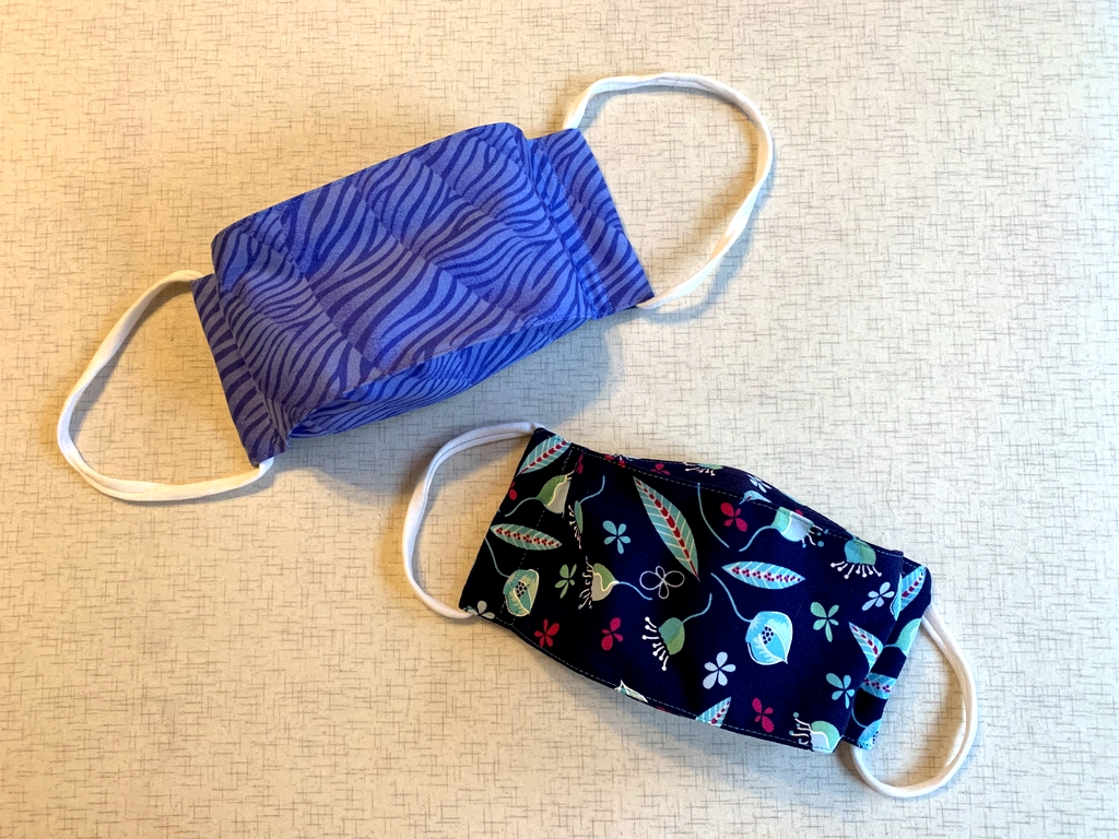
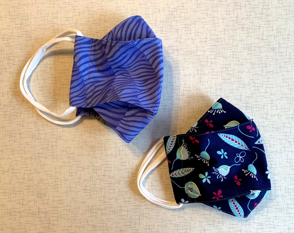
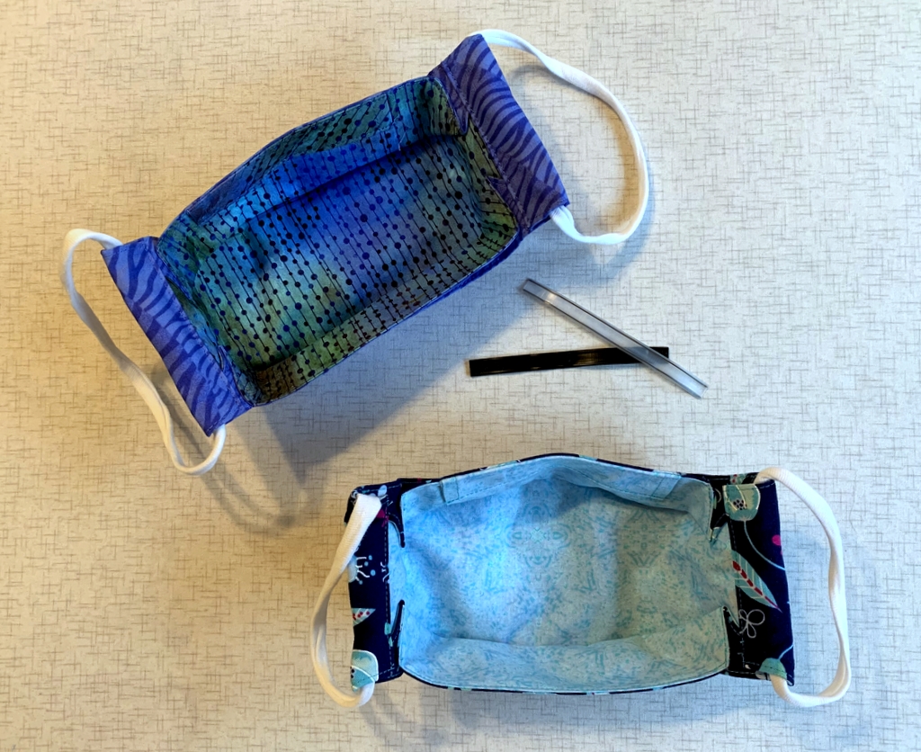
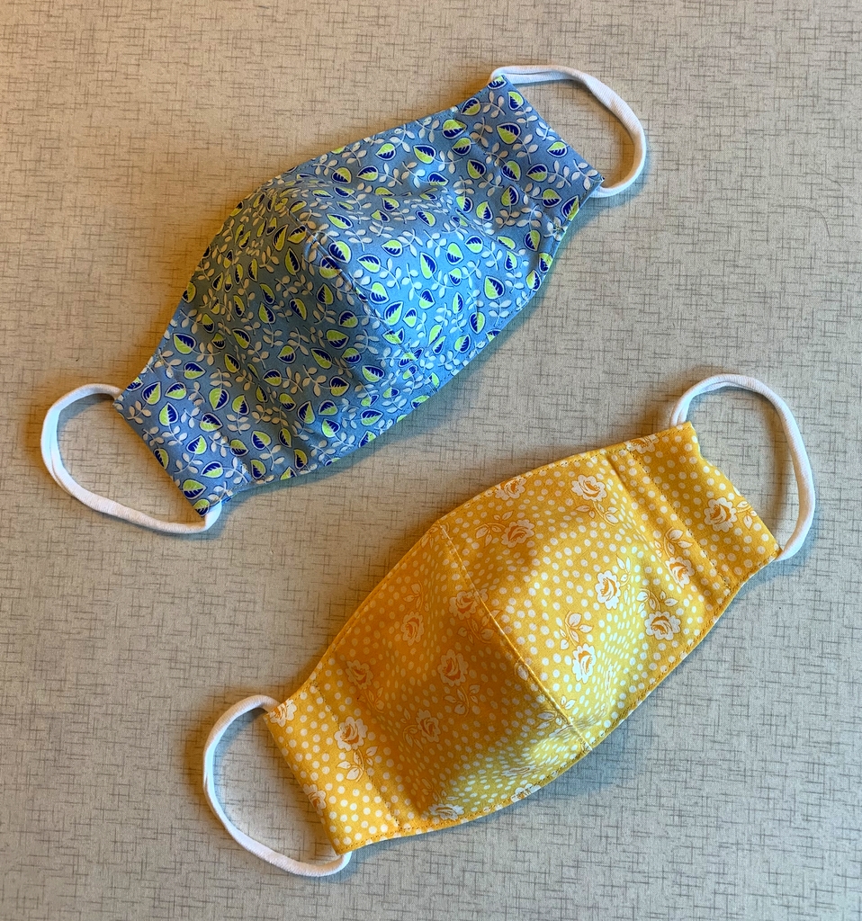
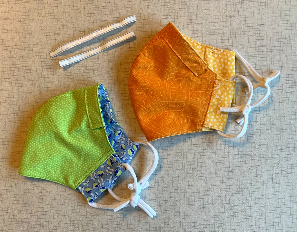
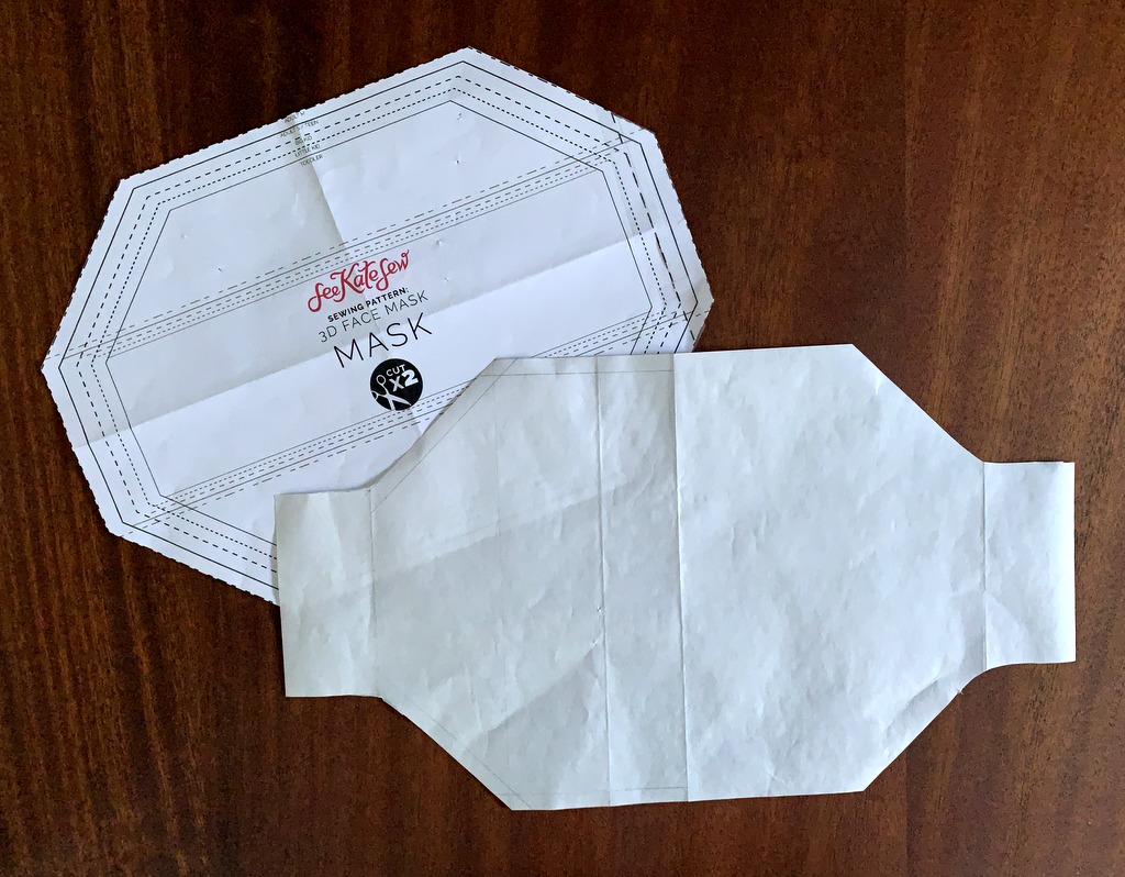
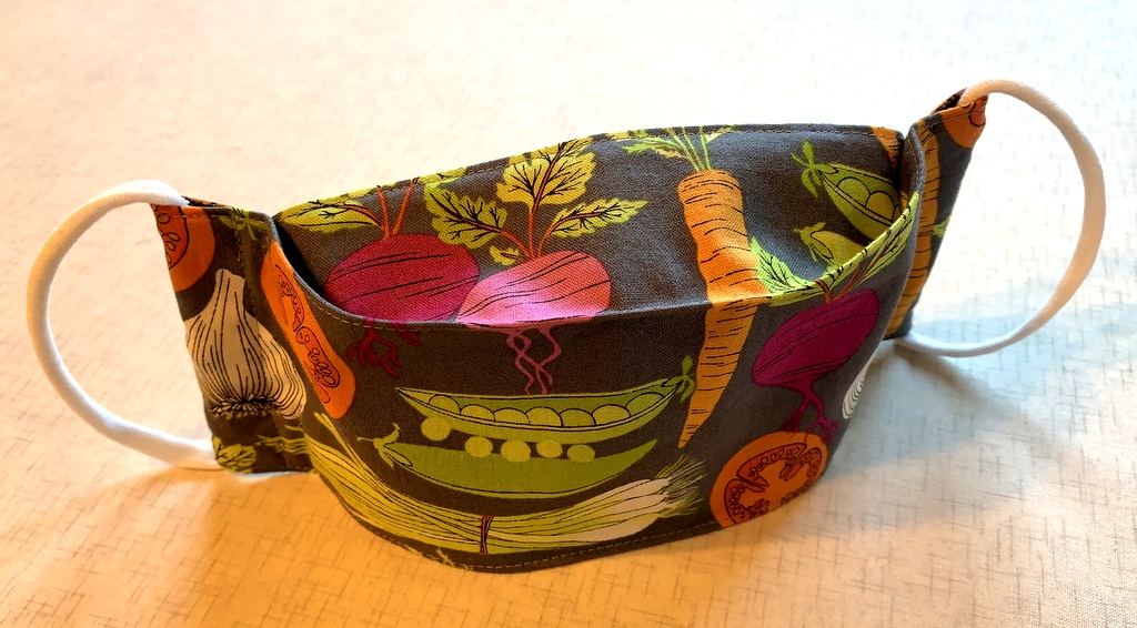
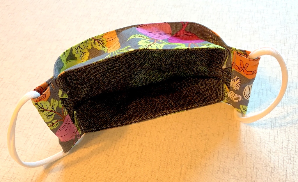
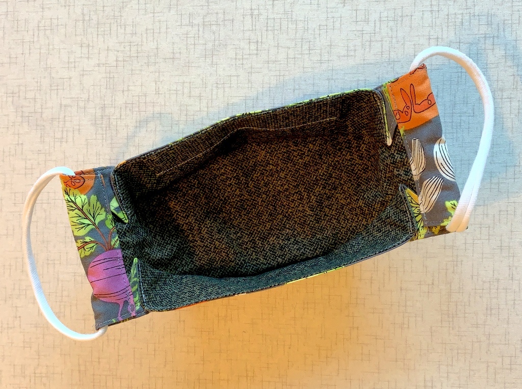
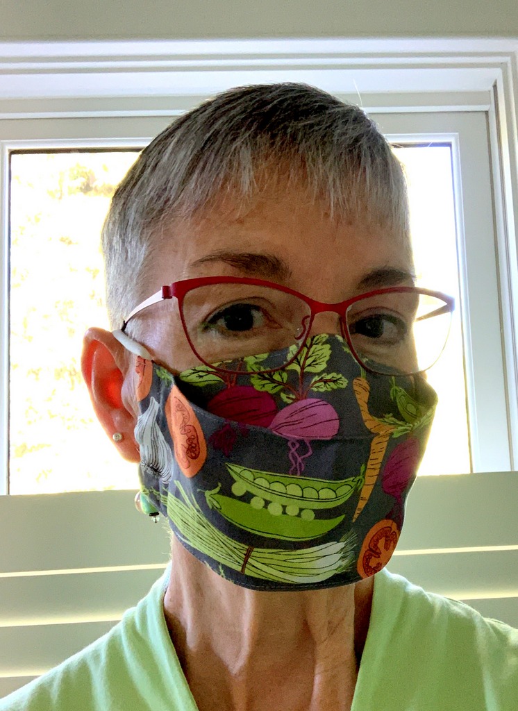
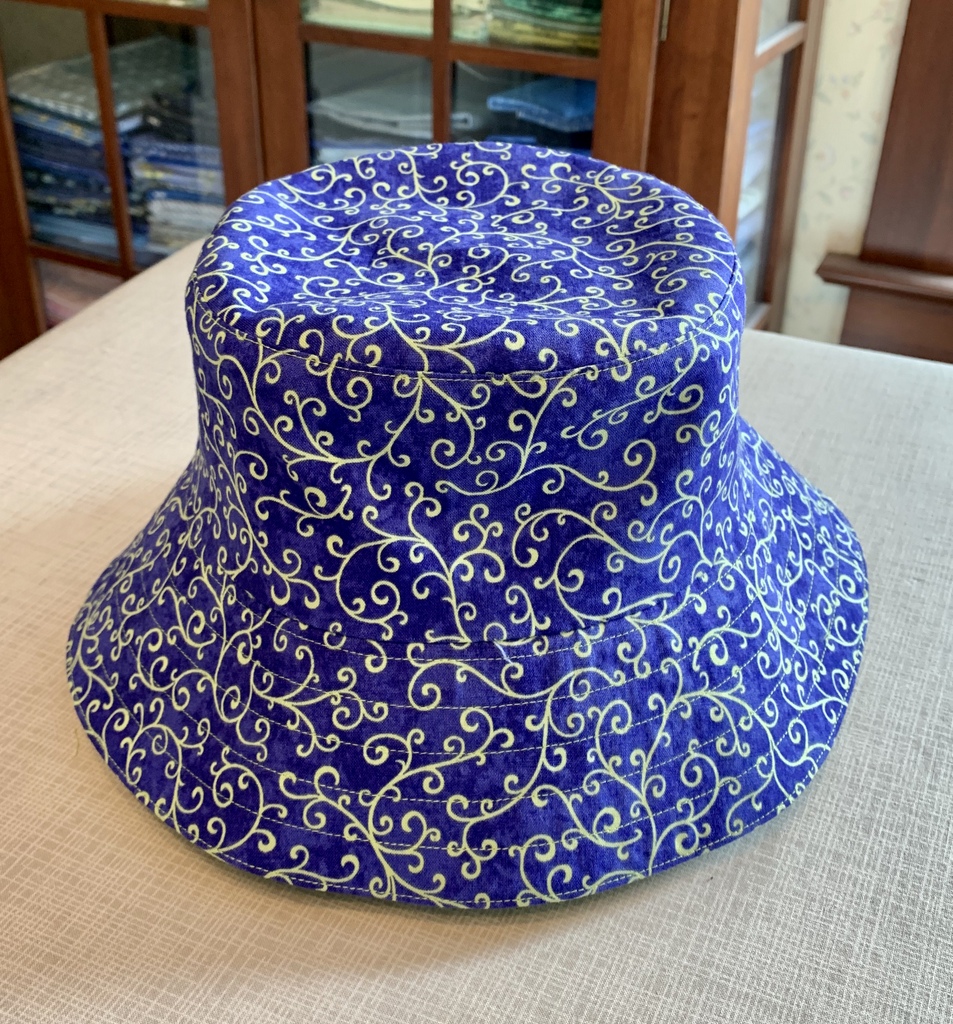
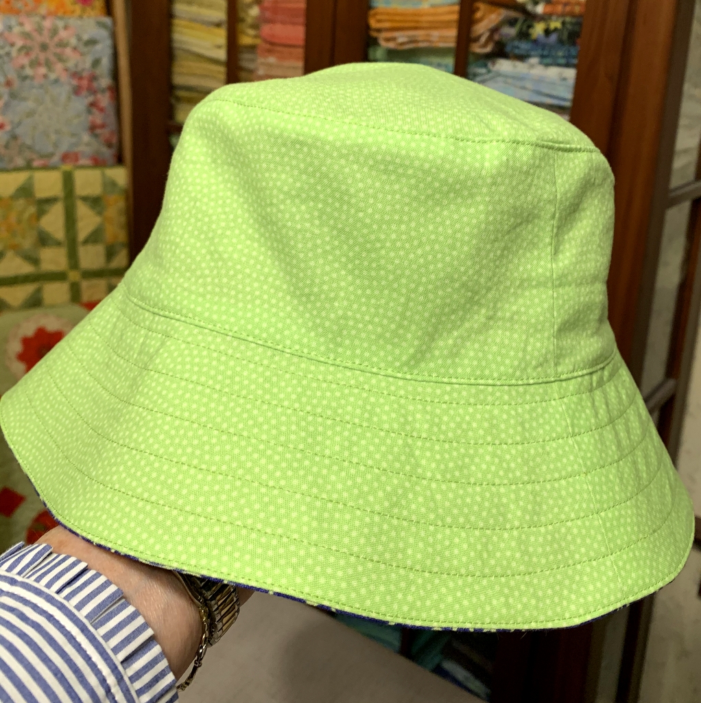
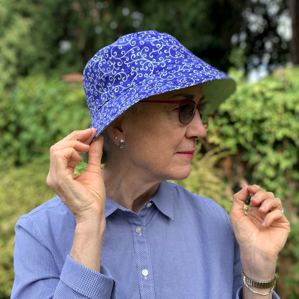
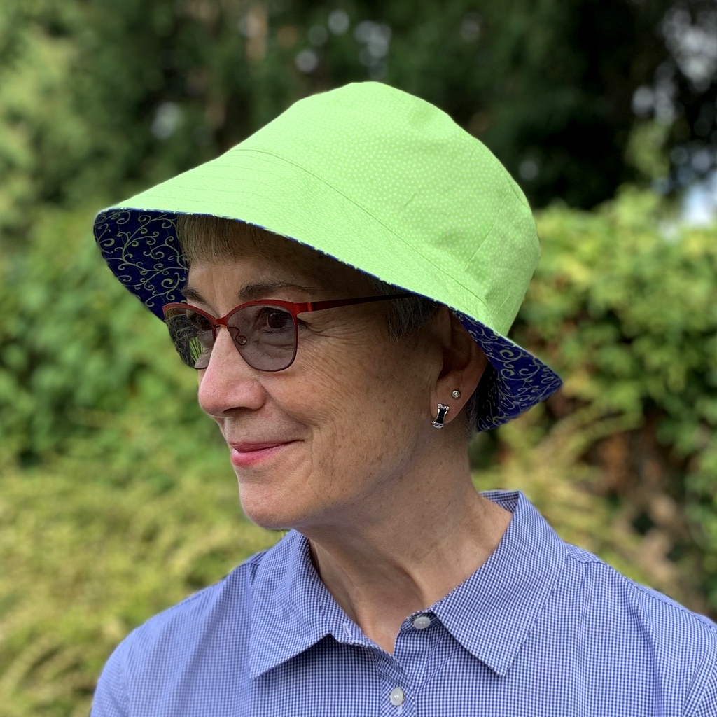
We’ve actually reached the end of September. And until today I hadn’t worked on a single quilt the entire month. Can you believe that? Oh, I did some sewing in September: a few face masks, a pair of pillowcases, a bucket hat. I also worked on a fun home decorating project over the weekend that I’ll tell you about in a bit.

But a quilt? Not until today, when I pulled out this throw-sized quilt top I pieced a dozen years ago:

A pattern of green and yellow colors with white background
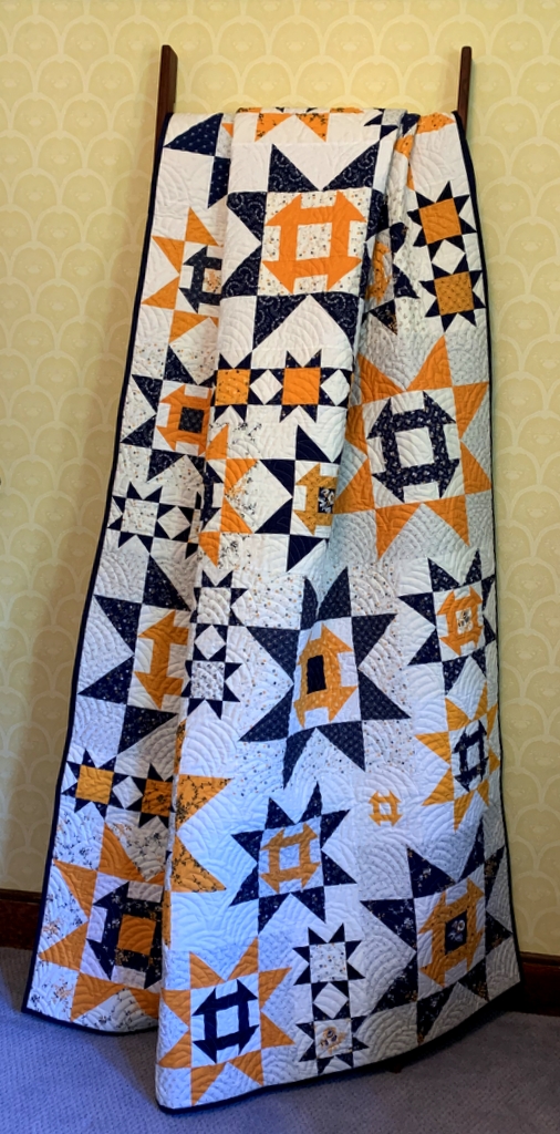
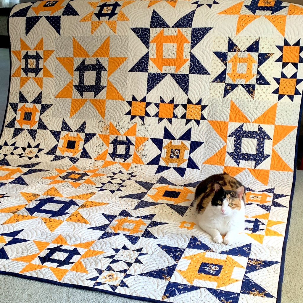
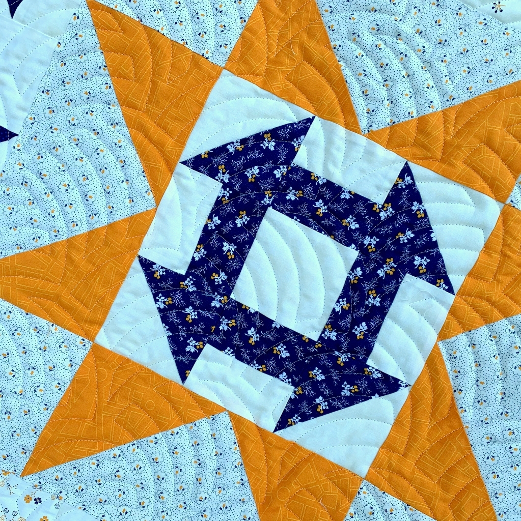
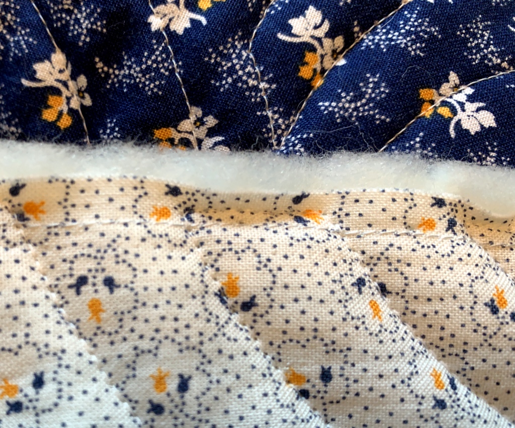
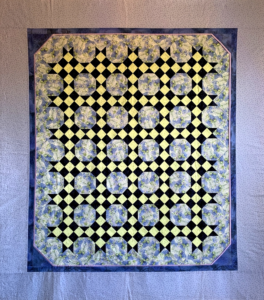
This little quilt came into being because I had a stack of 9-patch blocks left over from another project. (That’s a lot of leftover blocks, right? A confession: I had pressed the seams in the wrong direction while strip-sewing.) I combined the 9-patches with some snowball blocks, set them all on point, and created this 52″ x 58″ throw.

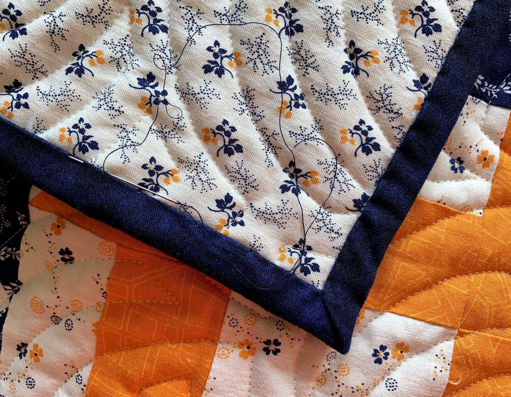
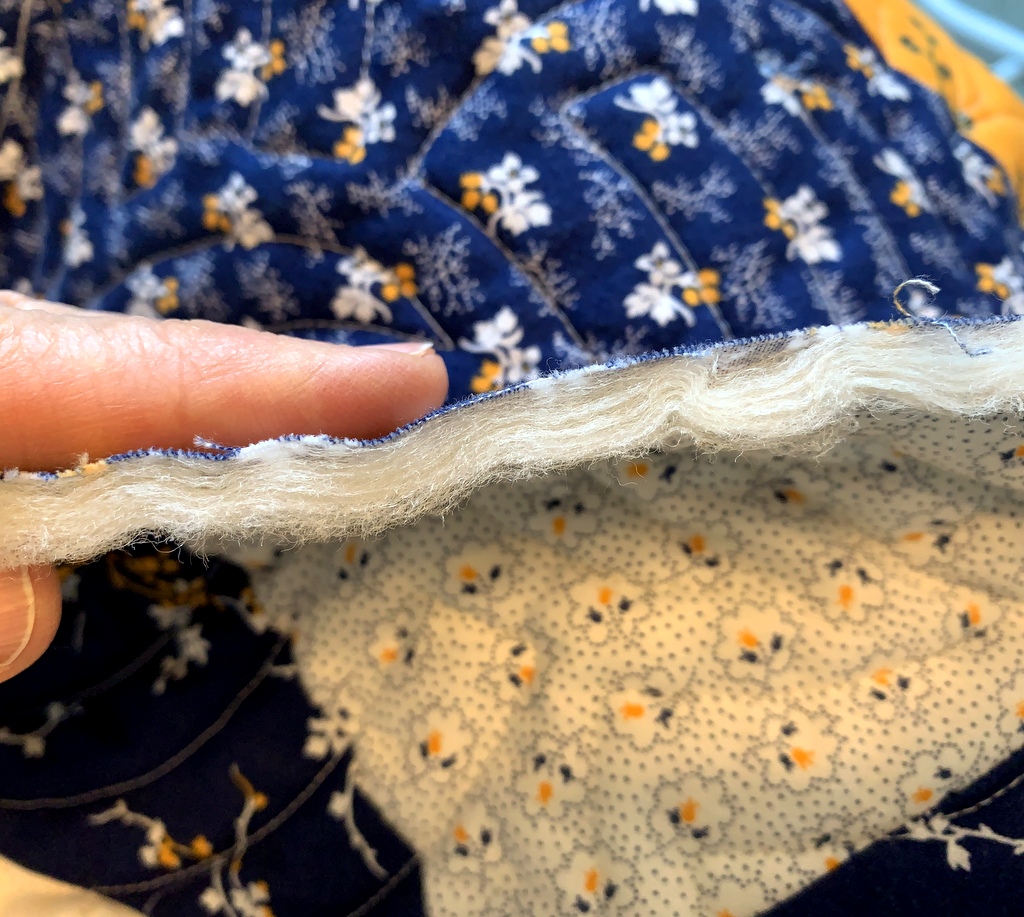
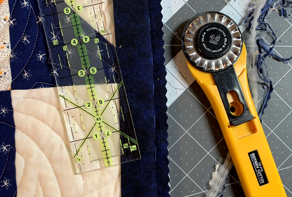
This project was ready to quilt back in 2008. I had pin-basted it to the batting and backing and had actually sewn a single line of stitching. One line! I have no memory of why I didn’t continue but I have no desire to finish quilting it myself now. My “quiltmaking” today consisted of removing all the basting pins and getting the layers ready to deliver to a longarm quilter.

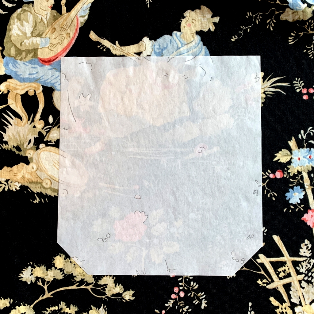
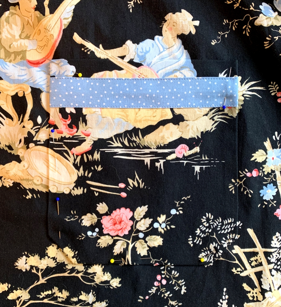
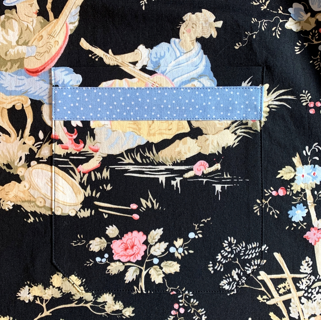
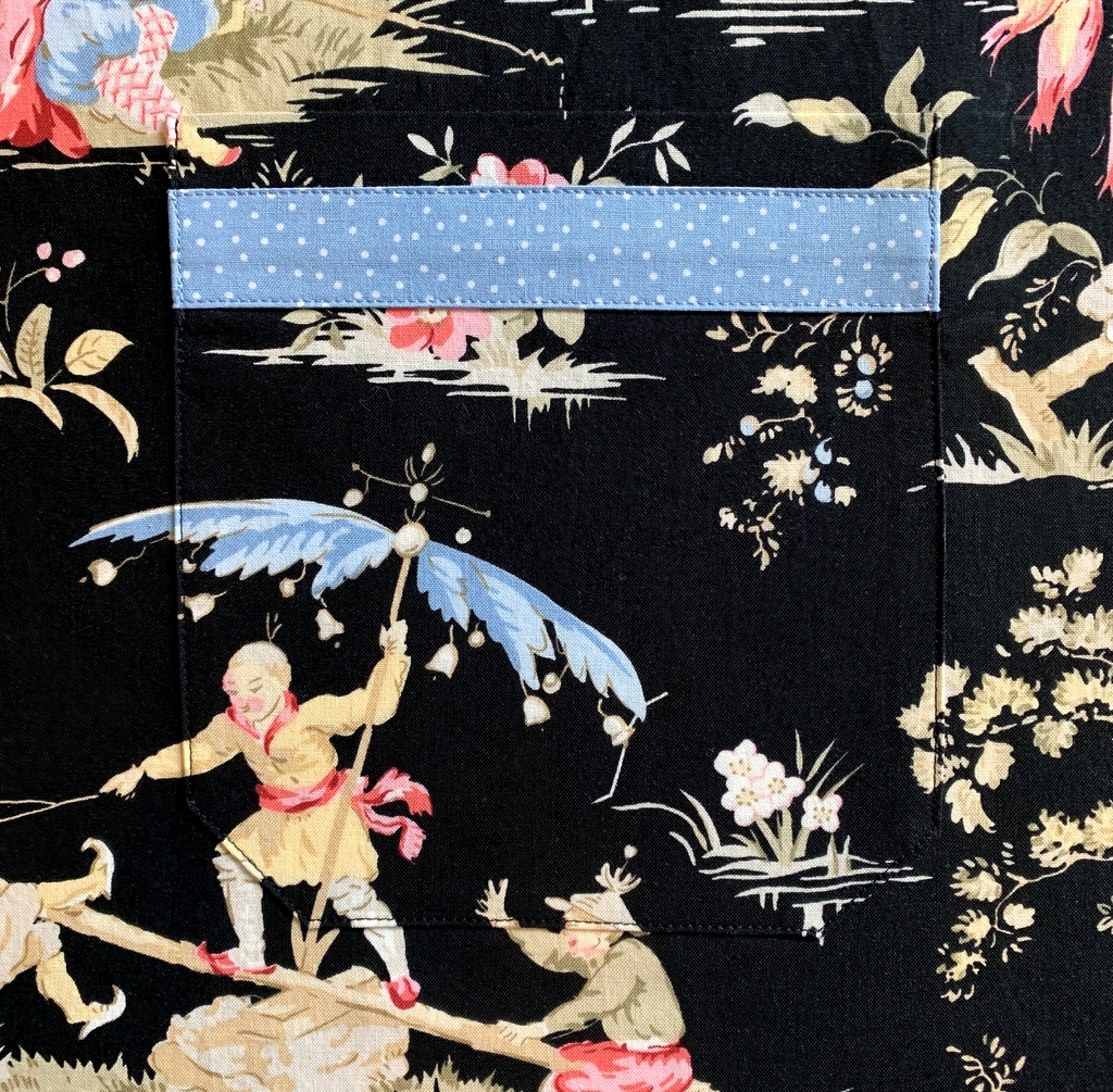
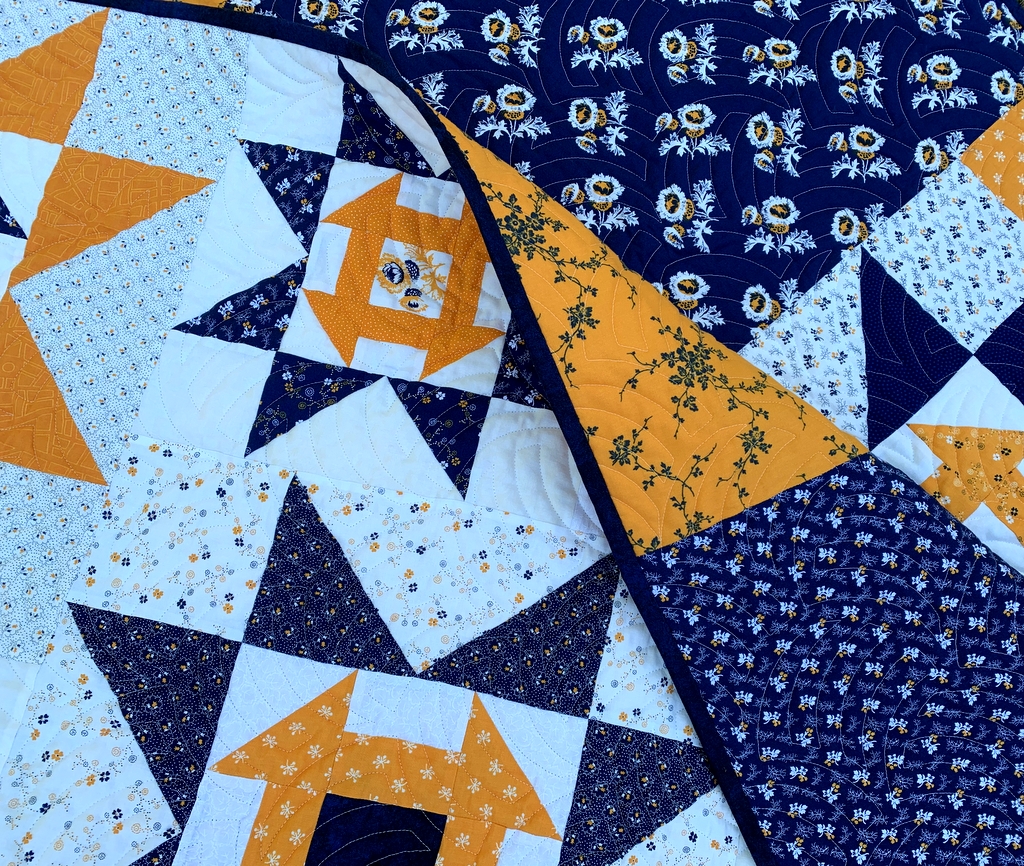
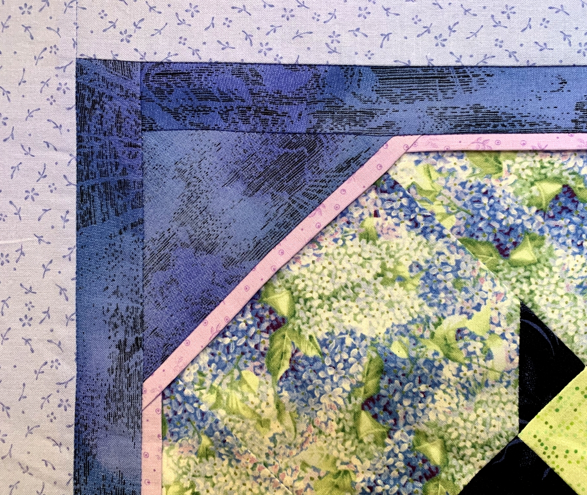
My plan was to have it quilted with a simple edge-to-edge design. Then I realized that because I added a flange to the interior, the quilt will probably need to be custom quilted. Here’s a close-up of the flange:

A pattern of green and yellow colors with white background

Some of the fabrics are ones I would probably not buy now but I like the top well enough to want to finish it.

Now about that home dec project:

My husband and I took our first trip since the pandemic arrived on our shores, driving from Portland to Bend last Thursday to spend a delightful long weekend with my stepmother Shirley. While there I made two tailored bedskirts for her extra-long twin beds. Shirley recently bought new bedspreads with a nautical theme featuring navy and aqua images on a white background. We decided on a solid navy fabric for the bedskirts.

Here’s a look at the pattern I made on graph paper along with the fabric, a navy blender (almost a solid) called “Shadowplay” by Maywood that I like so much I buy it by the bolt:

A pattern of green and yellow colors with white background
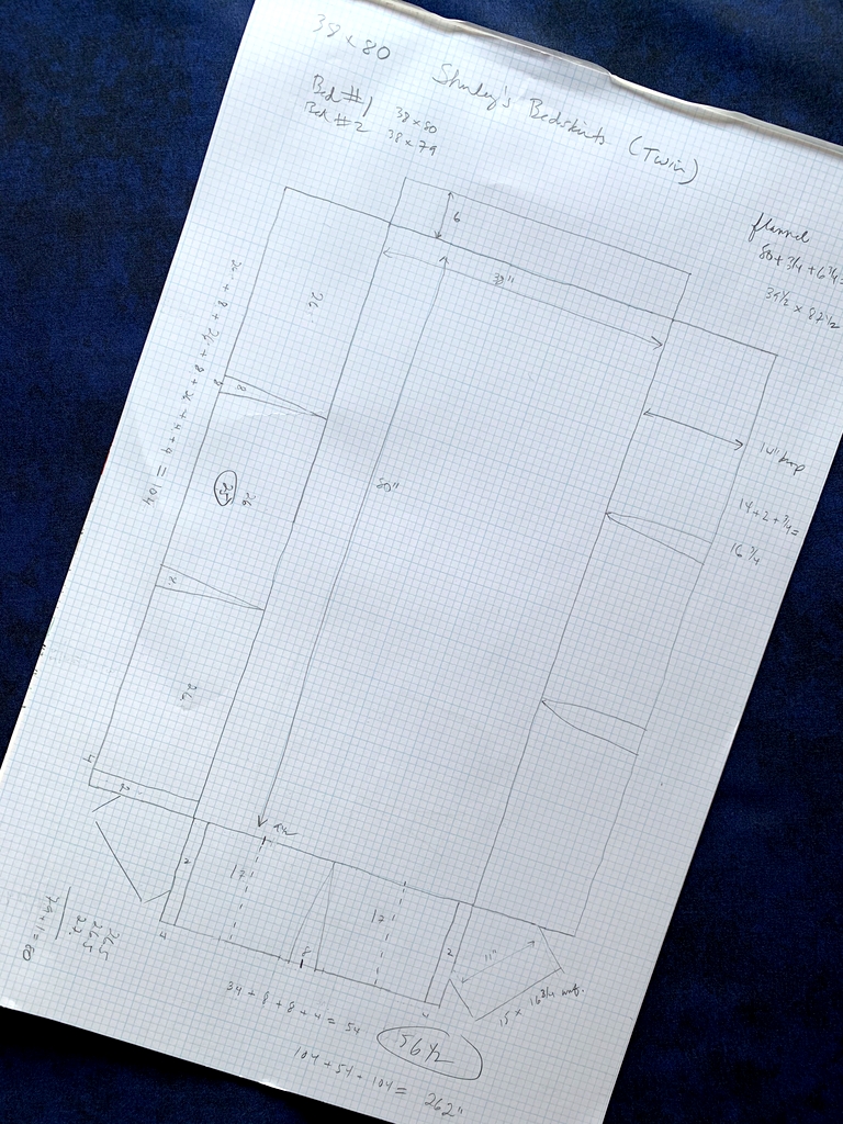
You may be able to tell from my pattern that the bedskirts have one inverted pleat along the end and two on each side. Because of the dark fabric and the lighting in Shirley’s bedroom I wasn’t able to get good pictures of the completed bedskirts but they did turn out beautifully. You’ll just have to take my word for it!


Posted in bedskirt, family, home dec, snowball blocks, update | 5 Comments

Toile Pillowcases, Take 3


This is the third and final pair of queen-size pillowcases made from a lovely toile fabric from Timeless Treasures that’s been in my stash for a few years:

A pattern of green and yellow colors with white background

The first two pair were made last year, the first pair as a gift and the second for my own home.I made these pillowcases last week as a hostess gift, planning to deliver them to my twin sister Diane when the Dear Husband and I make our annual Thanksgiving trip to Georgia in November. (Of course we will be taking every precaution while traveling during the coronavirus pandemic.)

I made the mistake of telling Diane about the pillowcases and she cajoled me into sending them in advance. I’m glad I did because she promptly put them on the pillows in the main floor guest room and sent me pictures. Here’s a close-up of the cases:

A pattern of green and yellow colors with white background
There’s something special about toile. I was really sorry to use up the last of that fabric. I actually searched for more on the Internet but came up empty-handed.

A pattern of green and yellow colors with white background

I did not make the accent pillow on the bed; Diane had it made at a specialty shop using fabric left over from the bedskirt. But I do spy four things in the photo above that are “me made”: the pillowcases, the quilt at the foot of the bed, the bedskirt, and — hard to see but look at the reflection in the mirror in the bathroom for a glimpse — the shower curtain, made in 2011 and embellished in 2012. You can read about that here. (There’s one more thing I made that you can’t see in the photo: tailored valances. I wrote about that project in this post, also from 2012. By the way, the pillowcases were made using my photo-laden Perfect Pillowcases tutorial.)

The DH and I will be sleeping on these pillowcases soon! This year’s trip is a very special one as Diane and I will be celebrating an important birthday, one of those big ones ending in a zero. Here’s a hint: we will become septuagenarians.


Posted in 4-Patch Wonder, bedskirt, family, faux-kaleido quilts, home dec, roll-it-up pillowcases, shower curtain, update, valance | 3 Comments

A Bee in My Bucket Hat


Hmm. Doesn’t have quite the same ring as “a bee in my bonnet,” does it? But I already have a blog post titled “A Bee in My Bonnet” so the one above will have to do.

Why a bucket hat? Well, after happening upon images on Instagram of the Sorrento Bucket Hat by Elbe Textiles I was inspired to give it a try. The pattern is available as a digital download for a mere two dollars. Lauren, the owner of Elbe Textiles, donates all proceeds from the sale of the pattern to a different cause every month. What a lovely thing to do.

Here’s a picture of my newly completed hat:

A pattern of green and yellow colors with white backgroundThe multiple stitching lines around the brim are optional. I really like the effect of the contrasting thread. I chose a swirly dotted print in spring green for the lining:

A pattern of green and yellow colors with white backgroundOh, did I mention the hat is reversible? Two for the price of one!

It’s easy to see why it’s called a bucket hat:

A pattern of green and yellow colors with white background

I interfaced the brim (an optional step) to give it more shape. It’s fun to play around with the brim, flipping it up in the front or the back for a different look. Here it is with the front of the brim flipped up . . .

A pattern of green and yellow colors with white background

. . . and here is the reverse side with the back brim flipped up:

A pattern of green and yellow colors with white background
Now all I need is a matching face mask. (Kidding!)


Posted in bucket hat, face masks, family, update | 8 Comments

Kitchen Remodel: Before and After


After posting pictures in January of the valances I made for our kitchen windows, I declared last year’s kitchen remodel “officially complete” and blithely added I would post before and after pictures “one of these days.” Well, friends, it’s been nine months coming but “one of these days” has finally arrived.

Our kitchen was fully functional before the remodel. Indeed, it had been updated only 20 years earlier. But there were several things about the kitchen I had grown dissatisfied with and I knew that making changes now would achieve three ends. First, the Dear Husband and I would enjoy cooking in the kitchen more. Second, it would give us the opportunity to correct some design flaws from previous remodels. Third — and much more important — the updates would make our home more attractive to buyers, a consideration down the line when it’s time to think about selling.

Let’s start with the east wall, moving around the corner to part of the south wall:

A pattern of green and yellow colors with white background

The soffit over the sink is gone, allowing the new cabinets on the south wall to go all the way to the ceiling. The old casement windows were failing, which is what started the remodeling ball rolling. We replaced them with double-hung windows in keeping with the windows in the rest of our 1913 house. Not shown in the photos above is the sliding glass door that takes up the rest of the east wall.

Here’s the east wall with the valances in place:

A pattern of green and yellow colors with white backgroundLooking directly at the south wall:

A pattern of green and yellow colors with white backgroundThe upper cupboard space gained with the elimination of the east wall soffit was offset by cupboard space lost by having a custom range hood cover installed. We also lost a great deal of lower storage space by giving up the angled corner cupboard to the left of the stove containing a very large two-tiered lazy Susan that held most of my pots and pans. This forced me to pay attention to the items I actually use in my kitchen and resulted in paring down contents not just there but throughout the kitchen.

Here’s a “before” shot of the west wall:

A pattern of green and yellow colors with white background

Apparently I didn’t get a shot of the entire west wall after the remodel so I can’t show you a side-by-side comparison. Here are two “after” shots of the west wall:

A pattern of green and yellow colors with white background

A pattern of green and yellow colors with white backgroundThe counter-depth refrigerator makes the kitchen feel roomier. It’s wider than the old fridge but doesn’t hold nearly as much. No matter: the old one is now downstairs in the pantry. Having a second fridge is one of the biggest bonuses of this remodel.

By the way, after taking the “after” shots last fall I had the lovely watercolor (by my talented daughter-in-law, Jeanne Ann White) reframed. Not until I got it home and hung it on the wall did I notice that the wood frame is the same color as the stainless steel appliances:

A pattern of green and yellow colors with white background

In the northwest corner of the kitchen, the doorways to the dining room and TV room were transformed by millwork matching the rest of the house:

A pattern of green and yellow colors with white background
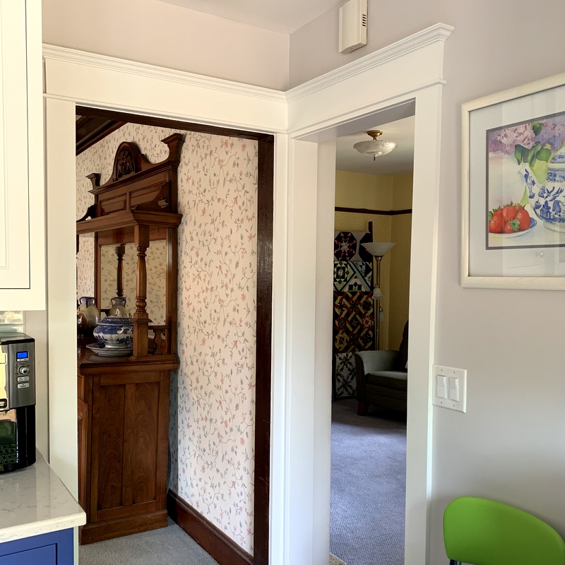
It didn’t occur to me to take a “before” picture of this corner because there was literally nothing there but sheetrock.

Finally we come to the north wall:

A pattern of green and yellow colors with white background

Jeanne Ann’s work is featured on this wall as well. The wood trim you see on the far right side of the photos is the frame of the sliding glass door.

And there you have it.

I’m going to do one more post, focusing on some of the decorative accents I’ve added to the kitchen.

If you’re new to my blog and want to review the kitchen remodel from the outset, feel free to follow these links:

March 27, 2019: All Quiet on the Sewing Front
April 14, 2019: Prepping for the Kitchen Remodel
April 22, 2019: Kitchen Remodel: Week 1
April 28, 2019: Kitchen Remodel: Week 2
April 30, 2019: Kitchen Remodel: My Color Inspiration
May 5, 2019: Kitchen Remodel: Week 3
May 11, 2019: Kitchen Remodel: Week 4
May 15, 2019: Kitchen Remodel: Week 5
May 26, 2019: Kitchen Remodel: Week 6
June 3, 2019: Kitchen Remodel: Week 7 — Part 1
June 9, 2019: Kitchen Remodel: Week 7 — Part 2
June 13, 2019: Kitchen Remodel: Week 8
June 16, 2019: Kitchen Remodel: Week 9
August 14, 2019: Kitchen Remodel: An Update
August 24, 2019: Kitchen Remodel: the Glass-Fronted Cabinet
January 5, 2020: First Finish of 2020: Kitchen Valances

Let me end this long post by saying I am beyond grateful to have a kitchen. As wildfires raged through Oregon last week leaving destruction and devastation in their wake, some of my family members and friends were forced to evacuate their homes. I am relieved to report their homes are still standing but it will be some time before they can go home because the fires are still burning and the air is thick with dangerous smoke. The fires came within a few miles of Portland but the city was blanketed by smoke. Portland has had the worst air quality in the entire United States for the last few days. Rain is forecast for tomorrow so we are hoping for some relief.

I have watched in anguish the images on TV of entire neighborhoods reduced to rubble not just in my state but also in California and Washington. Wildfires are burning in a dozen western states but the west coast has been hit especially hard. Against that backdrop I feel lucky to have a beautifully remodeled kitchen.


Posted in family, home dec, kitchen remodel, update | 7 Comments

Enrobed


Last December I made the Dear Husband a new bathrobe because his old one was practically falling apart. I remember thinking, “My robe is pretty worn out, too. I should make myself a new one.”

Fast forward eight months. Eight months! That’s how long it took me to get the job done. But the wait was worth it. Here’s my brand new kimono-style robe:

A pattern of green and yellow colors with white background

The fabric is a lovely Asian-inspired toile from Michael Miller Fabrics that’s been in my stash for a number of years. I probably bought it thinking to use it in a quilt. Fortunately I had purchased a fairly large piece, enough to eke out a bathrobe. Also in my stash was a piece of blue polka-dotted fabric that was a good choice for the contrasting band, belt, and pocket trim.

Here’s what the robe looks like from the back:

A pattern of green and yellow colors with white background
Rather than make belt loops and a loose belt as the pattern called for, I stitched the belt directly to the robe on the back:

A pattern of green and yellow colors with white background

Perhaps you can see the stitching a bit better in this next photo:

A pattern of green and yellow colors with white background

The Simplicity pattern I used (5314) didn’t include pockets — what bathrobe doesn’t have pockets, for heaven’s sake? — so of course I made my own. And because the toile fabric depicts large-scale scenes of people and objects like pagodas and bridges and musical instruments, I decided to match the design on the pockets to the fabric underneath.

To do that I made patterns for the pockets out of freezer paper. After positioning them and ironing them in place, I made registration lines on the pattern that lined up with the design underneath:

A pattern of green and yellow colors with white background

Then I lifted the freezer paper pattern from the robe and matched it with the same design elements on the fabric scraps I had left over after cutting out the robe. Voilà – fussy-cut pockets.

Here’s the right-side pocket pinned in place:

A pattern of green and yellow colors with white background

(You’ll notice I added an inch-wide strip of my contrasting polka-dotted fabric to the pockets for some extra design appeal.)

Here’s the pocket stitched in place:

A pattern of green and yellow colors with white background

I did the same thing with the pocket on the left side:

A pattern of green and yellow colors with white background

I’m very pleased with the way my new robe turned out. Can you picture me sitting out on the back deck tomorrow morning enjoying my morning coffee? Here’s my dress rehearsal:

A pattern of green and yellow colors with white background


Posted in family, garment sewing, update | 18 Comments

It’s a Wrap: Scattered Stars


Finally!I got the label made today for my cheddar and indigo quilt, Scattered Stars, so I can officially declare it finished:

A pattern of green and yellow colors with white background
Here’s a look at the back:

A pattern of green and yellow colors with white backgroundScattered Stars finished at 66″ x 88″.

For the label I made an inset circle and then enclosed it in another circle:

A pattern of green and yellow colors with white background
Here’s a close-up:

A pattern of green and yellow colors with white background
I tried arranging Scattered Stars artfully on a quilt ladder, with mixed results:

A pattern of green and yellow colors with white backgroundAt least you get a good look at the beautiful quilting done by Karlee Sandell of SewInspired2Day.

A pattern of green and yellow colors with white background

The quilt motif is “Woven Wind,” a contemporary version of the classic Baptist Fan design.

Coco photobombed my quilt at every step in its construction so it seems only right that she should show up for the final reveal:

A pattern of green and yellow colors with white background

Thank you for following along on my quiltmaking journey!


Posted in cats, cheddar and indigo, Churning Stars quilt block, quilt labels, update | 16 Comments

Feedbag Face Masks


I have my twin sister Diane to thank for the name.

In my last post I wrote about a new-to-me face mask pattern I tried out using a vegetable print that made me look like I had green peapod lips and teeth. In addition to commenting on the unfortunate location of the veggies on the face mask, Diane said I looked like I was wearing a feedbag.I have to admit she had a point:

A pattern of green and yellow colors with white background

It’s a wonderful pattern, though! The proper name of the pattern is the 3D Face Mask from SeeKateSew, and it’s such a great design that I’ve made a couple more masks:

A pattern of green and yellow colors with white background

These are for the Dear Husband and me. I’ll bet you can tell from the size of the ear loops which one is his and which one is mine:

A pattern of green and yellow colors with white background

Here’s a look at the inside of the masks (note the plastic strips from coffee packages that work very well as nosewires when inserted in the fabric casings):

A pattern of green and yellow colors with white background

It’s pretty clear that face masks are going to be part of our wardrobes for the foreseeable future. Who knows how long it will be before the coronavirus pandemic comes under control? Though the reason we need to wear these masks is truly awful, there is a bit of enjoyment to be had in coming up with fun fabric combinations to make them. I’ve certainly enjoyed the photos posted on Instagram of masks created by other makers, and I’ve enjoyed dipping into my own stash to cut some small pieces of treasured fabrics.

Even though I really like SeeKateSew’s pattern, I’m still a big fan of the mask pattern designed by PJ Wong. I recently made masks for my friends Sue and Anne using PJ’s pattern:

A pattern of green and yellow colors with white background

Look how bright and cheerful the masks are on the inside:

A pattern of green and yellow colors with white background

Okay, friends, time to wrap up this post and head to the grocery store. You know what that means: time to strap on the old feedbag!

A pattern of green and yellow colors with white background


Posted in face masks, update | 7 Comments

Face Mask Fail


Well, maybe “fail” is too strong a word. Maybe I should just say the final result wasn’t what I expected. . .

To be clear, the problem had nothing to do with the pattern. It’s a very good one.

I’ve been intrigued by the three-dimensional face masks I’ve seen some folks wearing. The boxy shape seems to fit the face well and allows for plenty of breathing room. I decided to make a new mask for the Dear Husband using the 3D Face Mask from SeeKateSew, billed as “the most comfortable face mask.” I picked this print from Andover Fabrics that I bought last year to make the DH a new apron (which hasn’t happened yet):

A pattern of green and yellow colors with white background

He’s the gardener of the family and I thought this fabric would make a fun mask for him to wear when he’s outside working in our yard or tending our community garden plot.

I did make one adjustment to the pattern:

A pattern of green and yellow colors with white background

That’s my freezer paper pattern in the foreground, with extensions on the side to allow for a generous ¾” casing for the ear loops rather than the narrow â…” casing the pattern provides. The freezer paper pattern can be used over and over again — no pinning because the freezer paper is pressed directly onto the fabric, where it is easily peeled off after the fabric has been cut.

The printed directions by SeeKateSew are very clear, as is her website tutorial. The mask came together very easily. Here’s what it looks like from the front:

A pattern of green and yellow colors with white background

Here’s a look at the inside . . .

A pattern of green and yellow colors with white background

. . . and here you can see I added a sleeve at the top for a removable nose wire:

A pattern of green and yellow colors with white background

When the mask was done I could tell it would be too small for my husband. “No problem,” I thought. “I’ll adjust the pattern to make a bigger mask for him. I’ll keep this one for myself.”

Then I tried it on:

A pattern of green and yellow colors with white backgroundDo you see what I see?

Those peas! They look like teeth . . . and the peapods? They look like lips. Green lips.

And see the roots on that bunch of green onions?

Chin whiskers!!!


Posted in aprons, face masks, family, update | 21 Comments

Beautiful Blenders


As I was tacking down the binding on my Scattered Stars quilt a couple of days ago, I was reflecting on how much I like one of the “modern” cheddars in my cheddar and indigo quilt and was rueing the fact that only a few inches of that fabric remained in my stash.

A pattern of green and yellow colors with white background

The fabric is Barcelona City Map in saffron from the “Barcelona” line by Zen Chic for Moda. The line came out several years ago so I didn’t hold out much hope I would find any left but I decided to check the Internet anyway.

Much to my delight, I found an on-line shop called Lark Cottons that still has some — and the shop is in my own city of Portland, Oregon! While perusing the Lark Cottons website I made another happy discovery: Barcelona City Map came in a variety of other colors — and Lark Cottons still has some of those in stock.

Well, you probably know what’s coming: not only did I replace my stash of the saffron/cheddar color, I ordered three other colors:

A pattern of green and yellow colors with white background

And more good news: I didn’t have to wait for a package to arrive in the mail. Lark Cottons offers curbside pickup so these beauties were in my hands the very same day I ordered them.

They will be excellent additions to my rather extensive stash of blenders. I rarely use solid colors in my quilts, preferring the subtle texture and visual interest that printed fabrics bring. I’m also drawn to maps and geographical features on fabric so you can see why these appealed to me so much.

Color me happy with these beautiful Barcelona blenders!


Posted in cheddar and indigo, Churning Stars quilt block, update | 8 Comments

Vexation!!


I don’t even want to think about the number of hours I spent attaching the binding to my Scattered Stars quilt. What should have taken a couple hours at most stretched into (shall we just say) several hours over the space of several days.

I trace my problems to three decisions — none of which I regret. I can say that now that the binding is on to stay! I’ve already started tacking it down on the back side. Here you can see I’ve turned the first corner and the binding looks fine:

A pattern of green and yellow colors with white backgroundBut getting to that point. Oy!

My first decision was not to add a border to Scattered Stars. That meant the points of my outer stars, being exactly ¼” from the edge of the quilt, would butt right up against the binding, leaving no room for error in attaching it. The danger would lie in cutting off the points by taking a seam allowance that was too deep. Fortunately, I had staystitched ¼” away all around the outer edges of the quilt top so I knew my star points were right where they needed to be.

My second decision was to have my binding finish at ½” wide. That required trimming the quilt a quarter-inch beyond the raw edges of the top so there would be a full half-inch from the stitching line to the outer edge. In the foreground of this picture you can see my line of staystitching, the quarter-inch seam allowance, and the additional quarter inch of batting (the quilt is folded so that the back of the quilt is in the background):

A pattern of green and yellow colors with white background

Now take a look at that batting. It’s wool. That was my third decision. Wool batting is lighter weight than most other batts made from cotton or cotton/poly blends. Scattered Stars is only twin-size but all those seams in all those star blocks added quite a bit of extra weight. I knew wool batting would lighten the load, so to speak.

But here’s the thing about wool batting: it’s really quite poufy. Look at this side view:

A pattern of green and yellow colors with white background
It appears to be made of many ultra thin layers.

I can’t say for sure but that puffiness may have been a factor when stitching the binding on. I had pinned sections of binding at a time, removing the pins as I went, so I was quite sure all of my edges were properly aligned. But somehow the seam allowance on my quilt top shifted slightly to the left as I was sewing. In some places, not all — but I didn’t notice it was happening because my binding fabric was on top.

I actually sewed all four sides of the quilt before I discovered there were several places where I had caught much less than a quarter-inch of the quilt in my seam. If it had happened in just a couple of places I could have taken the stitching out and readjusted the fabric but it happened all around the quilt. Nothing to be done but rip out the entire binding and start over.

The second time I pinned even more carefully and sewed a section only about 20″ long to test my stitching. I checked my seam . . . and the same thing happened. I was using my walking foot so the layers were feeding evenly through my sewing machine but that one layer of fabric was still pulling to the left. Out came the stitching again.

Want to guess what I wound up doing? The only other thing I could think of: basting the binding to the quilt. By hand:

A pattern of green and yellow colors with white background

I aligned my basting stitches on the staystitching line underneath, thus guaranteeing I had the necessary quarter-inch of fabric underneath . . .

A pattern of green and yellow colors with white background. . . and also guaranteeing I hadn’t chopped off any star points:

A pattern of green and yellow colors with white background

Then it was just a matter of machine stitching right over my basting stitches. No shifting of fabric this time. What a relief!

I’ve chosen wool batting for many of my quilts and have also used it when applying binding that finished at ½” so I really can’t figure out why I had such a problem this time. I’m just glad the binding is finally on to my satisfaction and I can move toward a finish.

Oh, there’s one more thing I did before starting to tack the binding to the back of the quilt. I pinked the outer edges of the seam allowance to remove a bit of the bulk:

A pattern of green and yellow colors with white backgroundPinking the edges also eliminated the raveling that often accompanies cut edges of fabric. I have a pair of trusty pinking shears but for long straight stretches I like to use my rotary cutter with a pinking blade. I think this pinking blade is actually meant for paper — I found it in the scrapbooking section at a craft store — but it works very well on fabric.

Since I’m one of those quilters who actually enjoys tacking down binding, this next step will be a pleasure. Then it’s on to the last step, the label.


Posted in cheddar and indigo, Churning Stars quilt block, update | 10 Comments