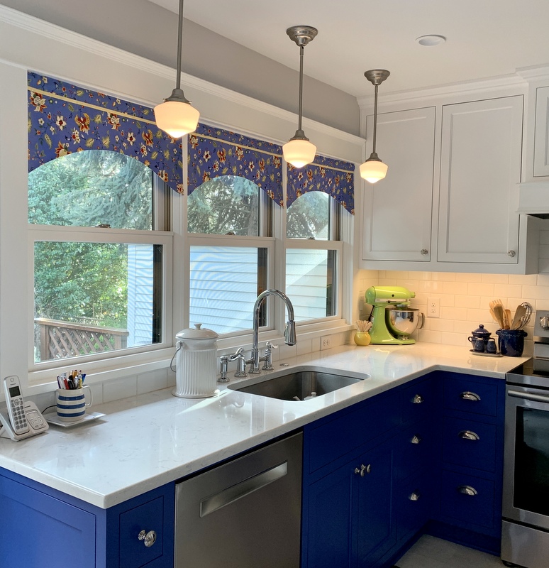
 This project falls squarely in the “why on earth did it take me so long to get it done?” category. After all, last year’s major kitchen remodel — faithfully documented on the pages of this blog — was essentially completed by the end of August. (You can see one of my last posts about the kitchen here.)
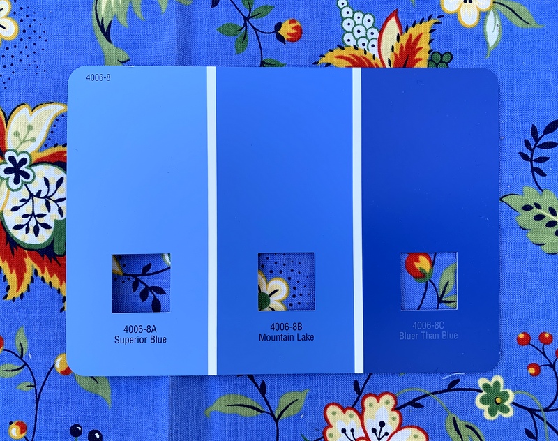
The only thing left to complete the remodel was making valances for the three new windows. I already had the fabric, a vibrant Jacobean floral that had been in my stash for a few years. The fabric (from the “Breath of Avignon” line designed by Sandy Klop for Moda) inspired my choice of paint color for the lower cabinets:

I also had a picture in my mind’s eye of what the valances would look like. No simple ruffled valances like I’ve made before. I liked them well enough but this time I wanted a more tailored look. I envisioned valances that curved upward from the sides with an inverted pleat in the middle made with contrasting fabric.
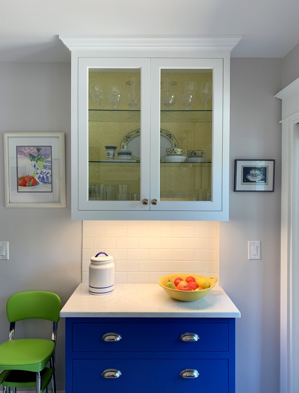
Since I had covered the back wall of the glass-fronted cabinet with yellow fabric . . .

. . . I decided to use fabric in the same shade of yellow for the pleat. And for extra pizzazz, I decided to insert a navy blue flange between the pleated part of the valance and the top band.
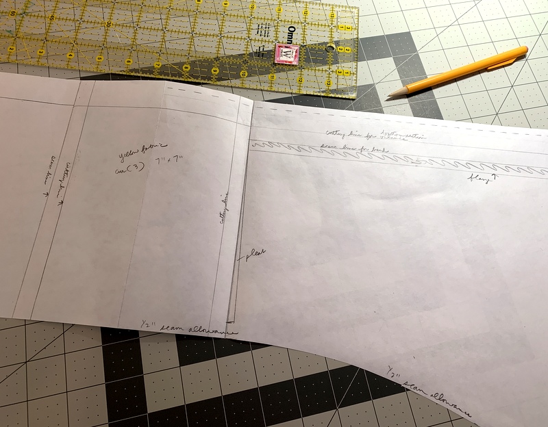
After taking very careful measurements, I drew up a pattern on freezer paper . . .
 . . . and proceeded to fashion the first valance.
Alas, it was not a success:
 First of all, I measured incorrectly; the valance wasn’t wide enough. You’re not supposed to see the end of the spring tension rod at the top of the window. Second, when the valance was placed at the top of the window, you could see the bottom of the pleat. That was not the look I was going for. Third, instead of folding the ends of the upper band in to make a rod pocket, I sewed the ends shut. (What on earth was I thinking?) In order to audition the valance on the window, I had to add a sleeve on the back.
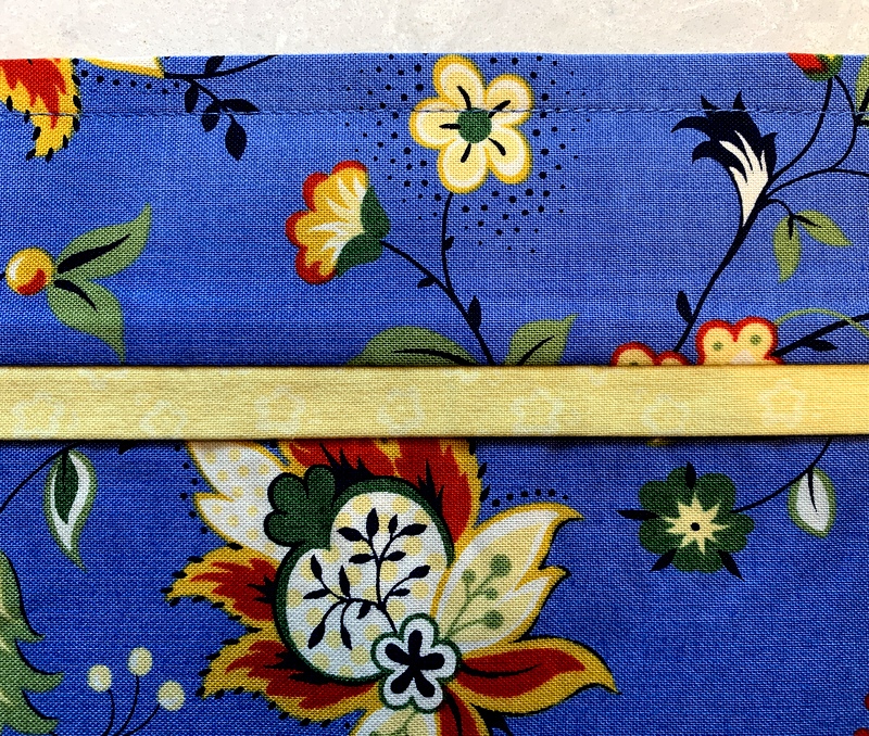
The valance isn’t a keeper but it was very useful as a prototype. With some valuable input from my sister Diane, I nixed the pleat and changed the flange from navy blue to yellow. Here’s a close-up of the updated flange:
 Can you see the pattern of tiny little flowers? It’s very subtle.
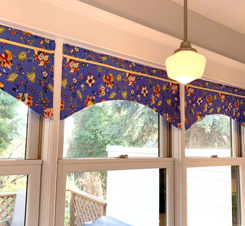
I’m much happier with the look of the yellow flanges:
 I fussycut the second and third valances to match the design on the first, simply because I thought it would look better than having each valance cut at random from the focus fabric.
The lining of the valances is a blue print pulled from my stash:

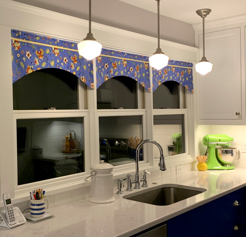
Before the valances went up, the globes of the pendant lights blended into the white woodwork. I really like the way they stand out now. Here’s what the kitchen looks like at night:

I can now declare the kitchen remodel officially complete. One of these days I’ll do that “before and after” post I promised last year.

