My two youngest granddaughters, Bonnie (age 14) and Beatrice (age 11), are here for a 10-day visit. This is the third year they have flown to Portland from San Francisco to spend part of their summer vacation with their granny and grandpa, and we are savoring every moment. All too soon, I fear, summer jobs and other commitments will keep them from spending as much time with us.
One highlight of their visit so far was a dinner cruise on the Willamette River. The girls were invited into the wheelhouse and both of them steered the ship — and they have Honorary Captain’s Certificates of Outstanding Seamanship from the captain to prove it!
Each year the girls work on a sewing project while they are here. Two years ago they each made a pillowcase and last year they made four-patch coasters. This year they made banners — you know, the kind with triangular flags attached to a strip. (A shout out to my friend Vickie Rooks for the suggestion.)
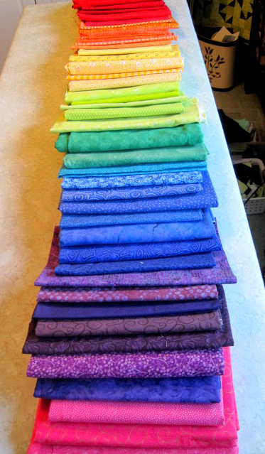
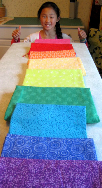
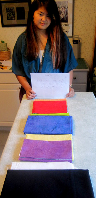
Both girls wanted bright colors for their flags so we raided my stash for fabrics reading as solids and arranged them along the lines of the color wheel:

Here is Bea with her fabric choices . . .

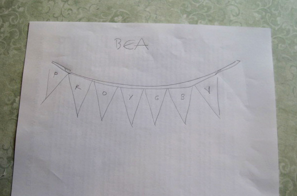
. . . and her banner design:

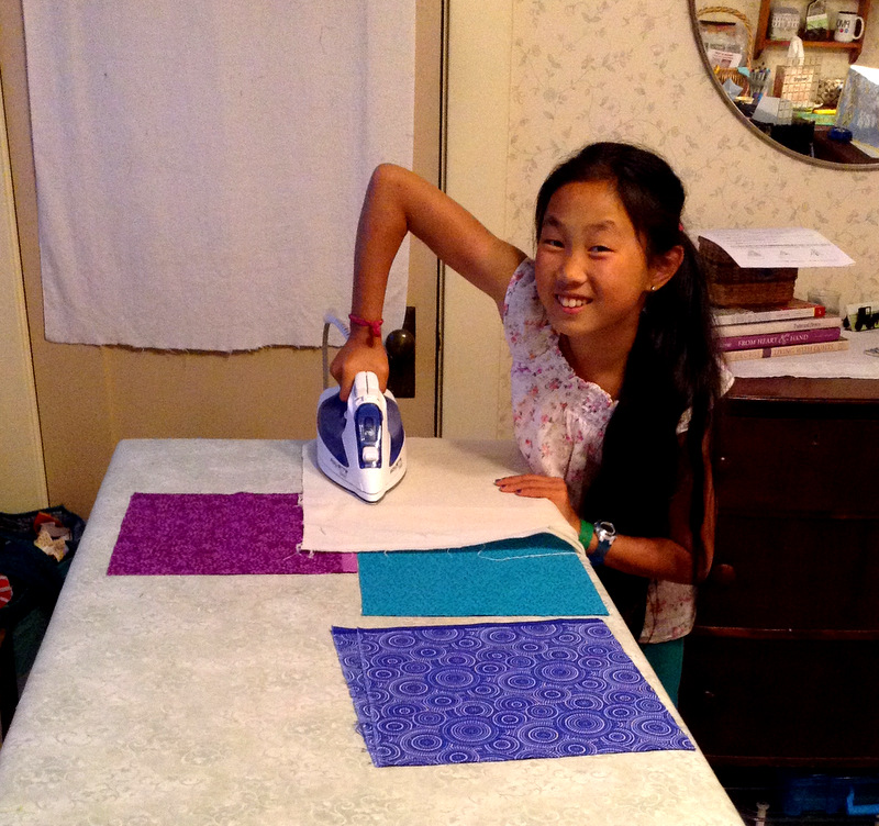
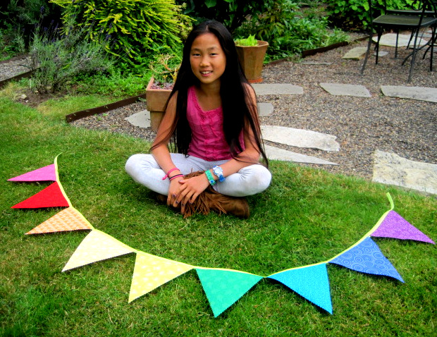
Practically ROYGBIV: red, orange, yellow, green, blue, and violet, with pink next to red at the far left. For each flag Beatrice cut two 8½” squares of fabric and one square of double-stick fusible web. She fused the web between the squares (that’s a press cloth on top):

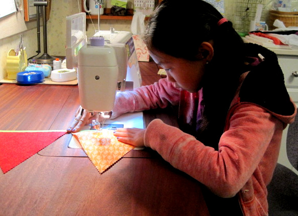
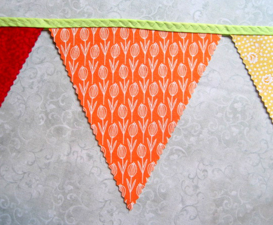
When all the layer were fused together, she cut triangle shapes using a rotary cutter with a pinking blade. Then she inserted the top of each flag between wide double-fold bias tape and stitched along the tape with a serpentine stitch:


Here is Beatrice with her finished banner:

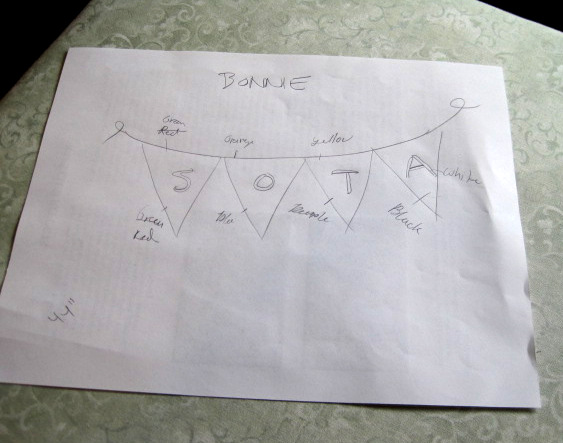
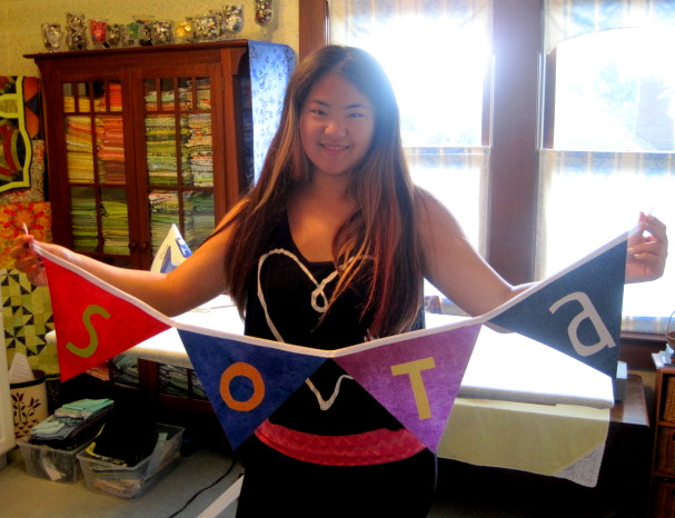
Bonnie will be starting high school this fall at the School of the Arts (SOTA) in San Francisco so she opted for four larger flags that spell out SOTA. We sketched out her design and color choices, which included white on black for one flag:

Here’s a close-up of her design:

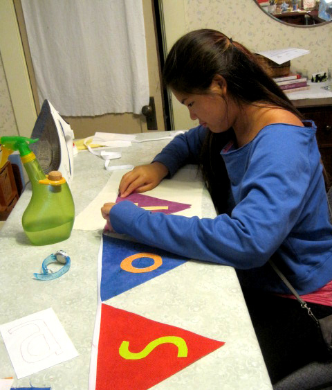
Bonnie started out with 11″ x 8½” rectangles. After fusing the letters to the flags, she trimmed the rectangles into triangles. You will see below that the capital A became a lower case a. That’s because the School of the Arts actually presents its logo as SOTa, not SOTA.
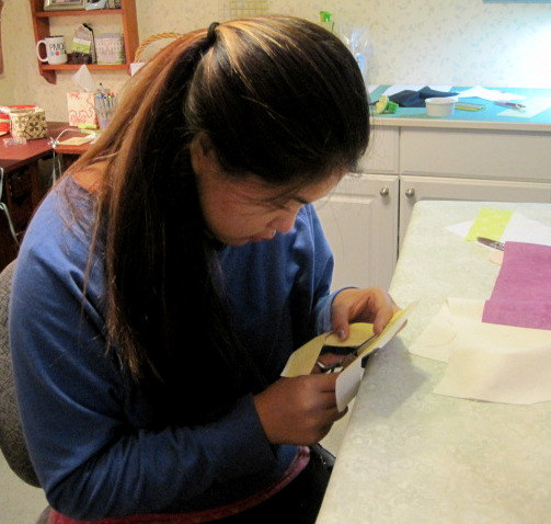
Bonnie at work on her flags . . .


. . . and with her finished banner:

Great work, Sewing Bs!
