Category Archives: home dec

Kitchen Remodel: The Glass-Fronted Cabinet

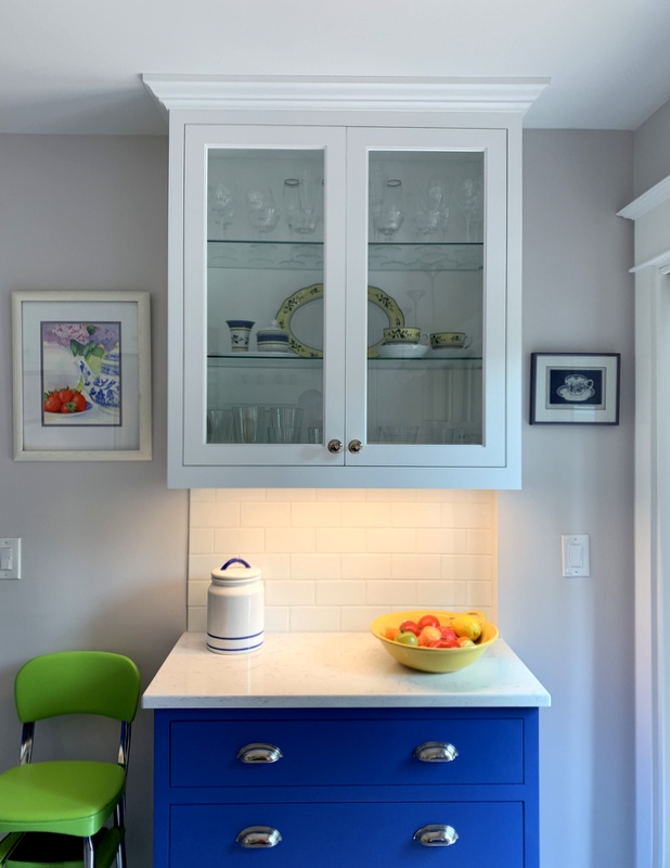
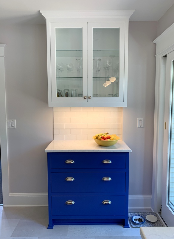
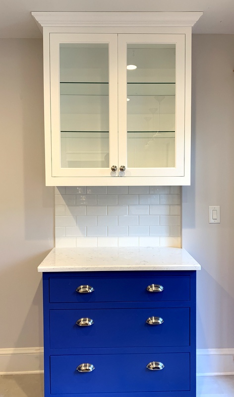
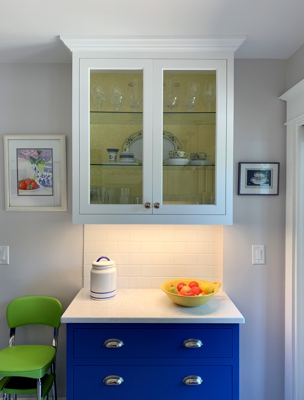
When I showed you pictures of my newly remodeled kitchen last week, I mentioned there was something I wanted to do to the glass-fronted cabinet. Today I did it:


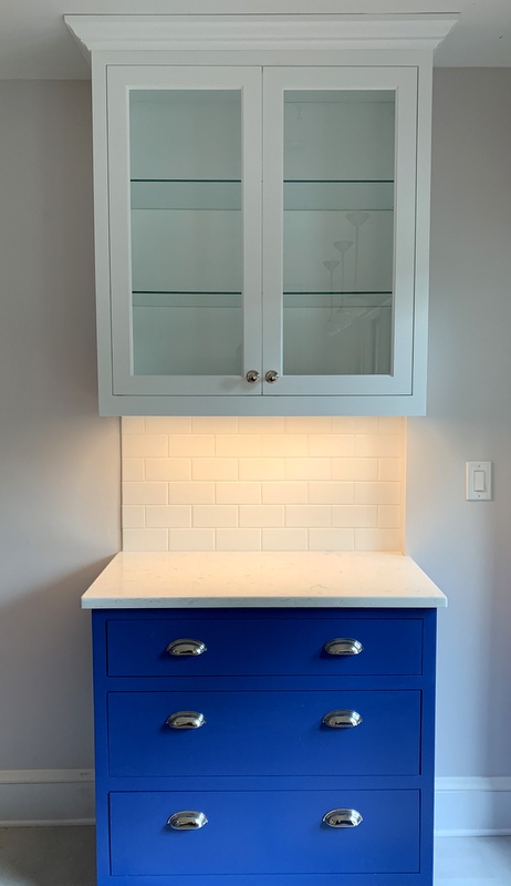
Do you see what I did? Here’s the before picture:


Yes! I covered the back of the cabinet! It needed something. The clear glassware didn’t show up well against the white walls and the spots of color from the dishes on the middle shelf didn’t add enough pizzazz.

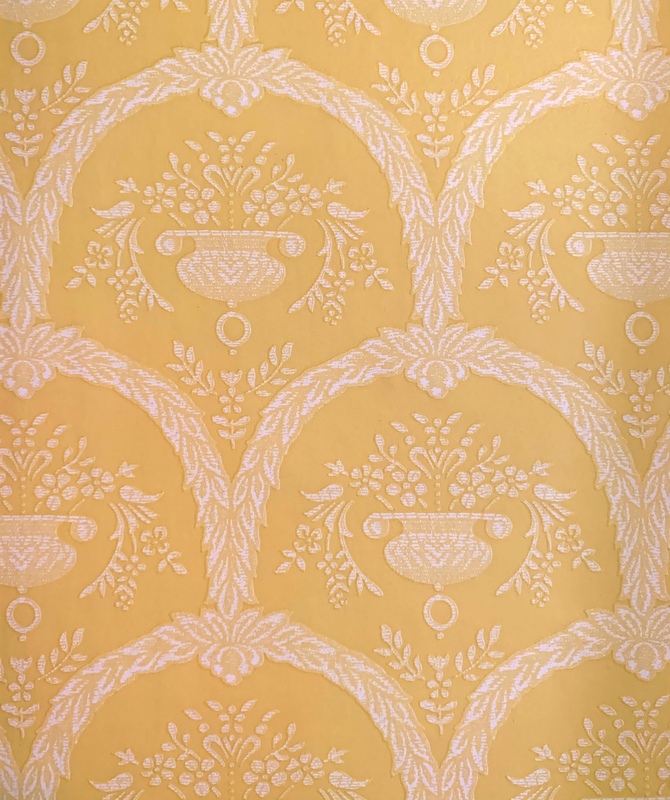
I was originally planning to use a scrap of wallpaper left over from another room. It was the right shade of yellow but it was too formal for the kitchen:


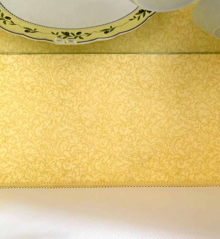
My twin sister Diane suggested I use fabric. Of course! With medium-weight interfacing fused to the back, it would have just the right amount of body to attach to the back wall. I had what I thought was the perfect fabric in my stash but when I went to fetch it all I had were scraps. Fortunately, there was enough yardage of another tone-on-tone print to do the trick.

I cut the fused fabric and interfacing slightly oversize. After fusing them, I trimmed the sides with a rotary cutter to fit the back of the cabinet. Nice raw edges with no raveling, thanks to the interfacing. I applied double-sided tape to the back of the fabric at the top edge and pressed it into place with my fingers.

I figured the glass shelves would hold the sides in place, and they do. Along the bottom edge I glued a piece of braided trim, also from my stash, to provide a nice finished look:

Am I pleased with the outcome? You bet!


Posted in family, home dec, kitchen remodel, update | 13 Comments

Kitchen Remodel: An Update

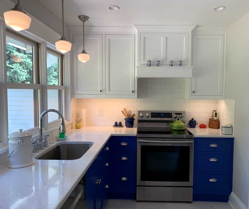
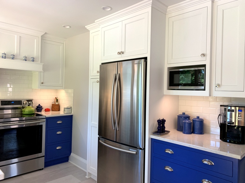
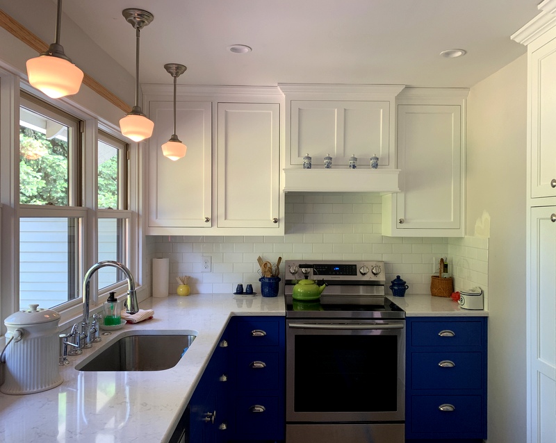
It’s been a couple of months since I posted photos of our kitchen remodel. It was almost complete by mid-June and for all practical purposes it’s complete now, although there are a couple of technical issues to resolve regarding a lower cabinet. I’m still planning to do a “before and after” post but for now I’ll show you pictures of the kitchen so you can see some of my decorating choices.

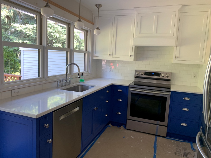
Here’s the view looking toward the southeast corner:
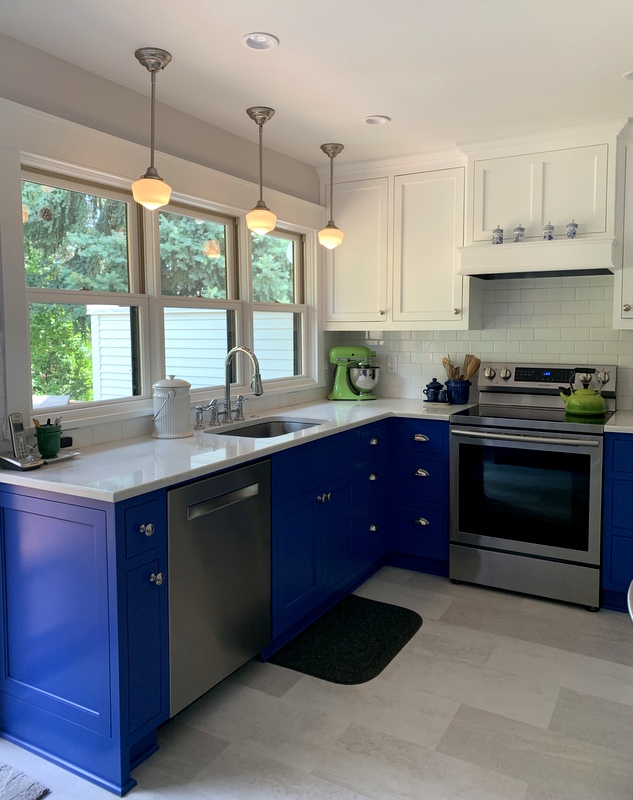
The kitchen faucet was one of the very first things I bought and I was a little nervous about how big it seemed:
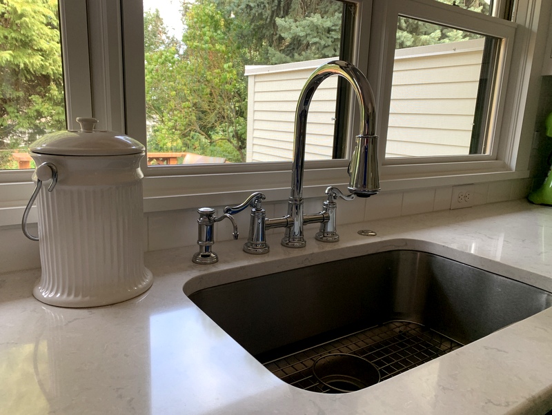
My husband and I were on the same page about wanting hot and cold faucets rather than one faucet that has to be adjusted to hot and cold. Once installed the fixture seemed to fit just fine. The first soap dispenser I chose was so wobbly I sent it back and the replacement almost looks like it’s part of a kitchen faucet set.

Opting for a single sink was such a good decision. Our old sink was divided. It’s so much easier to wash large pots and pans in this one, and anything not going into the dishwasher gets washed and dried and put away.

Here’s a straight shot of the south wall:
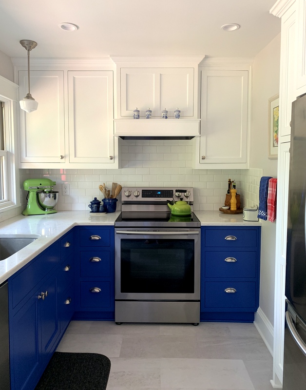
You can probably tell from this photo that my blue and white color scheme is punctuated by splashes of primary colors.

Looking toward the southwest corner:
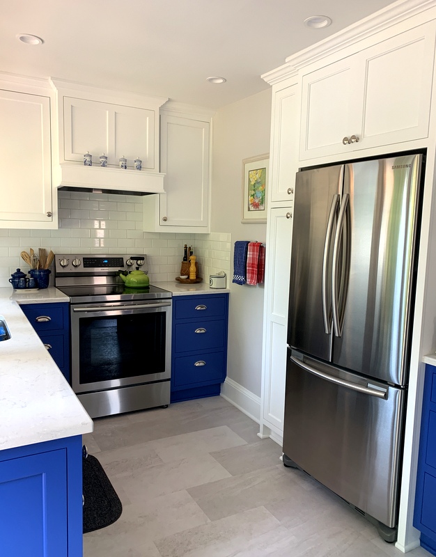
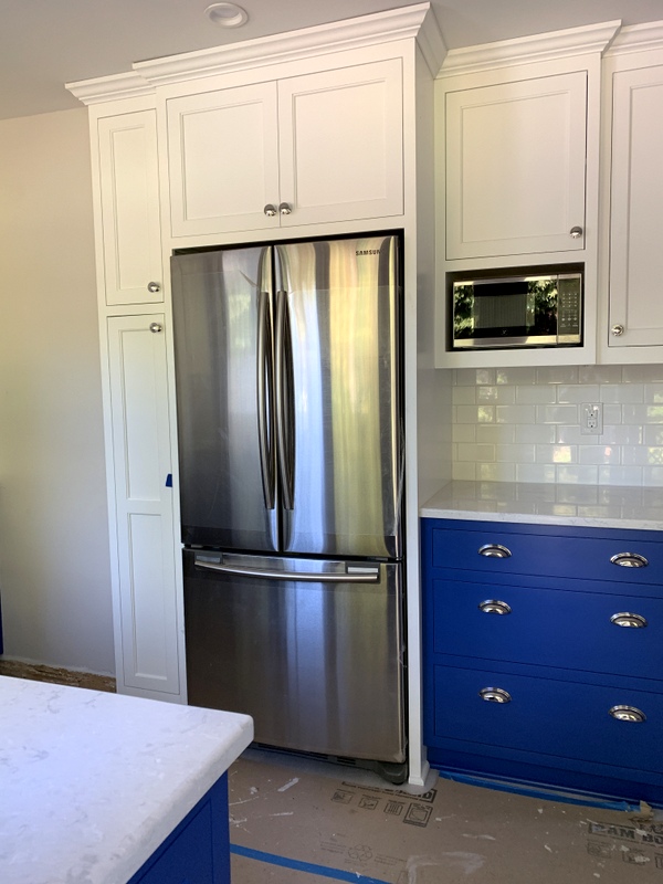
Here’s a peek into the broom closet to the left of the fridge:
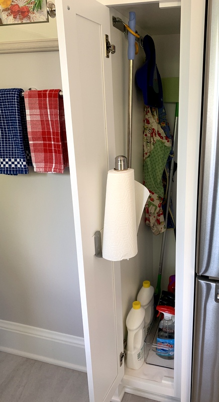
Notice the paper towel dispenser mounted on the inside door? One less thing taking up space on the kitchen counter!

The rest of the west wall:
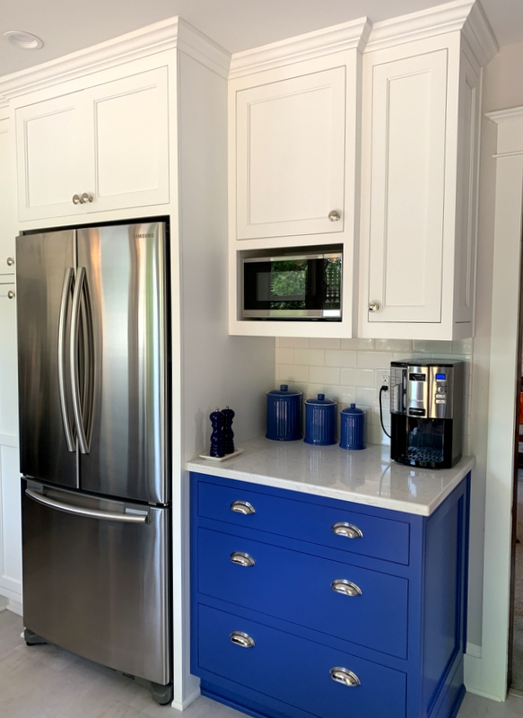
The blue ceramic canisters were chosen not just for their color. They are shaped along the lines of the white ceramic composter to the left of the sink (see second photo).

Circling around to the north wall:
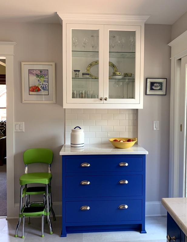
There’s my new cookie jar. And how do you like the retro-style kitchen step stool? It arrived in a flat box a few weeks ago but didn’t get assembled until last night, which tells you something about the timing of this post. It’s a happy coincidence that the green of the step stool is repeated in the watercolor above it.

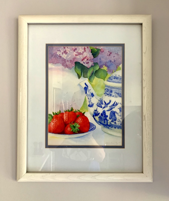
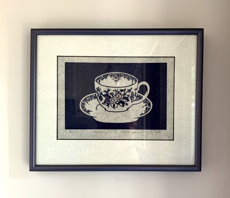
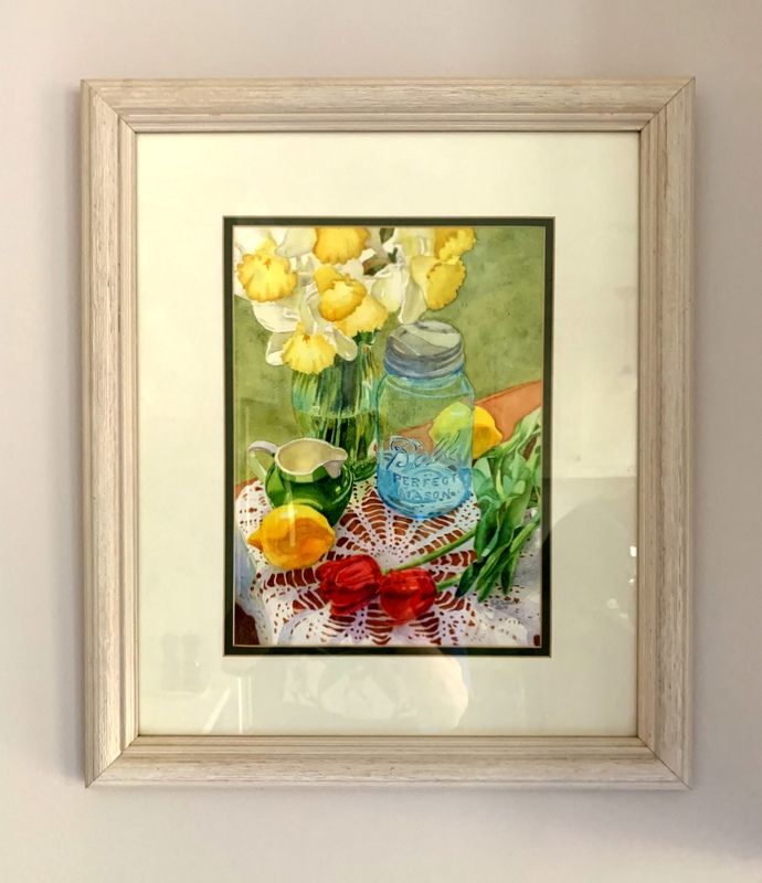
Speaking of which, I must tell you that the three pieces of artwork in my kitchen are by my talented daughter-in-law, Jeanne Ann White. Here’s a close-up of the original watercolor to the left of the glass-fronted upper cabinet . . .

. . . and the linocut print on the right side of the upper cabinet . . .

. . . and the original watercolor to the left of the refrigerator:
I love what Jeanne Ann’s artwork adds to the kitchen!

So what’s left? Well, in addition to the aforementioned cabinet issue — happily not noticeable in any of these photos — I still plan to make a tailored valance for each window. That project was put on hold while I labored on my Hazel’s Diary Quilt top. And I have something in mind for the glass-fronted cabinet I think you’re going to like.

Before I embark on those, I have a certain project to finish up that I’ve been working on periodically for months but haven’t written about yet. Although not connected in any way to Hazel’s Diary Quilt, it does involve needleturn appliqué. I hope you’ll check back in with me to see what it’s all about.

Thanks for stopping by the Portland White House to see my new kitchen!


Posted in appliqué, family, home dec, kitchen remodel, needleturn appliqué, update | 17 Comments

Kitchen Remodel: Week 9

Friends, we are this close to being done. Witness the painted trim around the windows:

Did you notice you can now see the kitchen floor? It made me deliriously happy to peel off the brown protective paper and finally mop that floor!

The view above is looking southeast. Moving clockwise around the kitchen, here are some more views starting with the south wall:

What’s left to do?, you may ask. Mostly little things: cleaning up a few paint spills and spatters, doing some caulking, putting the doorbell back up, installing the phone jack cover, that kind of thing. Oh, and the liner for the hood range insert is finally on its way. Once that’s in, I do believe we will be ready for inspection.

In the meantime, I’m slowly filling the cupboards and drawers. You can see from the photo above that I haven’t finished filling the glass-fronted upper cabinet yet. And I’m thinking about the valances I plan to make for the windows. I’ve had something in mind for some time but haven’t even gotten to the sketching stage yet. I’m going for a look my sister Diane would describe as “simply elegant and elegantly simple.”


Posted in family, home dec, kitchen remodel, update | 12 Comments

Kitchen Remodel — Week 8

How I wish I could report the kitchen remodel is done. But no, we had a setback. On Monday morning of Week 8, my contractor inspected the crown molding that had been installed on the refrigerator wall the previous Friday and insisted that it be redone. (Is that not a sign of a good contractor?) Because of scheduling issues, the redo didn’t happen till the end of the week. That meant that the painting of the trim and the touch up on the walls and ceiling had to be pushed forward to Week 9.

In addition, we are waiting for delivery of a hood liner for the range hood insert. When I ordered the insert there was no mention of a hood liner. How vexing is that? We didn’t discover a liner was necessary until the insert was actually being installed. Result: the part didn’t get ordered till the end of May. I was hoping it would be here by now.

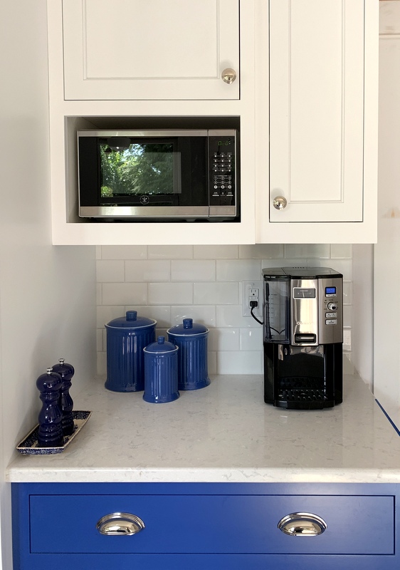
At least my husband and I are back in the kitchen making meals, getting accustomed to the new appliances, and admiring the new look. My twin sister Diane surprised us with a Cuisinart “Coffee on Demand” coffeemaker:


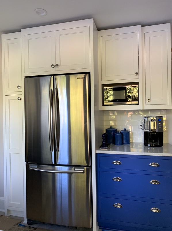
(Thanks, Nubs — we love it!) And how do you like my new ceramic canisters? I found them online and ordered them because they looked to be the same color as the lower cabinets. It’s a pretty good match!

Here’s a look at the west wall (sans crown molding):

I am loving the gleam of the stainless steel appliances and polished nickel bin pulls and the crisp contrast of the blue and white cabinets.

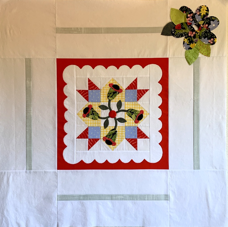
My sewing/quilting life may have been put on the back burner (so to speak) during this remodel but I am gearing up for more appliqué on Hazel’s Diary Quilt. I’m auditioning fabrics for the corner flowers on the center medallion and have cut out a few petals and leaves:


That’s a start. As a reminder, here’s a look at the center medallion from the cover of Shelly Pagliai’s book which contains the directions for Hazel’s Diary Quilt and several other quilts and small projects:


(You may remember I picked a different block for the center of my quilt.)

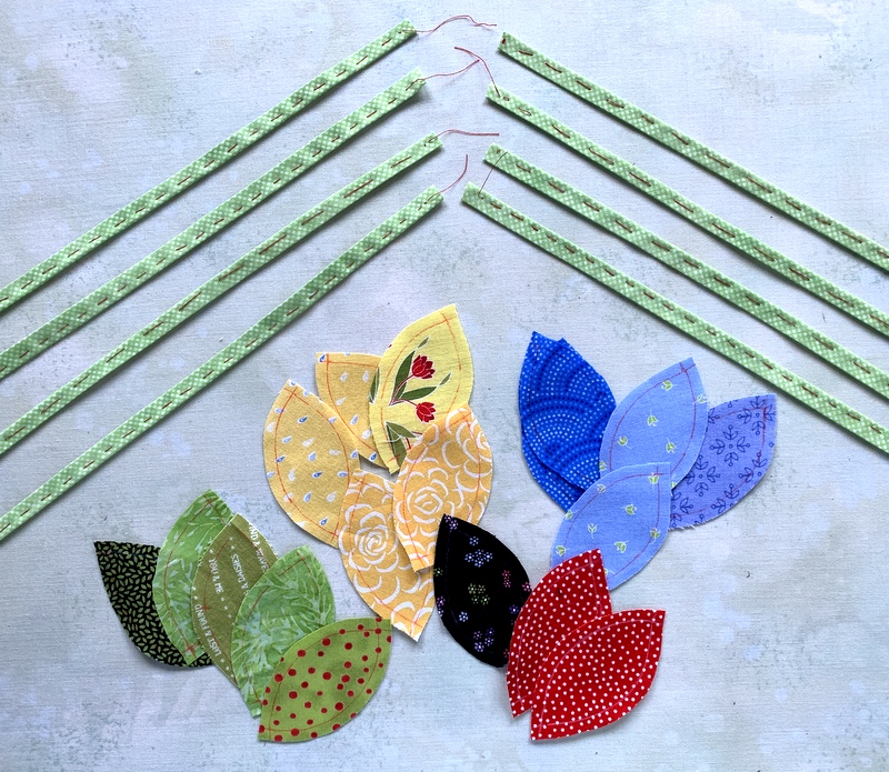
I’ve prepared the bias stems that wind around the light grey strips surrounding the block in the middle of the medallion and have cut out a few leaf shapes:

Progress on this project has been admittedly slow but I have given myself a deadline of July 31 to complete the top. That’s the day I’ve arranged to turn it over to an accomplished longarm quilter for custom quilting. Nothing like a deadline to get one going!


Posted in appliqué, Hazel's Diary Quilt, home dec, kitchen remodel, needleturn appliqué, update | 6 Comments

Kitchen Remodel: Week 7 — Part 2

We’re continuing with the progress made during Week 7. The glass doors and shelves arrived for the upper cabinet on the north wall:

Here’s the same view with the undercabinet lights turned on:

The Dear Husband scoffed when I initially told him I wanted under-cabinet lights. Guess who really loves them now?

Did you notice something else? Cabinet hardware! I can’t keep from going around the kitchen opening all the drawers and cupboard doors. They’re the “soft close” kind so all it takes is a gentle push for them to glide closed.

Here’s a look at the east and south walls with the cabinet hardware added:

Looks pretty spiffy, doesn’t it? Did you happen to notice that red glow on the backsplash under the cabinets to the left of the stove? It’s the reflection of my next door neighbor’s red patio umbrella. That’s how much shine those backsplash tiles have.

Here’s a look at the west wall:

We are using the kitchen even though the counters have to be cleared every time the workers come. It’s a happy trade-off, believe me.

Here’s a look at the kitchen in full use mode:

It looks almost finished but there’s quite a bit left to do starting with painting the trim,  scheduled for the beginning of Week 8. The end is in sight!


Posted in family, home dec, kitchen remodel, update | 7 Comments

Kitchen Remodel: Week 6

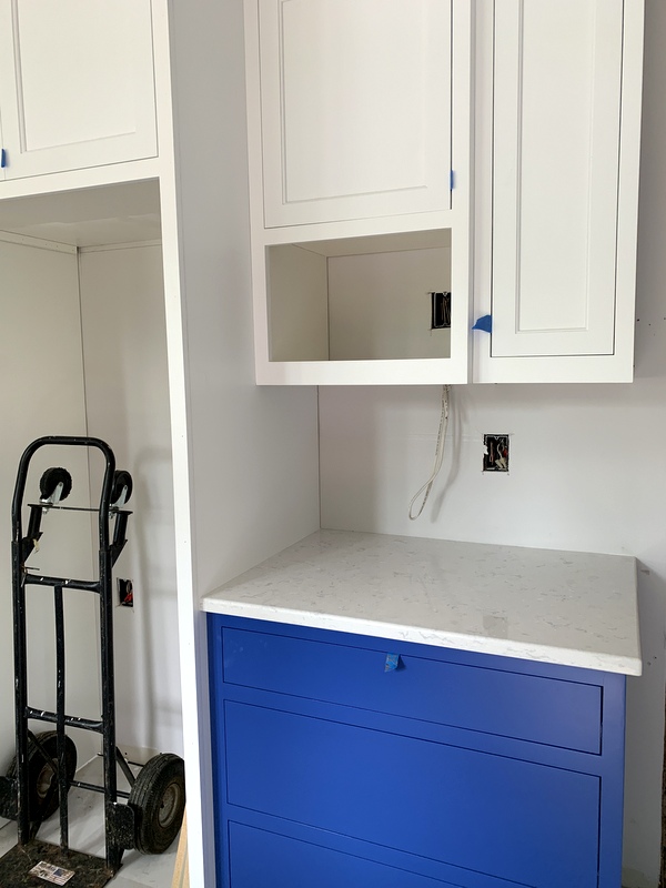
We have countertops!

They certainly dress up the kitchen, don’t they? The countertops are Cambrian quartz in a pattern called Swanbridge. I’m very pleased with the look of the pale gray counters against the blue lower cabinets.


The space currently occupied by the handtruck in the photo below is where the refrigerator belongs. The fridge has been in our dining room for the last six weeks. (One more week till it gets moved to the kitchen. Believe me, I am counting the days.)


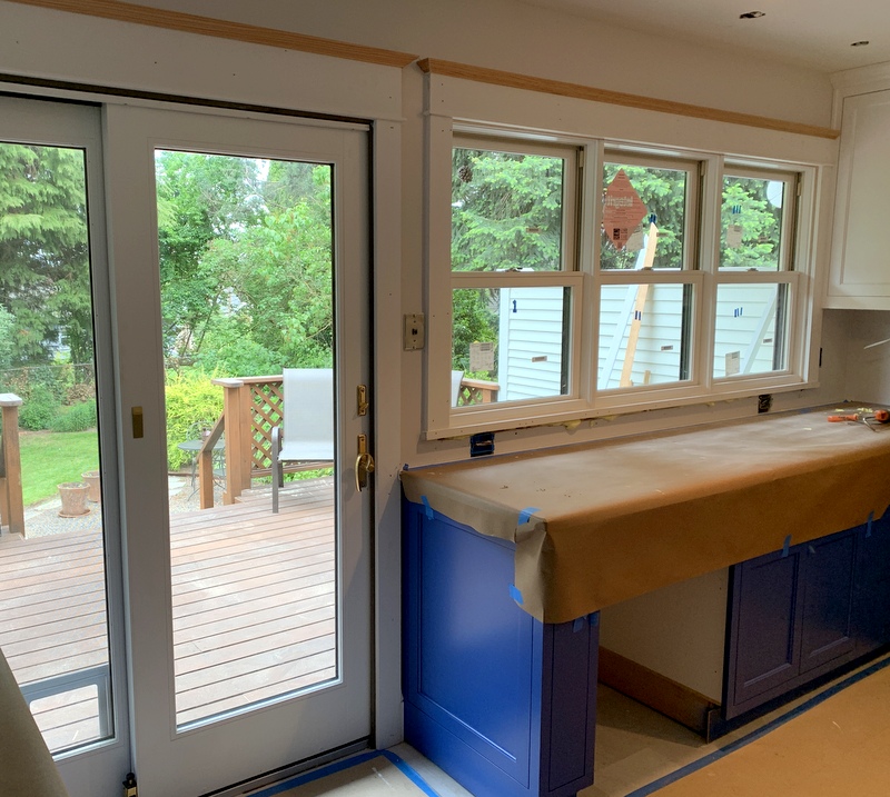
Last week my contractor and his assistant started working on the trim around the windows and doors:


The millwork matches the trim in the rest of our 1913 house, a vast improvement from the previous remodel.

The subway tile backsplash is also underway. You’ll see that transformation in my next kitchen remodel post. Do come back for that!


Posted in home dec, kitchen remodel, update | 5 Comments

Kitchen Remodel: Week 5

When my twin sister Diane saw the photos in my last kitchen remodel post of the range hood cabinet above the stove, she asked if I would use the ledge for display.

“Maybe,” I replied. “What should I put there?”

Her response was immediate: “Parsley, sage, rosemary and thyme!”

But of course. Twenty-some years ago I bought a set of Spode spice jars in the Blue Room pattern and have used them in my kitchen ever since. As soon as I auditioned them, I knew they were perfect for the spot:


Surely you noticed the new stove is in place (having been moved from its temporary home in my living room). It will be a while before I can cook on it but it needed to be installed so the template for the quartz countertop could be accurately made. That happened last Tuesday.

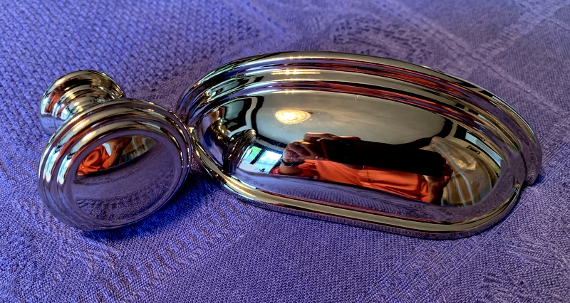
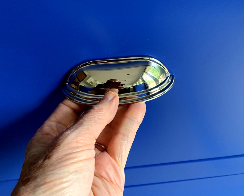
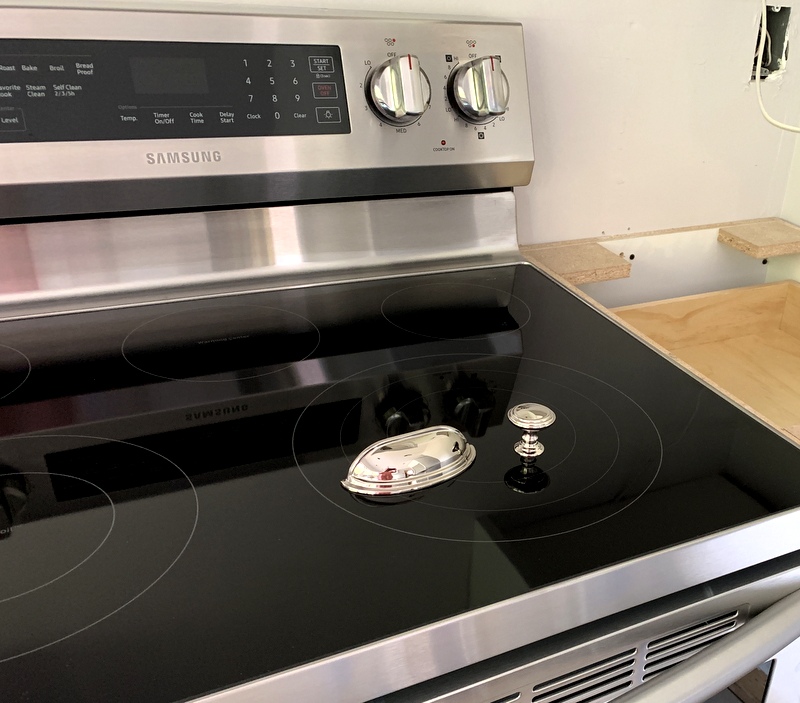
The new appliances — stove, fridge, and dishwasher — are stainless steel and all three have a brushed finish with some polished accents. Those design features helped me decide pretty quickly on the finish of the cabinet hardware:

Can you tell the knob and drawer pull are polished nickel? Polished nickel has a slightly warmer cast than polished chrome and adds just the right amount of bling to the kitchen. See how good the hardware looks alongside the stainless steel?


It looks mighty pretty against the blue cabinets, too:


Posted in family, home dec, kitchen remodel, update | 13 Comments

Kitchen Remodel: Week 4

Last week was a big one for the Portland White House kitchen remodel.

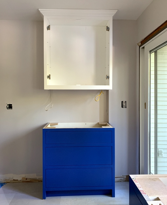
First, the walls got painted a soft gray and the ceiling and trim around the windows and sliding glass door got painted white:

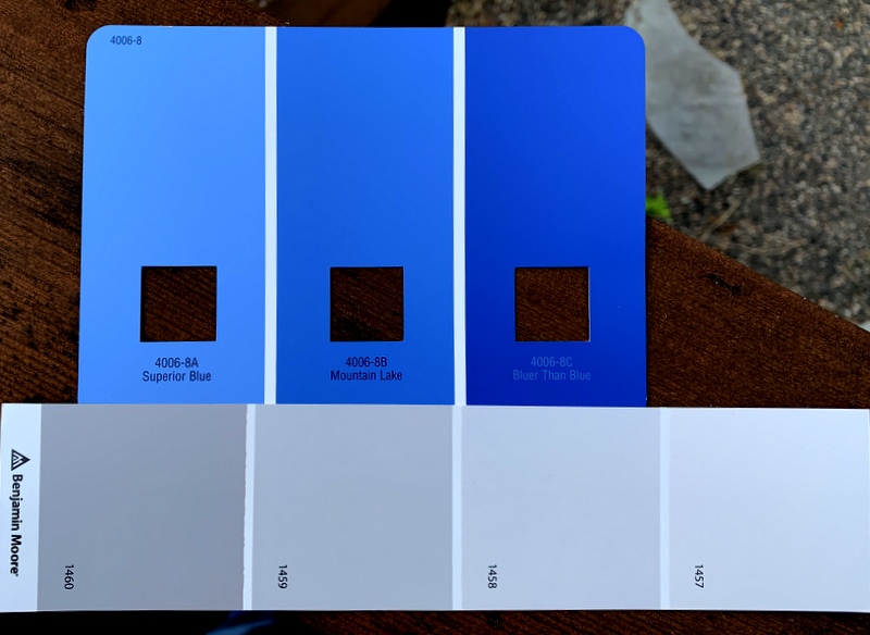
I was originally planning to have the walls painted with Benjamin Moore’s “Metro Gray,” which happens to be the same shade I chose for the master bath remodel in 2013. At the last minute I went one shade lighter (1458) with “Silver Bells.” Gray might seem an odd choice for Portland, which gets its share — and then some — of overcast days, but I knew the bright white of the upper cabinets and the vivid blue (Valspar 4006-8C “Bluer than Blue”) of the lower cabinets would be a good foil for this elegant shade of gray:

Can’t you imagine a quilt in these colors?

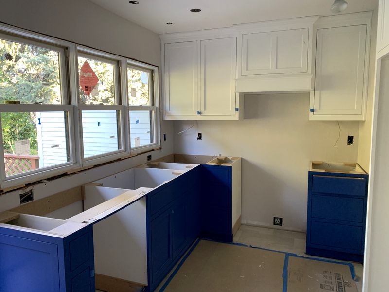
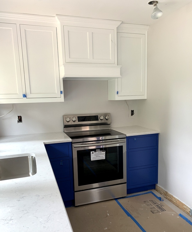
With the cabinets installed, the empty shell of a room was transformed into a kitchen! Here’s the view looking southeast:
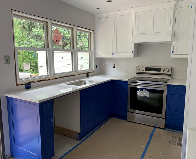
Notice the custom cover for the range hood. (Thank you, sister Diane, for guiding me to this design decision.) The tabs of blue painter’s tape on the upper and lower cabinets allow the cupboard doors and drawers to be opened. The doors are inset — that is, flush with the cabinet frames — so until the knobs and pulls are installed, the best way to open the cupboards and drawers is to pull on those tabs of blue tape.

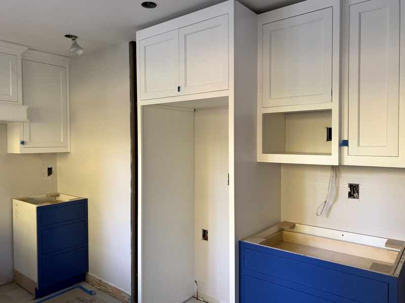
Here’s the view looking southwest:

The narrow cabinet to the left of the refrigerator cabinet is missing as it got damaged somehow at the shop. The installer wants to wait until the cabinet is in place before attaching the crown molding as he thinks the molding should be cut from the same strip.

The upper cabinet on the north wall will have glass doors and shelves, to be delivered later:

That upper cabinet makes the wall look pretty top heavy. I’m hoping the glass doors will make it feel lighter.

I must say, Coco has remained remarkably mellow as the remodel progresses. As long as her meals arrive on schedule, she is one happy cat:


Posted in cats, family, home dec, kitchen remodel, update | 4 Comments

Kitchen Remodel: Week 3

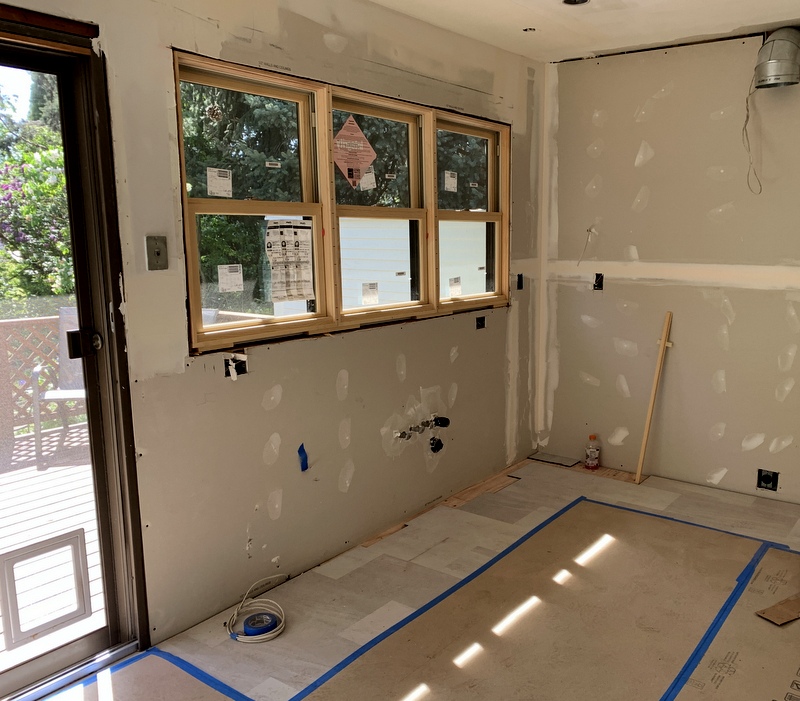
We have new windows in the kitchen! Take a look:
The windows are traditional double-hung windows made by Marvin, replacing three casement windows we installed in 1985. This time around I chose windows that match the rest of our 1913 Craftsman house; the trim around the new windows will match the rest of the windows as well.

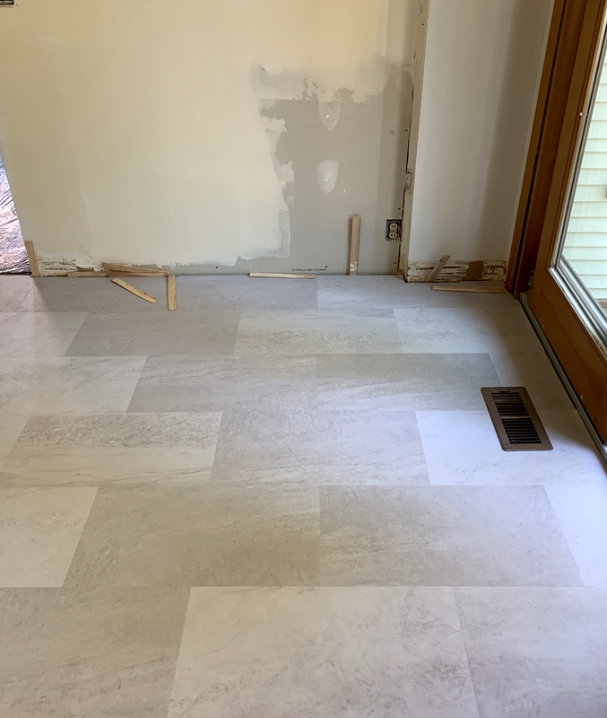
The floor also went in last week. I snapped a picture when it was partially in:

Before I could get a photo of the entire room, the workers covered the floor with butcher paper in preparation for the walls being painted.

The floor looks like porcelain tile, doesn’t it? Surprise! It’s actually luxury vinyl tile — LVT for short. You practically have to get down on your hands and knees to see that it’s not real tile. LVT was an extremely practical choice for the Dear Husband and me. He and I both like to cook — he makes breakfast every morning and I do dinner. I don’t want to say we’re sloppy cooks but . . . we spill stuff. LVT is easy to clean and maintain plus it’s softer underfoot than tile. And definitely warmer. (We put porcelain tile in the master bath when we remodeled in 2013; my big splurge on that project was a heated floor).
I had these tiles (each measuring 12″ x 24″) installed across the width of the kitchen rather than the length. Since the kitchen is just a little over 9′ wide, I think the placement of the tiles will make the kitchen seem larger.

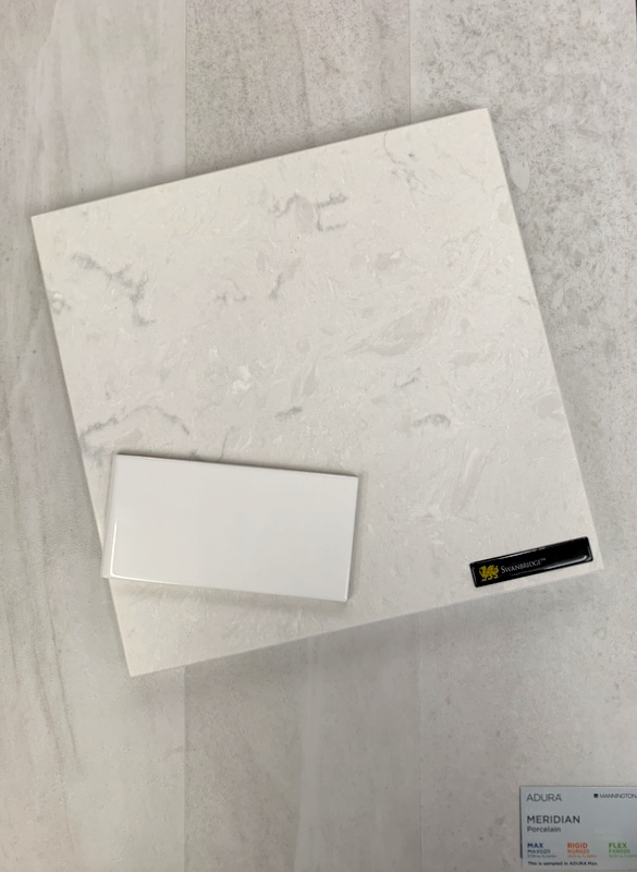
Now that you’ve seen the floor, take a look at my countertop and backsplash choices:

The countertops will be quartz. I chose the pattern “Swanbridge” from Cambria’s Marble Collection. I had to laugh when I read the manufacturer’s description of the design:

“A marbled background with grays and pinpoints of charcoal summon up images of the stony beach along Sully Island where pirates walked within sight of the Welsh hamlet of Swanbridge in the Vale of Glamorgan.”

Some copywriter sure got carried away. I prefer this description I saw on houzz.com: “a mix of very light grey, silvery grey veining and small dabs of creamy white.”

The backsplash will be 3″ x 6″ subway tile by Daltile in Arctic White. I looked at a lot of beautiful tile patterns but in the end I kept coming back to this simple classic look.

Remember the pendant lights I showed you in my Week 2 post? They turned out to be waaay too big. I returned them and found a more suitable size:

These globes are 6″ wide and 4½” tall — much more suitable for the space. And they were much less expensive than my initial choice.

What’s coming up in Week 4? Paint! And on Friday we expect the cabinets to be delivered. I can hardly wait!


Posted in family, home dec, kitchen remodel, update | 8 Comments

Kitchen Remodel: Week 1

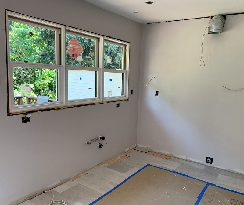
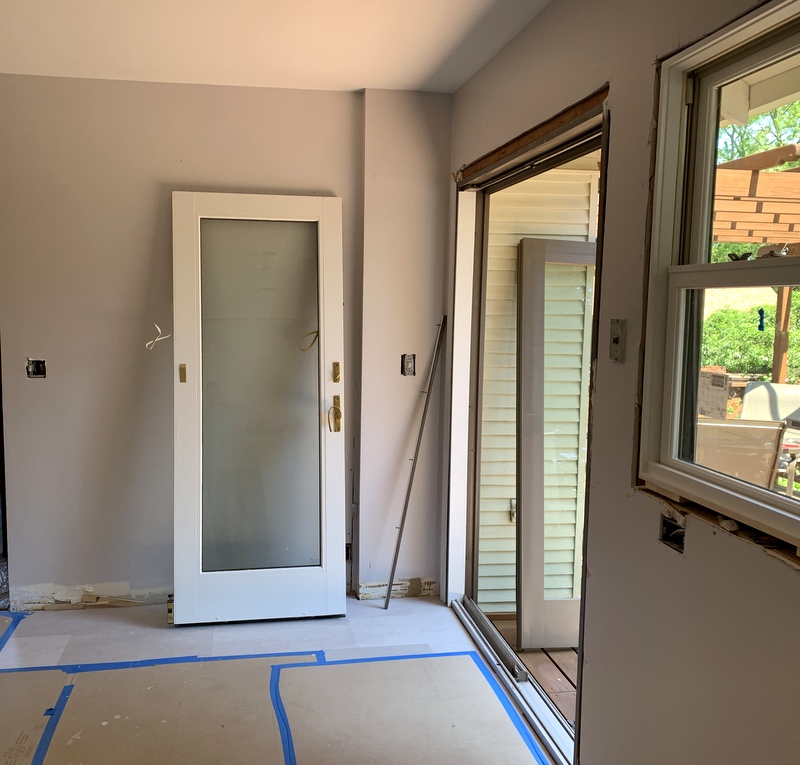
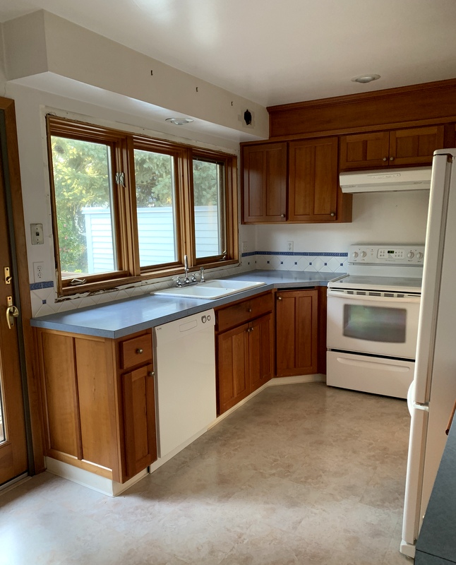
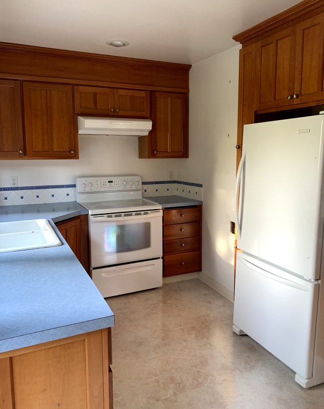
Last week marked the official start of our kitchen remodel. This is what the kitchen looked like Monday morning before the demo crew arrived:

Looking toward the southeast corner

Looking toward the southwest corner

In the first picture, you can see that the trim around the windows has already been removed. My contractor did that a couple weeks ago to get the exact measurements he needed for the new windows. You can also see what looks like a hole in the upper right side of the soffit over the kitchen sink. It is a hole. We needed to confirm that the soffit could be removed and the best way to do that was to knock a hole in it to look inside!

(I really wanted that soffit removed in the last remodel but my then-contractor was strangely reluctant to take it off. I wish now I had insisted on it because I would have gained much more storage space on the south wall. That’s one design issue that is being rectified in this remodel.)

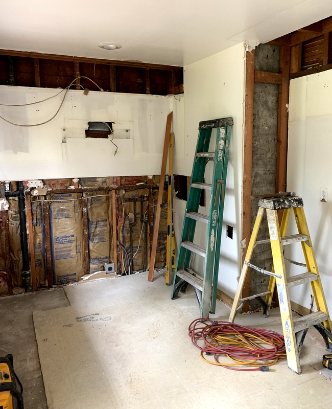
Here’s a look at the kitchen after the demo:

Looking toward the southeast corner

Looking toward the southwest corner

My contractor determined the original ceiling was dropped about 10″ at some point, perhaps when the soffits were installed. Raising the ceiling to its original height now would be an expensive proposition because of existing second story plumbing so we’ll leave it as is.

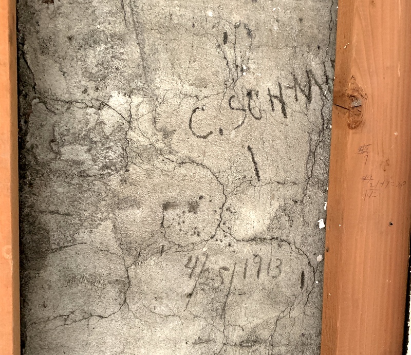
On the west wall the demo exposed writing on the concrete surrounding the furnace. We knew the house was built in 1913. Now we have an exact date . . .

. . . although we don’t know what it signifies. We also see a partial name: C. Schmi. I’m guessing it’s Schmidt. Could he be the worker who encased the chimney in concrete in a “Kilroy was here” moment? I guess we’ll never know.

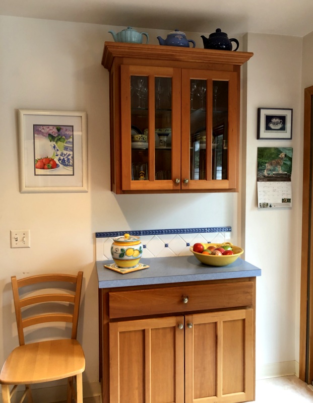
By the way, I completely forgot to take a picture of the north wall of the kitchen. Here it is before I emptied all the cupboards and took down the wall decorations:

The electricians were here all day last Thursday completely rewiring the kitchen and doing some rewiring in the basement pantry. The electrical inspector came Friday and gave his stamp of approval.

The old refrigerator has been moved down to the pantry and is already in use. And the new refrigerator? We plugged it in last week — in the dining room! It’s the logical spot for it as we have set up a temporary kitchen there.

I hope you’ll come back soon to see what happens in Week 2!


Posted in home dec, kitchen remodel, update | 8 Comments