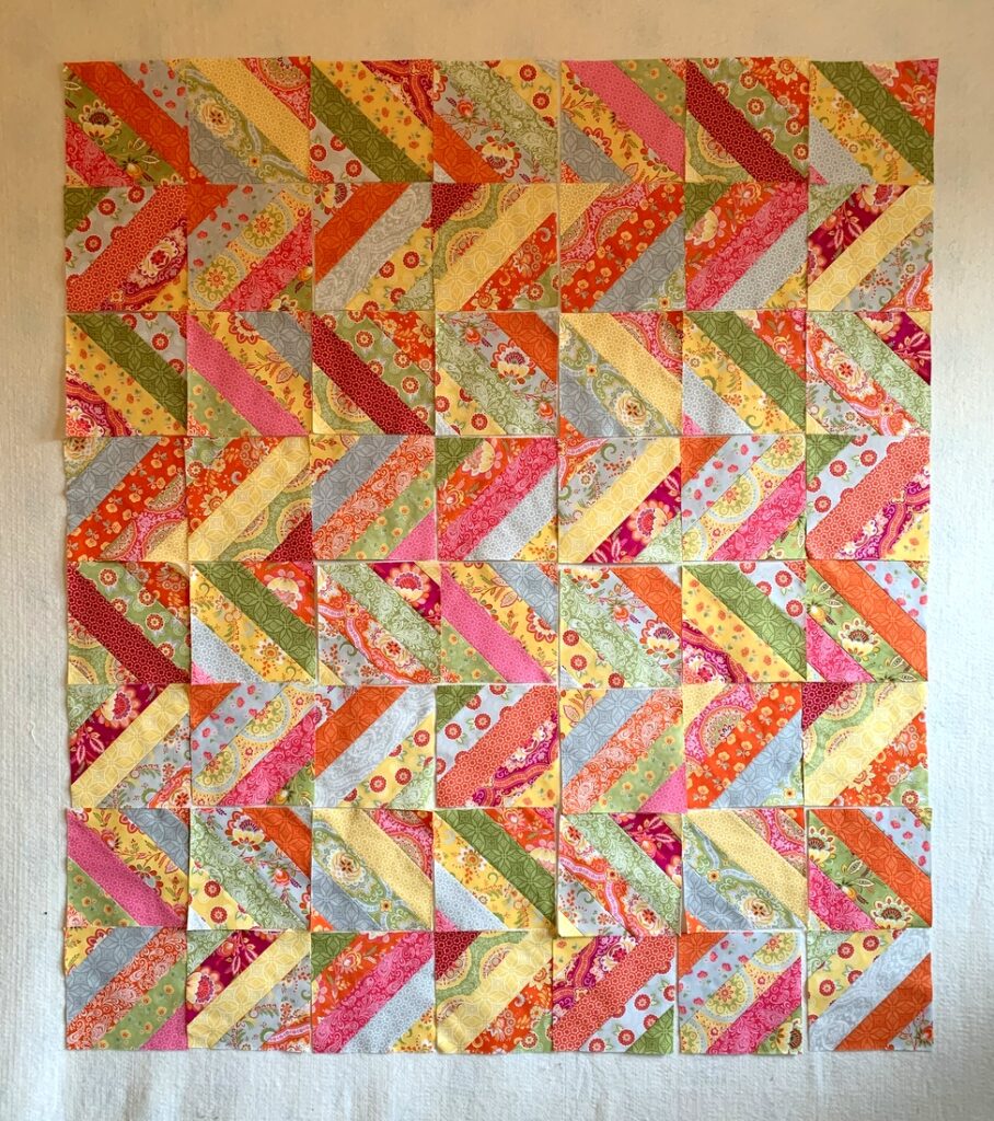
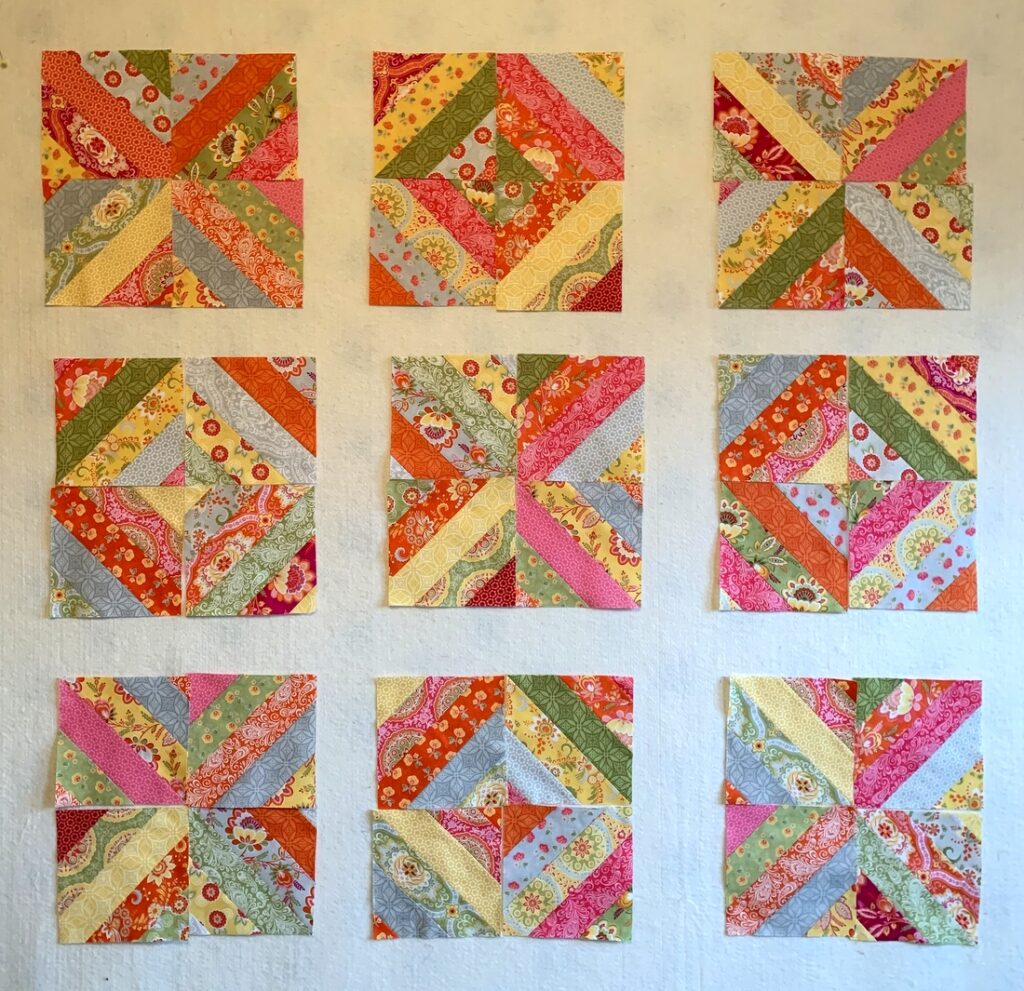
Let me start this post by telling you this is not the final layout of my current work-in-progress:
What was supposed to be a quick and easy quilt top has taken me the better part of two weeks — mainly spent in moving blocks around on my design wall. Making the strip sets and cutting them into blocks was indeed quick and easy — and really fun, as this line of fabrics (“High Street” by Lily Ashbury) was quite delightful to work with.
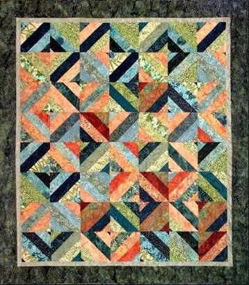
Instead of arranging my blocks like the original design, Larene Smith’s Tea Time in Bali, seen here . . .
. . . I opted for a “streak of lightning” setting, the one you see at the top of this post. After playing around for quite a while with the arrangement, I called in the Dear Husband for a second opinion.
“Well,” he said after a long pause, “it looks very modern.”
“Hmmm, yes. But it looks so . . . busy,” I said. “I’m just hoping the yellow and light grey strips give the eye a place to rest.”
“They don’t,” he replied. “There’s no place in this quilt for the eye to rest.”
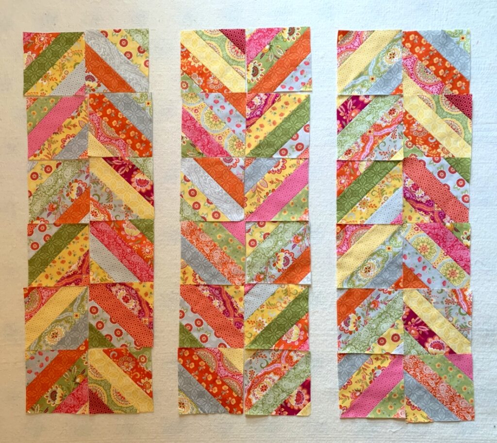
He was right, of course. At that moment I knew I had to come up with another plan, one that would include some negative space. The first thing I tried was breaking the blocks into columns:
That seemed like a step in the right direction, giving me chevrons rather than streaks of lightning. When I rotated the photo I liked the effect even better:
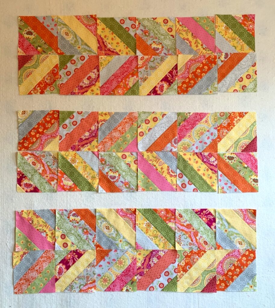
But I wasn’t there quite yet. Chatting on the phone with my sister Diane about my setting troubles, she asked me to text her photos and after seeing the one directly above she suggested breaking the blocks up even more. That got me to this point:
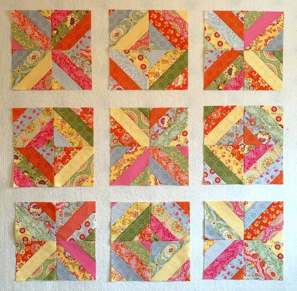
I liked where this was going. My blocks were now more like the ones in the pattern layout, with each set of four blocks looking like an X or an O. But those dark purple prints were bothering me. I removed them and added strips from some of the blocks I didn’t use:
Ah, now that’s more like it!
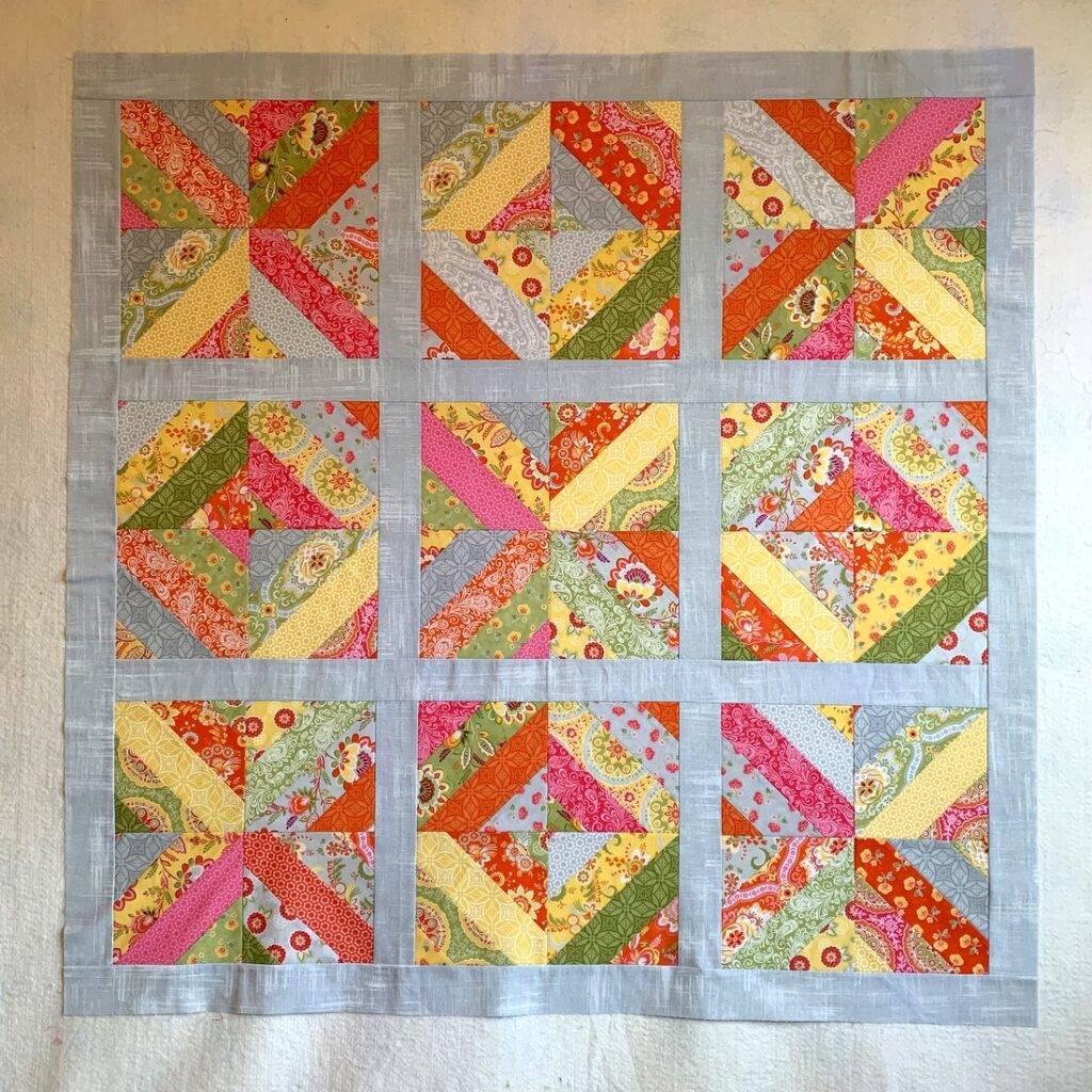
Now on to the sashing. It was easy to envision white sashing just by looking at the blocks up on my design wall but I was leaning toward light grey, thinking it would add to the modern vibe I was going for. Into my stash I dove, coming up with some strips already cut that were originally planned for another project:
The fabric, “Painter’s Canvas” by Laura Gunn for Michael Miller Fabrics, actually looks rather silvery, with random striations going in both directions.
Right now this quilt measures 45″ square. I could declare it a done deal and get it ready to be quilted but there are a couple more things I want to try. . .
I hope you’ll check back to see the outcome.

