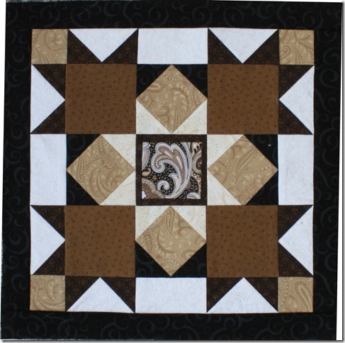
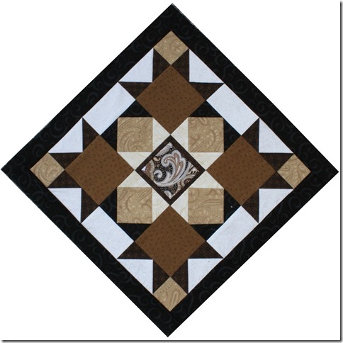
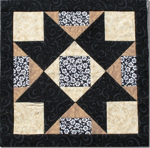
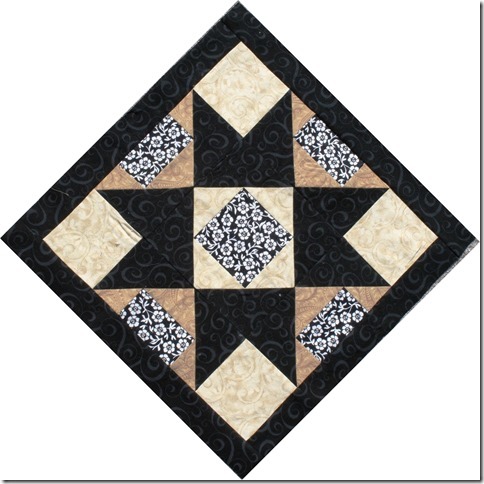
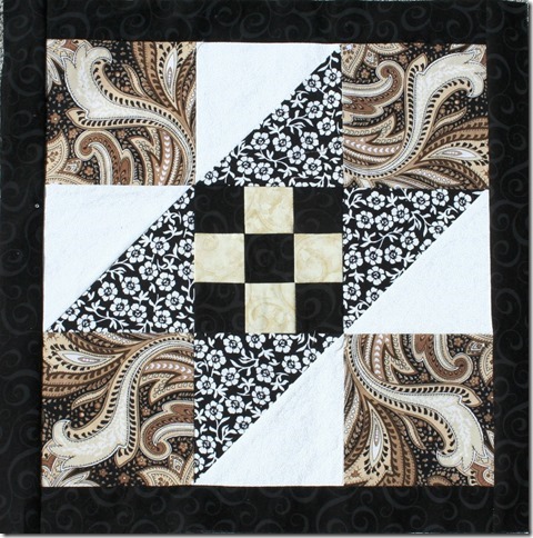
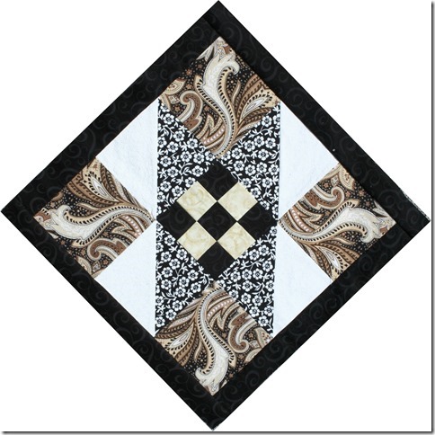
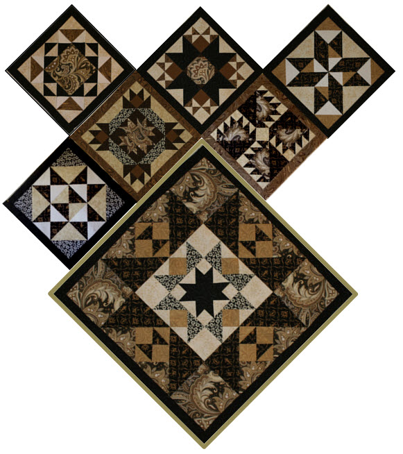
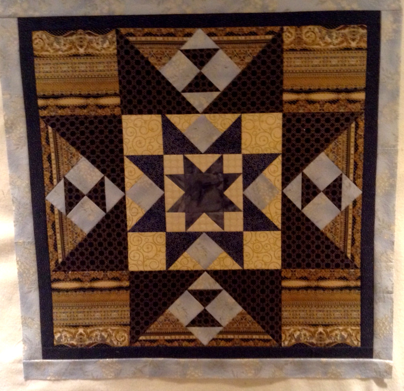
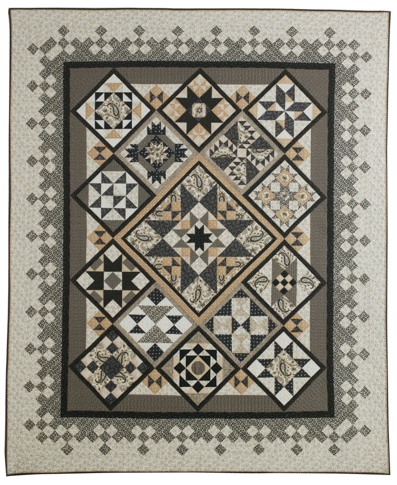
Of the 14 blocks in my Reach for the Stars sampler quilt, Block 12 was by far the easiest to make — just five squares and four four-patches — yet I spent an inordinate amount of time fussing over it.
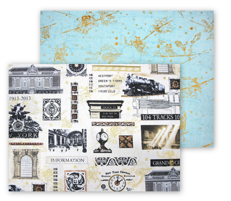
I spun my wheels initially just trying to decide which fabrics to use. I’m using several blacks, greens, and aquas and two different focus fabrics (from the same line), trying to spread them evenly throughout the quilt. Eons later (or so it seemed), I had my motif isolated from the focus fabric of choice and had settled on the white-on-black dot and the pale aqua batik.
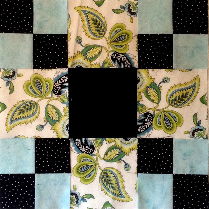
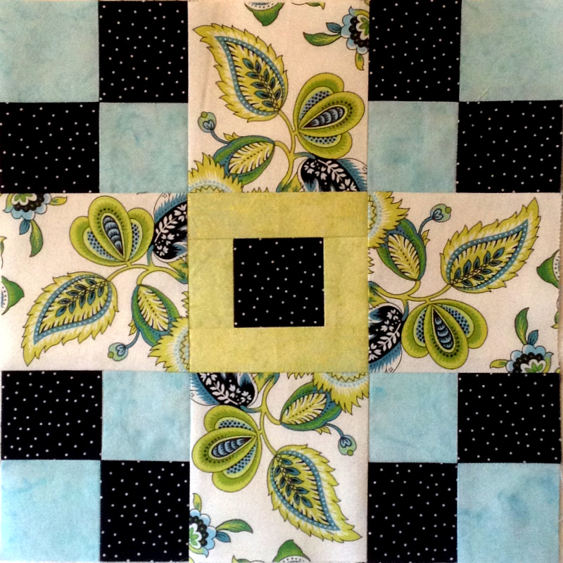
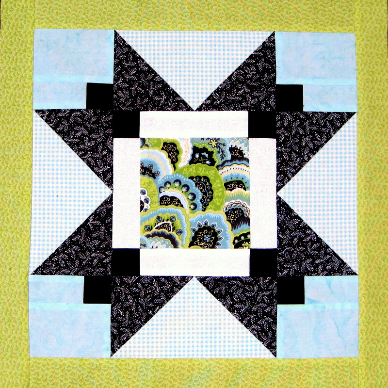
Going with the original block layout, my block 12 looked like this:
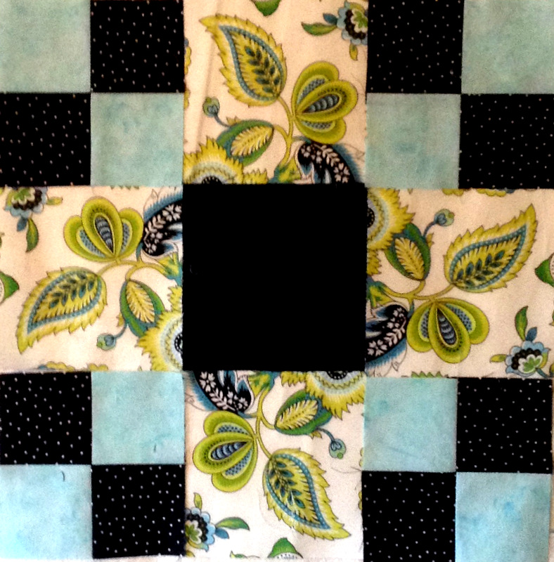
I knew I was going to change this layout. Because Block 14 is sashed in black, I was pretty sure that black in the corners would prove overpowering. I tried switching the position of the four-patch units:
Better, maybe . . . but still too much black with the sashing to come.
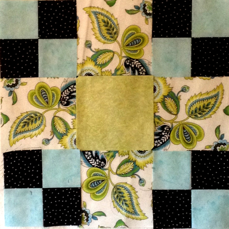
I auditioned a green square in the center in place of the black:
Nope. Too light.
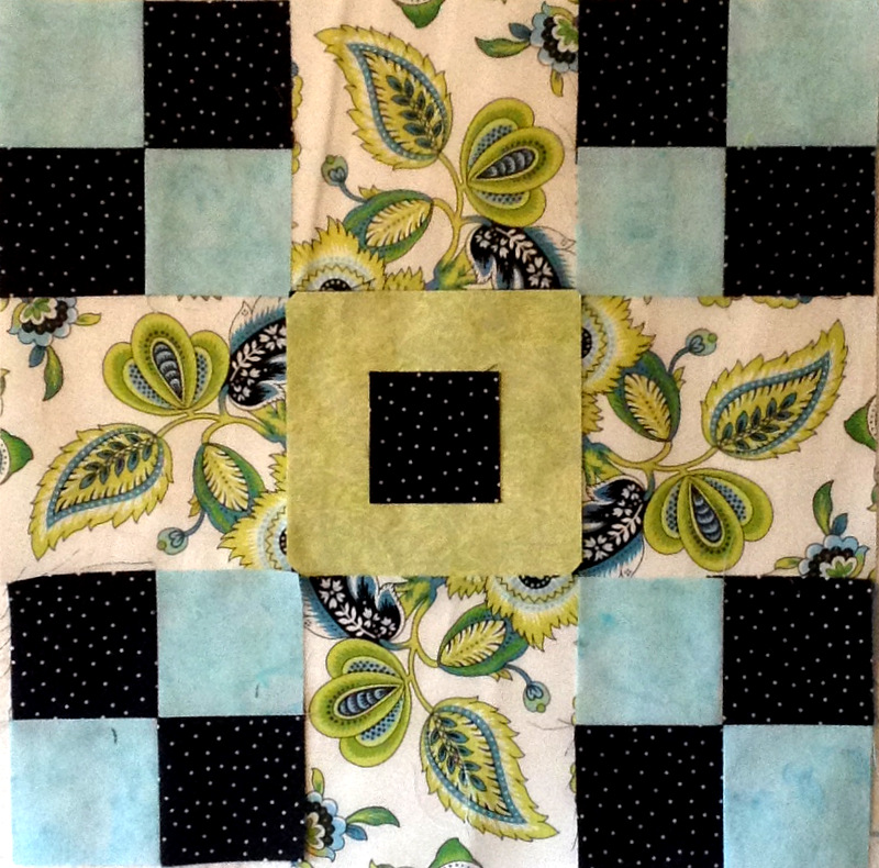
What about a square of black in the center of the green?
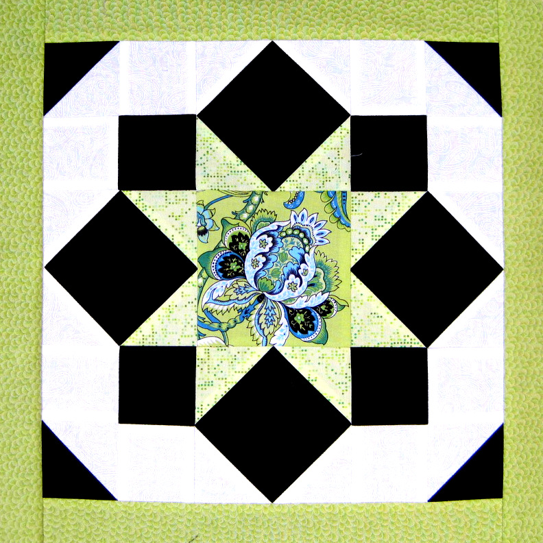
Ah, that’s better. I can live with that.
Here is the block all sewn together. . .
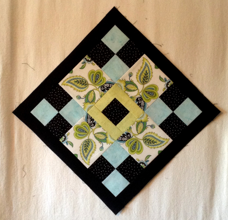
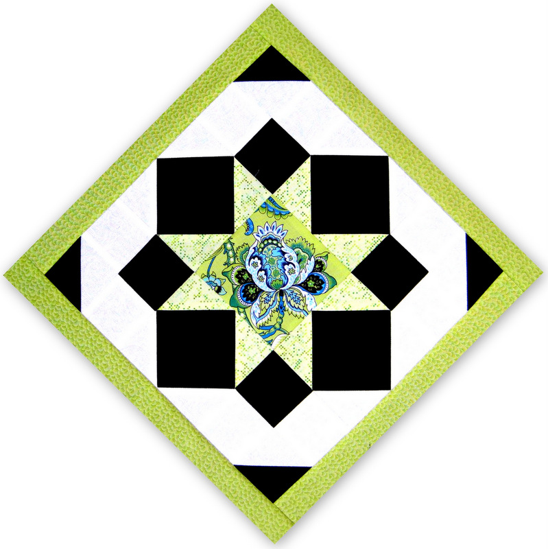
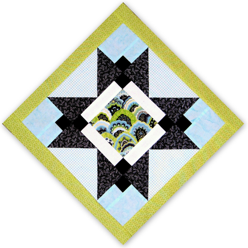
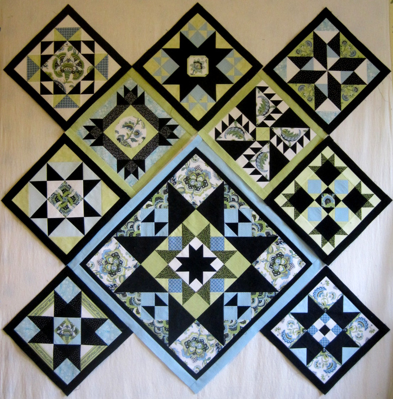
. . . and here it is sashed and positioned on point, as it will be in the finished quilt:
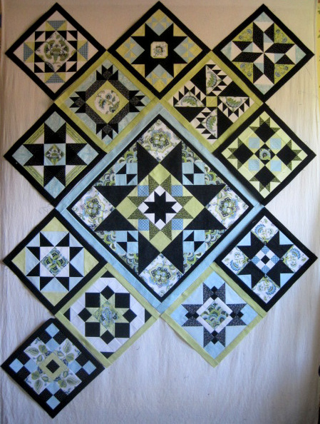
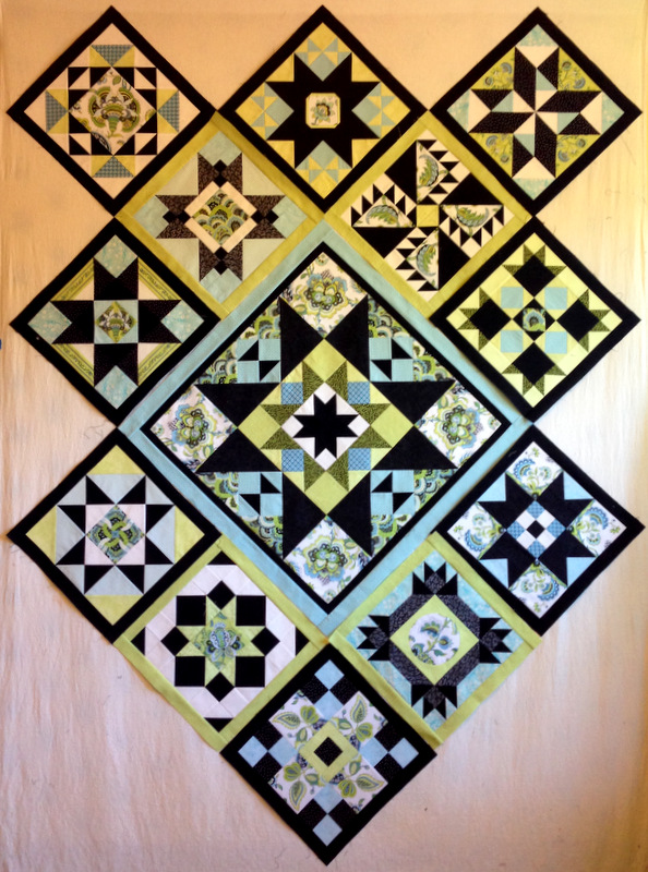
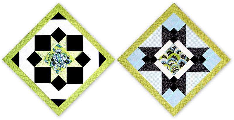
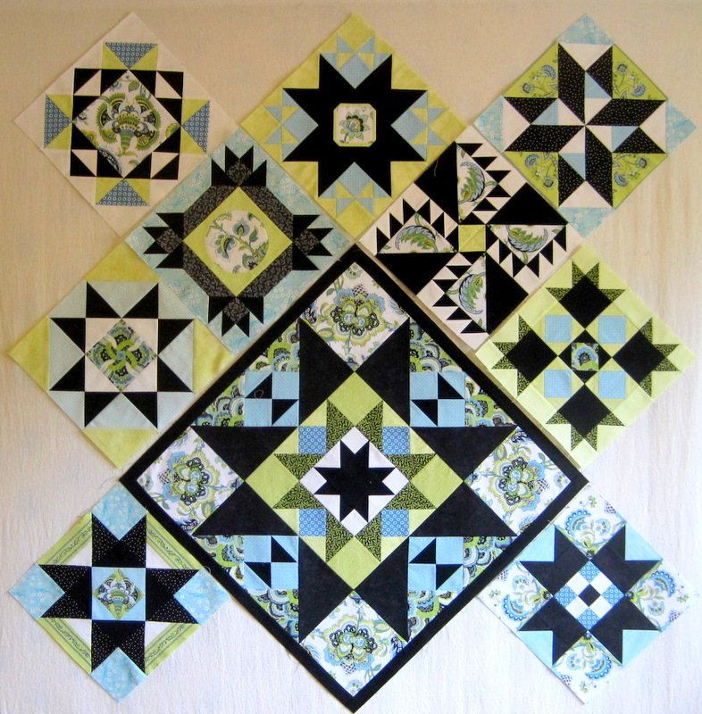
Still too much black? Maybe. When I added the block to my design wall, it looked . . . I don’t know . . . heavy compared to the other blocks. What do you think?
I also auditioned it in the center spot:
It actually looks pretty good there. Maybe my Block 12 just became Block 13!

