Author Archives: Dawn

Two New WIPs

I have a new Work-in-Progress to report:  a baby quilt! Granddaughter Bethany is expecting her fourth child in a few weeks — and it’s a girl! Baby Isabella — yes, she already has a name — will be joining three older brothers. We are all so excited to be welcoming a girl (although a boy would be equally treasured).

One thing I knew for sure in planning this quilt: it would not be “gender neutral.” Baby Isabella’s quilt will be decidedly feminine, meaning: Think Pink! I pulled out a treasured piece from my stash, “Cherry Baby,” a lovely pink and green print from Holly Holderman for Lakehouse Dry Goods, and discovered a companion print, “Cherry Toss,” tucked in with it. I’ve had these fabrics for — oh, a good dozen years. I must have been waiting for the perfect project.

I won’t be showing more until the quilt is done. Bethany follows my blog so I want to keep part of the quilt a surprise for her. I do hope she likes what she sees so far!

I titled this post “Two New WIPs.” I’ve described the Work in Progress underway in my sewing room. And what of the second WIP? Why, it’s Baby Isabella, of course!


Posted in baby quilt, family, update | 4 Comments

Sock It To Me!

You must be wondering what on earth a pair of socks has to do with quilting. Let me explain. The pattern on these socks is one of the prints from designer Katarina Roccella‘s new line, “Capri,” which is in quilt shops right now. If you missed my recent post about it, here’s a look at the line of quilting cottons from Art Gallery Fabrics:

(You don’t see the lemons-on-stripe print in the photo above because it’s one of two designs in the line that were printed on fabrics other than cotton.)

If you’re a regular reader you know that I ran off in high spirits last month and bought 10 prints from the line. So far I’ve only made a pair of pillowcases using three of the fabrics. I’m still dreaming about what to do with the remainder.

In her March 27 post on Instagram (instagram.com/katarinaroccella), Katarina mentioned that several designs in the “Capri” line, including lemons-on-stripes, were available on a huge range of products through a website called redbubble.com. I was intrigued. Following a link in her profile, I visited the website and learned that Redbubble is a global online marketplace for print-on-demand products based on artwork submitted by independent artists. An image isn’t printed on an item until an order comes in so there’s no waste from overproduction. When someone orders a product, the artist gets a portion of the proceeds.

I decided to give Redbubble a try, ordering a pair of socks and two coffee mugs with the lemons-on-stripes design. My socks arrived six days later! (The mugs are supposed to be delivered tomorrow.) I’m very pleased with the quality of the socks, which are made from a blend of recycled polyester, nylon, cotton, and spandex. They’re super soft and fit very nicely. Based on the quality of the socks, I placed an order today for a travel mug with the same lemons-on-stripe design — you know I have a thing for lemons! — and a mouse pad with the main fabric in the “Capri” line, a landscape of the Amalfi Coast.

If you are intrigued, too, you can click here to see Katarina Roccella’s designs on everything from leggings to smartphone cases to shower curtains to journal covers. It’s pretty amazing! By the way, I don’t have a financial interest in Redbubble nor do I accept any sponsorships on my website/blog. I’m writing about this because I believe making purchases that support artists like Katarina Roccella is a worthwhile thing to do and the items are things I will enjoy using.

I made another purchase recently that benefits a different but infinitely worthy cause. I saw the March 18 post on Instagram of Pat Sloan (instagram.com/quilterpatsloan) wearing a t-shirt featuring a beautiful sunflower image designed by Kate Spain. The tees are for sale on Kate Spain’s website, with proceeds going to support Chef José Andrés and the World Central Kitchen for relief efforts in Ukraine and Poland.

Kate’s design is called “Sunflowers in My Heart” and quilters who purchased t-shirts were encouraged to post photos on Instagram wearing theirs. Here’s the photo I posted:

Kate Spain herself commented on my post! You can check it out here.

Thank you for stopping by!


Posted in roll-it-up pillowcases, update | 4 Comments

A Sea of Stars

I made another 12″ block in my ongoing Sea Sampler project today. Before I show you the finished block, take a look at the fabric I used for the star points:

Is that not swoonworthy? It’s an ombre from Maywood (from a few years ago) that I pulled from my stash when I noticed how much the print looks like phosphorescent waves. While I was checking the proper spelling of “phosphorescence,” I came across another word for it: “bioluminescence.” Water bioluminescence resembles a sea of stars suspended in the waves. Yes, that’s exactly what I see in this fabric!

The block came together in an odd way. Normally I decide what will go in the center of the block and work outward. This time, I started from the outside in, making the star points first:

I used the darker value of the ombre fabric, which is darkest on the selvedge ends, moving to lightest in the center. You can see what I mean here, where the fold line marking the middle of the fabric width is very visible:

While I was pondering what to put in the center, my eyes fell on my current Junior Billie Bag, which sits by the door to my sewing room. As it turns out, both sides of the bag served as inspiration for the center. Here are the two sides during construction so you can see both at once:

The one on the left features a Churn Dash block inside a Sawtooth Star. I was thinking about making a Churn Dash block when it dawned on me that the fabric in the center of this particular Churn Dash has ferns that look like they’re under water. That small square — 2″ finished — is from the same piece of fabric as the circle on the right side.

I had actually auditioned that fabric when I was going through my stash for the Sea Sampler project and had rejected it because it didn’t look watery. But when I pulled out a piece and got a better look at the fern fronds, I saw an image that reminded me of an underwater garden. Even better, the image would fit really nicely in the 6″ x 6″ space I needed to fill.

I fussycut a piece slightly on the bias so the ferns would point toward a corner, as if it were gently undulating under water. This is the result:

See the bubbles?

Behold my finished block:

As you can see, I added small triangles to the corners of the center block as well as the inside corners of the four outer squares. Why? Because I wanted more green in the block and I wanted to add some visual interest to the basic block design. I love how the green triangles form little hourglasses on the diagonal.

Here is the new block (second row, center) with the other five 12″ blocks made thus far:

They join three 18″ blocks, which you can see here, and a smattering of 6″ blocks. This quilt is evolving slowly but surely. My sewing time is somewhat limited these days so I’m just coasting along, making a block here and there. But I do have what I think is a great idea for a layout.


Posted in Billie Bag, sampler quilt, update | 10 Comments

“The Isle of Capri”

I’m bringing a little sunshine to the Portland White House with these pillowcases made from “Capri,” Katarina Roccella’s new fabric line for Art Gallery Fabrics. I fell in love with the line when I spotted it in Hawthorne Supply Company‘s weekly email newsletter a couple of weeks ago. It took a few days of daydreaming about it before I yielded to impulse and placed an order.

I was telling my students in a quilting class last week about my — ahem — rather large purchase, which I referred to as “a shopping accident.” One of my students said, “You didn’t have a shopping accident, you had a shopping adventure!” That sounds ever so much better, don’t you think?

I confess: I wound up ordering 10 prints from the line — and I may not be done yet! Just take a look at the fabrics:

Can you see why I fell in love with it? I have no earthly idea what I’m going to make with this luscious array but I did order enough extra of the aqua lemon print to make those pillowcases for the Dear Husband and me. (I used the burrito or roll-it-up method for the pillowcases, using my own tutorial which you can find here.)

I am lucky to have visited the tiny island of Capri several years ago on a trip to Italy with the DH. These pillowcases will be a fond reminder of that trip. They are a fond reminder of something else. When my siblings and I were little, our father used to sing to us. One of the songs he sang was “The Isle of Capri,” whose first two verses go like this:

“Twas on the Isle of Capri that I found her
Beneath the shade of an old walnut tree
Oh, I can still see the flow’rs blooming ’round her
Where we met on the Isle of Capri.

“She was as sweet as a rose in the dawning
But somehow fate hadn’t meant her for me
And though I sail with the tide in the morning
Still my heart’s on the Isle of Capri.”

According to Wikipedia, “The Isle of Capri” was a #1 hit in 1935, the year my father turned 12. The music was written by Will Grosz with lyrics by Jimmy Kennedy. The tempo is described as a tango foxtrot but my dad sang it like a ballad. I love those old romantic songs as much as I love pretty pillowcases.

I’m going to put the new cases on our pillows tonight. Maybe I will dream of Capri!


Posted in family, home dec, roll-it-up pillowcases, update | 12 Comments

Susan’s Star, Embellished

I didn’t think the block I made last month called Susan’s Star could get any better but I embellished it today by appliquéing a round fussycut flower in the center square, and I’m so happy with the result:

Credit for this idea goes to my quilting cousin, Patricia, who follows my blog and suggested the addition after reading my post of March 3. Good call, Patricia!

Susan’s Star is one of three 18″ blocks in a sampler quilt I’m working on that also features 6″ and 12″ blocks. The other two 18″ blocks have a blossom in the center, one pieced and one appliquéd:

Patricia thought my third 18” block would benefit from having a flower in the middle as well. For the block on the right I used a method other than needleturn applique. For Susan’s Star, though, I decided the time had come to give needleturn appliqué another go. If you are new to my blog, you may not know I learned needleturn appliqué in 2019 making this quilt.

Because three years had passed since I’d done any needleturn appliqué, I approached this task, simple and small though it be, with some trepidation. To be honest, I’m not sure I did everything correctly but it turned out just fine.

I started by drawing a dotted circle (my stitching line) on the fabric using a jar lid as a template and cutting a scant quarter inch away from the stitching line. After finger-pressing the stitching line I pinned the piece in place:

Stitching has commenced! Off to a good start:

After the first few stitches I felt like I had found my rhythm. Do you suppose doing needleturn appliqué is like riding a bike?

And here we are where we started, with the finished block:

I haven’t been spending nearly enough time in my sewing room lately so getting this little project completed felt very good. It was my way of celebrating National Quilting Day.


Posted in appliqué, Hazel's Diary Quilt, needleturn appliqué, sampler quilt, update | 6 Comments

More Marvelous Mitts

Oven mitts, that is. I’ve made a few pair recently for friends and family. Tracy’s mitts are a royal blue tone-on-tone floral:

I quilted a 1″ grid which offers a pleasing contrast to the curves of the petals. The lining fabric is a bright blue and yellow paisley print with just a touch of silvery metallic:

Jeanne Ann’s mitts are made of a blue and green filigree fabric that I’ve used in several projects:

These were quilted with random wavy lines, a design I like a lot and can do easily and quickly using my walking foot (no marking lines needed). The lining is the same dotted fabric used for the band at the cuff.

I love that filigree fabric so much I scoured the Internet last week for more and was lucky enough to find a yard. I’m tempted to make a pair of mitts for myself out of it. But wait! I’m using that fabric — as well as the royal blue floral in Tracy’s mitts — in my current Sea Sampler project so I’d better move the idea of new mitts to the back burner. (I don’t need new mitts in any case; the ones I made two years ago look almost new, despite having made multiple trips through the washer and dryer.)

My friends David and Ken embarked on a major kitchen remodel last year so I told them I’d make them a pair of mitts as a “kitchen warming” present. The remodeling project was drawn out much longer than expected due to the pandemic. Shipping delays, mostly. But their kitchen is finished now and so are their mitts:

David gave me an outline of his hand so I could make a custom pattern:

These mitts are considerably larger than the other ones I’ve made so far. In fact, they’re close to the “one size fits all” mitts one sees in the stores – the ones that are too big for me, which is precisely what led me to make my own pattern last year, followed by a tutorial.

Here’s one of David and Ken’s mitts next to one of Tracy’s:

Quite a difference, eh?

Are you ready to make yourself a pair of oven mitts? You can either use my free pattern or follow my directions (in the Prequel to the Tutorial, below) to make a pattern to fit your own hand.

Click here to download the free pattern:
Oven Mitt Pattern, page 1 of 2
Oven Mitt Pattern, page 2 of 2

Oven Mitts that Fit: Prequel to the Tutorial

Oven Mitt Tutorial from First Light Designs, Part 1

Oven Mitt Tutorial from First Light Designs, Part 2


Posted in family, oven mitts, tutorial, update | 5 Comments

Boosting a Block . . . Again

If this 18½” block looks familiar, it’s because you’ve seen some earlier versions of it. It’s one of the blocks from my ongoing Sea Sampler project begun last spring.

The block you see above started out as this 12½” block made using Cluck Cluck Sew’s free pattern called No Point Stars:

I decided to convert it into an 18½” square block by setting it on point, framing it with a strip of purple, and adding setting triangles to bring it to size:

I felt it needed a boost so I hand appliquéd a fussy-cut flower to the center of the block:

Definitely an improvement.

After making a few smaller blocks (the ones that will finish at 6″ and 12″ square), this was what I had:

So far so good.

I made a couple more 12″ blocks and then added a third 18″ block, the one I call Susan’s Star because I first spotted the design on Susan Ache’s Instagram page (see her post of Nov. 29, 2021):

When you take a look at my three large star blocks, you will probably be struck, as I was, by how much Susan’s Star and the block called Chicago Star (upper left) stand out compared to the block that began life as a No Point Stars block:

I knew instantly what that block needed: some green!

Wow, what a transformation!

I put all three stars up on my design wall . . .

. . . and as much as I liked the addition of green to my embellished block, it still needed something more. What could it be?

Maybe I should add a green triangle to each corner, drawing the eye out to the edges the way the other two blocks do. I cut four green triangles and stuck them up on the block to audition the effect:

I really liked what I saw but . . . would blue triangles in the corner be a better choice than green?

Only one way to find out:

Yes!

After sewing the blue corners on, I put all of the 12″ and 18″ blocks on my design wall and stepped back 10 feet. This is what I saw:

Yes indeed. That was just the boost the block needed.

I’m sure you have figured out by now that this sampler quilt is coming together without a plan. I don’t have any idea how big it will be or how many more blocks I will make. That’s okay with me because I am confident I will love the end product.


Posted in sampler quilt, update | 9 Comments

Susan’s Star Meets Dawn’s Sometime Sea Sampler

Isn’t this a fabulous block? I call it Susan’s Star.

If you follow Susan Ache — her Instagram handle is yardgrl60 — you may have seen her rendition of this block on her post of Nov. 29 last year. Susan is fond of taking orphan blocks and creating fabulous sampler quilts. She made her version of this block in red, green, and white. I was instantly enchanted when I saw it, so much so that I kept coming back for repeat views.

I wondered if it was her own design or perhaps a traditional block, so I contacted her this week to find out. Susan told me she hasn’t done any research to see if it’s an existing traditional block; she was just playing around when she created it. I asked her if it would be all right if I posted my version and if I could also post a picture of her original version. She kindly said “yes” to both questions.

Here is Susan’s original version:

I think you can see why I was inspired!!

I thought the design might fit well with one of my Works-in-Progress (WIPs) dating back to May of 2021. To refresh your memory, that was when I started making blocks using this initial fabric pull:

The pull was for a very informal Block of the Month program via Zoom that Montavilla Sewing Center, where I teach, had created for me and some of my students while in-person classes were suspended due to Covid. When in-person classes resumed in September, the Zoom classes sort of petered out but I decided to forge ahead, making my favorite blocks from the BOM design but branching out to include others, with the idea of coming up with my own sampler quilt.

When I saw Susan’s block, I just knew I had to include it. The blocks I have made thus far measure 18″, 12″, and 6″ square. (That’s the finished size; the unfinished size is ½” larger.) I’m not sure what size Susan made her block but I made mine to finish at 18″ square.

Many of the fabrics I’m using suggest waves, tidepools, and starfish so I have come to think of this project as my “Sea Sampler.” Because I’ve worked on it off and on, this has morphed into my “Sometime Sea Sampler.” (Could that be the final name of the quilt? Perhaps!)

Oh, one more thing. I clipped quite a few seams on the back to achieve the flattest seams. I thought you might like to see what that looks like:

In the next few days I’ll post photos of the blocks I’ve made so far. Maybe that will help me decide how to move forward.


Posted in Block of the Month (BOM), sampler quilt, update | 7 Comments

Fraternal Twins

I’m enjoying the inside view of one of the front windows at Montavilla Sewing Center in Lake Oswego. I taught a class there this evening, and as the sky darkened my two versions of Dresden Neighborhood were set off very nicely, with the reflected view of the shop adding a lovely touch.

Do you ever like a quilt design so much you make it twice? I can think of at least four designs I’ve made twice. It’s always fun to see how two quilts from the same design look alike but also differ — sort of like fraternal twins. I should know: I am one! My twin Diane and I don’t look alike but our voices are so similar her daughters can’t tell us apart on the phone.

The pattern Dresden Neighborhood was designed by Kim Lapacek of Persimon Dreams. I’m delighted to be able to teach her design in my class called “Wonky Dresden Neighborhood,” scheduled Saturday, April 23, at Montavilla Lake Oswego.


Posted in appliqué, table topper, update, wall hanging, wonky Dresden neighborhood | 7 Comments

“Mirror Mirror on the Wall . . .

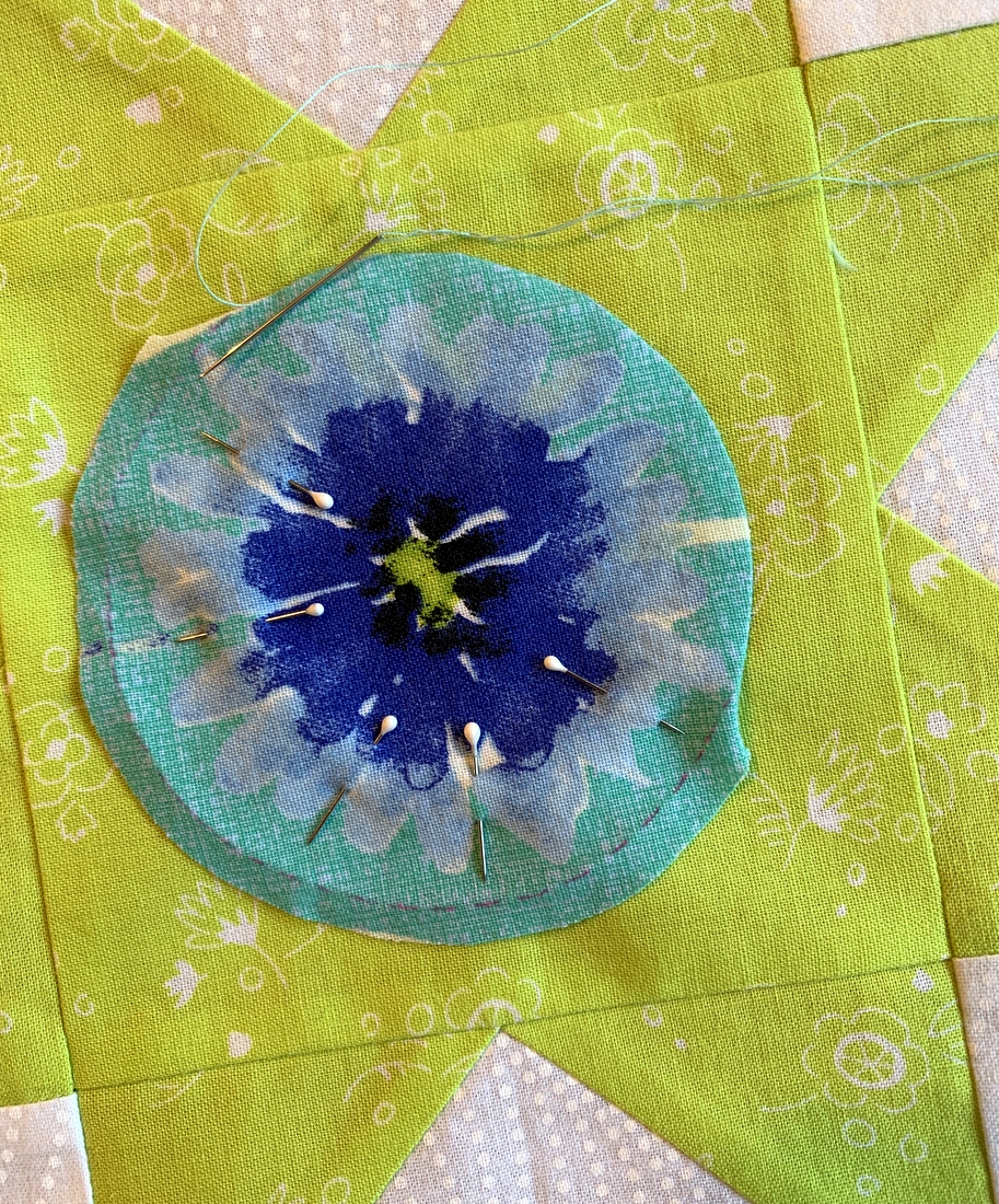
. . . which is the fairest button of all?” Not exactly a fair question, is it? After adorning my Holliberry Circle mini quilt with vintage buttons and showing off the result in my last post, a few people commented on ones they especially liked so I thought I’d offer close-ups of all of the buttons:

The clear green glass button on the right above is certainly unusual, and I love the one on the left that reminds me so much of a Churn Dash block.

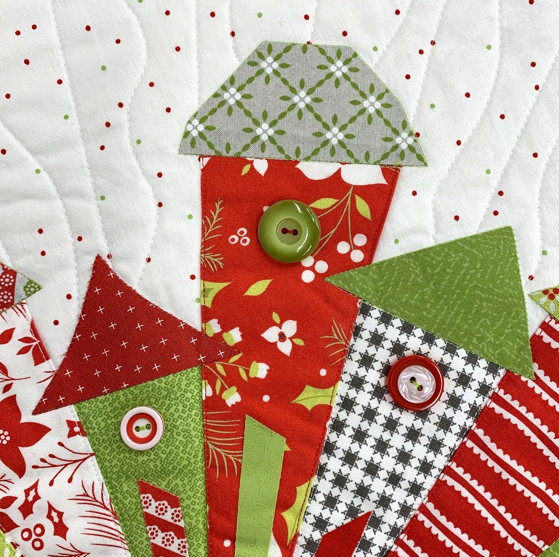
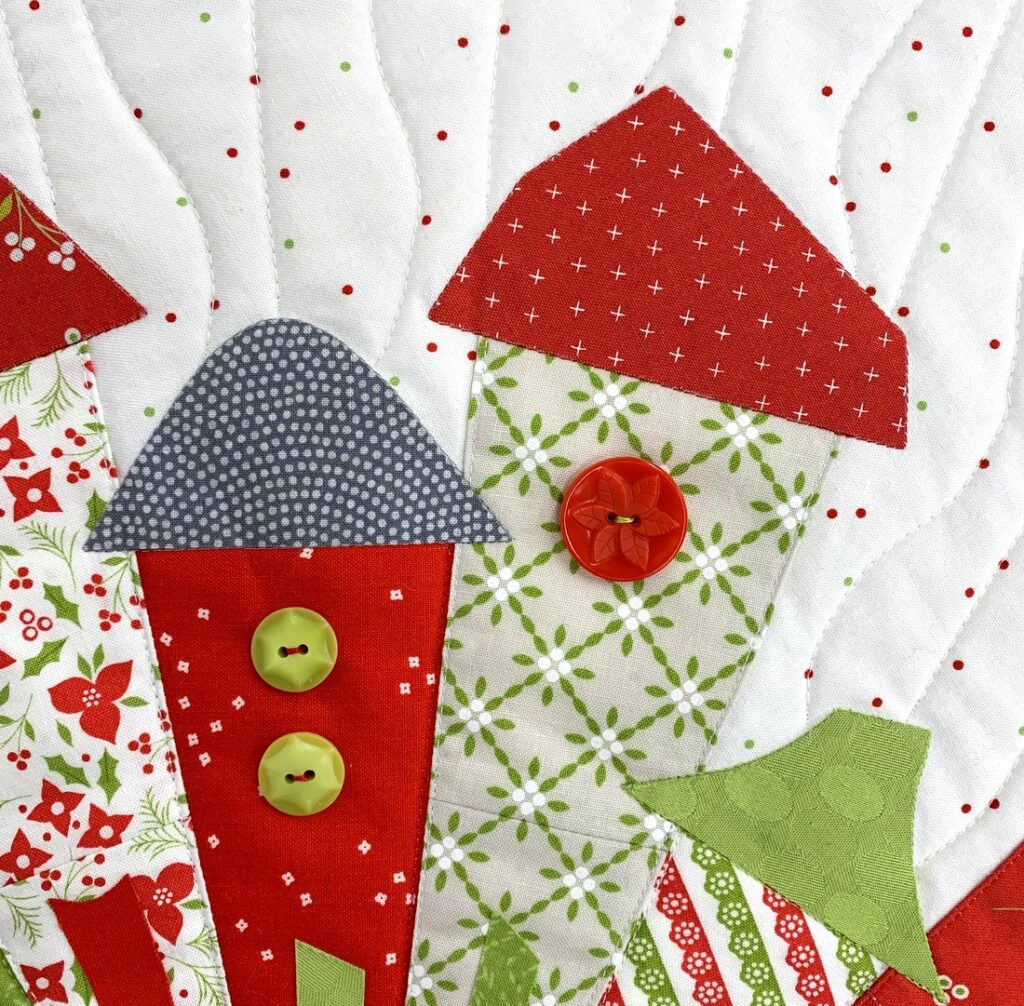
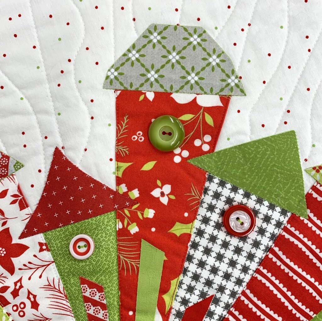
In the photo below, notice the secondary star shape in the round green buttons. And does the red button on the right make you think of the Canadian Maple Leaf? It doesn’t have as many points but still . . .


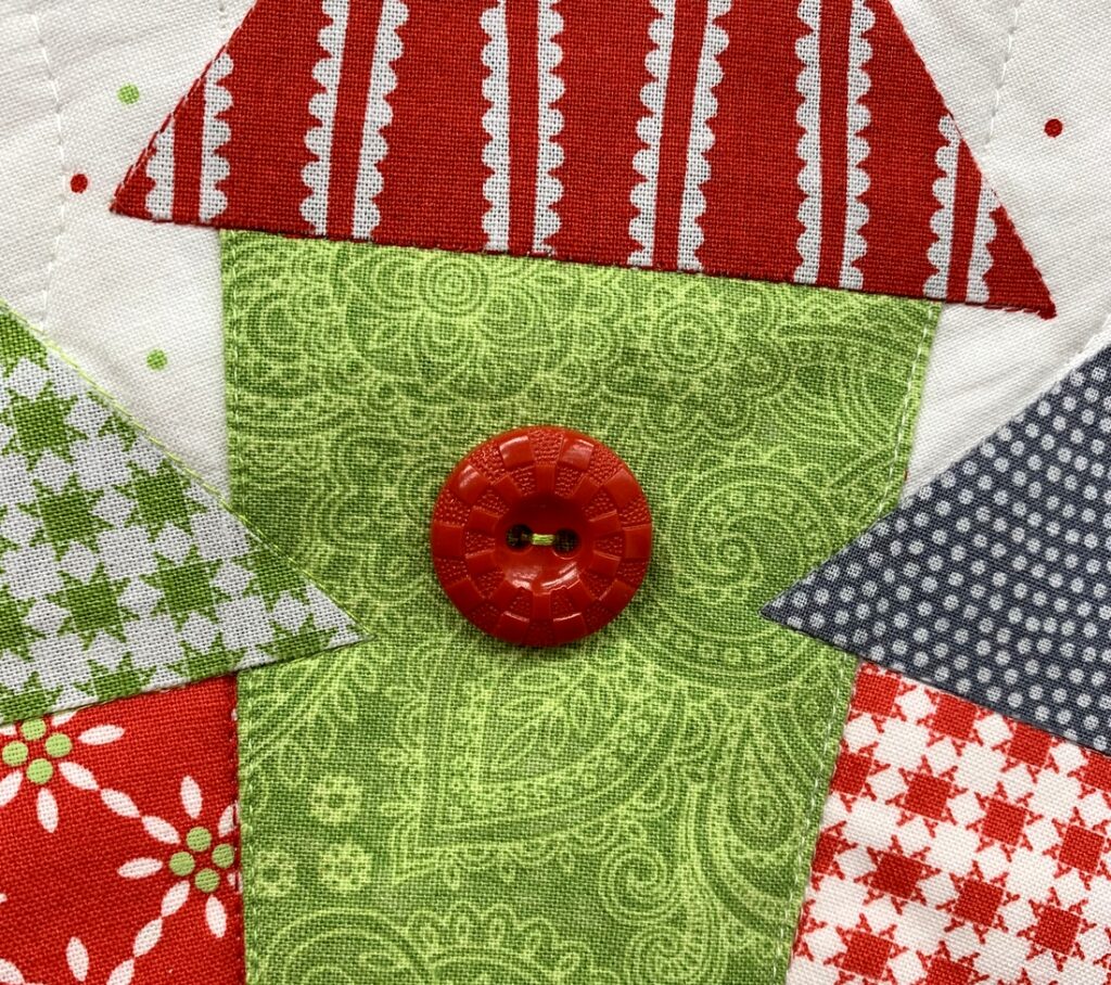
The basketweave pattern in the red button below charmed me:


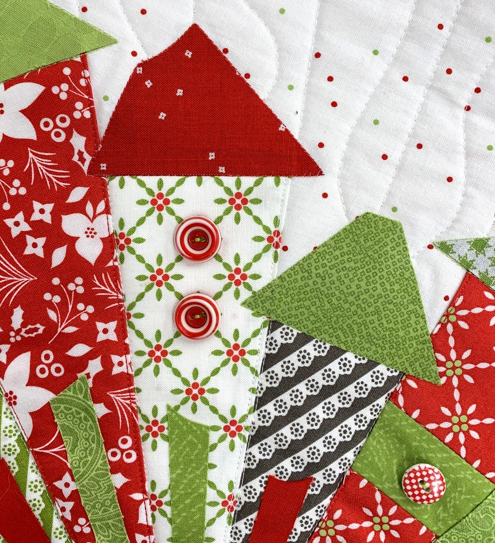
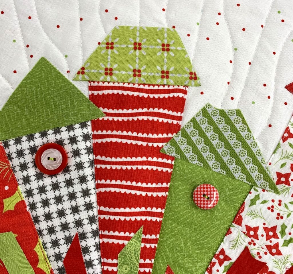
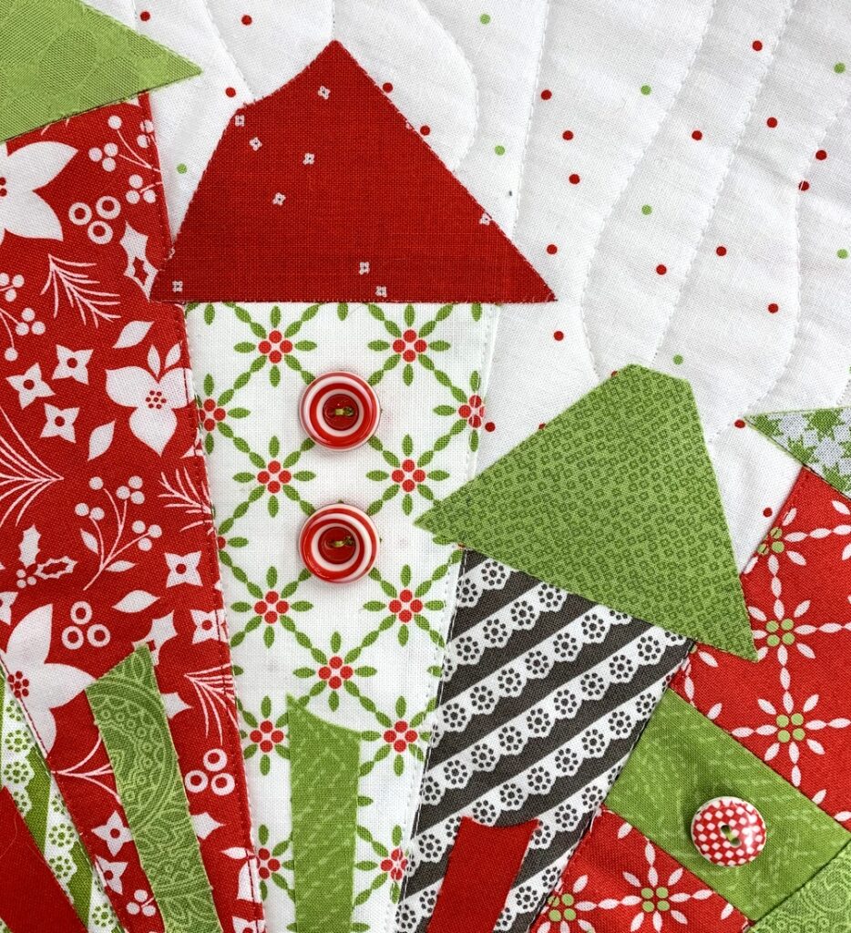
My friend Vickie really loved the red and white “gingham” buttons — there are two on the quilt, one of which is shown below right. The red and white button on the left below is actually two buttons. I centered a small white button with an interesting design on top of a plain red one, thinking the combo set off the grey and white background print very nicely:


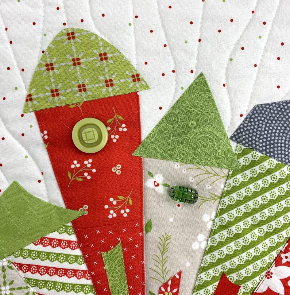
I think of the buttons you see below as “the peppermint candy buttons.” They appear on another house, too:


Here’s another look at that double button along with its two neighbors to the left:


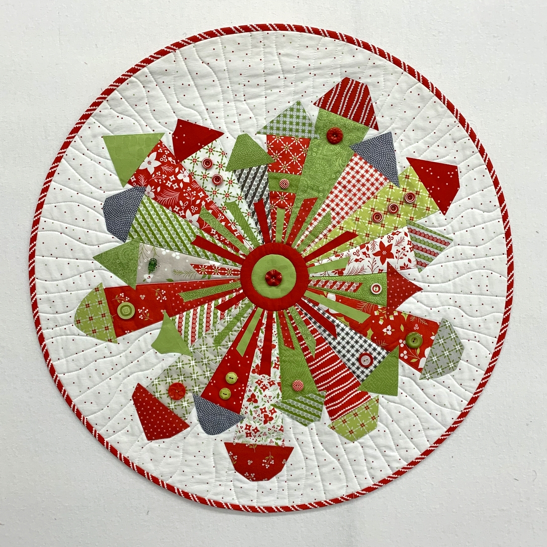
And finally there’s that red ruffle button smack dab in the center of the quilt:

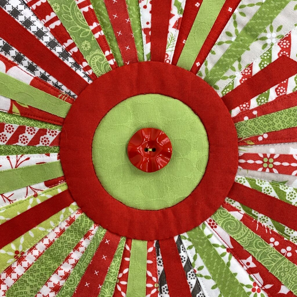
Did you happen to notice that I attached the red buttons with green thread and vice versa? Just a little fun touch to make the quilt more interesting.

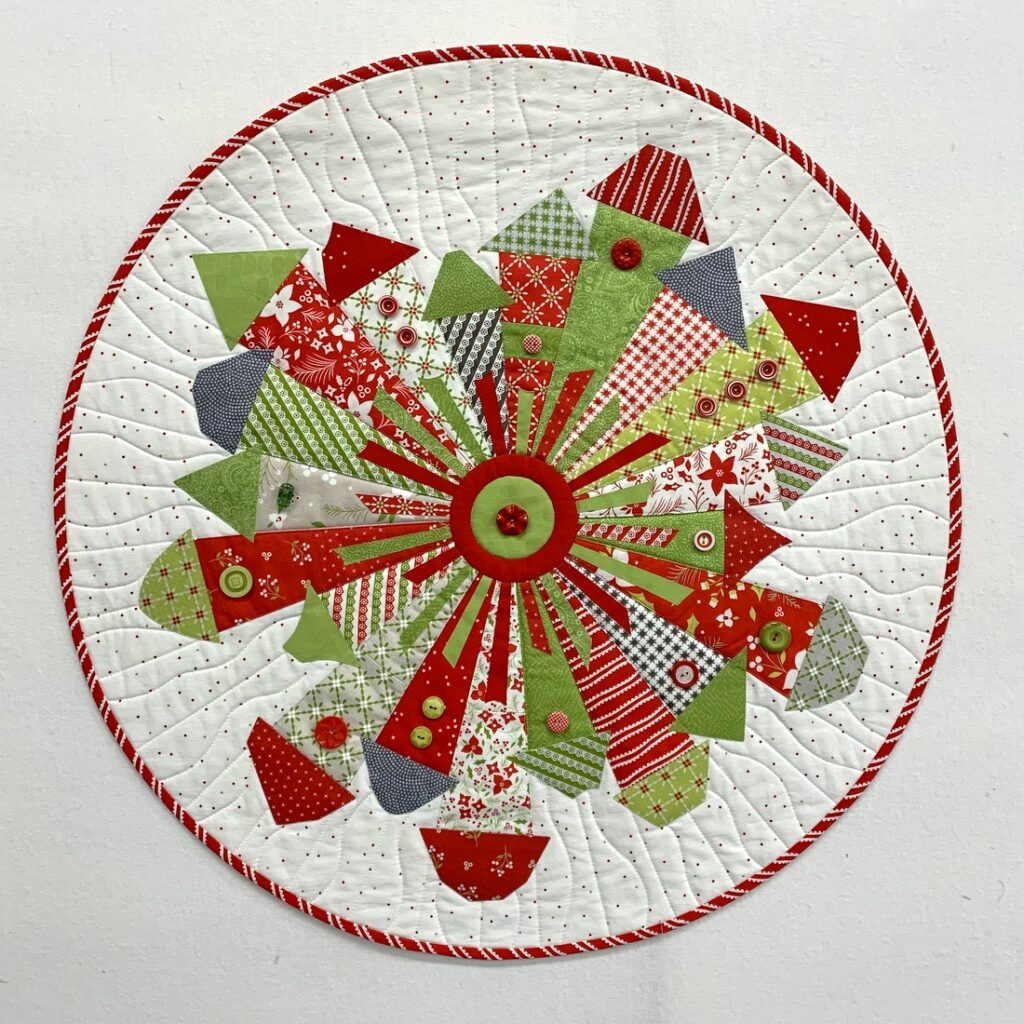
Here’s a look at the entire quilt:

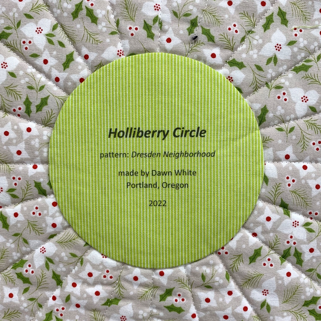
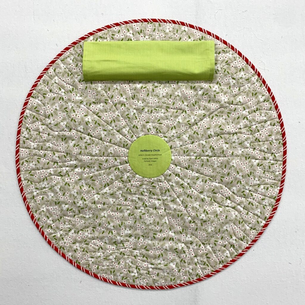
And here’s a look at the simple label on the back, printed on the computer and appliquéd by hand in the center of the circle:

I added a sleeve on the back (so it can hang at Montavilla Sewing Center in Lake Oswego) but changed my placement of the sleeve after reading a question from reader Linda, who asked, “How do you hang a circle quilt? I have one and I put a hanging sleeve on it but it droops.” I’ve never made a round quilt before but because of the smart question Linda posed I raised my sleeve more toward the top of the quilt:

I tested the sleeve using a spring tension rod and it seemed to hold the quilt properly, with the curve at the top seeming to stay in place above the rod. I haven’t seen the quilt hanging at Montavilla yet but I am hopeful it doesn’t droop above the rod.

My friend Colleen responded to Linda’s question with two thoughts about how to keep a round quilt from drooping. Colleen wrote, “. . . I was wondering if you made an X with very thin dowels with tiny pockets for them to plug into on the perimeter if that would work? Kind of along the theory for how a kite is stabilized. Or maybe a thin wire circle around the perimeter? That could even fit inside the binding . . .” Both of those ideas sound like they could work. Ingenious, Colleen! Something along those lines would most likely be a necessity on a quilt larger than this one, which measures 25″ in diameter. If it turns out my quilt at Montavilla is drooping, it’s nice to know I have some options.

Another question was posed by my twin sister Diane (a non-quilter), who said, “This inquiring mind wants to know how you sew on buttons without leaving telltale threads and knots showing on the back.” Ah, my twin knows me so well. I like my backs to look as good as the fronts and she knew I would not like to see “telltale threads and knots” in full view. I inserted my knotted thread behind the button on the front of the quilt, passing the thread through the button holes three times before adding the finishing knot behind the button as well. It was a bit on the fiddly side but you can’t argue with the results.

I declare myself ridiculously pleased with the result and can now say: “Holliberry Circle is a wrap!”
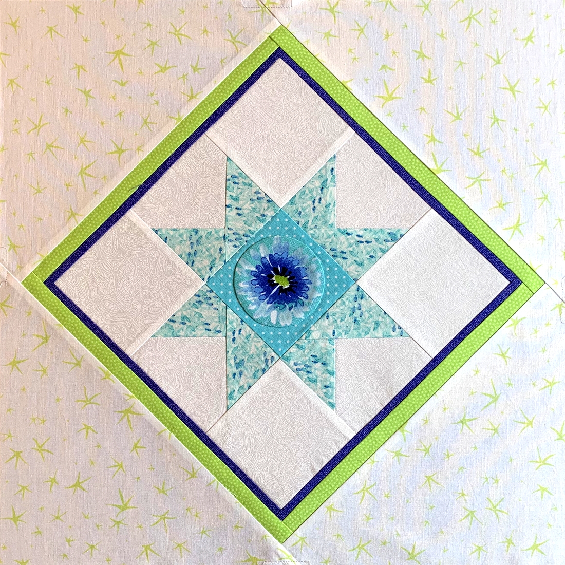
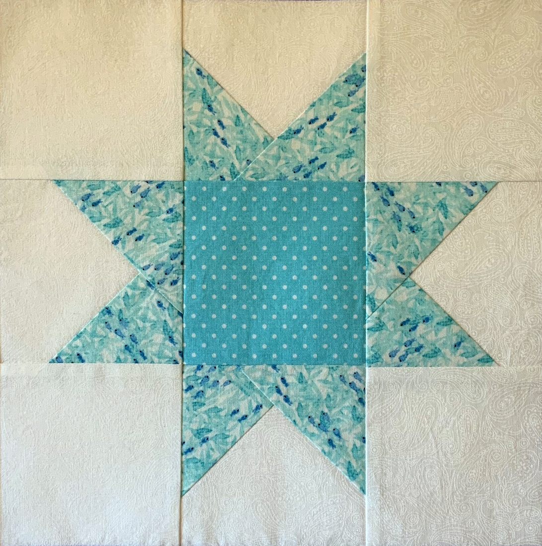
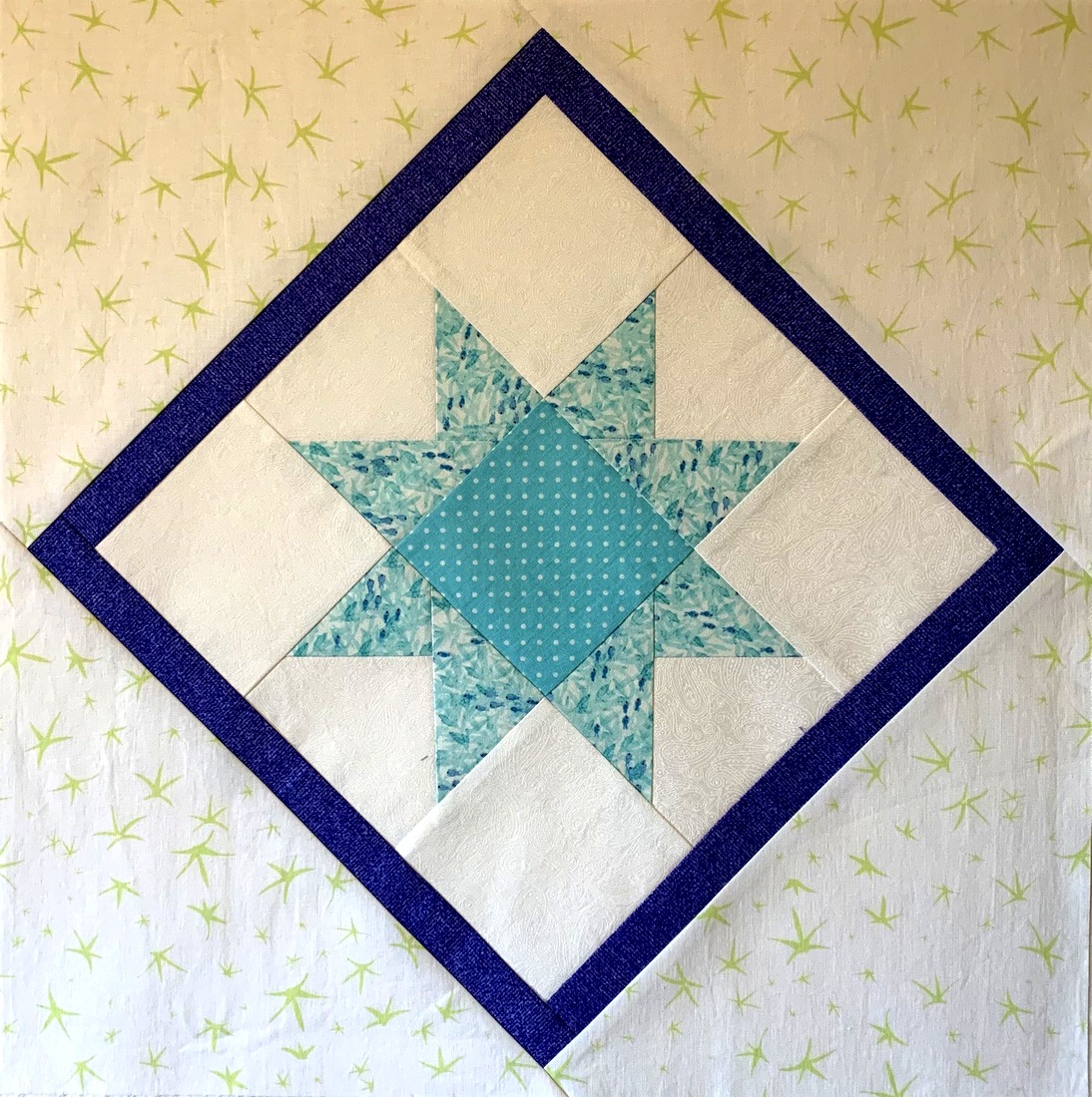
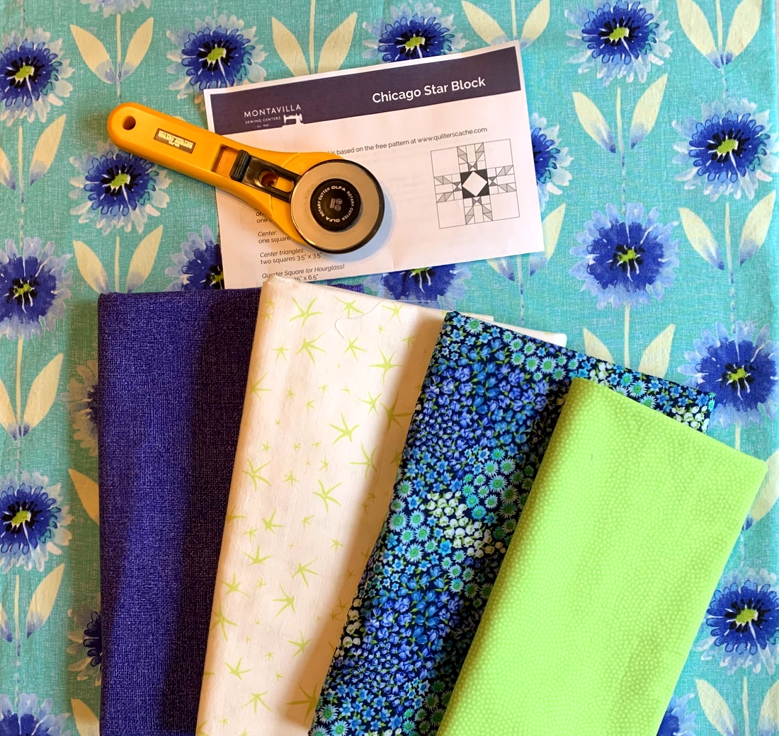


Posted in appliqué, table topper, update, wall hanging, wonky Dresden neighborhood | 9 Comments