Category Archives: appliqué

Who Knew?

Who knew that playing around with computer-generated quilt labels could be so much fun? Well, not everyone’s kind of fun, I suppose. But I was delighted to learn from comments on my last post that my accidental method of making labels with fusible-backed fabric worked for other quilters using different fusibles and printing their labels on different computers. As promised, I will work on a tutorial for my website to show the method step by step.

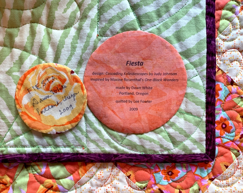
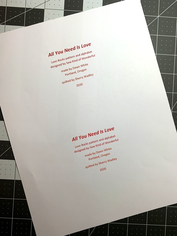
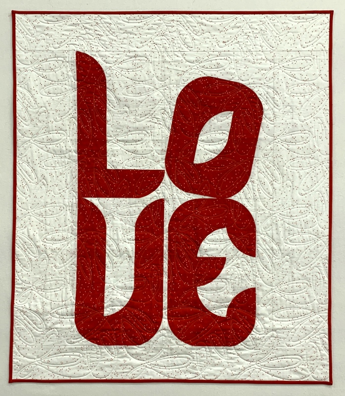
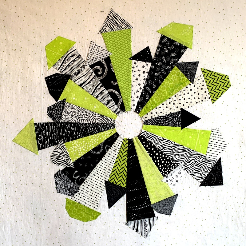
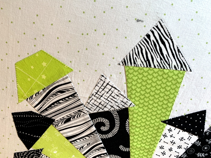
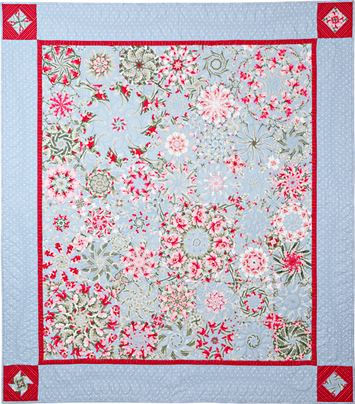
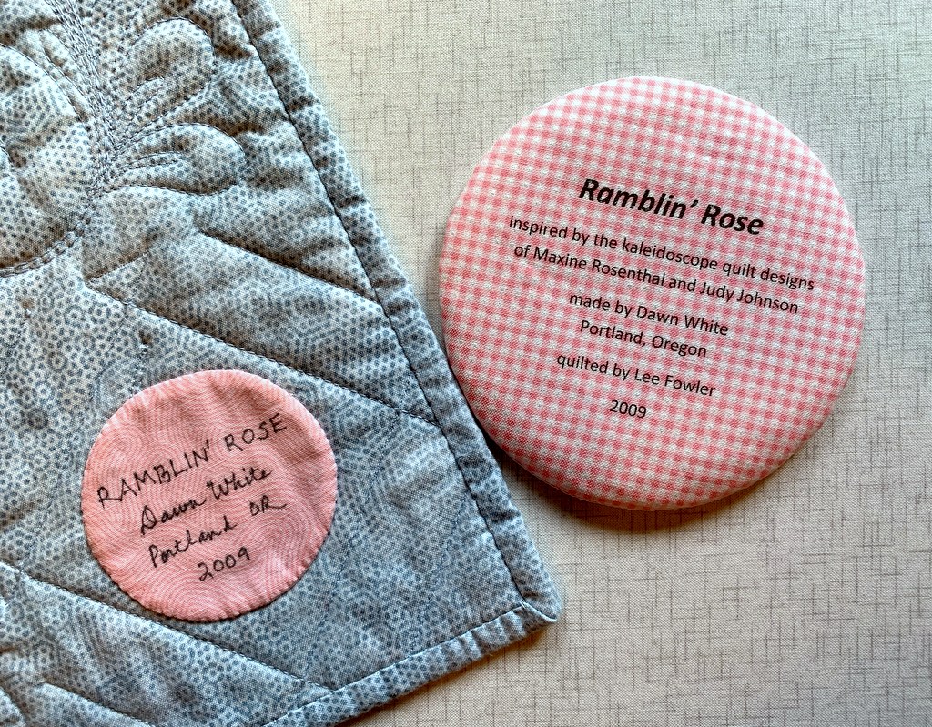
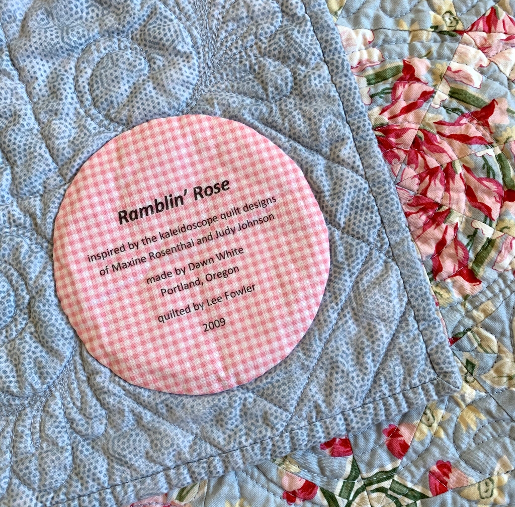
One quilter, Marge, noted that she starches her label fabric and sends it right through the printer. No interfacing, just one layer of fabric. Of course I had to try it! I decided to make a new label for Ramblin’ Rose, another kaleiodoscope quilt from 2009 that needed more information:

Ramblin’ Rose, 53″ x 59″ (2009)

I’m happy to report that Marge’s method worked beautifully. Marge did say she “starches the heck” out of her fabric so I made sure I did too. As a matter of fact, I spent more time starching the fabric than I would have just fusing interfacing to fabric. You really have to iron the fabric after each application of starch until it’s completely dry. The weight and feel of the “page” of starched fabric felt almost identical to the fused layer I experimented with earlier.

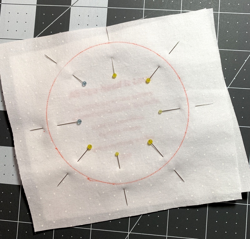
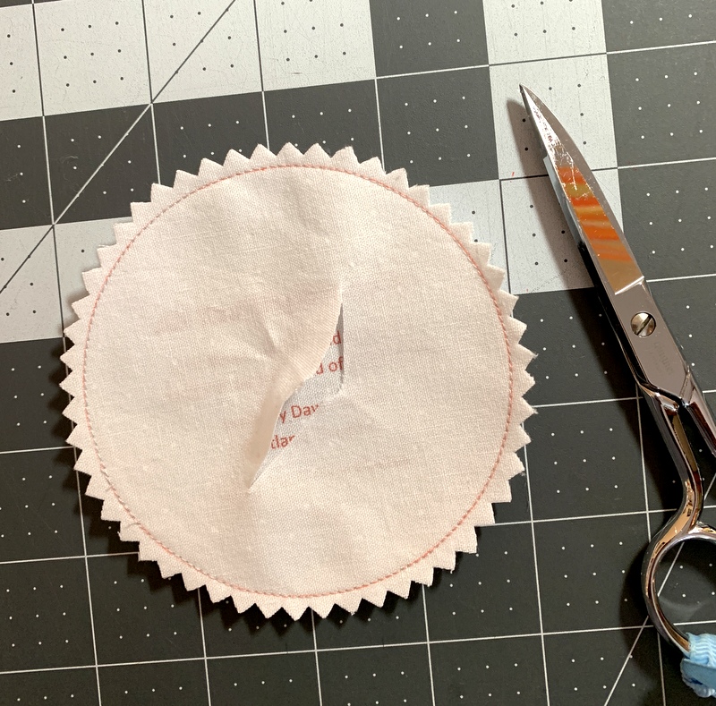
Unfortunately, when I printed my starched page I realized that the top line of the label was too close to the top of the page, not allowing enough room to draw around a compact disc for my preferred round label. I had to prepare a new one. Instead of starching a new piece of fabric, I went back to my method of fusing interfacing to the label fabric.

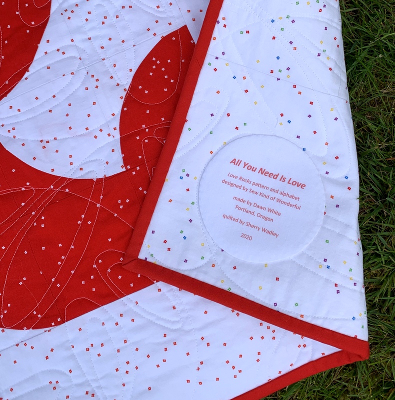
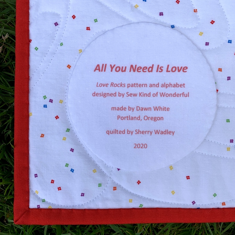
Here’s the old label still on the quilt and the one I just made:

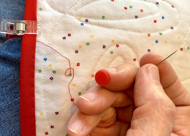
In my last post I described how I used a piece of quilter’s cotton for the back of my label. My friend Arden suggested I try using fusible interfacing instead. That’s what I use for my label backing when I make hand printed labels. With those I have only two layers: the label fabric and the interfacing used for the backing instead of fabric. With a computer-generated label, though, I have three layers: the label fabric fused with interfacing and the second piece of interfacing used as the label backing. Would two layers of interfacing plus the label fabric make the finished label too stiff, I wondered?

Worth a try. Yes, the label did feel a little stiff and I found it very challenging pushing the needle through the layers when I hand appliquéd the label in place. I’m wondering if washing the quilt would soften the label a bit. Ramblin’ Rose has been displayed on a quilt rack in my sewing room for over a decade so it could probably use a trip to the laundry room. I’ll toss it in the washer and dryer and report back.

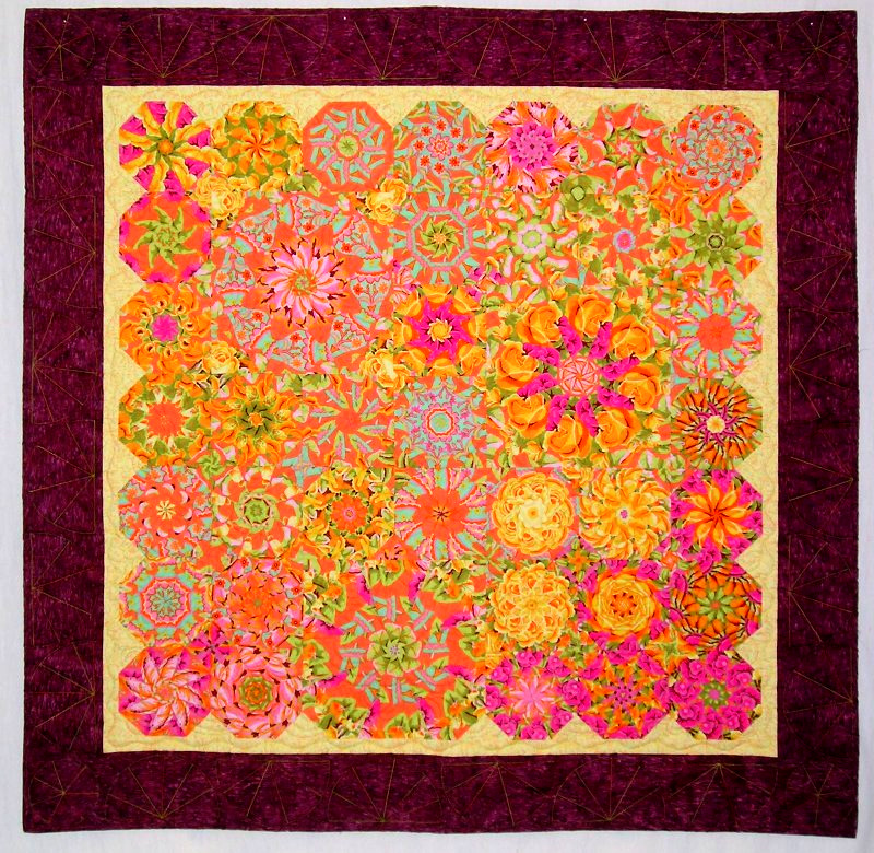
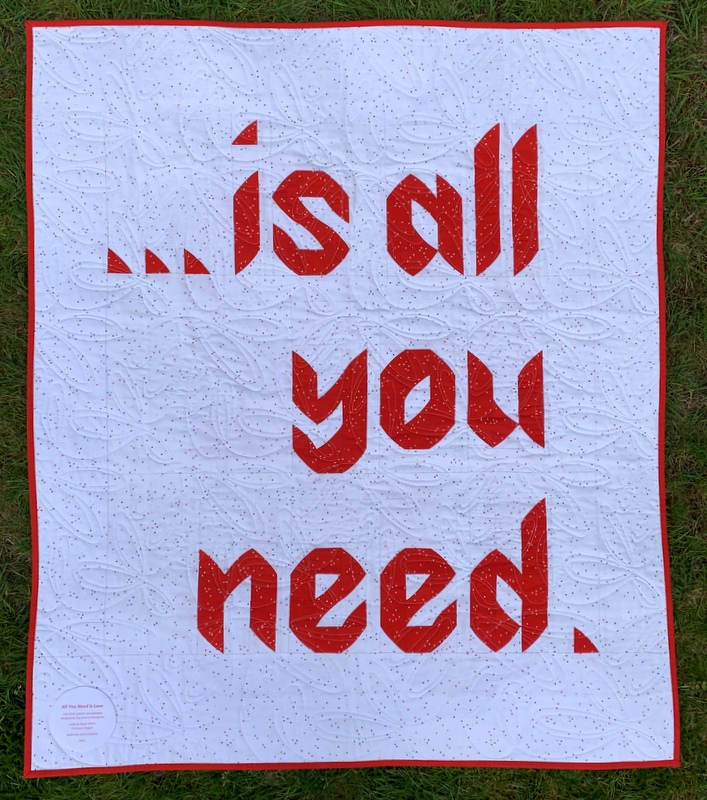
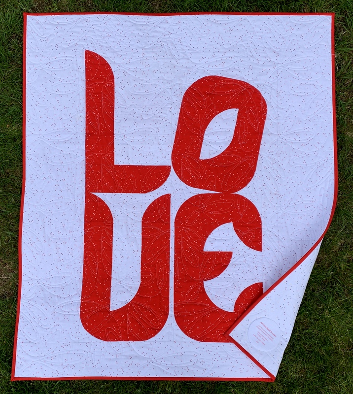
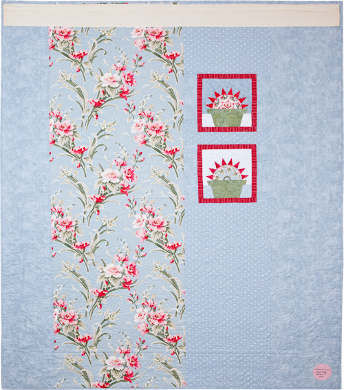
By the way, here’s a look at the back of Ramblin’ Rose (with the old label still in place — and the hanging sleeve so it could hang in a quilt show):

Update

Ramblin’ Rose has made her trip through the washer and dryer, and I’m delighted to report the label turned out beautifully: it has body but is still supple like the rest of the quilt:

This method is definitely a keeper!


Posted in 4-Patch Wonder, appliqué, kaleidoscope quilts, quilt labels, tutorial, update | 2 Comments

Label Me Surprised

A quilt I made over 10 years ago has an updated label, thanks to a mistake I made the other day creating a computer-generated label for my latest quilt, Uptown Funk. The label pictured above is the fourth one I’ve made using my computer and inkjet printer — and I may never go back to printing them by hand. (The smaller label on the left is the one I removed from the quilt so I could sew the new one on.)

For the first computer-generated label I made, created last fall for Give me the Simple Life, I followed a tutorial that called for label fabric to be fused to a layer of freezer paper and run through the printer. I had to use two layers of freezer paper before I was successful. Even then, the freezer paper rippled a little bit so it took a couple of tries (i.e. the printer jammed and I had to start over) before I got a label I could use.

On my second label, made for All You Need Is Love, I wanted an extra layer under the label so the print on the backing fabric wouldn’t show through. As an experiment I fused interfacing to the back of my label fabric before pressing it to one layer of freezer paper. There was very little rippling of the freezer paper. It went through the printer easily and I got a useable label on the first try. That in itself was serendipitous. Little did I know there was more serendipity to come!

To make label #3 for Uptown Funk, I decided to follow the second method. Three layers: label fabric, fusible interfacing, freezer paper. I made my preparations and trooped from my sewing room on the second story of our house down to the basement where the computer and printer are. Once there I realized I had only two of my three layers. I had fused the interfacing to the label fabric and trimmed it to size but had forgotten all about the freezer paper.

Arghh!! Did I really want to climb two flights of stairs to my sewing room to complete the freezer paper step? Or should I take a chance and run the fabric through the printer without the freezer paper? The worst that could happen is the printer would jam, right? So I tried it with just the two layers . . . and it worked — beautifully!

Was it just a fluke? Or have I stumbled onto an important discovery?

I decided to test my inadvertent discovery today by making a new label for a quilt I’d made in 2009. Back then my standard label information consisted of the name I had given the quilt, my name, and the year completed. At the time I didn’t appreciate the importance of providing additional information, such as the the designer of the quilt (if it wasn’t me) or the name of the person who quilted it for me. Nowadays I make it a point to include all that information on my labels.

Fiesta was quilted for me by the late great Lee Fowler, and I have been wanting to update the label information to acknowledge that for a very long time. I’ve actually been meaning to go back and remake several of my older labels but have always found an excuse to put it off. Creating labels by hand can be onerous and time-consuming, even when the results are pleasing. But now, thanks to the ease and speed of making a computer-generated label, my procrastination may be a thing of the past.

Here, very briefly, are the steps I took to make this label:

First, featherweight interfacing is fused to the label fabric. (I used Pellon 911FF.) Both pieces are cut slightly larger than a standard sheet of paper, 8½” x 11″:


Second, the fused fabrics are trimmed to 8½” x 11″ exactly:


Third, the two layers are fed into the inkjet printer and the label is printed from a file created on the computer. I tried two different sizes of type since I had room on the page for two labels:


Going with the smaller type, I decided I wanted a round label 4″ in diameter. (Labels can be any shape but I like the look of a round label.) My standard pattern is a compact disc measuring 4⅝” in diameter but it seemed a bit large so I made a trip to the kitchen to find just the right size to trace around. This small blue bowl is exactly 4″ across:

The larger circle drawn around the label was made with a compact disc, the smaller with the blue bowl.

I traced around the blue bowl on the wrong side of my label backing fabric so that when I held both layers up to the light I could position the top layer properly:

I don’t have a light table so the window had to do.

After being stitched and turned inside out, my label was ready to sew into place:

I chose to appliqué mine by hand but on another quilt it might be machine appliquéd if the stitching lines wouldn’t be distracting on the right side of the quilt.

My labels were printed on an HP OfficeJet Pro 8620. I know that all inkjet printers are not created equally. There must be wide variations between brands and models. I can’t help but wonder: with two successful labels behind me made with the new combo of label fabric + fusible interfacing + fabric for the back of the label, how transferable is this method of printing computer-generated labels?

Ah, that’s where you come in. If you are the least bit intrigued with my accidental discovery, would you be willing to make a test label? If this method works with different brands of printers — and different brands of fusible interfacing — I would be willing to create a  tutorial for my website with detailed instructions and a lot of photos. I thank in advance any quilter who decides to go for this.

Before I sign off, here’s a look at Fiesta, the first in my series of kaleidoscope quilts, front and back:

Fiesta, 54″ square (2009)
Back of Fiesta (2009)

Yes, I need to get a new photo of the back with the updated label!


Posted in appliqué, free motion quilting, kaleidoscope quilts, quilt labels, tutorial, update | 12 Comments

Of Luck and Labels

I made a serendipitous discovery today when making the label for All You Need Is Love, my latest quilt. Before I explain, let me show you a few photos of the quilt taken outdoors this afternoon. The photos are so much better than the indoor shots I showed you in my last post. I’m especially loving the contrast between the red of the quilt and the green of the grass:


Did you happen to notice the label in the lower left corner in the photo above?

No? How about in the photo below, showing the front of the quilt with one corner turned back?

It’s not very noticeable, is it? That was my goal!

Here’s a close-up:

The label contains important information: the name of the quilt, who designed it, who made it, where it was made, who quilted it, and the year it was finished. But I wanted the label to take a back seat to the message on the back of the quilt.

To achieve that I did three things: printed the label from my computer so that I could use smaller letters than I can comfortably write by hand; used red ink, which blends into the background better than black ink would; and reduced the size of my circle pattern from my usual measurement of 4⅝” in diameter (the width of a compact disc) to 3¾” in diameter . The quilt finishes at 38″ x 44″ so a smaller label was definitely called for.

This is my second experience printing a label using my inkjet printer. The first time was a few months ago when I made the label for Give Me the Simple Life. The procedure was pretty straightforward. You start with label fabric and freezer paper that are both cut larger than a standard piece of paper, press the shiny side of the freezer paper to the wrong side of the label fabric, and trim the result very carefully to exactly 8½” x 11″. You create a label on your computer, determining the font and point size based on the desired finished size of your label. You insert the fabric/freezer paper combo into your printer and print the label.

When I tried this the first time I found I had to use two layers of freezer paper to get my printer to accept the combo and even then it was a bit temperamental, jamming my printer a couple of times until I got the the result I wanted.

I would have followed the same procedure this time but for my concern that the bright little flowers on my background fabric would show through the white label fabric. I was using the same white fabric for the back of the label but I wanted an extra layer in the middle to make sure those bright little flowers stayed hidden.

I decided to try fusing featherweight interfacing to the back of my label fabric before pressing it to one layer of freezer paper. I’m so glad I did! The interfacing gave the fabric just the right amount of body to feed smoothly through my printer. Serendipity!

I previewed my label first on paper using two different shades of red:

The bottom red was a better match with the red in the quilt. Next I printed the label on my fabric/interfacing/freezer paper combo:

The ink on fabric wasn’t quite as bright as the ink on paper but would certainly be fine for my purpose.

After determining a circle 3¾” in diameter would work well as a finished label size (based on the width of the longest line), I wandered around my kitchen opening cupboard doors until I found something just the right size to trace around for the back of the label:

In the next photo the fabric for the back of the label is on top of the label fabric, right sides together and pinned in place. You can just make out the printing on the label through the top layer:


After stitching all the way around the circle (taking out the pins as I come to them) and trimming very close to the stitched edge with pinking shears, I cut a slit in the back of the label so it can be turned inside out:


With the label turned, pressed, and hand appliquéd in place, the slit in the back will never be seen. And I’m very happy with the result:

I have a feeling I will be using this method on future labels!


Posted in appliqué, Hazel's Diary Quilt, quilt labels, update, Wonder Curve Ruler | 9 Comments

Love Rocks

Always has, always will!

May I present my latest quilt finish? It’s called All You Need Is Love based on the pattern Love Rocks from the new book Text Me from Sew Kind of Wonderful:

The book features several sizes of alphabets made using Sew Kind of Wonderful’s new Wonder Curve ruler. I like to piece the backs of my quilts so I decided to have some fun with the alphabet and carry a message from the front of the quilt to the back:

My little quilt — 38″ x 44″ — sports an edge-to-edge quilting design. I wanted something modern and was attracted to this design that looks a bit like doodling:

“Modern Ties” is a whimsical design that offers a pleasing counterpoint to the precision of the letters. Sherry Wadley did such a nice job on this for me. The quilting enhances the design of the quilt without overpowering it, just the effect I was going for.

A lot of quilters I know don’t enjoy binding their quilts but I do. Stitching down the binding on this quilt was a breeze both because the quilt is small and because I used a nifty little “sticky thimble” to push the needle through the fabric:


The thimble is called a Poke-a-Dot — how cute is that? — and comes in a little round tin containing 24 dots. Each thimble can be used multiple times so I probably have a lifetime supply. I could have ordered just the small tin of Poke-A-Dots but I treated myself to a bigger tin — the full Appliqué Set from Jillily Studio — several weeks ago:

Having learned how to do needleturn appliqué last year in the making of Give Me the Simple Life, I’m interested in learning other approaches. And I do confess that the tin this appliqué set comes in influenced my decision to purchase it. (This is not a paid endorsement, by the way; I just happen to like these products.)

Another confession: I jumped the gun in showing you my latest quilt. It’s not quite finished. Still to come: the label.


Posted in appliqué, Hazel's Diary Quilt, needleturn appliqué, update, Wonder Curve Ruler | 5 Comments

Another Pretty Little Basket . . .

. . . made from the Pattern Basket‘s new pattern, aptly named Pretty Little Baskets. This one is half again as large as the first one I made (subject of my last post) because I resized it. Here’s the new test block:


It measures 12″ unfinished. For comparison, here are both blocks together:

It took me the better part of a day to figure the correct measurements to cut the fabric strips and to sew one block. The reason? Fractions! The original block measures 8″ unfinished, 7½” finished. That’s a bit unusual. Most blocks are a whole number finished, and the unfinished block is a half inch larger because it includes two quarter-inch seam allowances.

I wanted to make a basket block as close to 12″ as possible. I figured the easiest way was to use the original instructions and scale the measurements up 150%, meaning the block would measure 12″ unfinished, 11½” finished. I knew that would mean some unusual cutting dimensions. As it turned out, the procedure for determining the exact measurements was more involved than I originally thought and almost every strip of fabric was cut to an eighth of an inch.

But hey, it worked! And now I have two pretty little baskets. I like both sizes and will probably make more of both eventually, though for different projects. Wouldn’t these blocks be wonderful with some kind of appliqué added?


Posted in appliqué, update | 5 Comments

A Beautiful Day in the Neighborhood . . .

. . . my Uptown Funk neighborhood, that is, which now has doors and a few windows:

I wanted the long skinny doors to really stand out, like rays radiating from a sun, so I cut them all from black and green solids. I thought the effect might be diluted if I used prints.

I was planning to use the same solid fabrics for windows. If you look at the Dresden Neighborhood pattern by Kim Lapacek that my neighborhood is based on, you’ll see that all the buildings have doors and windows:

My plan changed when I happened upon a piece of fabric in my stash of a cityscape with a variety of windows — in the perfect color combo of black, white, and green. Of course I had to audition them! I fussycut just a few sets of windows and placed them randomly around the circle of houses.

The windows weren’t printed on the straight of grain so they’re all a little bit wonky. Perfect for my wonky little neighborhood. Here’s a close-up:

Oh, and see the little chimney? It’s the only one in the neighborhood. It’s covering up the smudge of dirt I pointed out in my previous post about this project. I stitched around the base of the chimney with black thread so it would stand out a bit more, and I also added a row of black stitching around the roof. I stitched around the other four roofs that had a lot of white in them after noticing that they blended into the background fabric too much.

I’m thinking windows on only five of my houses may be enough. What do you think?


Posted in appliqué, machine applique, update, wall hanging, wonky Dresden neighborhood | 6 Comments

A Spot of Green . . .

. . . in honor of St Patrick’s Day. It’s rather nice to be thinking about St. Paddy’s Day and not about the self-confinement the Dear Husband I have entered as part of our responsibility to help flatten the curve of the coronavirus pandemic. I’ve read a lot of posts today about how people are coping and I deeply appreciate the perspective that Sharon Santoni of My French Country Home brings to the situation. She lives in France some 5,000 miles way from my home in Portland, Oregon but we are definitely on the same page.

So back to the wearin’ of the green, or rather the sewin’ of the green:

That’s the last of the 20 roofs on my Dresden Neighborhood quilt (based on the pattern of the same name by Persimon Dreams).

I stitched all the roofs using the blanket stitch on my new Janome 9450QCP sewing machine. I confess: it was harder than I expected. Not because my machine is new. No, it’s because I’ve never machine appliquéd with a blanket stitch before! How did I get to this advanced age without learning that skill?

I had to practice — a lot — on scraps before attempting it on my funky little neighborhood. The most difficult part was stitching around the sharp corners. I couldn’t find a decent tutorial on how to do that so I fiddled with the points, trying different approaches until I was satisfied. And I matched my thread with the roof to minimize the imperfections.


See that zebra print roof above at about the 8:00 position? It’s the only roof that’s rounded and it was very easy going around it with the blanket stitch. Had I known that when I was cutting out the roofs, I would have made more of them rounded!

Uh-oh. There’s a dark smudge just to the left of the roof in the 11:00 position, made of the same zebra fabric. Here’s a close-up:


I have no idea how it got there. It definitely wasn’t there when I stitched around the roof. I tried dabbing it with a wet Q-tip but it looks like ink. The next time you see this there will probably be a chimney covering that sooty-looking spot. How appropriate.

What’s left? Doors and windows; a circle appliquéd in the center; and then it’s time to sandwich and quilt my little neighborhood.

As I was sewing the last roof on, the name for my quilt-in-progress popped into my head: Uptown Funk.


Posted in appliqué, family, Janome 9450QCP, machine applique, update, wall hanging, wonky Dresden neighborhood | 5 Comments

Throwback Thursday: Give Me the Simple Life (2019)

It’s time for the tenth and final installment in my Throwback Thursday series looking at quilts made in the last decade. Coming up with my choice for 2019 was easy: it was the only quilt I completed last year! Here is Give Me the Simple Life:

Give Me the Simple Life, 95″ square (2019)

The pattern is Hazel’s Diary Quilt by Shelly Pagliai of Prairie Moon Quilts. Regular readers followed the making of this quilt from my very first block (and post) in January 2018 till its completion in September 2019.

I’m very proud of this accomplishment, as I made it my goal to become proficient in needleturn appliqué during the making of the quilt. It certainly provided ample opportunities for practice! Longarm quilter Kazumi Peterson did the amazing quilting.

Approved by Coco the Cat Inspector

Give Me the Simple Life will be on display later this month at Northwest Quilters’ 46th annual show, “A Festival of Quilts,” in its new venue, Camp Withycombe, in Clackamas, Oregon. Dates are Friday and Saturday, March 20 and 21. If you are in the neighborhood, please stop by. There’ll be over 300 quilts on display and lots of vendors selling wonderful things (like fabric).

Thank you so much for joining me in this 10-week lookback at some of my favorite quilts!


Posted in appliqué, cats, free motion quilting, Hazel's Diary Quilt, needleturn appliqué, Throwback Thursday, update | 6 Comments

March Madness

Hooray — March is here! Spring is on its way! In celebration of my favorite season of the year, I’m working on a new project featuring the quintessential color of spring: green, of course. My favorite color.

You’re probably wondering why on earth I’ve started something new when I have so many Works-in-Progress and Unfinished Objects (aka WIPs and UFOs) on hand. All I can say in my defense is that a) I like working on multiple projects at once, and b) there’s a method to my madness.

Before I explain, let me show you the new project:

I’m building a wonky neighborhood using the pattern Dresden Neighborhood by Kim Lapacek of Persimon Dreams. The wedges are made with a Dresden plate ruler, hence the name of the pattern. Isn’t my little neighborhood cute? The houses will have wonky doors and windows, and the raw edges in the center will be covered by an appliquéd circle.

Here’s Kim’s version as shown on her pattern cover:

I came across the pattern last year and bought it right away. After looking at some clever and charming versions recently on Instagram and Pinterest, I decided to jump in and create my own version. I’m also working on a couple of large quilts so the idea of a small (24″ square finished) project has great appeal. That’s one reason.

The houses in this little neighborhood are meant to be embellished with decorative machine stitches, especially around the roofs. Late last year I upgraded my Janome sewing machine to the Horizon Memory Craft 9450 QCP model. I am absolutely loving some of the new features but haven’t yet played around with the decorative stitches. This project is the perfect jumping off point. That’s the second reason.

And the third reason? I’m going to be teaching a “Wonky Dresden Neighborhood” class in June. (I teach at Montavilla Sewing Center’s Lake Oswego store.) This is going to be my store sample so I have some extra motivation to finish it up as soon as possible and get it on display. Hardly a burden. I can’t wait to get back to it!


Posted in appliqué, home dec, machine applique, update | 8 Comments

The Judges’ Comments

Give Me the Simple Life (95″ square), made by Dawn White, quilted by Kazumi Peterson, 2019. Design: Hazel’s Diary Quilt by Shelly Pagliai.

Give Me the Simple Life, my version of Hazel’s Diary Quilt, is home again after hanging for three days at last week’s Northwest Quilting Expo. I entered my quilt for judging in the traditional category and received the judges’ comments when I picked my quilt up this morning.

Here’s what the judges said:

“A very compelling combination of a primary color palette. Presentation inside scalloped sashings is so appealing and beautifully executed.” Credit is due Shelly Pagliai of Prairie Moon Quilts, who designed Hazel’s Diary Quilt and cheered me on every step of the way as I posted my progress on Instagram and on this blog.

“Hand appliqué stitch is very well done.” This comment means a lot to me because I took on the challenge of making this quilt to become proficient at needleturn appliqué.

“Machine piecing is precisely done.” Thank you, judges.

“Quilting motifs are well chosen to fill the spaces.” Kudos to Kazumi Peterson, whose free motion quilting skills and precise ruler work greatly enhanced the finished product.

“Outside edge of quilt should be straight and corners square.” This comment caught me by surprise. Were the corners really not square? I used a square ruler to trim my quilt before attaching the binding.  Of course I got out that ruler and checked the corners. The first three were perfectly square. But guess what? The fourth corner was an eighth of an inch off!

I know there are many other imperfections in this quilt but all in all, I am very happy with how it turned out. Most of all, I am glad that it’s done!!


Posted in appliqué, free motion quilting, Hazel's Diary Quilt, needleturn appliqué, Northwest Quilting Expo, update | 7 Comments