Category Archives: tutorial

Tutorial: Making a Perfectly Round Quilt Label

Most of my quilts sport round quilt labels on their backs. My go-to “pattern” to make a round label is a compact disc, which measures 4⅝” in diameter. It seems to be the perfect size to contain all the information I want to put on a label. I described my method in a couple of posts earlier this year but not with great specificity. That’s why I decided to write a detailed post about it.

This tutorial is a companion to my most recent tutorial on printing quilt labels on fabric. Whether you write your labels by hand or create them by computer, you can follow the directions below to make a perfectly round label.

(By the way, I first wrote about my method of using compact discs to make quilt labels in 2012. Back then I was writing my labels by hand. I’ve streamlined the label-making process since then and have also moved to creating labels on my computer rather than printing them by hand. If you are writing your labels by hand, you can follow steps 1-5 of my 2012 tutorial and pick up the finishing process below.)

My labels are made with quilter’s cotton. I use fusible interfacing on the back because I like to “baste” the label in place by lightly fusing it to the back of the quilt before appliquéing it in place by hand. You can also use non-fusible interfacing and simply pin the label in place to appliqué it.

Supplies
⦁ quilt label printed on fabric (or quilt label hand-printed on scrap of fabric at least 6½”square)
⦁ scrap of light to medium-weight fusible interfacing at least 6½” square (I use Pellon 911FF)
⦁ compact disc
⦁ #2 pencil with a very sharp point
⦁ temporary marking pen or pencil (I recommend the Frixion erasable gel pen)
⦁ pinking shears

Step 1. Print a test copy of your computer-generated label on a sheet of paper. In my example I have created two labels on one page using two different typestyles so I can decide which one I like better after seeing it printed on fabric:

You might prefer to create just one label and center it on the page.

Step 2. Find the midpoint of the label by measuring the longest line and dividing by two, then by measuring from the bottom of the top line to the bottom of the last line. In my label below, the midpoint is the top of the stem on the letter “d” in the word “Portland.” Using a sharp #2 pencil, mark the center with a small dot.

Center the hole in the middle of the compact disc over the dot you marked. Draw a complete circle around the disc:

This gives you a preview of what your finished label will look like. If your circle is slightly off, erase the lines and redraw.

Step 3. Print your label onto fabric:


Step 4. Determine which label you plan to use and trim excess fabric. I decided to use the top label so I measured 6½” from the top of the fabric before making the horizontal cut:

My label is 8½” wide — more than it needs to be — because it’s the width of a piece of paper. A label that’s been hand-printed need not be wider than 6½”.

Step 5. Fusible interfacing usually has a bumpy texture on the fusible side whereas the non-fusible side is flat and smooth. On the flat, non-fusible side of interfacing fabric trace around the compact disc:

This is your stitching line so make sure it’s dark enough to see clearly. You can use a pencil like I did or a Frixion pen.

Step 6. Lay the interfacing over the label fusible side down and center it. You should be able to see the lettering clearly through the interfacing:

The circle you drew on the smooth non-fusible side is on top. When the label is turned right side out, the bumpy fusible side will be on the outside.

Step 7. Pin the layers in place:

I like to put pins in the 3, 6, 9, and 12 o’clock positions first, adding four more pins evenly spaced. The thinner the pin the better because you want the layers to be as flat as possible.

Step 8. Using a small stitch (2.2 on a computerized machine or about 12 stitches to the inch), sew all the way around the circle, removing each pin as you come to it. Go five or six stitches beyond where you started so you don’t have to knot the thread:

First Light Designs tip: Make sure you are using an open-toe foot on your sewing machine that allows you to see the needle going in and out of the fabric. You need to stitch precisely on the drawn line. If you stray even a stitch or two off the line your label won’t be perfectly round. Any sharp points in stitching will be visible when the label is turned right side out.

Step 9. Trim around the label with pinking shears. Notice that the inside point of the pinked edge is just a few threads from the stitching line:

First Light Designs tip: If you don’t have pinking shears, trim around the label a generous 1/8” from the stitching line. You can probably get away with a scant 3/16” but a quarter of an inch is too much. Clip from the outside edge almost to the stitching line all around the label; the clips should be no more than a quarter of an inch apart.

Step 10. Pull the interfacing away from the label fabric and make a small snip in the middle. Cut across the middle of the interfacing to within a half-inch or so of the edges:


Step 11. Turn the label right side out. From the back side of the label run a softly pointed tool around the stitched line until the label attains its round shape:

In the photo above you see a white point turner (also known as a bone folder) and a multipurpose quilter’s tool called That Purple Thang. Both tools work well for turning a round quilt label. So does a long fingernail.

Your label is now ready to be attached to the back of your quilt.

First Light Designs tip: After determining where you want the label to go — but before lightly fusing it in place — use a ruler aligned with two outside edges to make sure the lines on the label are parallel with a bottom edge.

Step 12. Fuse the label to the quilt lightly — enough to hold the label in place but not enough to completely melt the fusible. Use a press cloth and make sure to use the iron temperature specified by the directions that came with the fusible interfacing. You don’t want to scorch the label!

Allow the label to cool and appliqué it in place by hand:

And there you have it: a perfectly round label securely attached to the quilt.

Be sure to let me know if you have any questions!


Posted in appliqué, quilt labels, tutorial, update | 6 Comments

Printing Quilt Labels on Fabric: A Tutorial

Back in May — doesn’t that seem like a hundred years ago? — I wrote about a method I discovered quite by accident of printing computer-generated labels on fabric. It requires only two items: fabric and fusible interfacing — no freezer paper involved. I described my method and promised to write a proper tutorial on it. Here is that tutorial. Better late than never, right?

I’ve written this tutorial in two parts. Part 1 is all about getting the fabric ready. Part 2 is about creating the label on your computer.

Part 1, Preparing the Fabric for Your Label

Step 1. Choose a fabric for your label that allows the type to show clearly. The fabric can be a solid or tone-on-tone print in a light to medium-light value. You might also be able to use a printed fabric — perhaps one you used in your quilt – if it’s not too busy or too dark in value to make the printed label hard to read. I’m illustrating this tutorial by making a label for my most recent UFO finish, Lilacs in September, using a medium light spring green fabric with a crosshatch design.

Step 2. Cut the label fabric about ½” larger all around than a printed page. In the United States the standard paper size is 8½” x 11” so you would cut your fabric about 9½” x 12”. It doesn’t have to be exact. I just lay a piece of paper on top of my label fabric and cut around it with scissors:

Step 3. Choose a featherweight or lightweight fusible interfacing. I use Pellon 911FF (the FF stands for featherweight fusible) for most of my labels but other brands will work equally well.

Step 4. Cut the fusible interfacing slightly smaller than you cut the label fabric. I do this the same way, by laying a piece of paper on top of the interfacing and cutting around it with scissors:

Cutting the interfacing slightly smaller assures that you won’t accidentally fuse it to your ironing board cover when you iron it to the label fabric. No need to ask me how I know that . . .

Step 5. Place the fusible side of the interfacing on the wrong side of the label fabric, making sure none of the fusible extends beyond the edges of the label fabric . . .

. . . and fuse in place following the manufacturer’s directions.

Step 6. Place the fabric on your cutting mat interfacing side up. Trim to 8½” x 11”:

Make sure your cutting is precise because the piece of interfaced fabric needs to fit perfectly in the paper tray of your inket printer.

Step 7. Place the fabric in your printer’s paper tray. (Make sure you know whether the fabric side needs to go in the tray right side down or right side up, as it varies from printer to printer. It goes right side down in my HP Office Jet Pro 8620.) Now print the label:

Voilà! It should slide out of the printer just as if it were a piece of paper. (You’ll notice I put two labels on my page; I’ll explain why in Part 2.)

One more thing to do:

Step 8. Heat-set the ink on the label using a press cloth and plenty of steam:

This helps to keep the ink on the label from fading with repeated washings. Irons vary widely so let me caution you not to have the iron too hot as it may scorch the label, even with a press cloth on it. I like to set my iron on medium high and, with the press cloth on top, steam the writing on the the label for 10 seconds. I let it cool and steam it for 10 more seconds.

Now you’re ready to finish your label and attach it to your quilt. You’ll see in Part 2 below that I like to make my labels round but yours can be any shape you want. Squares and rectangles are popular and easy because all you need to do is turn and press the raw edges under ½” or so and stitch the label to the quilt.


Part 2. Creating the Label on Your Computer

Step 1. Open up a new document on your computer and type the information you want to include about your quilt. What you put on your label is entirely up to you. At a minimum I always include:

the name I have given my quilt
my name
my city and state
the name of my quilter (if I didn’t quilt it myself)
the year of completion

Notice that each line is centered.

If my quilt is an original design I might say “designed and made by Dawn White.” If the quilt was made from one of my own patterns I might include the name of the pattern or say “designed and made by Dawn White of First Light Designs.”

If my quilt was made using someone else’s design, I always credit the designer:

If I tweaked someone’s design, added my own design elements, or significantly changed construction techniques, I might add a line such as “based on (pattern) by (name of designer)” or “inspired by (name of designer)”:

Step 2. Determine the point size and typeface of your label. The point size refers to the size of the type, e.g. 12 point, 14 point, etc. The typeface refers to the design, or style, of the lettering. Most word processing programs offer dozens of typefaces to choose from. On my computer these typefaces are called “theme fonts.” (Did you know that font is the French word for face? Now doesn’t the word typeface make more sense?)

The point sizes you choose depend on the size and shape of your finished label and how much information you want to include. My label for Lilacs in September has five lines of copy. I put the name of the quilt in 24 point boldface and italic. The lines underneath are in 14 point. I auditioned a sans serif type face called Arial and a serif typeface called Cambria. Both labels fit on one page so I could make my final decision on which one to use after this page was printed on fabric. (Putting two labels on one page is just an option, of course. You could create one label and center it on the page, which would give you a lot of flexibility in deciding later on the shape of your label.)

Step 3. Save your document.

Step 4. Print your label on paper. This gives you a good sense of what the label will look like printed on fabric. Here is my label for Lilacs in September, printed with black ink:

If you have a color printer you can experiment with different colors of ink. Print the labels on paper first to test the depth of color. You may find the ink doesn’t look quite as dark or as vivid on fabric as it did on paper.

I used red ink on my label for All You Need is Love:

Take another look at the label for Scattered Stars, my cheddar and indigo quilt. I used indigo ink which turned out to be not as dark as I was expecting but I still chose it over black:


Most of my round labels are made using a compact disc as a pattern. A CD measures 4⅝” in diameter so a label with a few lines of text fits inside that circle nicely. My label for Give Me the Simple Life has eight lines but still fits inside the compact disc pattern size:

The addition of the red ring made the label finish at about 6″ in diameter.

Below is a computer-generated label I made in May to replace a label on Ramblin’ Rose, made several years ago. I had omitted two significant pieces of information — the inspiration for my quilt and the name of the longarm quilter — and wanted to correct those oversights. In the photo below the original label is still on the quilt, about to be removed and replaced with the one on the right:

I used to write all of my labels by hand, a time-consuming endeavor. Creating them on the computer and printing them directly onto fabric has turned out to be quick and easy — and rather fun to do. I don’t think I’ll ever go back to hand-printed labels.

I hope you find my tutorial helpful. Be sure to let me know if you have any questions. As always, thank you for visiting First Light Designs!


Note: I followed up this tutorial with a new one, posted Nov. 6, about how I make my round labels using a compact disc. You can find it here.


Posted in appliqué, cheddar and indigo, Churning Stars quilt block, Hazel's Diary Quilt, quilt labels, tutorial, update | 9 Comments

Best Tips for Perfect Star Points

Do you love star quilts as much as I do? I’ll bet half the quilts I’ve made over the years contain star blocks. Susan of stitchedbysusan.com, a quilter whose work I very much admire, asked me the other day on Instagram about my “best tips for perfect star points.” I thought to myself, “That’s a good topic for a blog post!”

I’m always surprised — and yes, a little disappointed — when I see star quilts with the points cut off. With a little care that can be avoided completely.

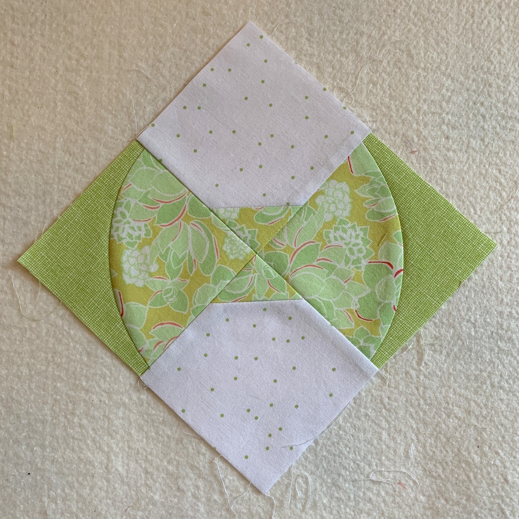
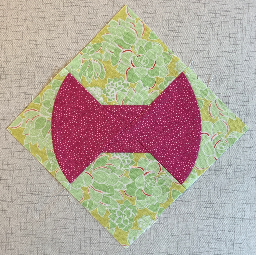
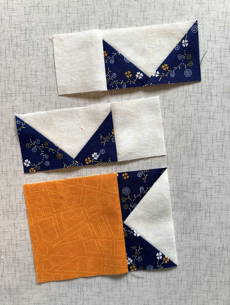
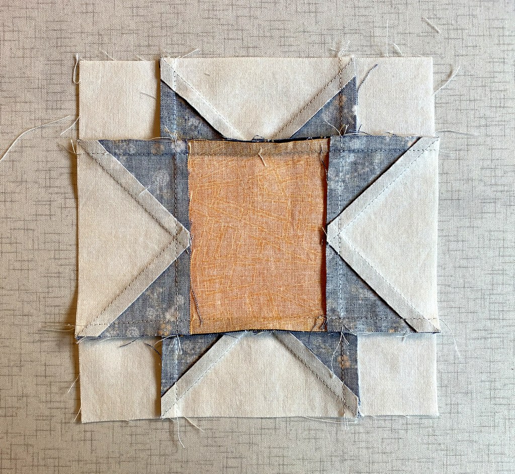
To illustrate this post I’m using a 6″ Sawtooth Star block from my current project. It’s made up of four Flying Geese units which form the star points, a square in the middle of the block, and four smaller squares in the corners:

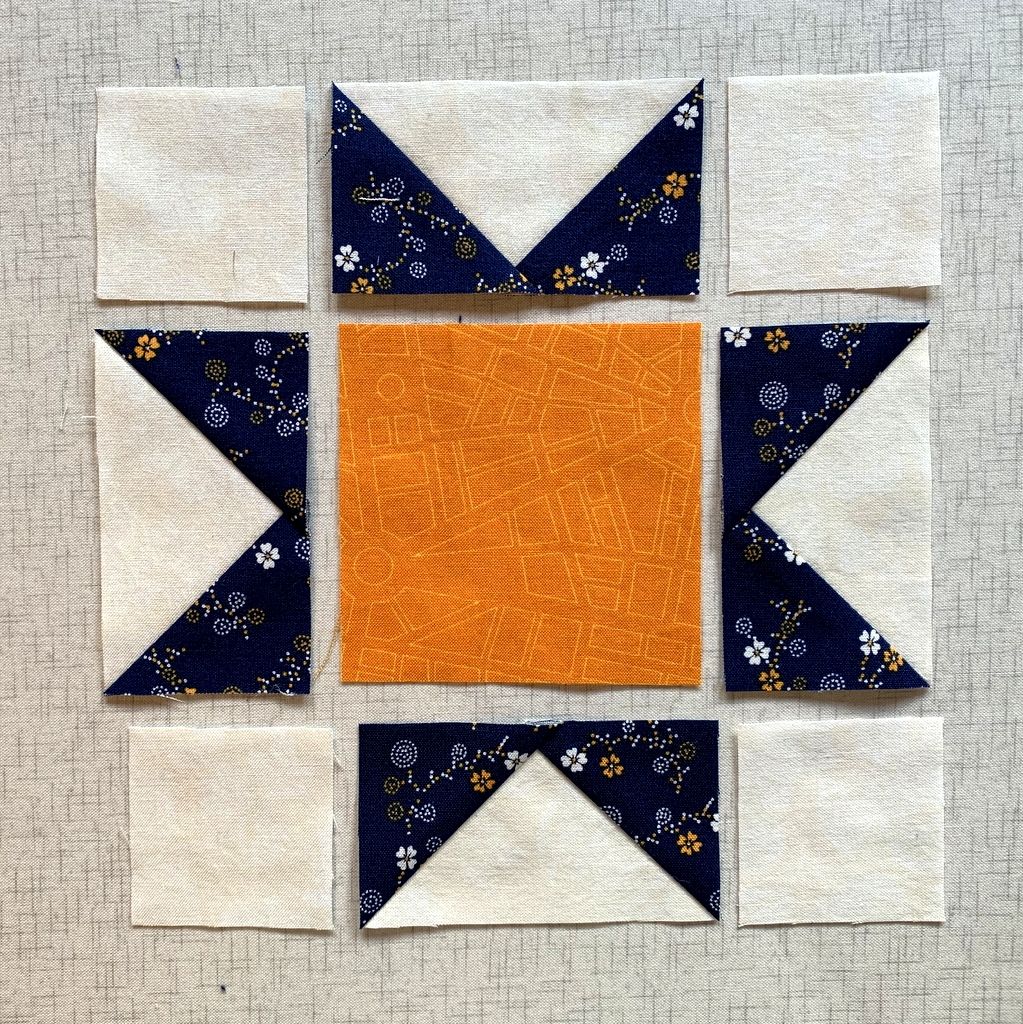
If you look at the four Flying Geese units you’ll notice that the points of the star go right to the corners, the outer edges of the units. If the seamline is off on either side of the corner by even an eighth of an inch, the star point is going to be off when it’s joined to the other pieces in the block. In a block this small, a sixteenth of an inch can make a difference.

Tip #1: Make sure the seamline intersects the corner precisely.

The easiest way to achieve this is to make the block slightly oversize and then trim to exact size with a ruler. This is especially true with star points because they contain diagonal seams and it’s all too easy to get some distortion when sewing and pressing them,  especially if you use steam and press with a heavy hand like I do.

There are several excellent Flying Geese trimming rulers on the market (I have two that I love) but the truth is you can trim perfect star points with any ruler that has the proper angled degree line going to a corner. Because a traditional Flying Geese unit is always twice as long as it is high, that angle is 45 degrees. Virtually every quilting ruler has a 45 degree angle marked on it.

Tip #2: Don’t forget the No Surprises pin.

I have my teacher and mentor Billie Mahorney to thank for this tip. It’s one of the most valuable things I ever learned from her. The No Surprises pin is the one that goes at the end of every stitching line to make sure the two layers are still lined up when you get to the end. The feed dogs on a sewing machine don’t always feed the layers evenly, resulting in one layer coming up short. This is especially true with longer seams. No matter how short the stitching line, I never fail to put in the No Surprises pin.

In my block the first three seams are pinned and ready to chain sew. Because these pieces are so small I didn’t feel the need to do pinning other than the No Surprises pin:


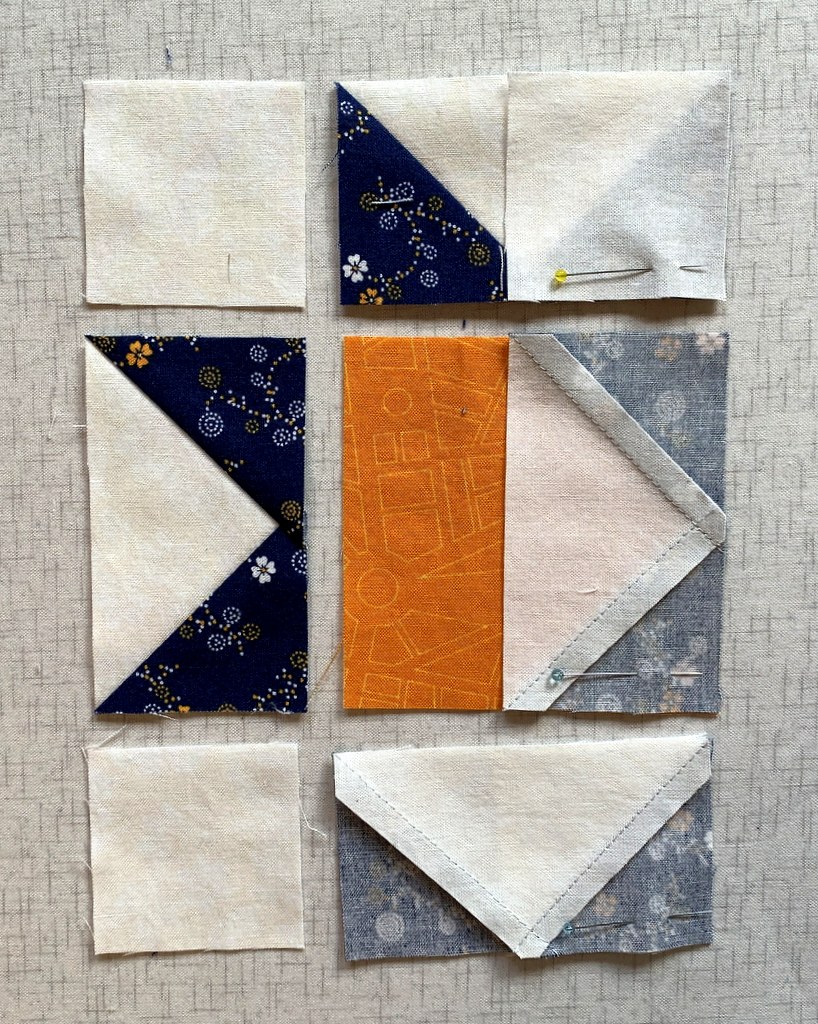
I have arranged the top and bottom pairs to be stitched so that I am stitching in the direction the diagonal seam was pressed (i.e. with the seam rather than against it).

On the middle pair I’m stitching on the side where I can see the intersection and make sure I cross it in the proper place (see Tip #3 below).

Here are the pieces chain stitched:


Look very carefully at this next photo for a preview of Tip #3:


Do you see how my stitching line joining the two pieces doesn’t cross at the exact top of the inverted V? It’s actually a couple of threads away from the point formed by the V and toward the raw edges.

When the stitching line is right on top of the point or — heaven forbid — a few threads on the inside, the point in the background fabric gets chopped off. This is where an accurate quarter-inch seam is so critical.

Tip #3: When approaching a point (in this case it’s the bottom of the V of a Flying Geese unit), don’t stitch exactly across the point where the stitching lines intersect; rather, sew a couple of threads away from the point and toward the raw edges. This little tip is what gives you a nice crisp point when the seam is pressed.

Tip #4: In order to achieve Tip #3, make sure you are using a foot that allows you to see the needle going in and out of the fabric. Most quarter-inch feet are “open toe,” allowing you to see the path the needle takes.

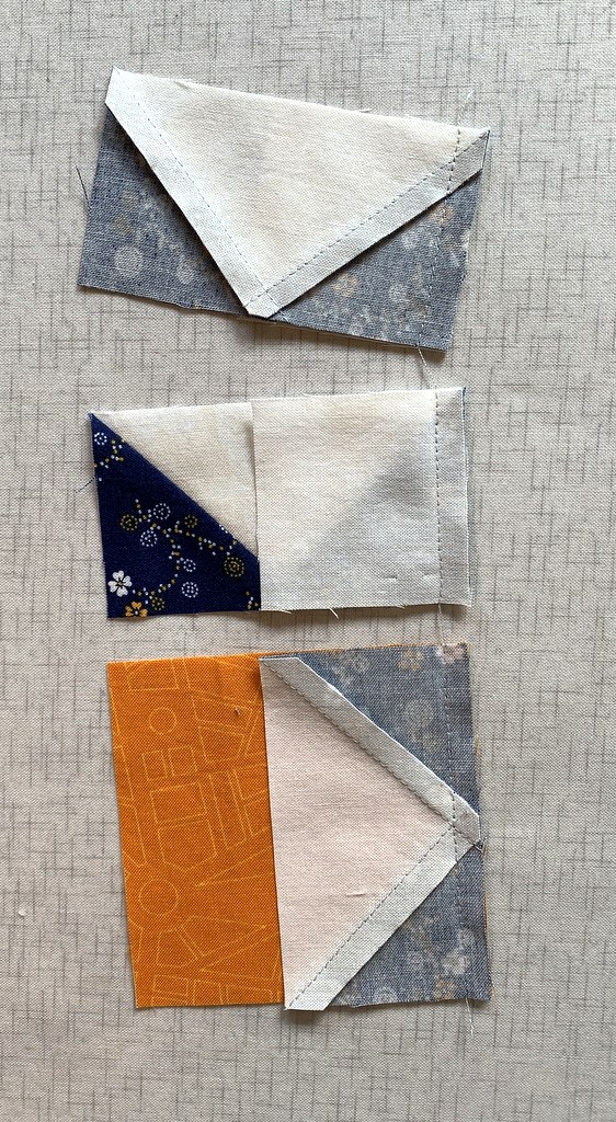
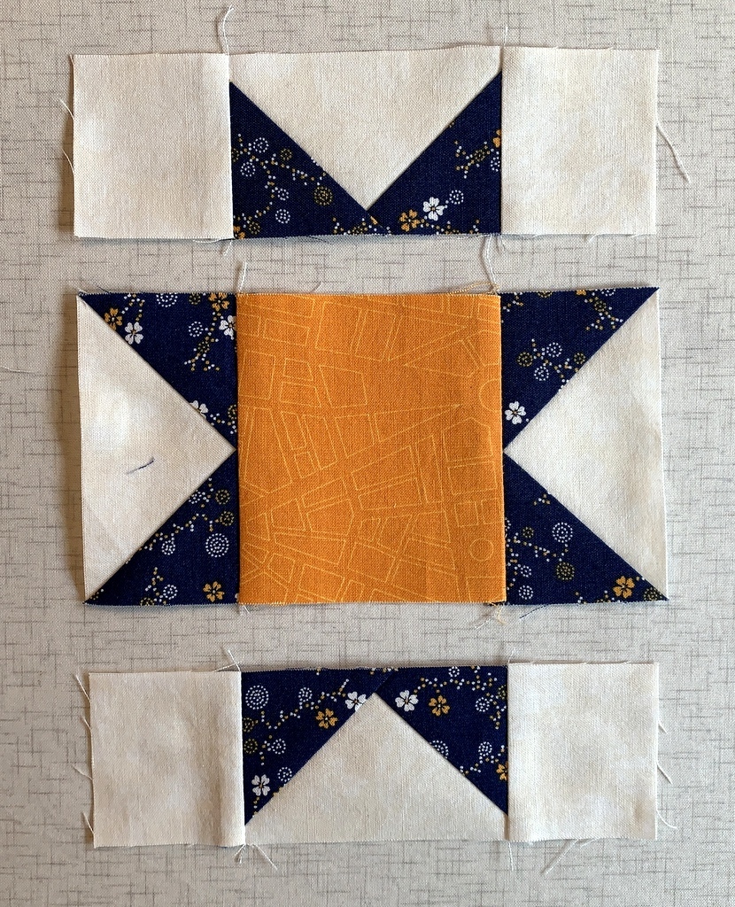
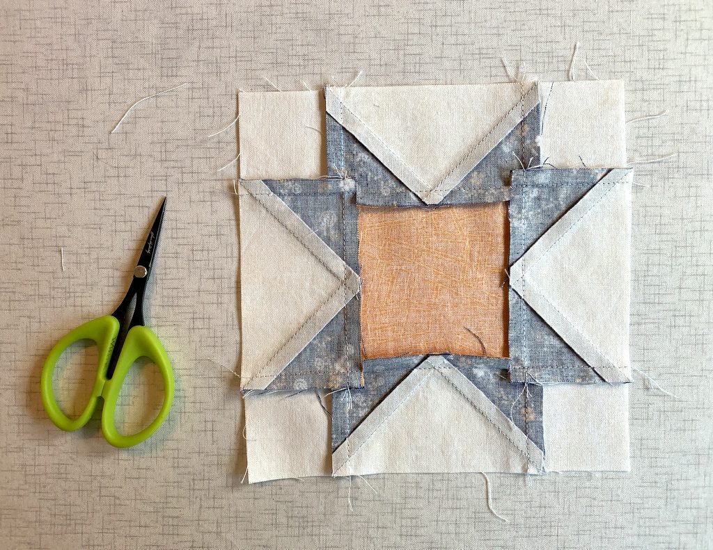
Take a look at the next photo. You can see that my star points in the top two pieces where the corner squares have been added are a quarter of an inch away from the edge — thus they won’t get chopped off when I sew them to another piece of fabric. In the bottom piece, which is the center of the block, the inside V of the background fabric is nice and sharp.

Tip #5: Sew seams with a regular quarter inch seam. This is not the time to go for a “scant quarter inch” because the point of your star will land inside the seam allowance when other pieces are sewn to the block. That’s another way star points get chopped off.

Now look at the picture again and notice how the seams are pressed. In the top two pieces the seams are pressed toward the outside (toward the corner squares). In the bottom piece, the seam is pressed toward the center square and away from the Flying Geese unit. My seams will nest when I’m ready to sew the units together.

Tip #6: Whenever possible, press away from the points, whether it’s the star points or the bottom of the V of a Flying Geese unit.

Tip #7: Whenever possible, press from the right side of the block. This helps prevent tiny pleats from being pressed in at the seamline, which often happens when blocks are pressed from the wrong side.

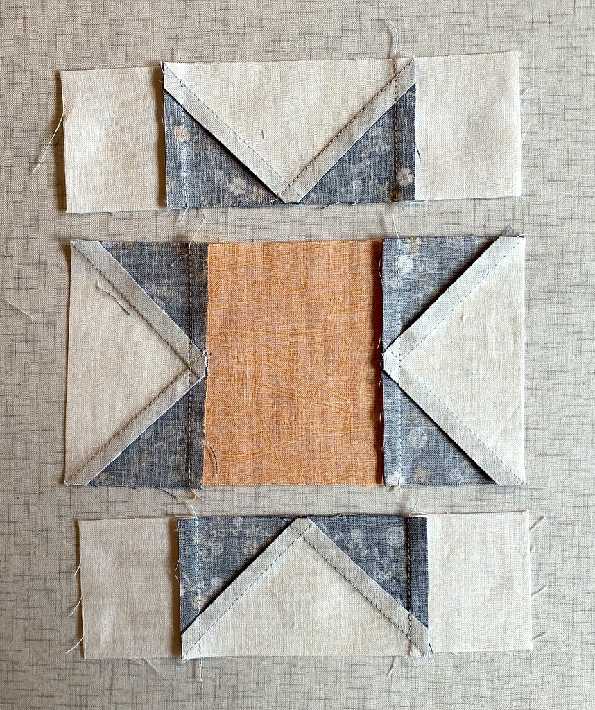
I’ve added the other pieces of my Sawtooth Star block and now have three units ready to sew together. Here they are from the front . . .

. . . and from the back:


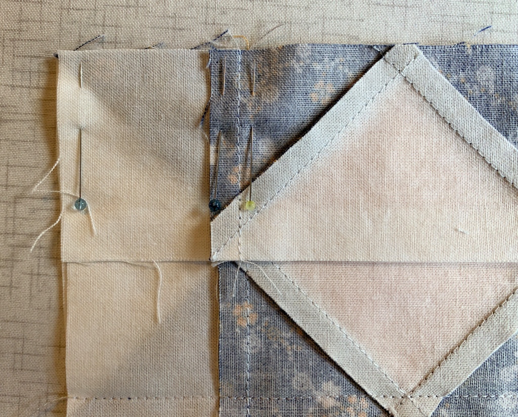
Even though the seams are pressed in opposite directions where they will meet, I still pin the intersections and add the all-important No Surprises pin at the end:

Do you see how the edges at the beginning of the stitching line (upper left corner) don’t meet? They’re supposed to. To correct this I’ve added a pin at the beginning of the stitching line to nudge that top layer over to meet its neighbor underneath:


These two seams that I’m sewing are the ones that connect my Flying Geese units to the middle section. When I get to the middle of the block I’ll make sure my stitching line is a couple of threads away from the point and toward the raw edges (Tip #3).

The seams are sewn and pressed toward the outside:

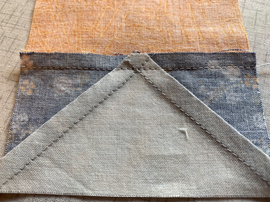
This is the way I pressed my star block seams for years. The block still looks good from the front but it feels bulky at the V where all those layers are lying on top of each other. Nowadays I clip the seam at the intersections so that I can press it toward center of the block, minimizing the bulk at the V:

Another option is to make a second clip on the other side of the intersection and press the seam open just between the clips, revealing a tiny 4-patch design. That’s what I showed you in my last post:

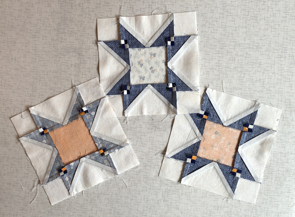
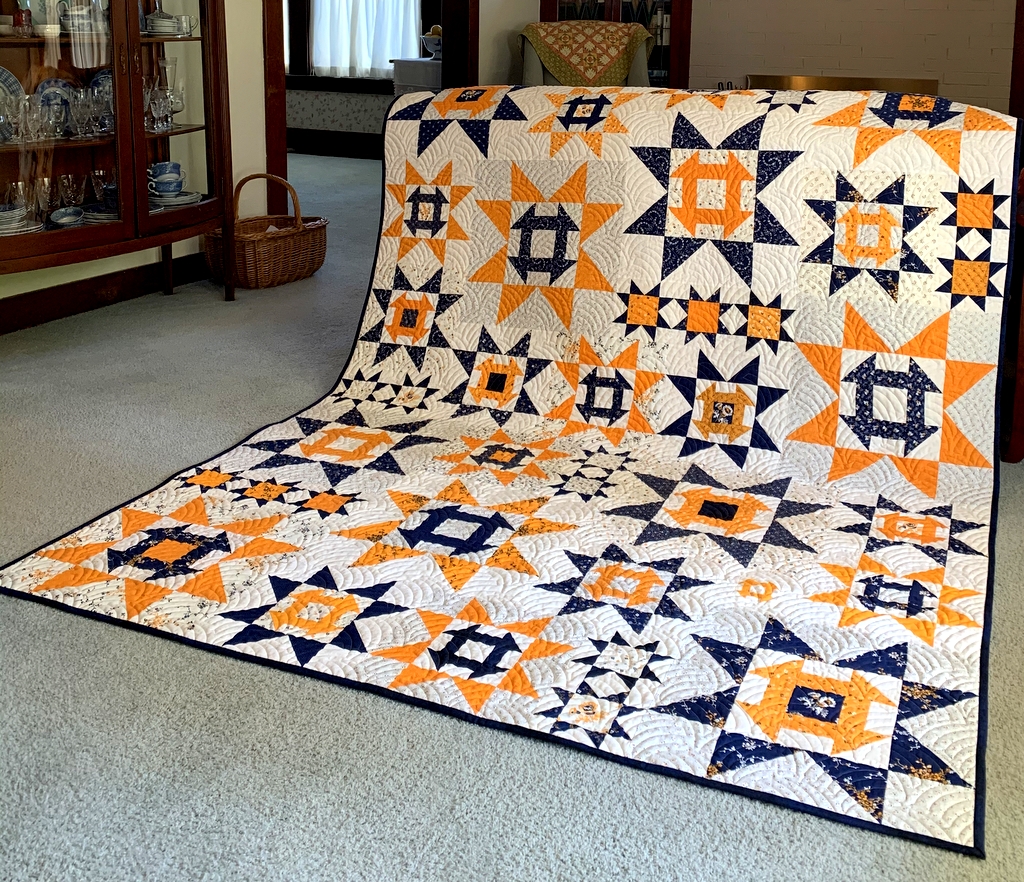
Here are my three most recent 6″ Sawtooth Star blocks, including the one starring (sorry, couldn’t resist) in this post:

I hope you found my tips helpful. Please let me know if you have any questions!

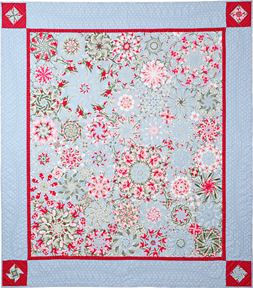
Update: to take a look at Scattered Stars, the quilt these star blocks were made for, click here.


Posted in cheddar and indigo, tutorial, update | 14 Comments

More About Masks

I’m shifting gears in my mask-making endeavors. Since mid-March, when the Dear Husband and I started sheltering in place at our Portland White House, I’ve made several dozen face masks using one of the first tutorials I came across, that of ER nurse Jessica Nandino. Between then and now, I’ve tried a few other patterns and haven’t found any I liked better.

Until now:

This is PJ Wong’s design. (I haven’t met PJ yet, although we both teach for Montavilla Sewing Centers. She’s an expert on designs and projects for machine embroidery and leads several clubs at Montavilla devoted to sewing, serging, and machine embroidery.) On the Montavilla website I came across this link taking me to instructions for two masks PJ has designed: one with a vertical center seam and one with three pleats. Both designs include instructions for an optional filter pocket, and the pleated mask also includes a casing for a nose wire. The site includes pdf patterns, written directions, and video tutorials.

I tried PJ’s design for the mask with the center seam (often called a duckbill mask) and proclaimed it a winner. What I like most about her design is the inclusion of a facing, separate from the mask and lining pieces, that gives the mask a beautifully finished look — inside and out. What’s more, the facing creates a casing at the sides that allows the mask to be secured with ties or elastic or — a new discovery for me — “t-shirt yarn.” (More on that below.)

As you see in the photo above, I used quarter-inch double fold bias tape on my first mask. All I had to do was stitch the tape closed and thread it through the casing. I cut my lengths of bias tape 36″ long, leaving a length of 18″ on each side at the top and 15″ at the bottom. That leaves plenty of tape to tie at the back of the head and the base of the neck. If you look carefully at the casing, you can tell that I stitched a little bar tack in the middle of the casing to maintain those lengths.

Here’s my first effort:

PJ’s duckbill pattern comes in four sizes, small through extra large. The one I made first is a medium and felt a bit large on me so I decided to try making a mask in the small size. And while I was at it, I wanted to try a different method of securing the mask in place. To be honest, cutting bias strips and sewing fabric ties was the one thing I found rather tedious about the other mask design I’ve been using, although it certainly has other features I really like.

I had seen several references on Instagram to using t-shirt fabric to make ear loops for masks. It is said to be softer than elastic hence more comfortable around the ears. All roads pointed toward a tutorial by craftpassion.com on making t-shirt “yarn.” It was a breeze to make and now I have a small ball of yarn made from one of the DH’s t-shirts, enough for a few dozen masks. (I haven’t told him yet about his sacrifice.)

Here’s my second effort, with t-shirt yarn for the ear loops:

The ear loops are very comfortable. And look how cute the mask is on the inside:

See what I mean about the nice finish? PJ’s directions call for the facing (green fabric) to be stitched down right next to the lining (yellow dotted fabric), which is left open so that a filter can be slipped into the center of the mask. Since I’m not using a filter, I stitched the ends of the lining closed.

The next version I made was for my twin sister, Diane, who needs a mask to go with the dress she is planning to wear to a wedding later this month. The dress is a navy knit wrap with a gray leaf design on it. She wanted a mask that would complement her dress, and she asked for a mask that would hold a nose wire. I made this one for her:

Take a look at the inside:

How cute is that lining fabric? Even with the addition of the gray leaf strip at the top, which holds a nose wire, the mask is nice enough to wear inside out:


Kidding, of course. But now I may have to make a mask for myself with the lemon fabric on the outside because it goes so well with my top!


Posted in bias tape, face masks, family, tutorial, update | 8 Comments

Here, There, and Everywhere

Do you ever buy a piece of fabric that you have no idea what to do with but you just know you have to have it? A couple years ago I was in a quilt shop in Bend, Oregon and spotted a succulent print in greens from the “Canyon” line designed by Kate Spain for Moda. I had to have some!

It sat on a shelf in my sewing room cabinet until a few weeks ago when I pulled it out to make this test block from a new pattern by Margot Languedoc called Pretty Little Baskets:

The pattern is definitely on my “to do” list but I only made one block with that fabric.

Then very recently Sew Kind of Wonderful released a new pattern called Curvy Bow Tie using the new Wonder Curve Ruler and I used a bit more of the fabric to make this test block:

Such a cute block but I wondered if the fabric would look better as the background of the block rather than the focal point. I made another block to see:

Oh yes, I like that better. But I’m not ready to make an entire quilt out of it just yet. (I love the Curvy Bow Tie pattern, though, and do plan to make a quilt when I’ve decided on a color scheme.)

What I really wanted to do with that fabric was make a pair of pillowcases for the Portland White House (using my own tutorial). So I did:

And I used some scraps to try out a new mask tutorial:

Now I can’t stop thinking of ways to use this fabric. Wouldn’t it make a great camp shirt?


Posted in bias tape, bowties, face masks, home dec, roll-it-up pillowcases, tutorial, update, Wonder Curve Ruler | 12 Comments

Who Knew?

Who knew that playing around with computer-generated quilt labels could be so much fun? Well, not everyone’s kind of fun, I suppose. But I was delighted to learn from comments on my last post that my accidental method of making labels with fusible-backed fabric worked for other quilters using different fusibles and printing their labels on different computers. As promised, I will work on a tutorial for my website to show the method step by step.

One quilter, Marge, noted that she starches her label fabric and sends it right through the printer. No interfacing, just one layer of fabric. Of course I had to try it! I decided to make a new label for Ramblin’ Rose, another kaleiodoscope quilt from 2009 that needed more information:

Ramblin’ Rose, 53″ x 59″ (2009)

I’m happy to report that Marge’s method worked beautifully. Marge did say she “starches the heck” out of her fabric so I made sure I did too. As a matter of fact, I spent more time starching the fabric than I would have just fusing interfacing to fabric. You really have to iron the fabric after each application of starch until it’s completely dry. The weight and feel of the “page” of starched fabric felt almost identical to the fused layer I experimented with earlier.

Unfortunately, when I printed my starched page I realized that the top line of the label was too close to the top of the page, not allowing enough room to draw around a compact disc for my preferred round label. I had to prepare a new one. Instead of starching a new piece of fabric, I went back to my method of fusing interfacing to the label fabric.

Here’s the old label still on the quilt and the one I just made:

In my last post I described how I used a piece of quilter’s cotton for the back of my label. My friend Arden suggested I try using fusible interfacing instead. That’s what I use for my label backing when I make hand printed labels. With those I have only two layers: the label fabric and the interfacing used for the backing instead of fabric. With a computer-generated label, though, I have three layers: the label fabric fused with interfacing and the second piece of interfacing used as the label backing. Would two layers of interfacing plus the label fabric make the finished label too stiff, I wondered?

Worth a try. Yes, the label did feel a little stiff and I found it very challenging pushing the needle through the layers when I hand appliquéd the label in place. I’m wondering if washing the quilt would soften the label a bit. Ramblin’ Rose has been displayed on a quilt rack in my sewing room for over a decade so it could probably use a trip to the laundry room. I’ll toss it in the washer and dryer and report back.

By the way, here’s a look at the back of Ramblin’ Rose (with the old label still in place — and the hanging sleeve so it could hang in a quilt show):

Update

Ramblin’ Rose has made her trip through the washer and dryer, and I’m delighted to report the label turned out beautifully: it has body but is still supple like the rest of the quilt:

This method is definitely a keeper!


Posted in 4-Patch Wonder, appliqué, kaleidoscope quilts, quilt labels, tutorial, update | 2 Comments

Label Me Surprised

A quilt I made over 10 years ago has an updated label, thanks to a mistake I made the other day creating a computer-generated label for my latest quilt, Uptown Funk. The label pictured above is the fourth one I’ve made using my computer and inkjet printer — and I may never go back to printing them by hand. (The smaller label on the left is the one I removed from the quilt so I could sew the new one on.)

For the first computer-generated label I made, created last fall for Give me the Simple Life, I followed a tutorial that called for label fabric to be fused to a layer of freezer paper and run through the printer. I had to use two layers of freezer paper before I was successful. Even then, the freezer paper rippled a little bit so it took a couple of tries (i.e. the printer jammed and I had to start over) before I got a label I could use.

On my second label, made for All You Need Is Love, I wanted an extra layer under the label so the print on the backing fabric wouldn’t show through. As an experiment I fused interfacing to the back of my label fabric before pressing it to one layer of freezer paper. There was very little rippling of the freezer paper. It went through the printer easily and I got a useable label on the first try. That in itself was serendipitous. Little did I know there was more serendipity to come!

To make label #3 for Uptown Funk, I decided to follow the second method. Three layers: label fabric, fusible interfacing, freezer paper. I made my preparations and trooped from my sewing room on the second story of our house down to the basement where the computer and printer are. Once there I realized I had only two of my three layers. I had fused the interfacing to the label fabric and trimmed it to size but had forgotten all about the freezer paper.

Arghh!! Did I really want to climb two flights of stairs to my sewing room to complete the freezer paper step? Or should I take a chance and run the fabric through the printer without the freezer paper? The worst that could happen is the printer would jam, right? So I tried it with just the two layers . . . and it worked — beautifully!

Was it just a fluke? Or have I stumbled onto an important discovery?

I decided to test my inadvertent discovery today by making a new label for a quilt I’d made in 2009. Back then my standard label information consisted of the name I had given the quilt, my name, and the year completed. At the time I didn’t appreciate the importance of providing additional information, such as the the designer of the quilt (if it wasn’t me) or the name of the person who quilted it for me. Nowadays I make it a point to include all that information on my labels.

Fiesta was quilted for me by the late great Lee Fowler, and I have been wanting to update the label information to acknowledge that for a very long time. I’ve actually been meaning to go back and remake several of my older labels but have always found an excuse to put it off. Creating labels by hand can be onerous and time-consuming, even when the results are pleasing. But now, thanks to the ease and speed of making a computer-generated label, my procrastination may be a thing of the past.

Here, very briefly, are the steps I took to make this label:

First, featherweight interfacing is fused to the label fabric. (I used Pellon 911FF.) Both pieces are cut slightly larger than a standard sheet of paper, 8½” x 11″:


Second, the fused fabrics are trimmed to 8½” x 11″ exactly:


Third, the two layers are fed into the inkjet printer and the label is printed from a file created on the computer. I tried two different sizes of type since I had room on the page for two labels:


Going with the smaller type, I decided I wanted a round label 4″ in diameter. (Labels can be any shape but I like the look of a round label.) My standard pattern is a compact disc measuring 4⅝” in diameter but it seemed a bit large so I made a trip to the kitchen to find just the right size to trace around. This small blue bowl is exactly 4″ across:

The larger circle drawn around the label was made with a compact disc, the smaller with the blue bowl.

I traced around the blue bowl on the wrong side of my label backing fabric so that when I held both layers up to the light I could position the top layer properly:

I don’t have a light table so the window had to do.

After being stitched and turned inside out, my label was ready to sew into place:

I chose to appliqué mine by hand but on another quilt it might be machine appliquéd if the stitching lines wouldn’t be distracting on the right side of the quilt.

My labels were printed on an HP OfficeJet Pro 8620. I know that all inkjet printers are not created equally. There must be wide variations between brands and models. I can’t help but wonder: with two successful labels behind me made with the new combo of label fabric + fusible interfacing + fabric for the back of the label, how transferable is this method of printing computer-generated labels?

Ah, that’s where you come in. If you are the least bit intrigued with my accidental discovery, would you be willing to make a test label? If this method works with different brands of printers — and different brands of fusible interfacing — I would be willing to create a  tutorial for my website with detailed instructions and a lot of photos. I thank in advance any quilter who decides to go for this.

Before I sign off, here’s a look at Fiesta, the first in my series of kaleidoscope quilts, front and back:

Fiesta, 54″ square (2009)
Back of Fiesta (2009)

Yes, I need to get a new photo of the back with the updated label!


Posted in appliqué, free motion quilting, kaleidoscope quilts, quilt labels, tutorial, update | 12 Comments

Throwback Thursday: I Love Paris (2011)

I’m taking a look back at some of the quilts I’ve made over the last 10 years, showing one every Thursday.

Last week I showed you Dianthus, a quilt I made in 2010. This week I’m featuring I Love Paris, made in 2011:

I Love Paris, 58″ x 64″ (2011)

The owner of the quilt shop where I was teaching at the time handed me a Lil’ Twister acrylic ruler by CS Designs and asked me to make something with it. This quilt was the result.

And the name? The heart-shaped design, the Eiffel tower, Paris map and French poodle fabrics . . . what else could I call this quilt but I Love Paris? Even the white background fabric has hearts on it, and there are different heart motifs in the quilting (beautifully done by longarm quilter Melissa Hoffman of Fiddlestitches).

Here’s a closer look at the fabrics and the quilting:

I wish I still had this quilt. A few years ago I sold it (reluctantly) to a family friend who wanted to give it to his girlfriend. He’s now married to someone else. Do you suppose the former girlfriend kept it?

Happily, some of the fabrics used in I Love Paris are still in my stash. I have no desire to make another quilt using the Lil’ Twister ruler but I would love to make another black-red-white quilt featuring the same fabrics.

In keeping with the theme, I made a heart-shaped label:

One of the first tutorials I posted on my blog when I launched it in 2012 was for I Love Paris. Just in case you’re thinking of whipping up your own version in time for Valentine’s Day (a mere five weeks away), you can find the tutorial here.

Thank you for stopping by on Throwback Thursday!


Posted in Paris, Throwback Thursday, tutorial, twister, update | 2 Comments

Christmas Pillowcases All Year ‘Round

Now that Christmas is over, I can show you the pillowcases I made for my twin sister Diane and her husband Ed:


The cases are made for a king size bed so they measure a generous 20″ x 33″. I am so in love with that floral fabric; it’s from a 2010 line for Henry Glass Fabrics called “At Home for Christmas” designed by Heather Mulder Peterson of Anka’s Treasures. It’s been in my stash for years. Knowing I would be using most of it, I scoured the Internet looking for more and even contacted Heather to see if she still had some in her shop; alas, it is gone.

I confess it was really hard to cut into that fabric but I knew that pillowcases made from it would look wonderful in Diane and Ed’s master bedroom:

The colors are Christmas-y but the prints are not, making the pillowcases appropriate for use all year round.

I had one other thing in mind when I chose the fabric. In the picture below you can just get a glimpse of a quilt on the wall:


It’s Midnight in the Garden, one of my very favorite quilts, made from my pattern 4-Patch Wonder:

I gave the quilt to Diane for her 60th birthday a few years ago and I get to see it whenever I travel to Georgia to visit her. I figured the pillowcases would complement her quilt very nicely. And they do, don’t they?!


Posted in 4-Patch Wonder, family, faux-kaleido quilts, home dec, kaleidoscope quilts, roll-it-up pillowcases, tutorial, update, wall hanging | 10 Comments

Giving Thanks

Greetings from Norcross, Georgia, the Atlanta suburb where my twin sister Diane and her husband Ed live. My husband and I are here for our annual Thanksgiving visit spanning two weeks. We’ve already been here a week. The time is going by way too fast!

Before we left Portland, Diane asked if I would bring fabric to make a pair of what she calls “Dawn pillowcases” as a thank you gift for a friend of hers. These are pillowcases made in such a way that all seams are enclosed. You may know them as burrito or roll-it-up pillowcases (see my tutorial here.) I love to have a sewing project to work on while I am here so of course I said yes.

Diane figured I would have something appropriate in my stash. (How well she knows me!) I texted her photos of possible fabrics and she quickly zeroed in on this lovely sage and cream toile from Timeless Treasures that I’ve had for a few years:

I brought several other fabrics as candidates for contrast strips, flanges, and bottom bands. Diane chose a narrow stripe for the flange and a small leaf print for the band, deciding against a third fabric for a contrast strip between the flange and the body of the pillowcase. This is the result:

The pillowcases are pictured on the bed in the main floor guest room, whose bedspread and quilt (the latter made by moi several years ago) match the cases perfectly.

As it happened, I didn’t have quite enough of the leaf fabric to make two bands without having to piece them. I used strips of the toile to do that. Take a peek inside a pillowcase:

Here’s a close-up of the inside:

I stitched the seam allowances down so they will stay flat when the pillowcases are washed.

Diane arranged the cases in a lovely gift box:

They’ll be in the mail tomorrow.

I had five yards of that toile; perhaps I was thinking of it as a potential quilt backing. There’s enough left to make two more sets of pillowcases — one for Diane’s guest room (since we know how well the pillowcases go with the furnishings) and one for the Portland White House. I’m thankful for that!


Posted in family, home dec, roll-it-up pillowcases, tutorial, update | 7 Comments