Category Archives: wall hanging

Cue Vivaldi

Imagine you are hearing the strains of Vivaldi’s “Four Seasons” as you view all four versions of my Season to Taste table runner/wall hanging design:

Four versions of Dawn’s pattern Season to Taste

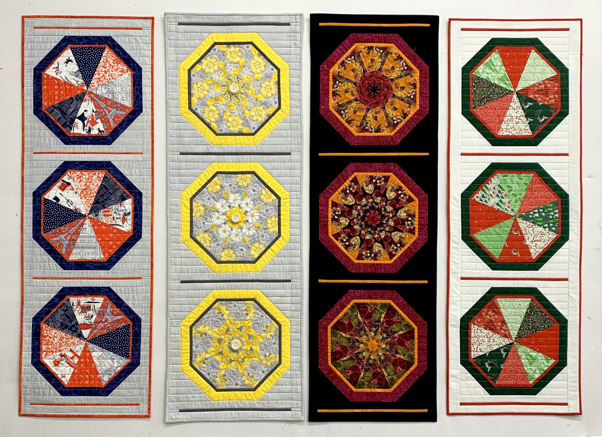
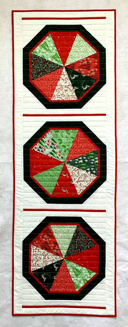
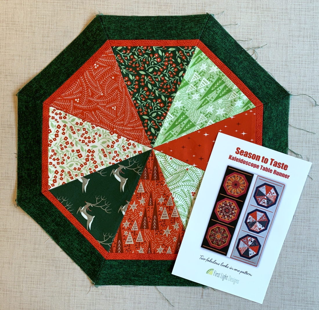
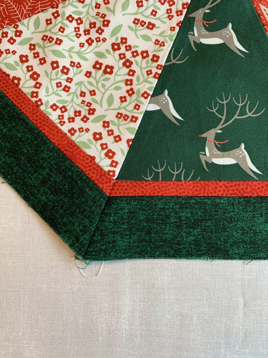
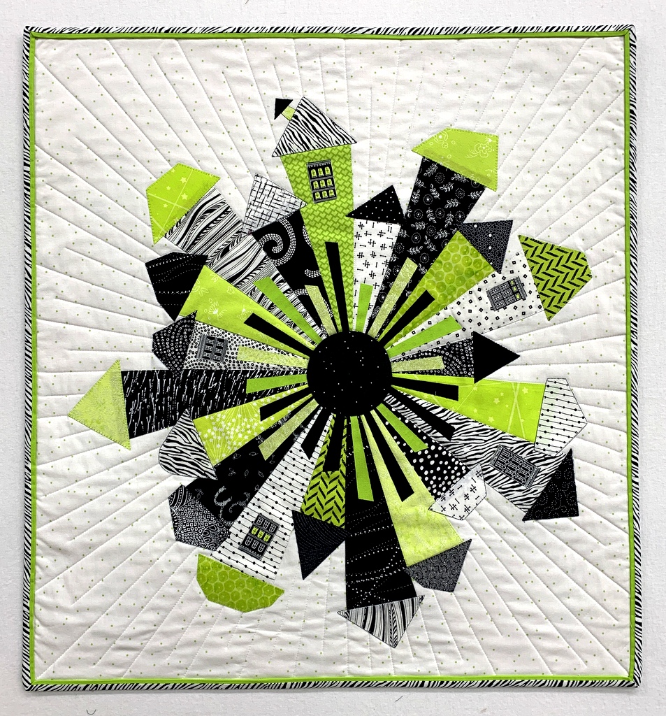
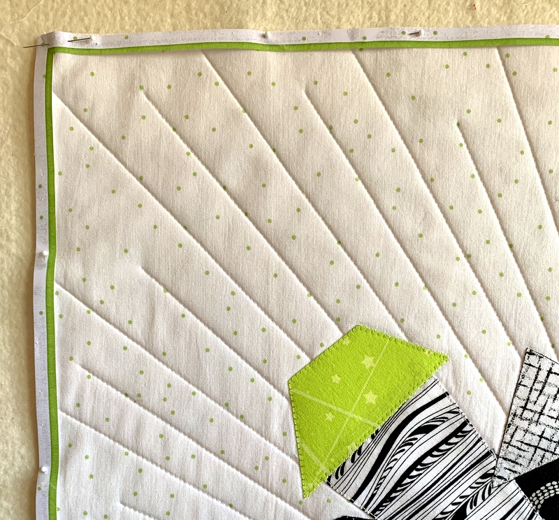
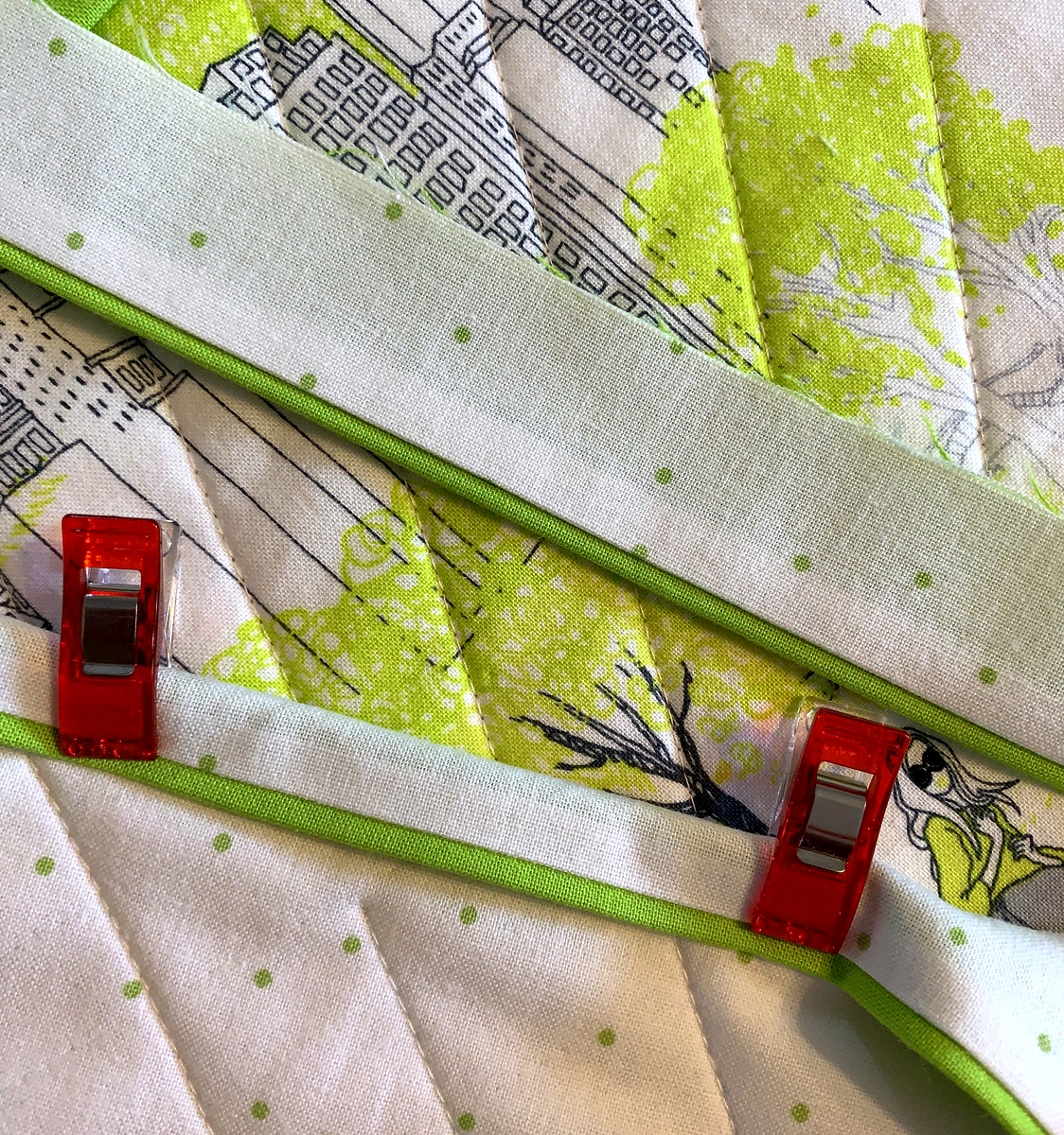
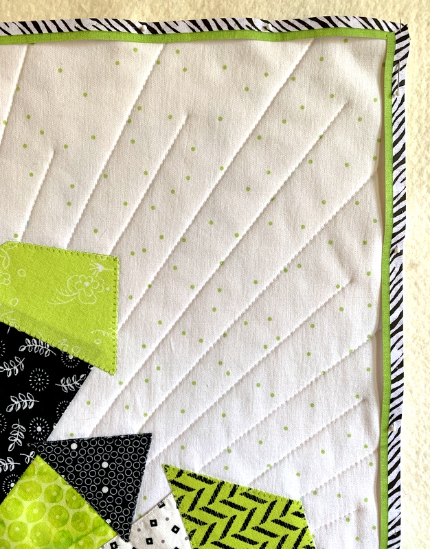
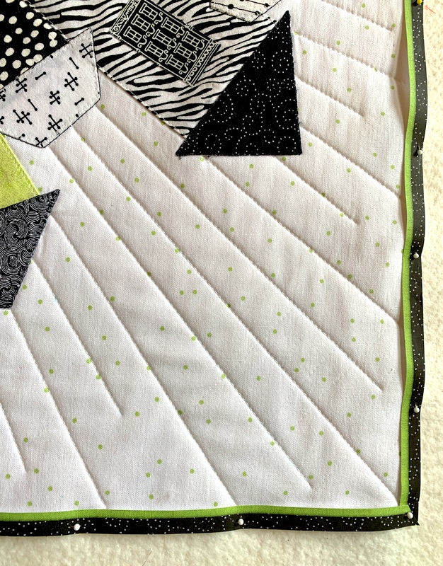
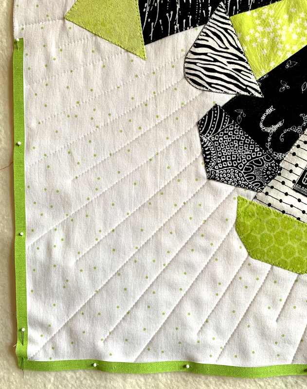
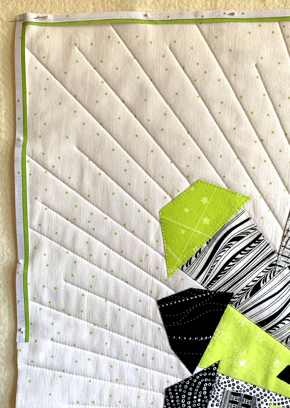
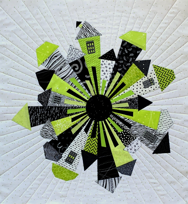
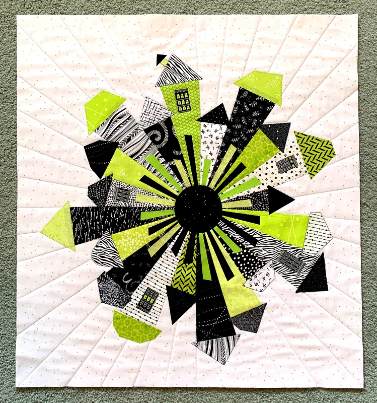
Aligning with Vivaldi’s concerti, the presentation begins with spring, followed by summer, fall, and winter. The winter version, named Winterwood, was the last one to be made:

Winterwood (2021)

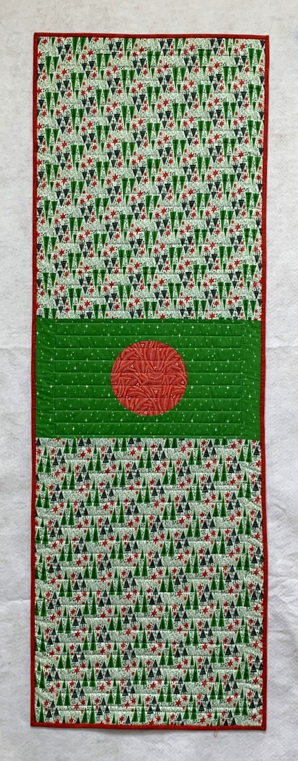
When I started working on this quilt using fabrics with a holiday vibe (red and green prints, though not overtly Christmas-y), I thought about making a second winter version that is weather-related, i.e. not associated specifically with the holidays. The other day I found a piece of fabric in my stash that may just fill the bill. I’m not sure when work will begin on it but I’m giving myself until winter 2022 to finish it. (Do you think that’s enough lead time??)

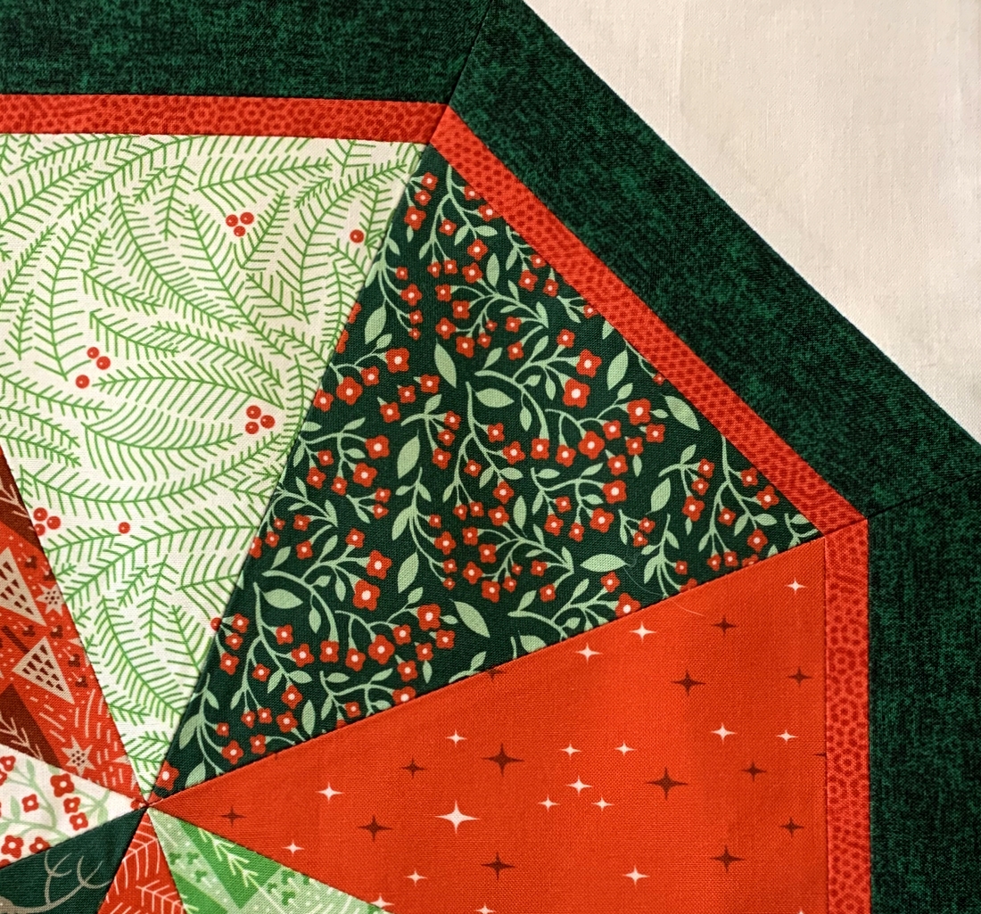
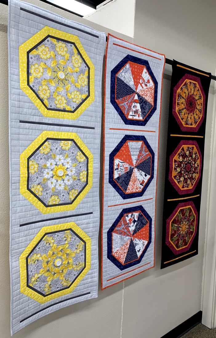
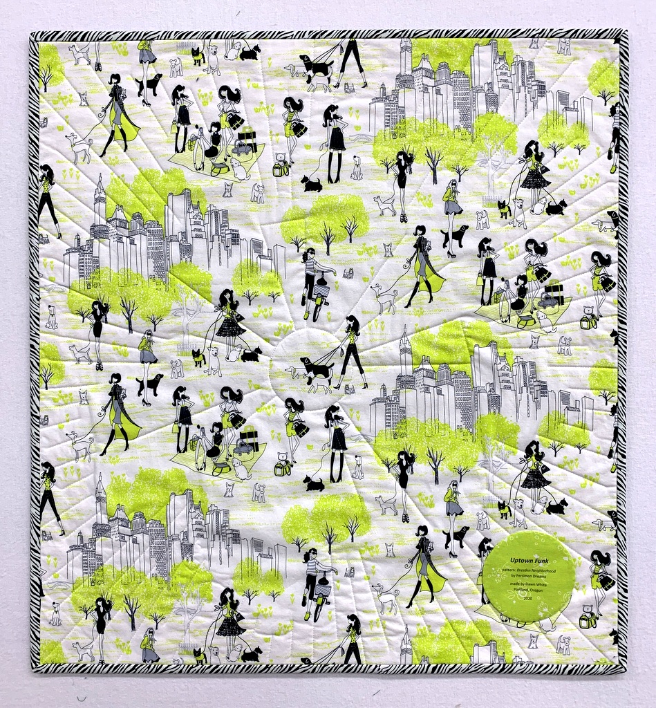
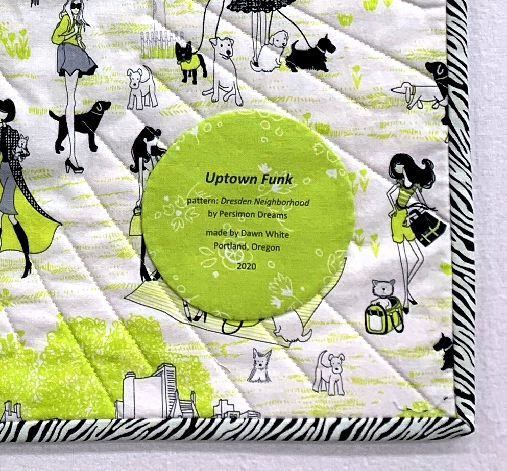
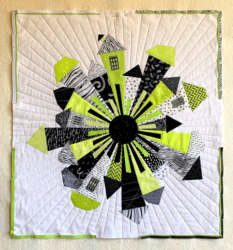
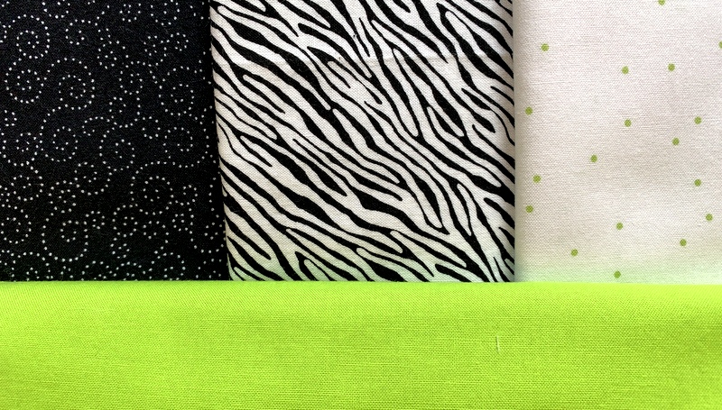
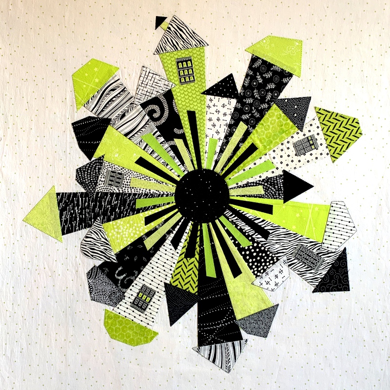
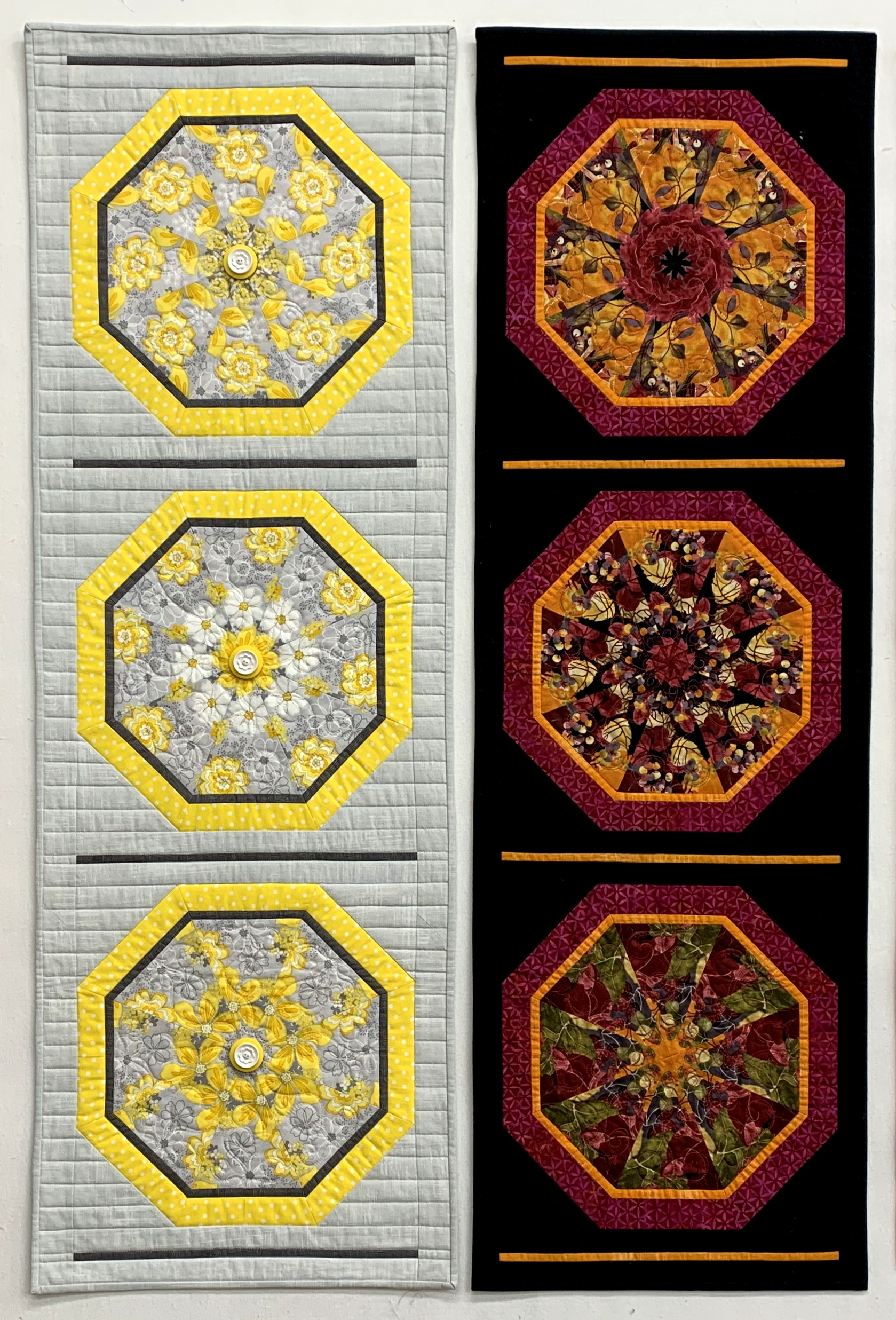
The 45-degree triangles in the spring and winter versions were made with a selection of fabrics while the summer and fall versions, seen below, were each made with one focus fabric for a true kaleidoscopic effect:

Sun Flowers (2015) and Autumn Reflections (2014)

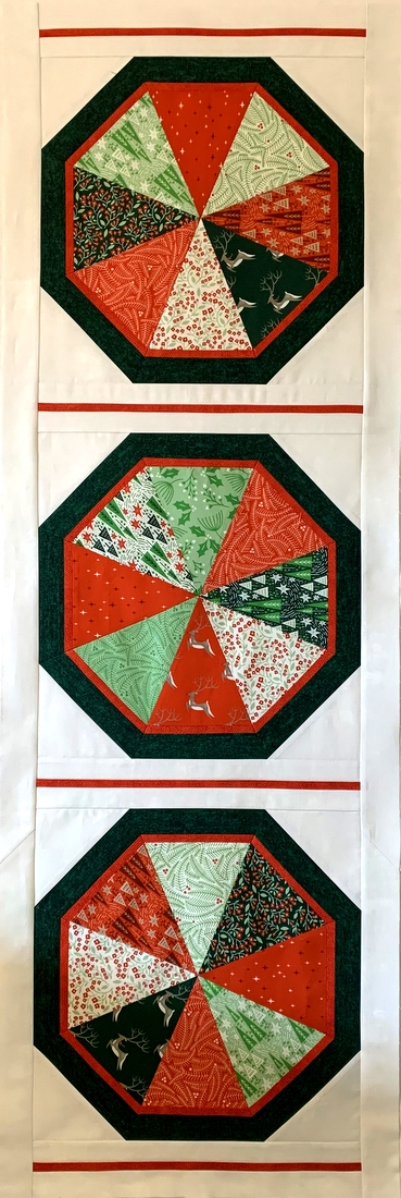
The fabric I have in mind for the second winter version would yield this kind of design.

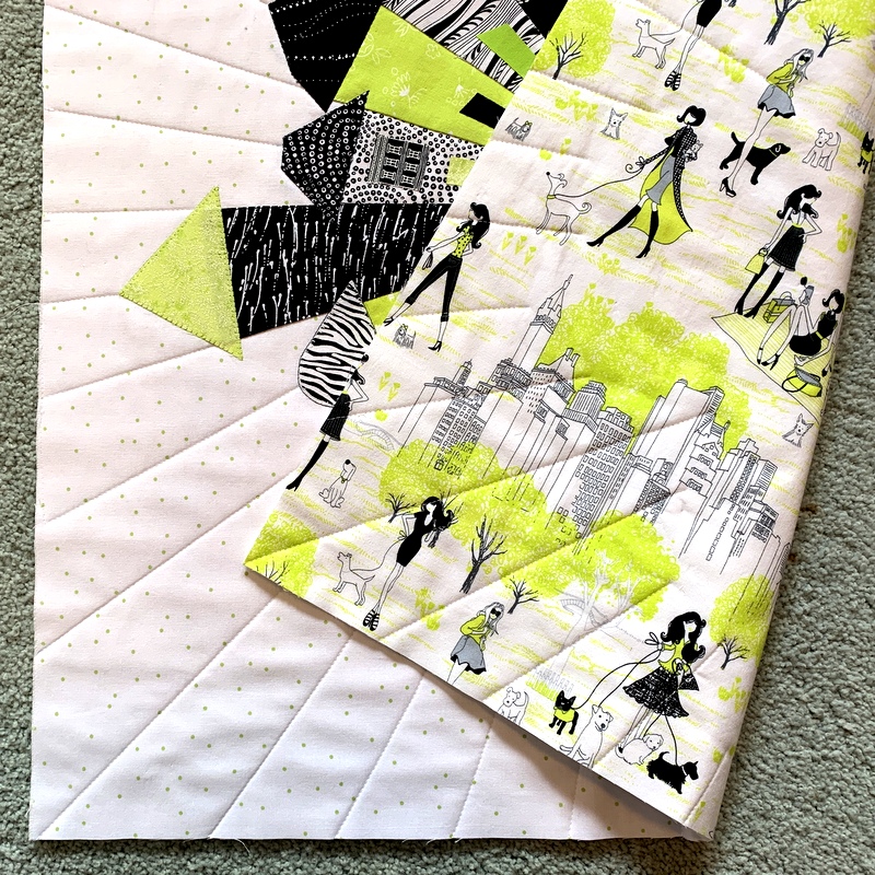
I’m happy with the way all of of these turned out but I confess I have a favorite. It’s my spring version, Under Paris Skies:

Under Paris Skies (Sous Le Ciel de Paris) (2014)

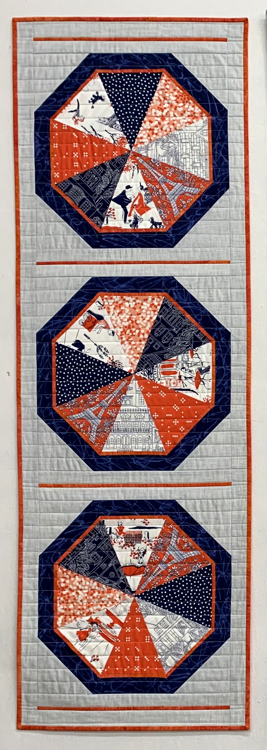
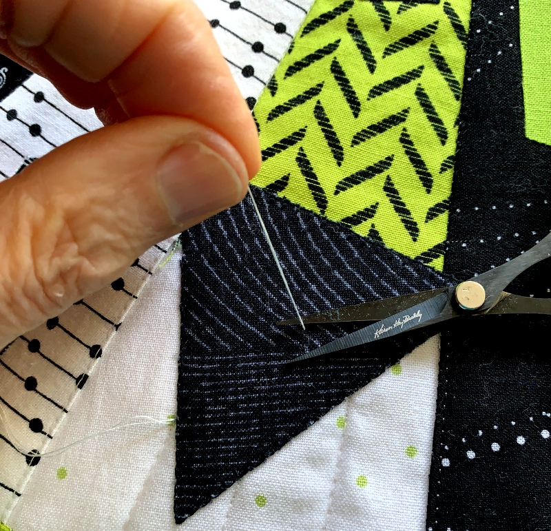
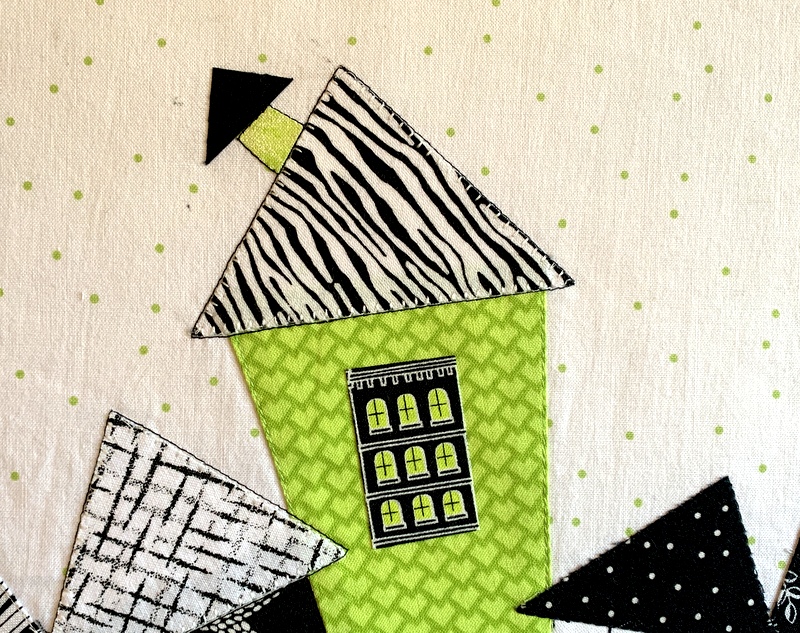
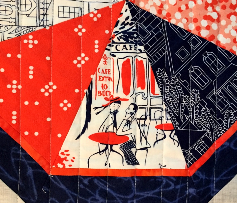
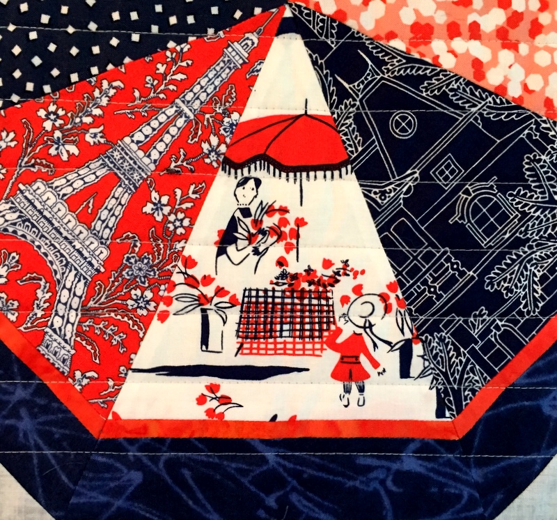
The quilt contains fussycut images of street scenes of Paris that always make me smile (in addition to which spring is my favorite season). Here are a couple of those street scenes:

So . . . what about you? Of the four quilts pictured here, do you have a favorite?


Posted in free motion quilting, home dec, kaleidoscope quilts, Paris, table runner, update, wall hanging | 6 Comments

Winterwood: Almost a Wrap

With the holidays fast approaching, I decided it was time to finish the winter version of seasonal wall hangings based on my pattern Season to Taste. This is Winterwood:

I finished the top in June and wrote about the making of it here. If you’re curious about where the name Winterwood came from, you’ll find the explanation in that June post.

Winterwood is quilted very simply with horizontal lines. Unfortunately, I forgot to extend the stitching lines across the borders, and now that the binding is on I’m not entirely happy with the result. I’m going to give it a good press and then decide if I need to add some after-the-fact quilting in the borders.

Winterwood was made to be a wall hanging but I decided to piece the back in such a way that it could double as a holiday table runner:

That’s a 7″ inset circle in the middle. I’m going to make a label using a compact disc as a pattern and put the label on the circle, figuring that I can put a candle or plate on top of the label to hide it. Because the tree fabric is directional, I deliberately arranged it so that the trees go in both directions.

Once this winter version is finished, I’ll show you how it looks with the spring, summer, and fall versions. Do I have a favorite? Why yes, I do. Perhaps you will, too!


Posted in home dec, kaleidoscope quilts, quilt labels, single-fold binding, table runner, update, wall hanging | 1 Comment

Winterwood

Here’s the completed quilt top of my winter version of Season to Taste:

It measures 18½” x 55½”.

Season to Taste is a kaleidoscope quilt pattern I created in 2014 with the idea of making one wall hanging or table runner representing each of the four seasons. You’ve seen my spring, summer, and fall versions before on the pages of this blog. I’ll post a photo of all four when I get this last one quilted.

My winter version will be called Winterwood in a nod to one of my favorite songs, written by Don McLean. You may be more familiar with his blockbuster hit “American Pie” from the album of the same name. “Winterwood” is from the same album which was released in 1971. Oh my! That means it’s 50 years old this year.

In my next post I’ll explain my method of getting the narrow accent strips (they finish at ⅜”) on my triangles to line up just so:


Posted in home dec, kaleidoscope quilts, table runner, update, wall hanging | 3 Comments

Season’s Greetings

What?? Here we are midway into a glorious spring in Portland, Oregon and my thoughts are on winter. Why, you ask? Because I have finally started work on the fourth and final quilt based on my Season to Taste pattern. This is the first of three blocks:


When I designed the pattern in 2014 I envisioned making a wall hanging (or table runner) for each season of the year. I started with the fall version, naming my quilt Autumn Reflections, and the spring version, Under Paris Skies. Those are the ones you see on the pattern cover above.

In 2015 I made a summer version named Sun Flowers. All three were on display last month at Montavilla Sewing Center in Lake Oswego:


Every so often I would think about making a winter version but I could never settle on fabrics. Did I want something in red and green to evoke the holidays or something in wintry hues of grey and dark blue? Did I want to make kaleidoscope blocks using eight repeats of the same print or a scrappy version using eight different prints?

Months passed. Years passed. (Hmm, my last post was about a quilt I started in 2015 and finished just this year. Do you see a pattern here?)

Then a few weeks ago I saw a photo of a quilt my friend Linda D. had made using a lovely collection of green and red prints. When I inquired about the fabric line (which turned out to be “Northern Light” by Annie Brady for Moda Fabrics), Linda generously offered to give me her leftover fabric. She actually made two bed-size quilts from these fabrics. When she dropped off the “scraps” I could see there was enough fabric in the sack to make a third bed-size quilt!

Today I stopped by Montavilla LO to pick up some background fabric. (Hard to believe but nothing in my stash seemed “just right” for this particular project.) At the shop I found a piece of “Grunge” by BasicGrey for Moda Fabrics that seemed like it might work — a creamy white with just a touch of green in the subtle texture and shading:

Alas, the green looked too minty when placed next to my kaleido block. I was about to give up the search when it occurred to me to flip the fabric over. You may not be able to tell from the next photo but trust me: the wrong side of the Grunge fabric is perfect:


Posted in kaleidoscope quilts, table runner, update, wall hanging | 2 Comments

First Light Designs: Best of 2020

Cheryl at Meadow Mist Designs is hosting a Best of 2020 Linky Party, inviting bloggers to highlight their top five posts of the year. It’s a fun way to look back over the last 12 months and identify some of the high points. (And wouldn’t we all much rather dwell on the high points of 2020 than the low points?!)

My top five are below, in reverse order. Clicking on the links will take you to the original posts.

5. Uptown Funk. My version of Dresden Neighborhood by Kim Lapacek of Persimon Dreams. It was so much fun to make!

Uptown Funk (24″ x 26″) by Dawn White (2020)


4. Something in Red: New Oven Mitts. Every oven mitt I’ve tried on in a store has been oversized, and every tutorial I’ve found online has included a pattern that’s too big. What’s a quilter to do? Why, make her own, of course! I just started making oven mitts in December and am still tweaking my process but I plan to offer my own tutorial and free pattern in early 2021.

Mitts that Fit! Made by Dawn White (2020)


3. A Bee in my Bucket Hat. A reversible hat made using the Sorrento Bucket Hat pattern from Elbe Designs.

Dawn’s Sorrento Bucket Hat (2020)


2. Love Rocks. All You Need Is Love, made using the Love Rocks pattern and alphabet (both contained in Sew Kind of Wonderful’s latest book, Text Me) and the Wonder Curve ruler.

Love Is All You Need (38″ x 44″) by Dawn White, quilted by Sherry Wadley (2020)
back of All You Need Is Love (38″ x 44″) by Dawn White, quilted by Sherry Wadley (2020)


1. Scattered Stars, an original design using a block first seen in Jenifer Gaston’s quilt Churning Stars.

Scattered Stars (66″ x 88″), made by Dawn White, quilted by Karlee Sandell (2020)


Thank you so much for checking out my “top five” blog posts. If you’re a blogger, you can join Cheryl’s party, too. The link is open until January 2. Be sure to check out the top five posts of the other quilting/blogging partygoers — and prepare to be inspired!


Posted in bucket hat, cheddar and indigo, Churning Stars quilt block, home dec, machine applique, tutorial, update, wall hanging, Wonder Curve Ruler, wonky Dresden neighborhood | 10 Comments

Uptown Funk Is Finished!

Uptown Funk, 2020 (24″ x 26″)

And now you know, if you’ve been following along as I pondered four binding options, that Option #1 — the lime green faux flange with the zebra fabric — was the winner.

But guess what? It wasn’t my first choice. Nope. I was going with Option #4, the green flange with the white background fabric as the binding. Here’s the mockup I showed you in my last post, with paper strips made from photocopied fabric:

Why this choice? I liked the idea of the white background fabric extending to the edges, almost as if the quilt were faced rather than bound, with that thin flange as a bright but understated accent. Plus it was an unexpected choice. (I have to thank my friend Deborah for suggesting white fabric. It never would have occurred to me, as I was gravitating to the black prints used in my quilt.)

I made my binding accordingly and started to apply it. Normally binding is stitched to the right side of the quilt and turned to the back. With this faux flange method, however, you sew the binding to the wrong side of the quilt and turn it to the right side to expose the flange. When I got ready to miter the first corner, I turned the binding to the right side. And this is what I saw:

Oh no! You can clearly see the green fabric through the white fabric in the binding. With this particular treatment the seam allowance must be pressed toward the binding fabric for the flange to lie flat. I tried pressing it the other way but it was a “no go.” There was no way I could see to remedy this problem.

Back to the drawing board — er, cutting table. My second choice for the binding was the zebra fabric. That was my husband’s first choice and also my twin sister’s. Some of my readers liked it too so I figured it was a keeper. (Thank you, Vickie R., for suggesting the zebra fabric. Like the white background fabric, it wasn’t even on my radar initially.)

I started cutting more binding strips . . .  until a certain feline came to investigate:


Princess Cordelia (Coco for short) was gently ejected from my sewing room so I could proceed. The binding went on very nicely.

The conventional way to finish a faux flange binding is to machine stitch in the ditch where the flange meets the binding fabric. Instead of doing that I fused the binding down with Steam-a-Seam-2, a  double-sided fusible web.

Here’s the back of Uptown Funk:

I love the way the binding looks with the backing fabric.

Here’s a close-up of the label:

Thank you, Kim Lapacek of Persimon Dreams, for designing Dresden Neighborhood! It was such a fun little quilt to make.


Posted in cats, update, wall hanging, wonky Dresden neighborhood | 6 Comments

And the Winner Is . . .

Hold on. Before I reveal my choice for the binding of my wonky Dresden Neighborhood quilt, take a look at my four options:


Did I make four different bindings? Oh no! I photocopied the fabrics, cut strips to look like binding, and pinned them to the quilt. Three of the four treatments involve a faux flange, in which the binding is made of two strips of fabric. I’ve never tried that method before.

Here’s a closeup of the fabric contenders:

There’s a white-on-black swirly print, a black-on-white zebra print, a green pindot on white (the same fabric as the background of the quilt), and the solid lime green flange fabric, the last of which I auditioned separately as a no-flange binding.

Let’s take a closer look, clockwise starting with the upper right corner:

Binding 1:


Binding 2:


Binding 3:


and binding 4:


Any one of them would work, don’t you think? But one emerged as the clear winner for me — and it wasn’t the one I was expecting.

Which one was it? Please come back tomorrow to find out!


Posted in update, wall hanging, wonky Dresden neighborhood | 5 Comments

Another Walk in the Neighborhood

Uptown Funk, my version of Kim Lapacek’s pattern Dresden Neighborhood, needed more quilting. I knew it right away when I looked at it this morning. So what did it need? More quilting lines radiating out to the edges. Not all the way to the outside, mind you. As you can see, the new stitching lines, placed between the first set I showed you in yesterday’s post, are of staggered lengths and all end shy of the edges, some by quite a bit.

I’m very pleased with the effect but creating that effect was quite a chore, let me tell you. Each stitching line began and ended with four tiny stitches (1.0 on my computerized machine) to lock the threads in place in lieu of knotting. The main part of the line was sewn with a stitch length of 2.7. That’s a lot of stopping and starting while the stitch length was being adjusted. And I buried all the threads. Let’s see: 40 stitching lines — yes, 40! — means there were 80 sets of threads to be buried.

I’ve found that the key to burying threads easily, once you’ve drawn them to the same side of the fabric, is to trim both threads to the same length — three to four inches works best for me — and use a needle with a large eye so the thread ends go in easily:

Because I pulled the bobbin threads through to the front when I started the stitching lines in the interior of the quilt, I buried a lot of the threads in the roofs:

The roofs have a layer of fusible web underneath them so those threads aren’t going anywhere. It was very easy to pull the threads taut and clip them right where they came out of the fabric:

The top thread at the end of each stitching line got pulled to the back of the quilt and buried in the backing fabric.

Just before getting started this morning, I left my sewing room for a few minutes. Look who I found lounging on my ironing board when I came back:

Good thing Coco’s paws were clean!

Now I’m ready for the binding. For those of you who commented on my last post and offered suggestions on color and fabric choices: thank you so much! I’m going to audition everyone’s ideas before making a final decision.

I expect to have a Friday Finish to show you.


Posted in cats, Janome 9450QCP, update, wall hanging, wonky Dresden neighborhood | 5 Comments

A Walk in the Neighborhood

It’s a bit of a stretch. The reference is to the walking foot on my Janome sewing machine, used to quilt Uptown Funk, my version of the Dresden Neighborhood quilt.


I seriously considered doing some free motion quilting in the background. Little spirals would have looked good or perhaps some pebbling. Alas, free motion quilting is not my strong suit. After considerable waffling I opted to keep it simple and go for straight lines. The doors on my wonky Dresden houses appear to radiate from the center circle so I extended the concept with my quilting lines radiating to the outer edges of the quilt.

Here’s a peek at the backing fabric:

The fabric, an older print from Timeless Treasures, features another kind of uptown neighborhood: Central Park in New York City. I’ve used this fun retro print in other projects and am happy to report I have plenty left. (There’s a funny story about this fabric you can read about here.)

My wonky Dresden neighborhood quilt measures 24″ x 26″ after trimming. Now I’m trying to decide what fabric to use for binding. Solid black seems too severe. Solid green? No, that would be too much green. I’m leaning toward using one of the black prints from the quilt and maybe inserting a very thin green flange.

Do you approve?


Posted in free motion quilting, Janome 9450QCP, update, wall hanging, wonky Dresden neighborhood | 7 Comments

A Beautiful Day in the Neighborhood . . .

. . . my Uptown Funk neighborhood, that is, which now has doors and a few windows:

I wanted the long skinny doors to really stand out, like rays radiating from a sun, so I cut them all from black and green solids. I thought the effect might be diluted if I used prints.

I was planning to use the same solid fabrics for windows. If you look at the Dresden Neighborhood pattern by Kim Lapacek that my neighborhood is based on, you’ll see that all the buildings have doors and windows:

My plan changed when I happened upon a piece of fabric in my stash of a cityscape with a variety of windows — in the perfect color combo of black, white, and green. Of course I had to audition them! I fussycut just a few sets of windows and placed them randomly around the circle of houses.

The windows weren’t printed on the straight of grain so they’re all a little bit wonky. Perfect for my wonky little neighborhood. Here’s a close-up:

Oh, and see the little chimney? It’s the only one in the neighborhood. It’s covering up the smudge of dirt I pointed out in my previous post about this project. I stitched around the base of the chimney with black thread so it would stand out a bit more, and I also added a row of black stitching around the roof. I stitched around the other four roofs that had a lot of white in them after noticing that they blended into the background fabric too much.

I’m thinking windows on only five of my houses may be enough. What do you think?


Posted in appliqué, machine applique, update, wall hanging, wonky Dresden neighborhood | 6 Comments