It’s a Wrap: Lilacs in September

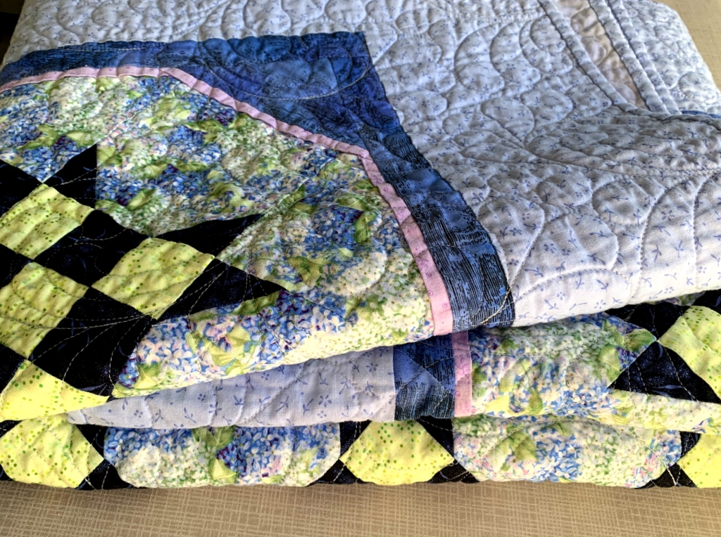
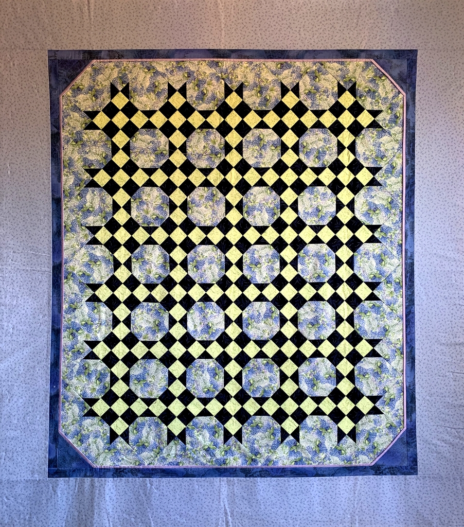
Presenting . . . Lilacs in September. The little quilt started 12 years ago to use up some leftover blocks is finally finished. I stitched the label on yesterday. But there was one more thing to do before I could call it a wrap: the quilt got tossed into the washer and dryer. I love the look and feel of a freshly laundered quilt, don’t you? Such puckery goodness:

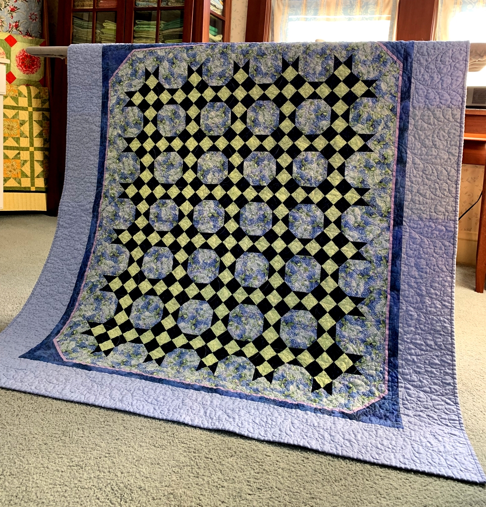
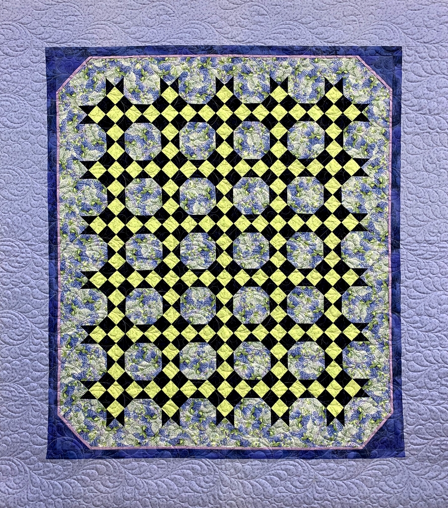
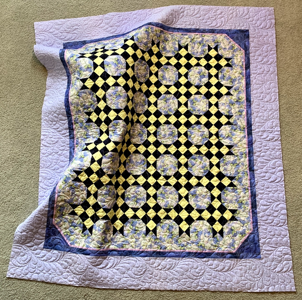
Here’s a look at the whole quilt:

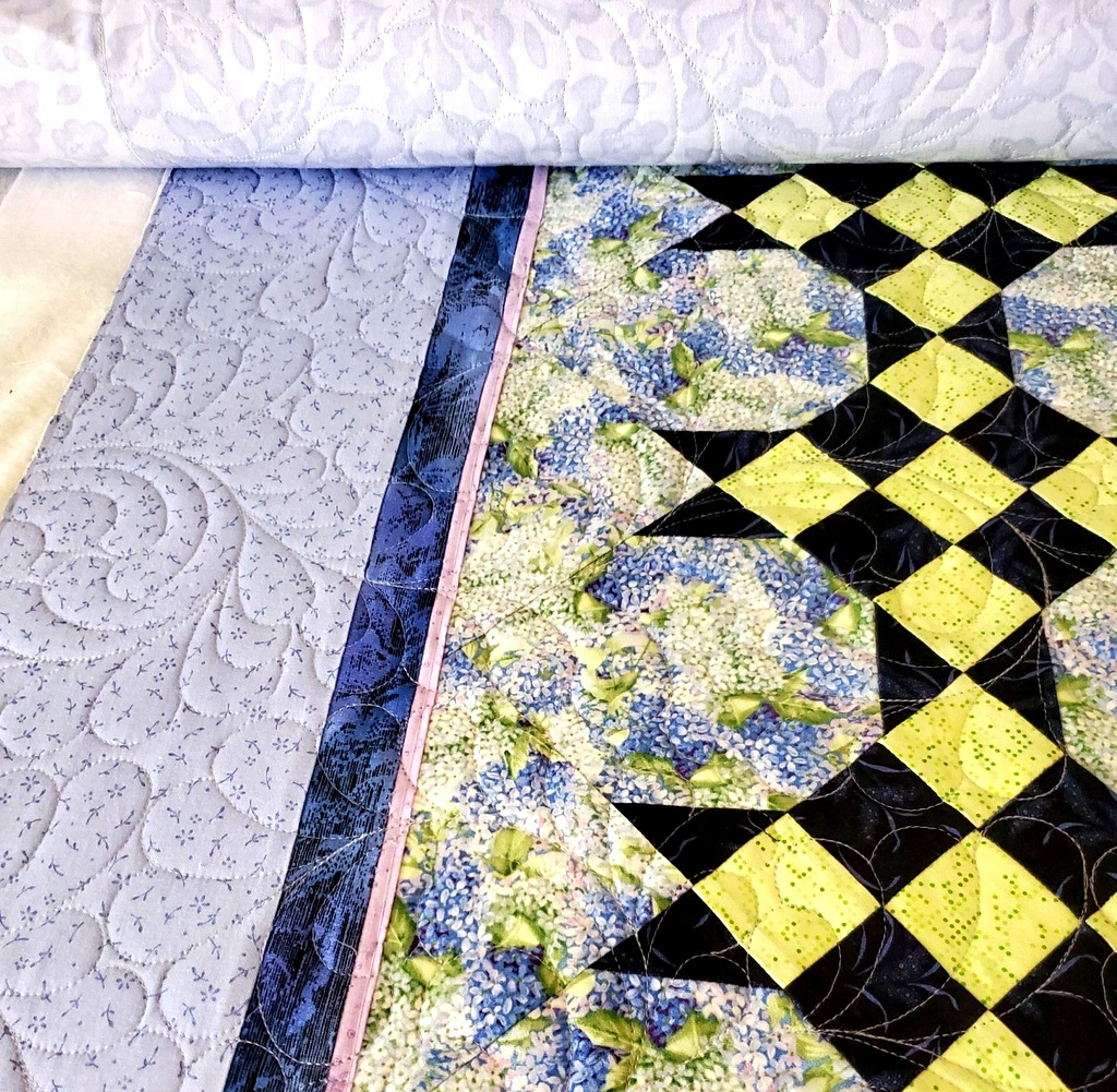
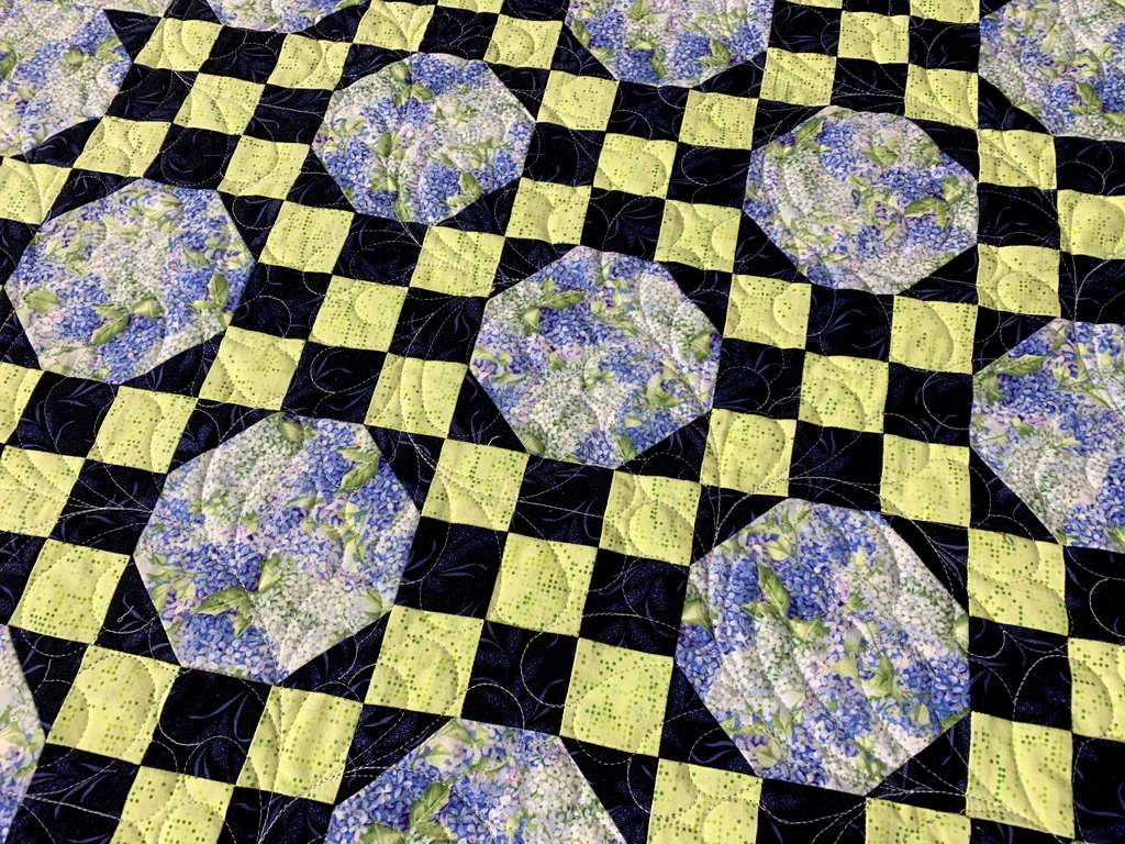
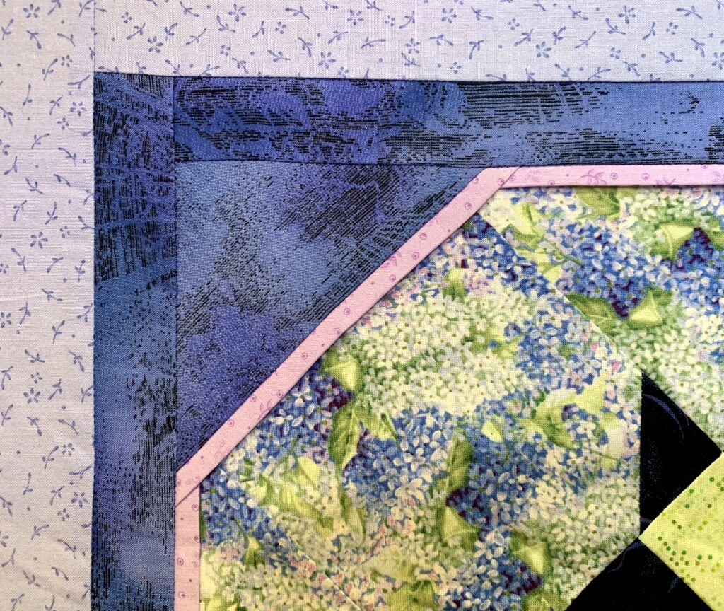
It’s a very simple design: nine patches alternating with snowball blocks. I jazzed it up a little by angling the corners, adding a flange, and finishing it with a narrow and wide border.

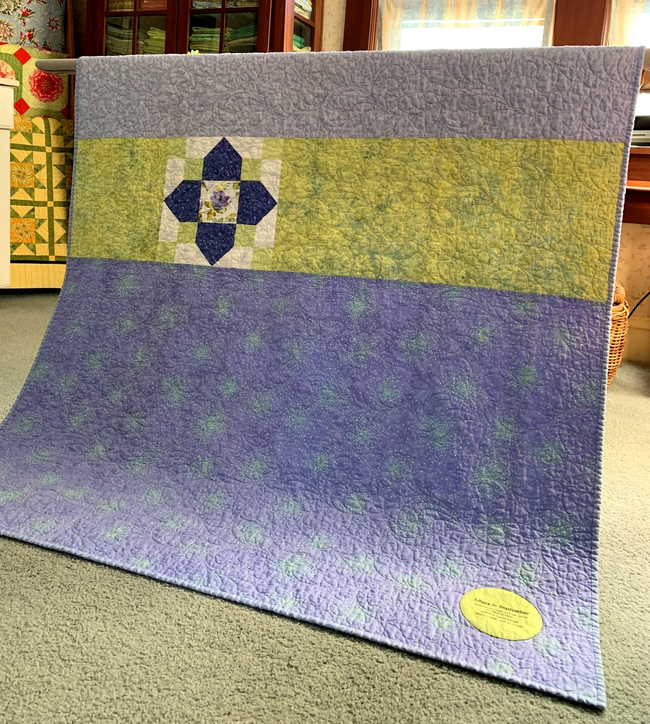
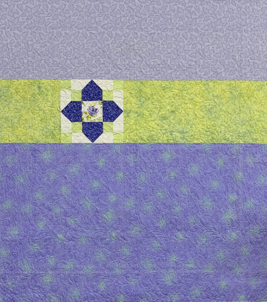
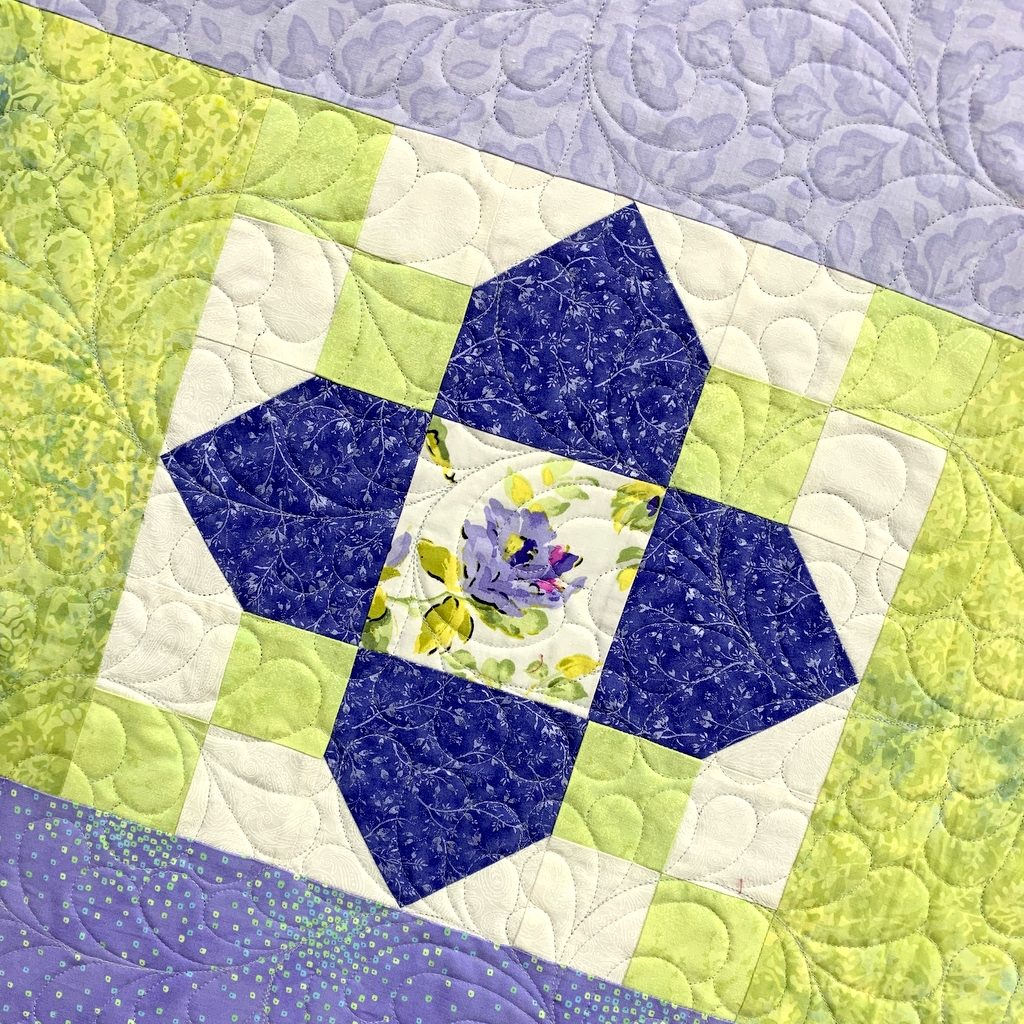
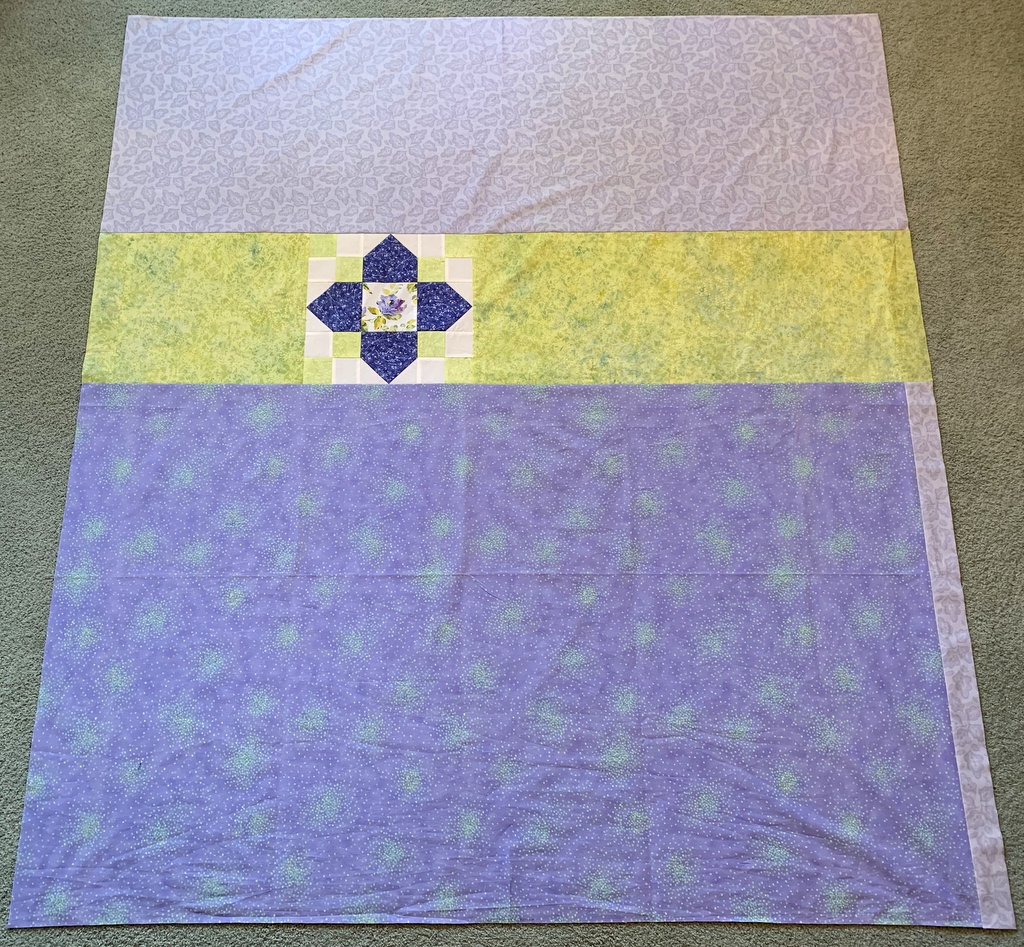
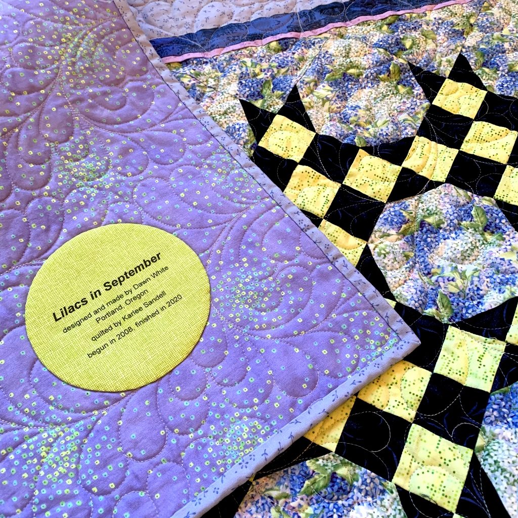
Here’s a look at the simple pieced back, jazzed up with a single Quatrefoil block:

Lilacs in September finished at 50″ x 56″ — a good size for a lap quilt. I’ve just moved it to the back of my chair in the TV room. The next time I plop down in my chair to read a book or watch TV, I’ll throw it across my legs to keep myself warm. See what I mean? It’s a wrap!


Posted in Quatrefoil, snowball blocks, update | 10 Comments

Printing Quilt Labels on Fabric: A Tutorial

Back in May — doesn’t that seem like a hundred years ago? — I wrote about a method I discovered quite by accident of printing computer-generated labels on fabric. It requires only two items: fabric and fusible interfacing — no freezer paper involved. I described my method and promised to write a proper tutorial on it. Here is that tutorial. Better late than never, right?

I’ve written this tutorial in two parts. Part 1 is all about getting the fabric ready. Part 2 is about creating the label on your computer.

Part 1, Preparing the Fabric for Your Label

Step 1. Choose a fabric for your label that allows the type to show clearly. The fabric can be a solid or tone-on-tone print in a light to medium-light value. You might also be able to use a printed fabric — perhaps one you used in your quilt – if it’s not too busy or too dark in value to make the printed label hard to read. I’m illustrating this tutorial by making a label for my most recent UFO finish, Lilacs in September, using a medium light spring green fabric with a crosshatch design.

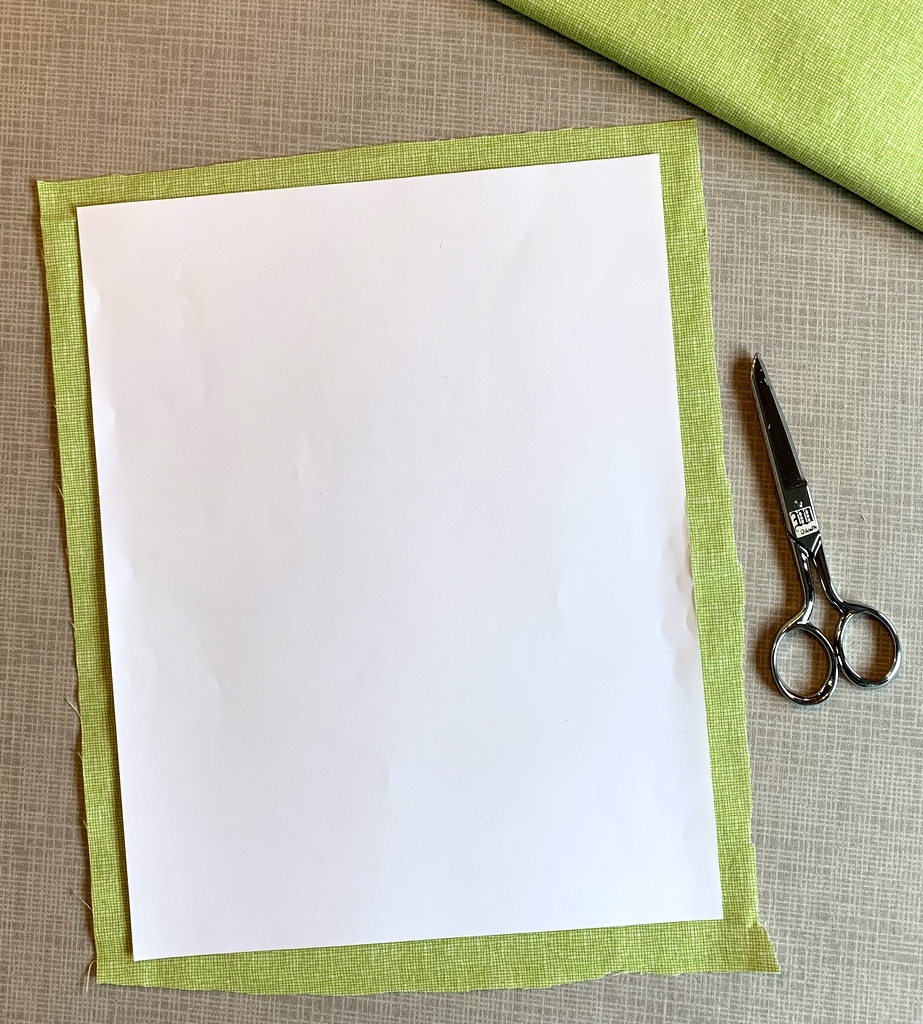
Step 2. Cut the label fabric about ½” larger all around than a printed page. In the United States the standard paper size is 8½” x 11” so you would cut your fabric about 9½” x 12”. It doesn’t have to be exact. I just lay a piece of paper on top of my label fabric and cut around it with scissors:
Step 3. Choose a featherweight or lightweight fusible interfacing. I use Pellon 911FF (the FF stands for featherweight fusible) for most of my labels but other brands will work equally well.

Step 4. Cut the fusible interfacing slightly smaller than you cut the label fabric. I do this the same way, by laying a piece of paper on top of the interfacing and cutting around it with scissors:
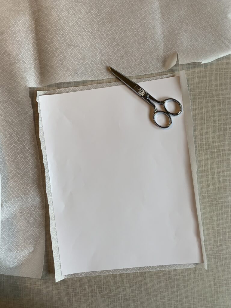
Cutting the interfacing slightly smaller assures that you won’t accidentally fuse it to your ironing board cover when you iron it to the label fabric. No need to ask me how I know that . . .

Step 5. Place the fusible side of the interfacing on the wrong side of the label fabric, making sure none of the fusible extends beyond the edges of the label fabric . . .
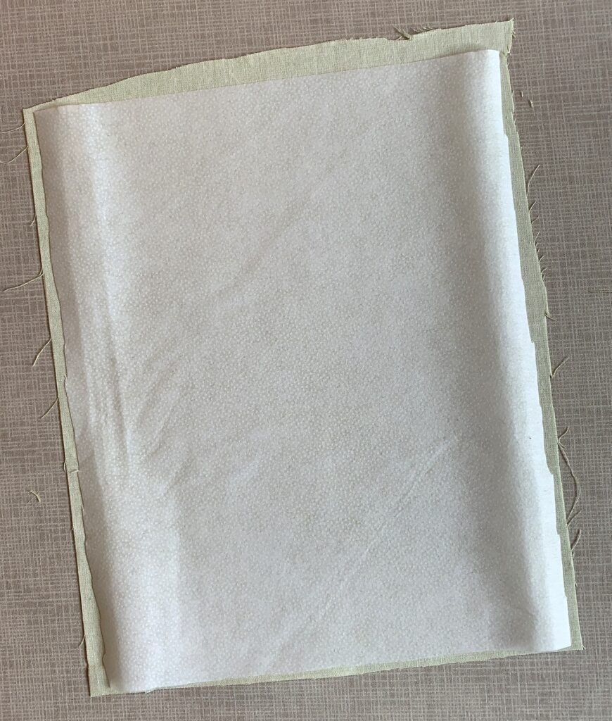
. . . and fuse in place following the manufacturer’s directions.

Step 6. Place the fabric on your cutting mat interfacing side up. Trim to 8½” x 11”:
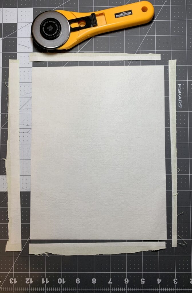
Make sure your cutting is precise because the piece of interfaced fabric needs to fit perfectly in the paper tray of your inket printer.

Step 7. Place the fabric in your printer’s paper tray. (Make sure you know whether the fabric side needs to go in the tray right side down or right side up, as it varies from printer to printer. It goes right side down in my HP Office Jet Pro 8620.) Now print the label:
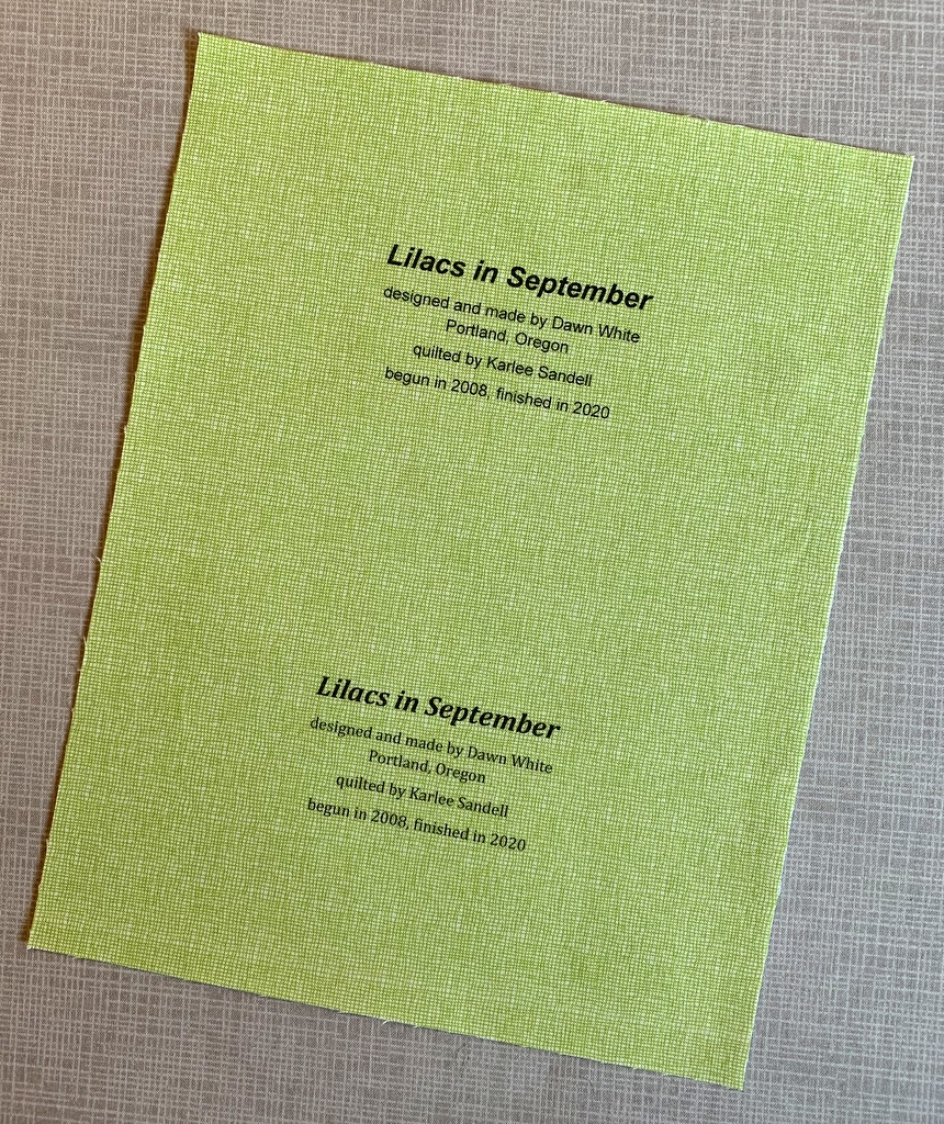
Voilà! It should slide out of the printer just as if it were a piece of paper. (You’ll notice I put two labels on my page; I’ll explain why in Part 2.)

One more thing to do:

Step 8. Heat-set the ink on the label using a press cloth and plenty of steam:
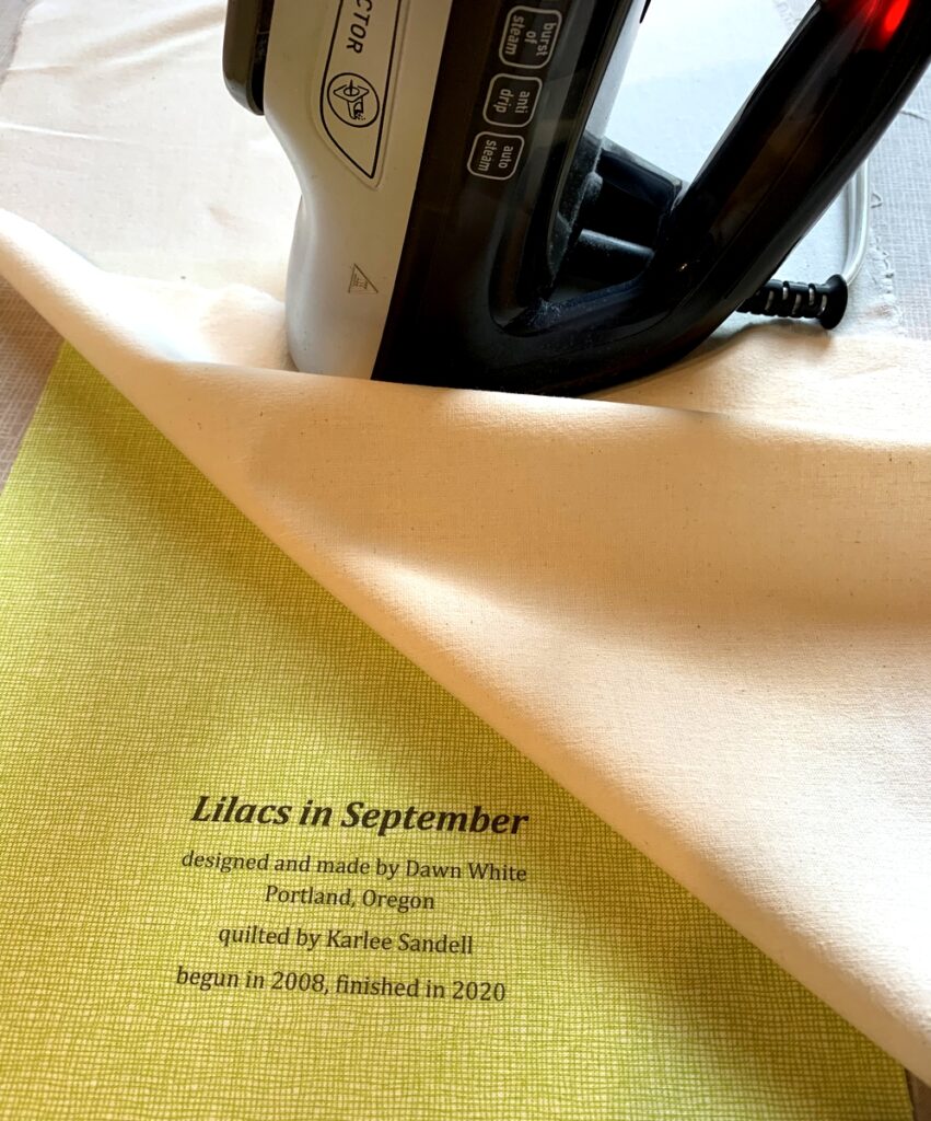
This helps to keep the ink on the label from fading with repeated washings. Irons vary widely so let me caution you not to have the iron too hot as it may scorch the label, even with a press cloth on it. I like to set my iron on medium high and, with the press cloth on top, steam the writing on the the label for 10 seconds. I let it cool and steam it for 10 more seconds.

Now you’re ready to finish your label and attach it to your quilt. You’ll see in Part 2 below that I like to make my labels round but yours can be any shape you want. Squares and rectangles are popular and easy because all you need to do is turn and press the raw edges under ½” or so and stitch the label to the quilt.


Part 2. Creating the Label on Your Computer

Step 1. Open up a new document on your computer and type the information you want to include about your quilt. What you put on your label is entirely up to you. At a minimum I always include:

the name I have given my quilt
my name
my city and state
the name of my quilter (if I didn’t quilt it myself)
the year of completion

Notice that each line is centered.

If my quilt is an original design I might say “designed and made by Dawn White.” If the quilt was made from one of my own patterns I might include the name of the pattern or say “designed and made by Dawn White of First Light Designs.”

If my quilt was made using someone else’s design, I always credit the designer:
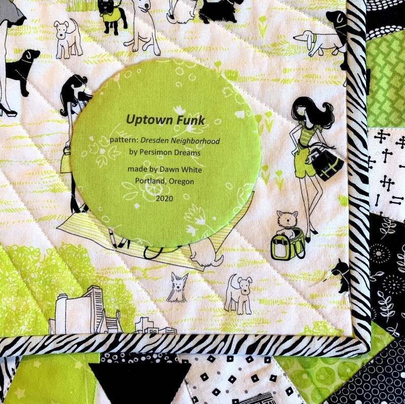
If I tweaked someone’s design, added my own design elements, or significantly changed construction techniques, I might add a line such as “based on (pattern) by (name of designer)” or “inspired by (name of designer)”:

Step 2. Determine the point size and typeface of your label. The point size refers to the size of the type, e.g. 12 point, 14 point, etc. The typeface refers to the design, or style, of the lettering. Most word processing programs offer dozens of typefaces to choose from. On my computer these typefaces are called “theme fonts.” (Did you know that font is the French word for face? Now doesn’t the word typeface make more sense?)

The point sizes you choose depend on the size and shape of your finished label and how much information you want to include. My label for Lilacs in September has five lines of copy. I put the name of the quilt in 24 point boldface and italic. The lines underneath are in 14 point. I auditioned a sans serif type face called Arial and a serif typeface called Cambria. Both labels fit on one page so I could make my final decision on which one to use after this page was printed on fabric. (Putting two labels on one page is just an option, of course. You could create one label and center it on the page, which would give you a lot of flexibility in deciding later on the shape of your label.)

Step 3. Save your document.

Step 4. Print your label on paper. This gives you a good sense of what the label will look like printed on fabric. Here is my label for Lilacs in September, printed with black ink:
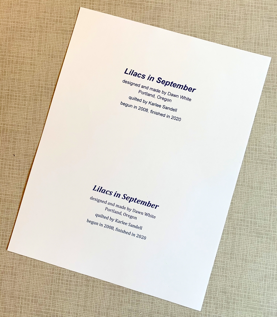
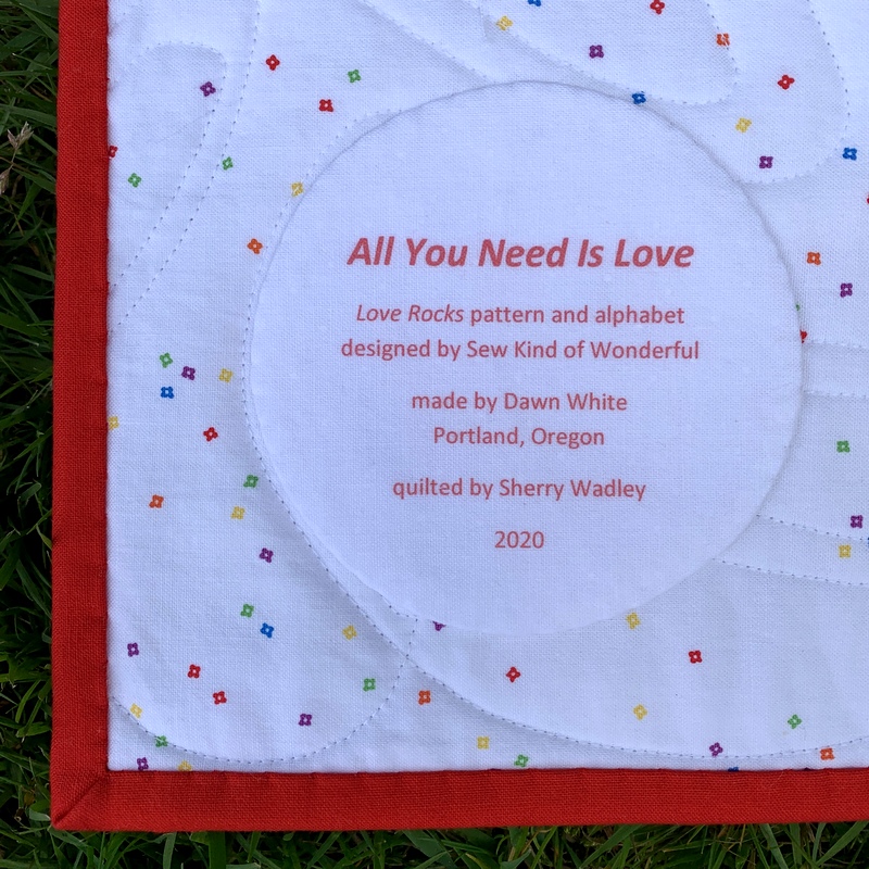
If you have a color printer you can experiment with different colors of ink. Print the labels on paper first to test the depth of color. You may find the ink doesn’t look quite as dark or as vivid on fabric as it did on paper.

I used red ink on my label for All You Need is Love:
Take another look at the label for Scattered Stars, my cheddar and indigo quilt. I used indigo ink which turned out to be not as dark as I was expecting but I still chose it over black:


Most of my round labels are made using a compact disc as a pattern. A CD measures 4⅝” in diameter so a label with a few lines of text fits inside that circle nicely. My label for Give Me the Simple Life has eight lines but still fits inside the compact disc pattern size:
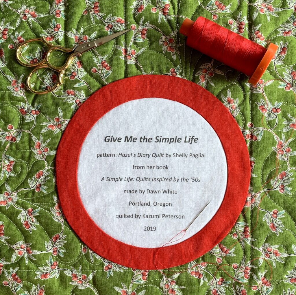
The addition of the red ring made the label finish at about 6″ in diameter.

Below is a computer-generated label I made in May to replace a label on Ramblin’ Rose, made several years ago. I had omitted two significant pieces of information — the inspiration for my quilt and the name of the longarm quilter — and wanted to correct those oversights. In the photo below the original label is still on the quilt, about to be removed and replaced with the one on the right:
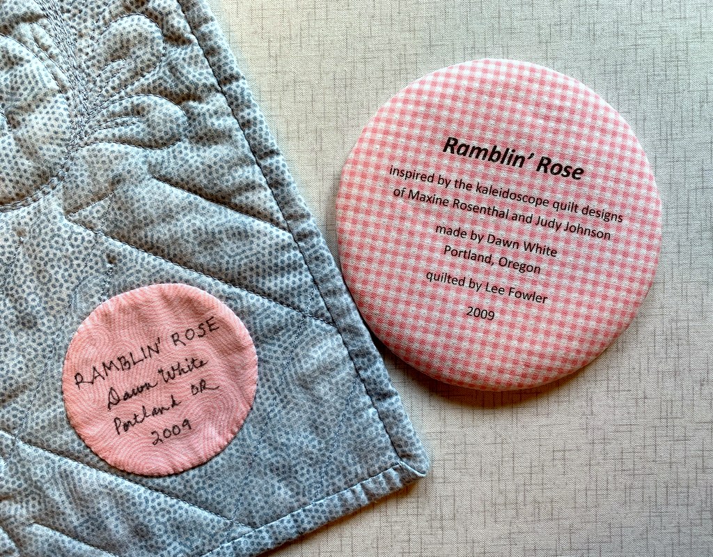
I used to write all of my labels by hand, a time-consuming endeavor. Creating them on the computer and printing them directly onto fabric has turned out to be quick and easy — and rather fun to do. I don’t think I’ll ever go back to hand-printed labels.

I hope you find my tutorial helpful. Be sure to let me know if you have any questions. As always, thank you for visiting First Light Designs!


Note: I followed up this tutorial with a new one, posted Nov. 6, about how I make my round labels using a compact disc. You can find it here.


Posted in appliqué, cheddar and indigo, Churning Stars quilt block, Hazel's Diary Quilt, quilt labels, tutorial, update | 9 Comments

A Late Bloomer

Off to the longarm quilter’s one day and ready for pick-up the next! I certainly landed in her queue at just the right time. Here’s a great in-process shot of the quilting Karlee of SewInspired2Day did on my 12-year-old UFO, newly named Lilacs in September:

I was surprised and delighted that Karlee was able to do an edge-to-edge design over the flange on this quilt top. I was sure that folded strip of fabric would get flipped back on itself when the needle traveled over it from the center of the quilt. Turns out Karlee’s longarm has a special foot for sewing over flanges. And she also basted the flange down first, removing the basting stitches after quilting.

The quilting motif is called Abundant Feathers. I was going for a traditional look for this very traditional nine-patch and snowball block design. Here’s a look at the finished front:


A couple of close-ups:


The thread is a pale grey, which blends with all the fabrics. The quilted feathers enhance the quilt without overpowering it.

Here’s a look at the back . . .

. . . including a detail of the singleton Quatrefoil block:


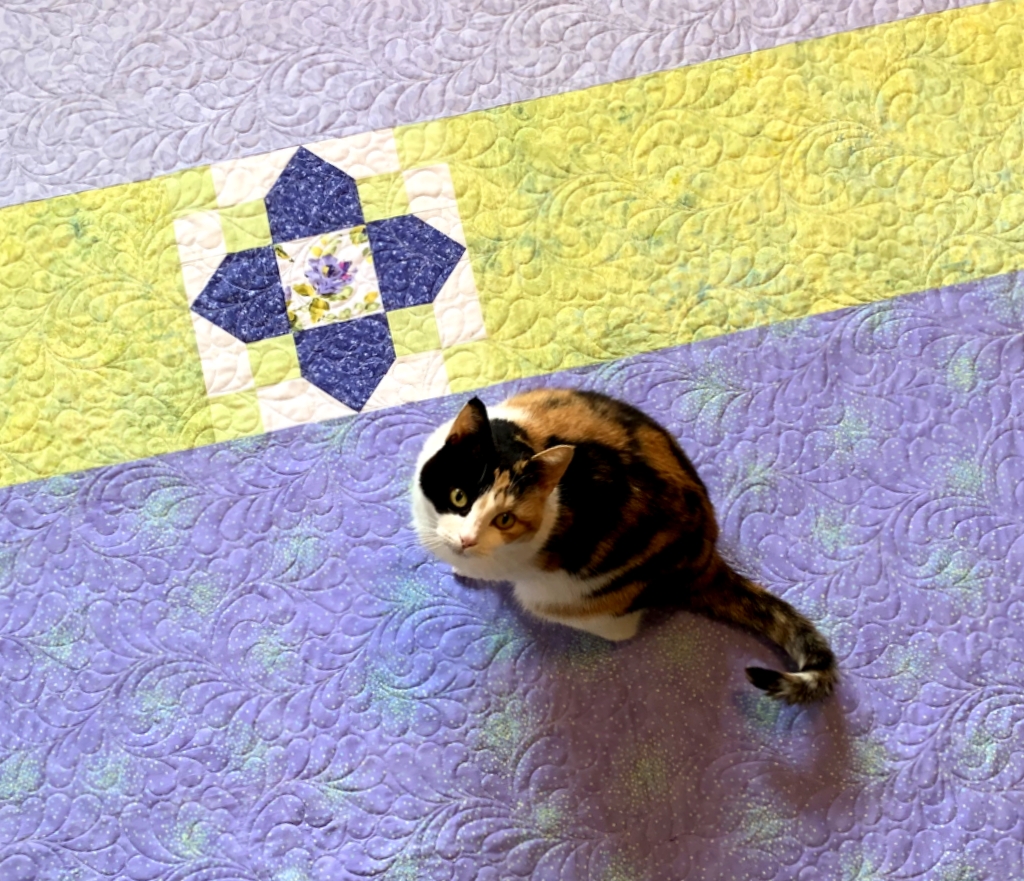
After trimming the quilt, I laid it on the floor to measure it (51″ x 57″) and take photos. Guess who appeared out of nowhere? Yep. Princess Cordelia, aka Coco.

If she’s not on the quilt, she’s under it:


Oh, about the name Lilacs in September. I was inspired by a 1995 British film called Daisies in December, starring Jean Simmons and Josh Ackland. Filmed in Cornwall, it tells the story of a grumpy senior citizen dumped at a seaside retirement home for two weeks by his vacationing family. He’s determined to have a rotten time. Of course he meets someone interesting . . . but there’s a complication. I had a copy of this film on VHS back in the day. It’s never been released as a DVD in the U.S. but it can be seen on Amazon Prime via the Hallmark Channel. I actually signed up the other day for a free seven-day subscription to the Hallmark Channel just so I could watch the movie again.

If daisies can bloom in December, I wondered, can lilacs bloom in September? (I pulled this quilt out of my sewing room closet on the last day of September.) The answer is yes: although many varieties bloom in spring, there are some later-blooming varieties. You could say this quilt is a late bloomer, given the number of years it’s been in my closet.

Now on to the binding. My first fabric of choice would be the medium dark blue fabric of the inner border. It would make a nice frame for the quilt. Second choice would be the light cornflower blue print of the outer border. After 12 years I didn’t have much hope that I’d find either fabric still in my stash. Oh, happy day! After looking just now I found a 16″ strip of the outer border fabric, more than enough for the binding strips. How perfectly providential!


Posted in cats, Quatrefoil, snowball blocks, update | 10 Comments

Quatrefoil

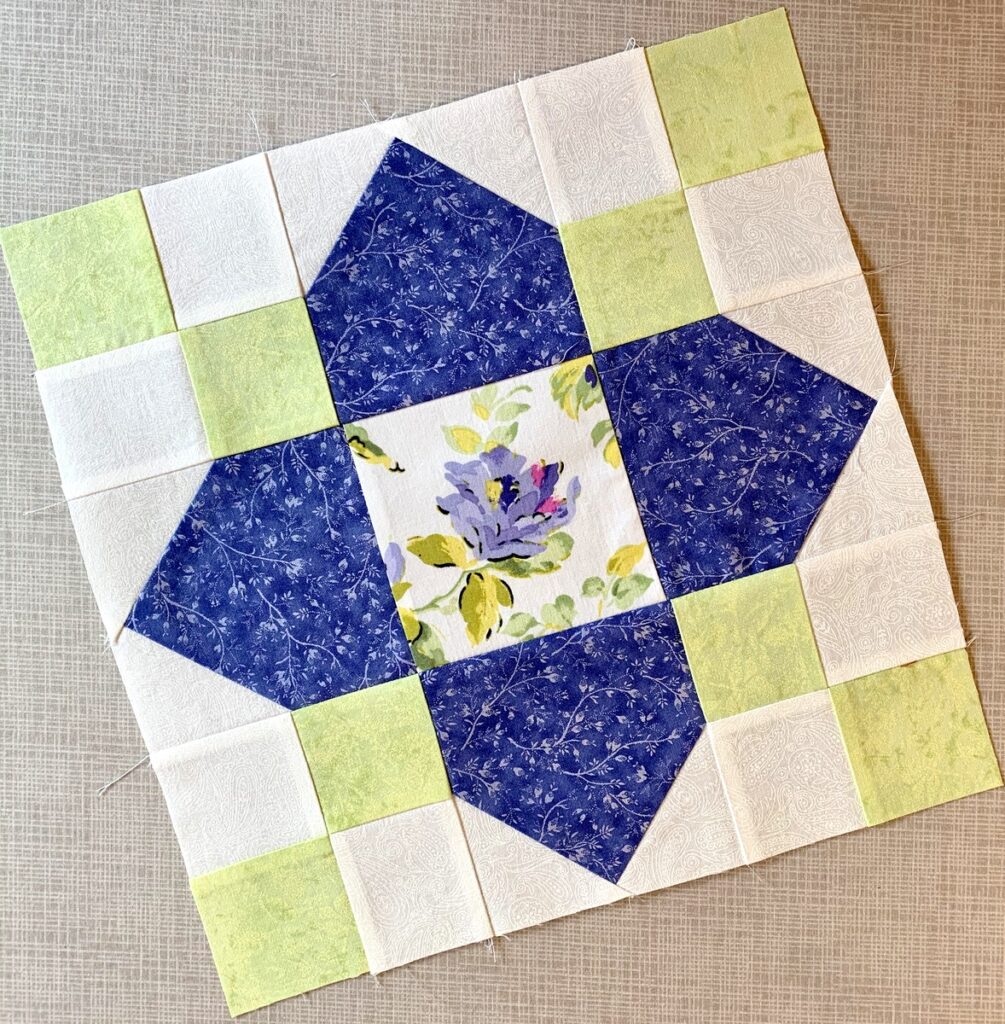
Isn’t that a lovely block design? It’s called “Quatrefoil,” which means four leaves, and it’s been around a long time. I’ve had my eye on this block ever since a student pointed me to Jenny Doan’s tutorial on the Missouri Star Quilt Company’s website. Jenny’s demo features a charming quilt made from precut 10″ squares from a single line of fabric.

I made one 12″ block — dressed up with a fussycut center — to add a little pizzazz to a quilt backing:


The block really deserves to be showcased in a full quilt because the four-patches in the corners form a secondary pattern. If you search for “quatrefoil quilts” on Instagram or Pinterest you’ll see some wonderful examples. My singleton quatrefoil really doesn’t do the quilt block design justice.

The backing you see above was made for the the quilt top I showed you in my last post, the one with snowball blocks and nine-patches that languished in my sewing room closet for a good dozen years. It was sandwiched and partially quilted but I never got very far with it. When I decided to have it quilted by a professional longarm quilter I knew I’d have to make a new backing because longarmers require four extra inches of batting and backing on all four sides to make sure the layers of the quilt can be loaded properly on the frames of their quilting machines. Quilters using their domestic sewing machines typically don’t need to do that.

Even if I had wanted to finish the original quilt sandwich myself I would have needed a new backing because there were two fade lines in the backing fabric where the quilt was folded. I have no idea how those fade lines got there because as far as I recall the backing was never exposed to sunlight. Can fadelines occur in dark closets?? Inquiring minds want to know.

In any case, I was able to salvage part of the original backing fabric and added a couple of other pieces from my stash that work well with the fabrics on the front. The quilt top and back were delivered today to Karlee Sandell of Sewinspired2Day to work her magic. I expect I will have something to show you very soon.


Posted in Quatrefoil, snowball blocks, update | 2 Comments

September Song

Can you picture Frank Sinatra crooning the lyrics to September Song?

“Oh it’s a long long while from May to December . . .”

[never truer than in the time of COVID!]

“But the days grow short when you reach September. . .”

We’ve actually reached the end of September. And until today I hadn’t worked on a single quilt the entire month. Can you believe that? Oh, I did some sewing in September: a few face masks, a pair of pillowcases, a bucket hat. I also worked on a fun home decorating project over the weekend that I’ll tell you about in a bit.

But a quilt? Not until today, when I pulled out this throw-sized quilt top I pieced a dozen years ago:

This little quilt came into being because I had a stack of 9-patch blocks left over from another project. (That’s a lot of leftover blocks, right? A confession: I had pressed the seams in the wrong direction while strip-sewing.) I combined the 9-patches with some snowball blocks, set them all on point, and created this 52″ x 58″ throw.

This project was ready to quilt back in 2008. I had pin-basted it to the batting and backing and had actually sewn a single line of stitching. One line! I have no memory of why I didn’t continue but I have no desire to finish quilting it myself now. My “quiltmaking” today consisted of removing all the basting pins and getting the layers ready to deliver to a longarm quilter.

My plan was to have it quilted with a simple edge-to-edge design. Then I realized that because I added a flange to the interior, the quilt will probably need to be custom quilted. Here’s a close-up of the flange:

Some of the fabrics are ones I would probably not buy now but I like the top well enough to want to finish it.

Now about that home dec project:

My husband and I took our first trip since the pandemic arrived on our shores, driving from Portland to Bend last Thursday to spend a delightful long weekend with my stepmother Shirley. While there I made two tailored bedskirts for her extra-long twin beds. Shirley recently bought new bedspreads with a nautical theme featuring navy and aqua images on a white background. We decided on a solid navy fabric for the bedskirts.

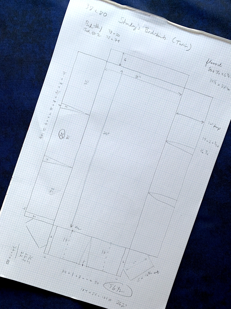
Here’s a look at the pattern I made on graph paper along with the fabric, a navy blender (almost a solid) called “Shadowplay” by Maywood that I like so much I buy it by the bolt:

You may be able to tell from my pattern that the bedskirts have one inverted pleat along the end and two on each side. Because of the dark fabric and the lighting in Shirley’s bedroom I wasn’t able to get good pictures of the completed bedskirts but they did turn out beautifully. You’ll just have to take my word for it!
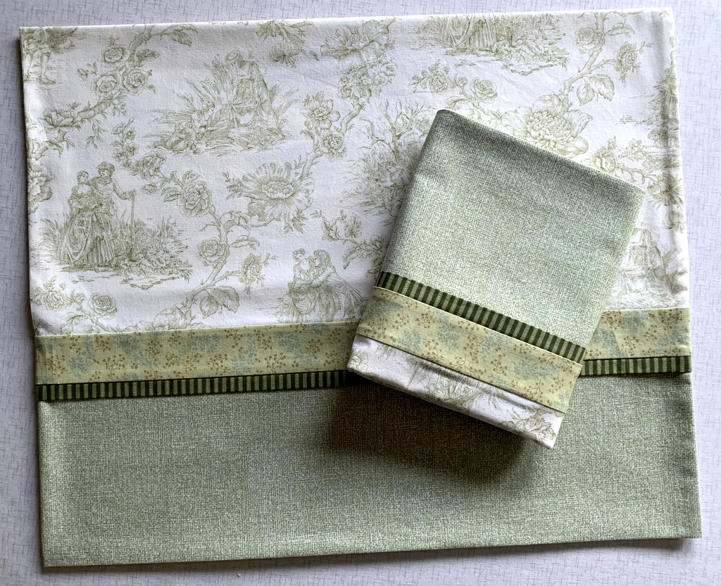


Posted in bedskirt, family, home dec, snowball blocks, update | 5 Comments

Toile Pillowcases, Take 3

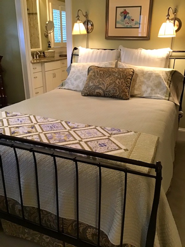
This is the third and final pair of queen-size pillowcases made from a lovely toile fabric from Timeless Treasures that’s been in my stash for a few years:

The first two pair were made last year, the first pair as a gift and the second for my own home. I made these pillowcases last week as a hostess gift, planning to deliver them to my twin sister Diane when the Dear Husband and I make our annual Thanksgiving trip to Georgia in November. (Of course we will be taking every precaution while traveling during the coronavirus pandemic.)

I made the mistake of telling Diane about the pillowcases and she cajoled me into sending them in advance. I’m glad I did because she promptly put them on the pillows in the main floor guest room and sent me pictures. Here’s a close-up of the cases:


There’s something special about toile. I was really sorry to use up the last of that fabric. I actually searched for more on the Internet but came up empty-handed.

I did not make the accent pillow on the bed; Diane had it made at a specialty shop using fabric left over from the bedskirt. But I do spy four things in the photo above that are “me made”: the pillowcases, the quilt at the foot of the bed, the bedskirt, and — hard to see but look at the reflection in the mirror in the bathroom for a glimpse — the shower curtain, made in 2011 and embellished in 2012. You can read about that here.  (There’s one more thing I made that you can’t see in the photo: tailored valances. I wrote about that project in this post, also from 2012. By the way, the pillowcases were made using my photo-laden Perfect Pillowcases tutorial.)

The DH and I will be sleeping on these pillowcases soon! This year’s trip is a very special one as Diane and I will be celebrating an important birthday, one of those big ones ending in a zero. Here’s a hint: we will become septuagenarians.


Posted in 4-Patch Wonder, bedskirt, family, faux-kaleido quilts, home dec, roll-it-up pillowcases, shower curtain, update, valance | 3 Comments

A Bee in My Bucket Hat

Hmm. Doesn’t have quite the same ring as “a bee in my bonnet,” does it? But I already have a blog post titled “A Bee in My Bonnet” so the one above will have to do.

Why a bucket hat? Well, after happening upon images on Instagram of the Sorrento Bucket Hat by Elbe Textiles I was inspired to give it a try. The pattern is available as a digital download for a mere two dollars. Lauren, the owner of Elbe Textiles, donates all proceeds from the sale of the pattern to a different cause every month. What a lovely thing to do.

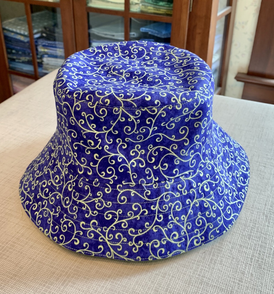
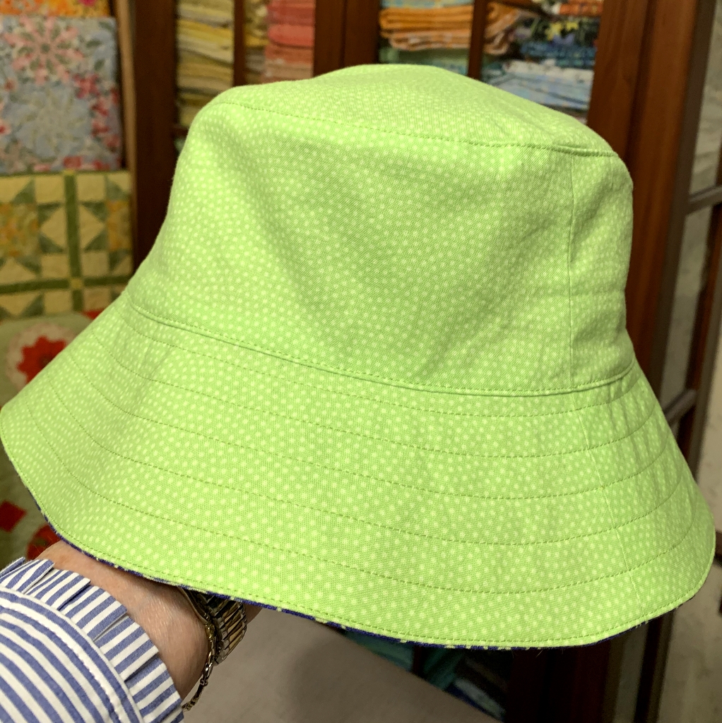
Here’s a picture of my newly completed hat:

The multiple stitching lines around the brim are optional. I really like the effect of the contrasting thread. I chose a swirly dotted print in spring green for the lining:

Oh, did I mention the hat is reversible? Two for the price of one!

It’s easy to see why it’s called a bucket hat:

I interfaced the brim (an optional step) to give it more shape. It’s fun to play around with the brim, flipping it up in the front or the back for a different look. Here it is with the front of the brim flipped up . . .

. . . and here is the reverse side with the back brim flipped up:


Now all I need is a matching face mask. (Kidding!)


Posted in bucket hat, face masks, family, update | 8 Comments

Kitchen Remodel: Before and After

After posting pictures in January of the valances I made for our kitchen windows, I declared last year’s kitchen remodel “officially complete” and blithely added I would post before and after pictures “one of these days.” Well, friends, it’s been nine months coming but “one of these days” has finally arrived.

Our kitchen was fully functional before the remodel. Indeed, it had been updated only 20 years earlier. But there were several things about the kitchen I had grown dissatisfied with and I knew that making changes now would achieve three ends. First, the Dear Husband and I would enjoy cooking in the kitchen more. Second, it would give us the opportunity to correct some design flaws from previous remodels. Third — and much more important — the updates would make our home more attractive to buyers, a consideration down the line when it’s time to think about selling.

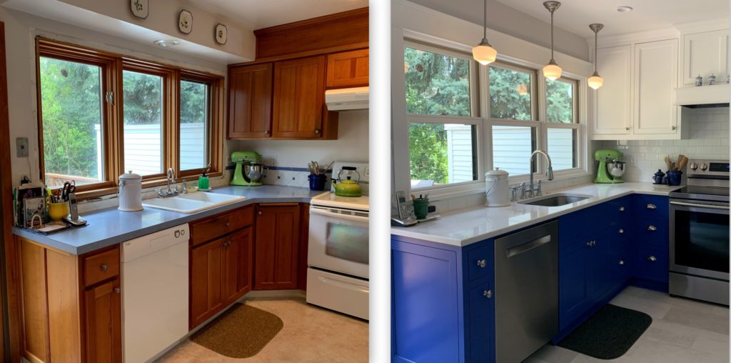
Let’s start with the east wall, moving around the corner to part of the south wall:

The soffit over the sink is gone, allowing the new cabinets on the south wall to go all the way to the ceiling. The old casement windows were failing, which is what started the remodeling ball rolling. We replaced them with double-hung windows in keeping with the windows in the rest of our 1913 house. Not shown in the photos above is the sliding glass door that takes up the rest of the east wall.

Here’s the east wall with the valances in place:

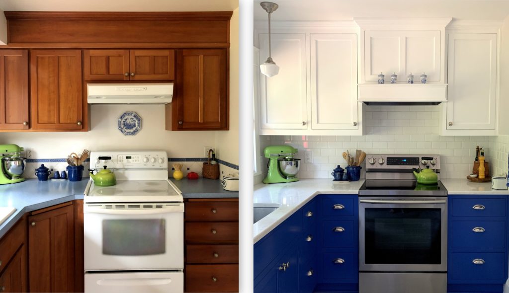
Looking directly at the south wall:

The upper cupboard space gained with the elimination of the east wall soffit was offset by cupboard space lost by having a custom range hood cover installed. We also lost a great deal of lower storage space by giving up the angled corner cupboard to the left of the stove containing a very large two-tiered lazy Susan that held most of my pots and pans. This forced me to pay attention to the items I actually use in my kitchen and resulted in paring down contents not just there but throughout the kitchen.

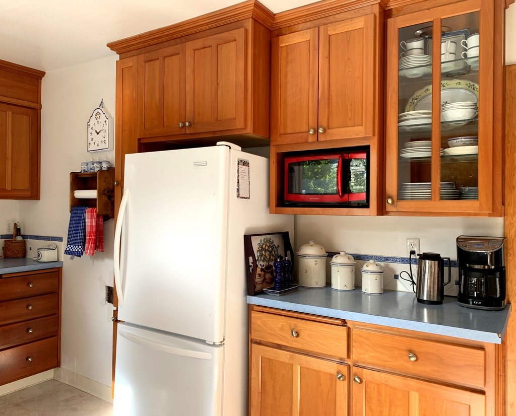
Here’s a “before” shot of the west wall:

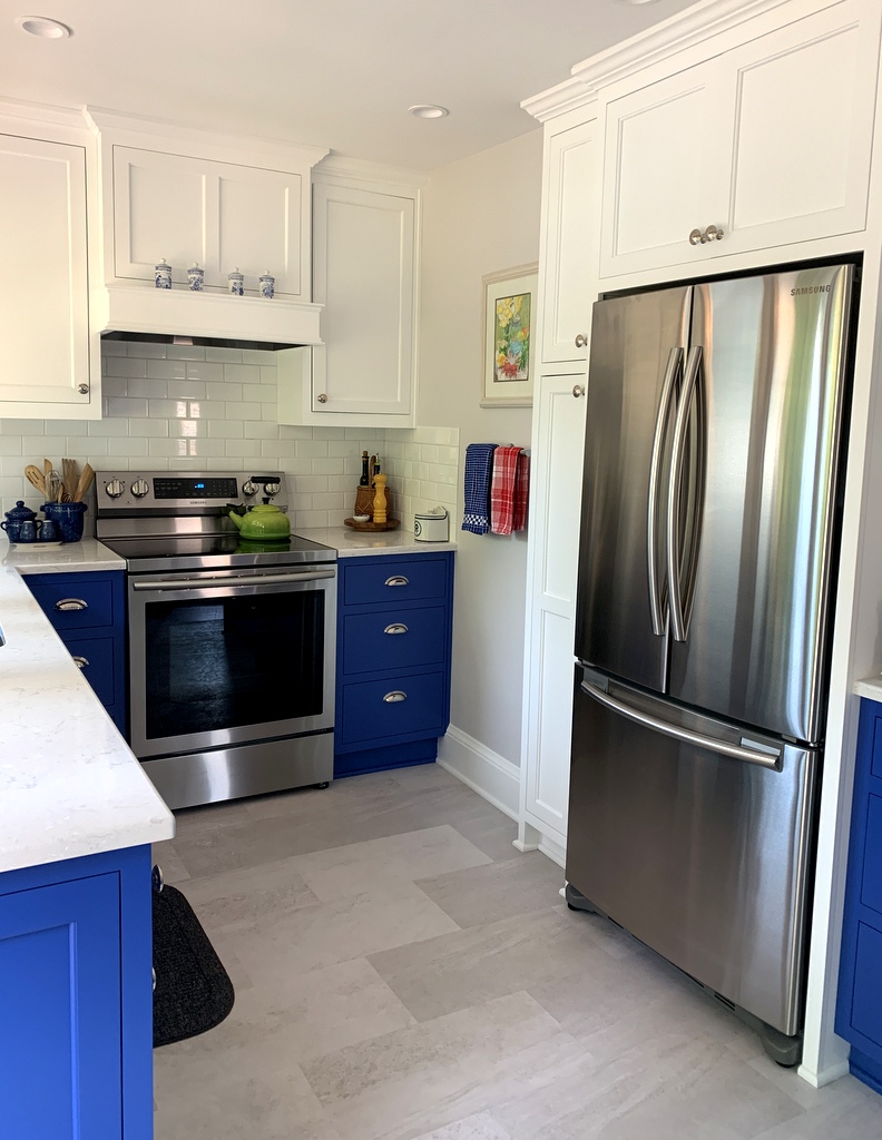
Apparently I didn’t get a shot of the entire west wall after the remodel so I can’t show you a side-by-side comparison. Here are two “after” shots of the west wall:

The counter-depth refrigerator makes the kitchen feel roomier. It’s wider than the old fridge but doesn’t hold nearly as much. No matter: the old one is now downstairs in the pantry. Having a second fridge is one of the biggest bonuses of this remodel.

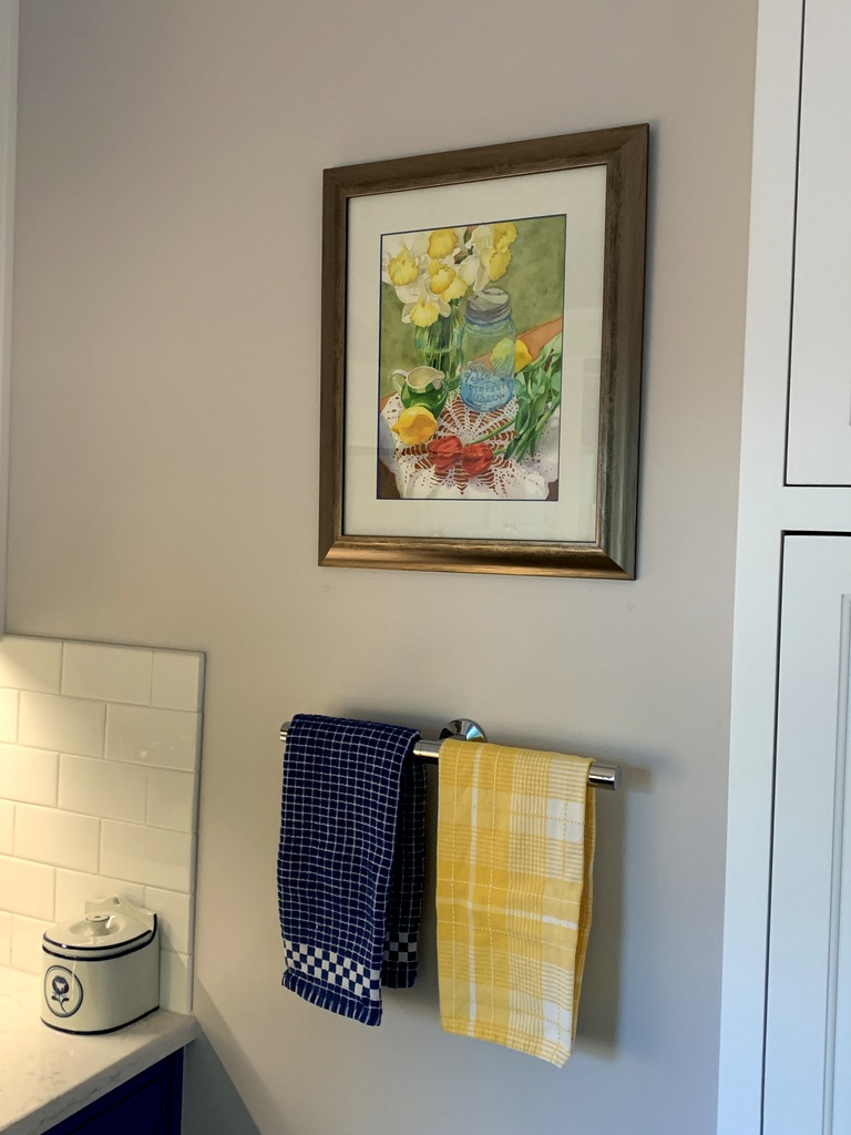
By the way, after taking the “after” shots last fall I had the lovely watercolor (by my talented daughter-in-law, Jeanne Ann White) reframed. Not until I got it home and hung it on the wall did I notice that the wood frame is the same color as the stainless steel appliances:

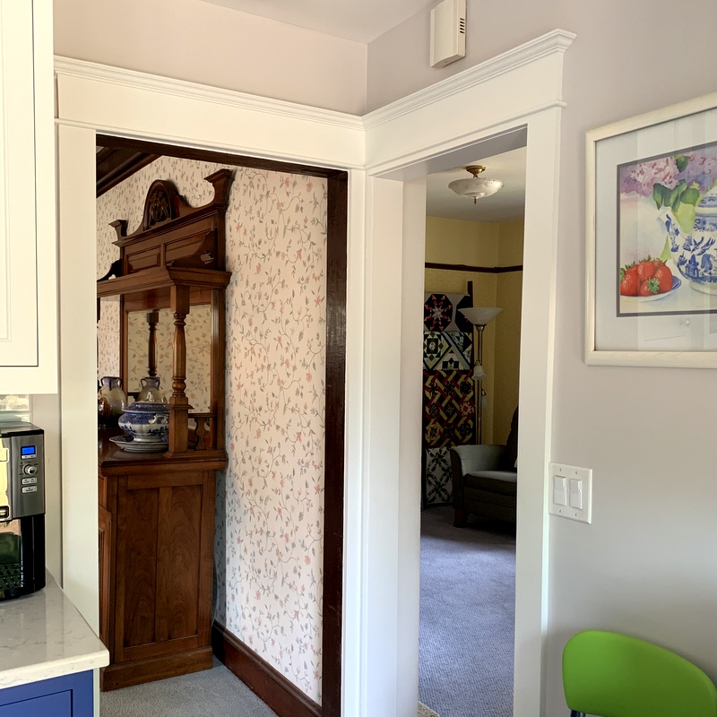
In the northwest corner of the kitchen, the doorways to the dining room and TV room were transformed by millwork matching the rest of the house:

It didn’t occur to me to take a “before” picture of this corner because there was literally nothing there but sheetrock.
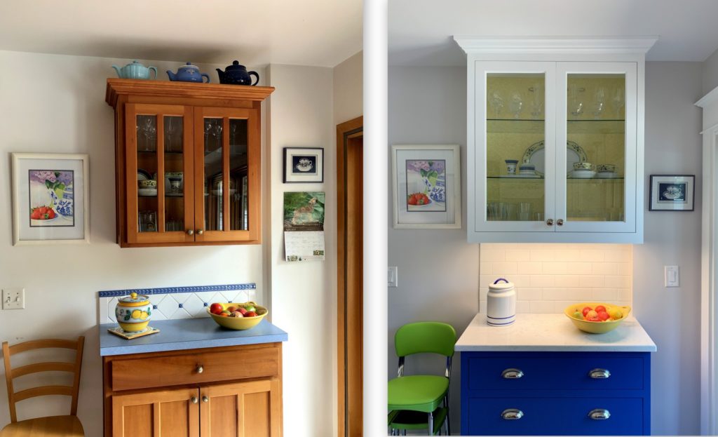
Finally we come to the north wall:

Jeanne Ann’s work is featured on this wall as well. The wood trim you see on the far right side of the photos is the frame of the sliding glass door.

And there you have it.

I’m going to do one more post, focusing on some of the decorative accents I’ve added to the kitchen.

If you’re new to my blog and want to review the kitchen remodel from the outset, feel free to follow these links:

March 27, 2019:  All Quiet on the Sewing Front
April 14, 2019:  Prepping for the Kitchen Remodel
April 22, 2019:  Kitchen Remodel: Week 1
April 28, 2019:  Kitchen Remodel: Week 2
April 30, 2019:  Kitchen Remodel: My Color Inspiration
May 5, 2019:  Kitchen Remodel: Week 3
May 11, 2019:  Kitchen Remodel: Week 4
May 15, 2019:  Kitchen Remodel: Week 5
May 26, 2019:  Kitchen Remodel: Week 6
June 3, 2019:  Kitchen Remodel: Week 7 — Part 1
June 9, 2019:  Kitchen Remodel: Week 7 — Part 2
June 13, 2019:  Kitchen Remodel: Week 8
June 16, 2019:  Kitchen Remodel: Week 9
August 14, 2019:  Kitchen Remodel: An Update
August 24, 2019:  Kitchen Remodel: the Glass-Fronted Cabinet
January 5, 2020: First Finish of 2020: Kitchen Valances

Let me end this long post by saying I am beyond grateful to have a kitchen. As wildfires raged through Oregon last week leaving destruction and devastation in their wake, some of my family members and friends were forced to evacuate their homes. I am relieved to report their homes are still standing but it will be some time before they can go home because the fires are still burning and the air is thick with dangerous smoke. The fires came within a few miles of Portland but the city was blanketed by smoke. Portland has had the worst air quality in the entire United States for the last few days. Rain is forecast for tomorrow so we are hoping for some relief.

I have watched in anguish the images on TV of entire neighborhoods reduced to rubble not just in my state but also in California and Washington. Wildfires are burning in a dozen western states but the west coast has been hit especially hard. Against that backdrop I feel lucky to have a beautifully remodeled kitchen.


Posted in family, home dec, kitchen remodel, update | 7 Comments

Enrobed

Last December I made the Dear Husband a new bathrobe because his old one was practically falling apart. I remember thinking, “My robe is pretty worn out, too. I should make myself a new one.”

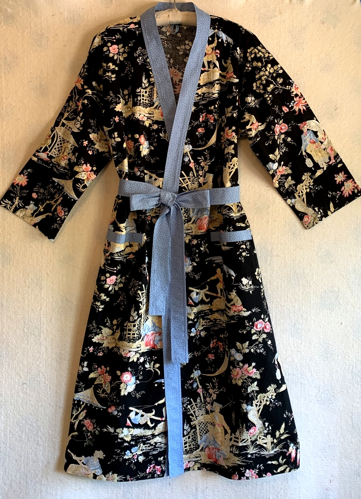
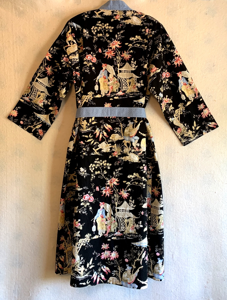
Fast forward eight months. Eight months! That’s how long it took me to get the job done. But the wait was worth it. Here’s my brand new kimono-style robe:

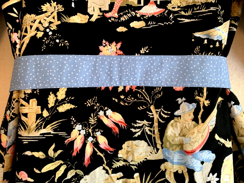
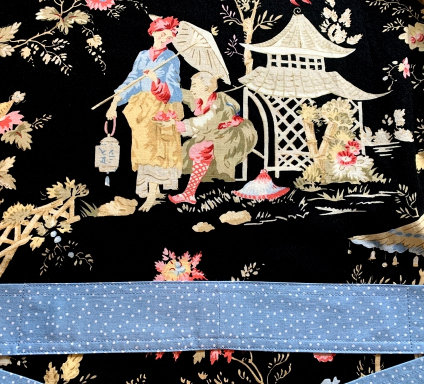
The fabric is a lovely Asian-inspired toile from Michael Miller Fabrics that’s been in my stash for a number of years. I probably bought it thinking to use it in a quilt. Fortunately I had purchased a fairly large piece, enough to eke out a bathrobe. Also in my stash was a piece of blue polka-dotted fabric that was a good choice for the contrasting band, belt, and pocket trim.

Here’s what the robe looks like from the back:


Rather than make belt loops and a loose belt as the pattern called for, I stitched the belt directly to the robe on the back:

Perhaps you can see the stitching a bit better in this next photo:

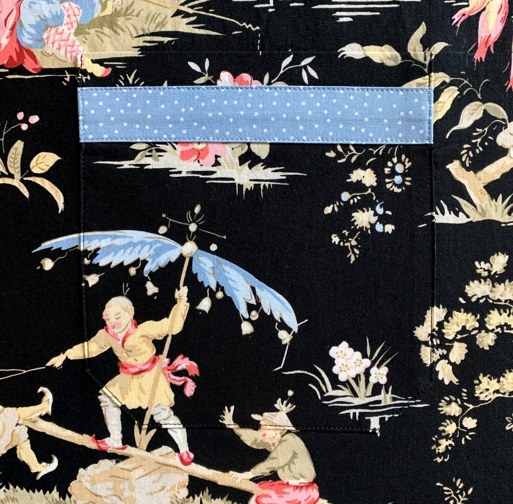
The Simplicity pattern I used (5314) didn’t include pockets — what bathrobe doesn’t have pockets, for heaven’s sake? — so of course I made my own. And because the toile fabric depicts large-scale scenes of people and objects like pagodas and bridges and musical instruments, I decided to match the design on the pockets to the fabric underneath.

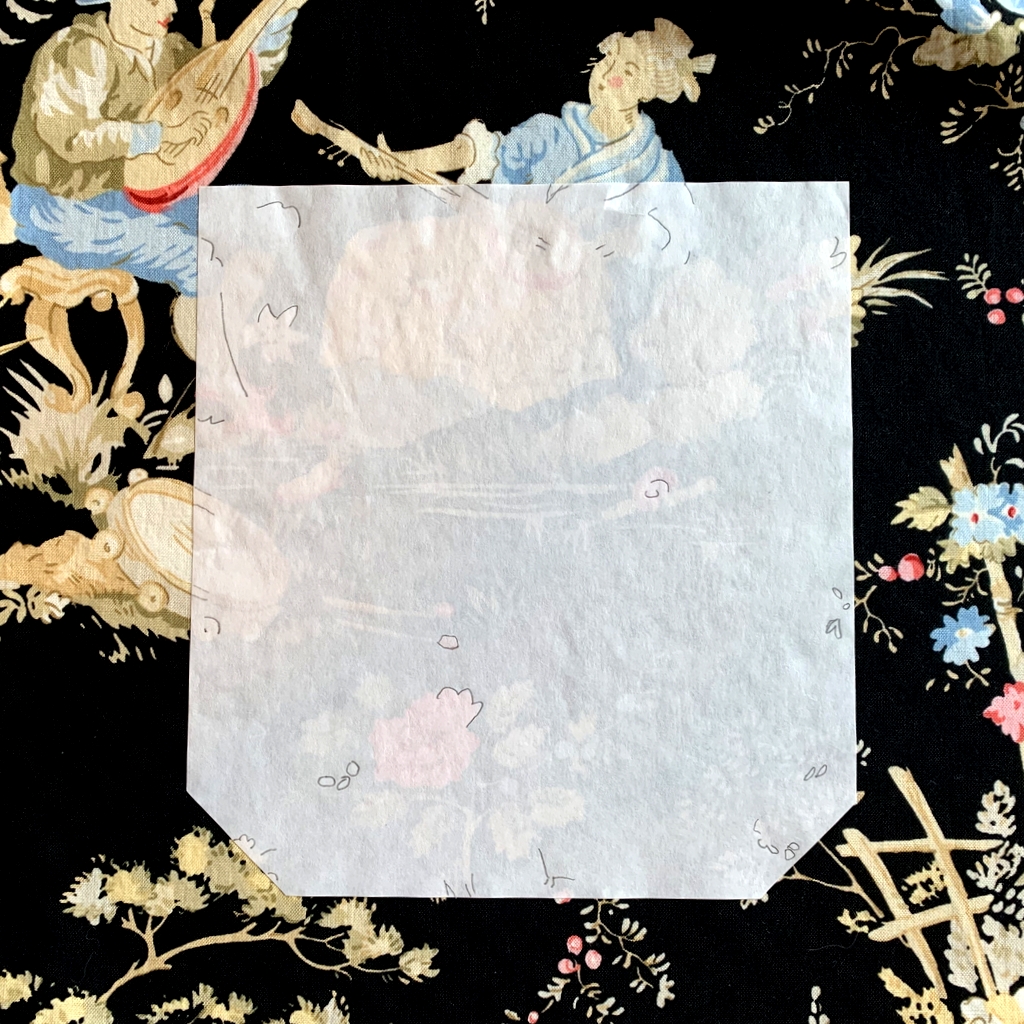
To do that I made patterns for the pockets out of freezer paper. After positioning them and ironing them in place, I made registration lines on the pattern that lined up with the design underneath:

Then I lifted the freezer paper pattern from the robe and matched it with the same design elements on the fabric scraps I had left over after cutting out the robe. Voilà — fussy-cut pockets.

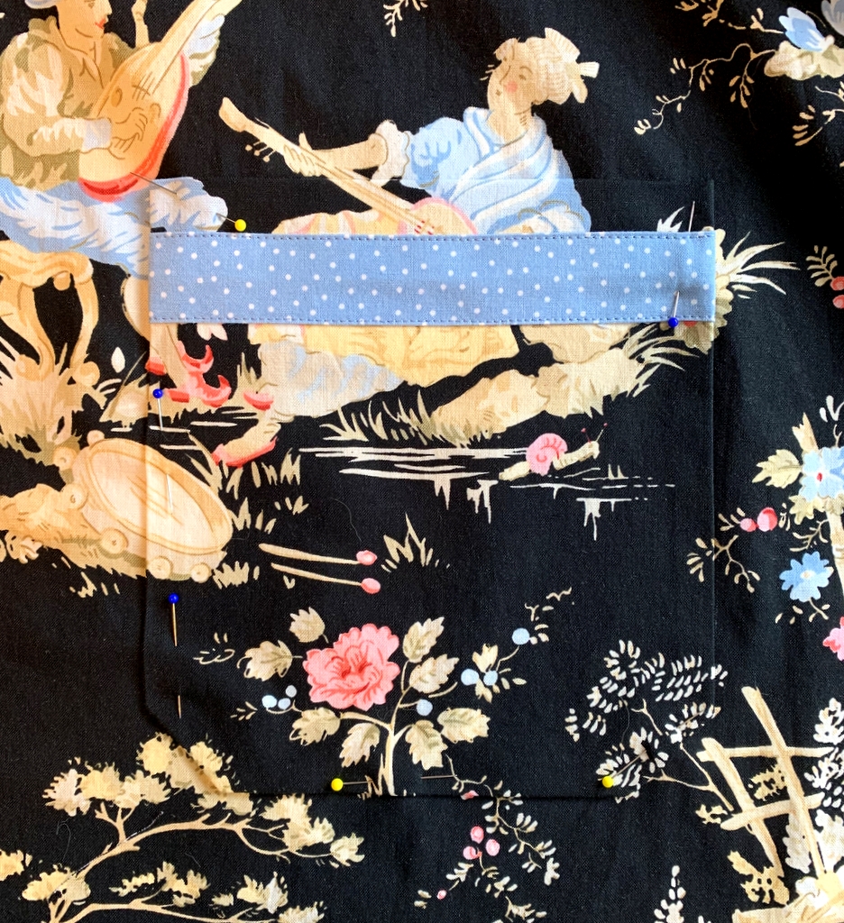
Here’s the right-side pocket pinned in place:

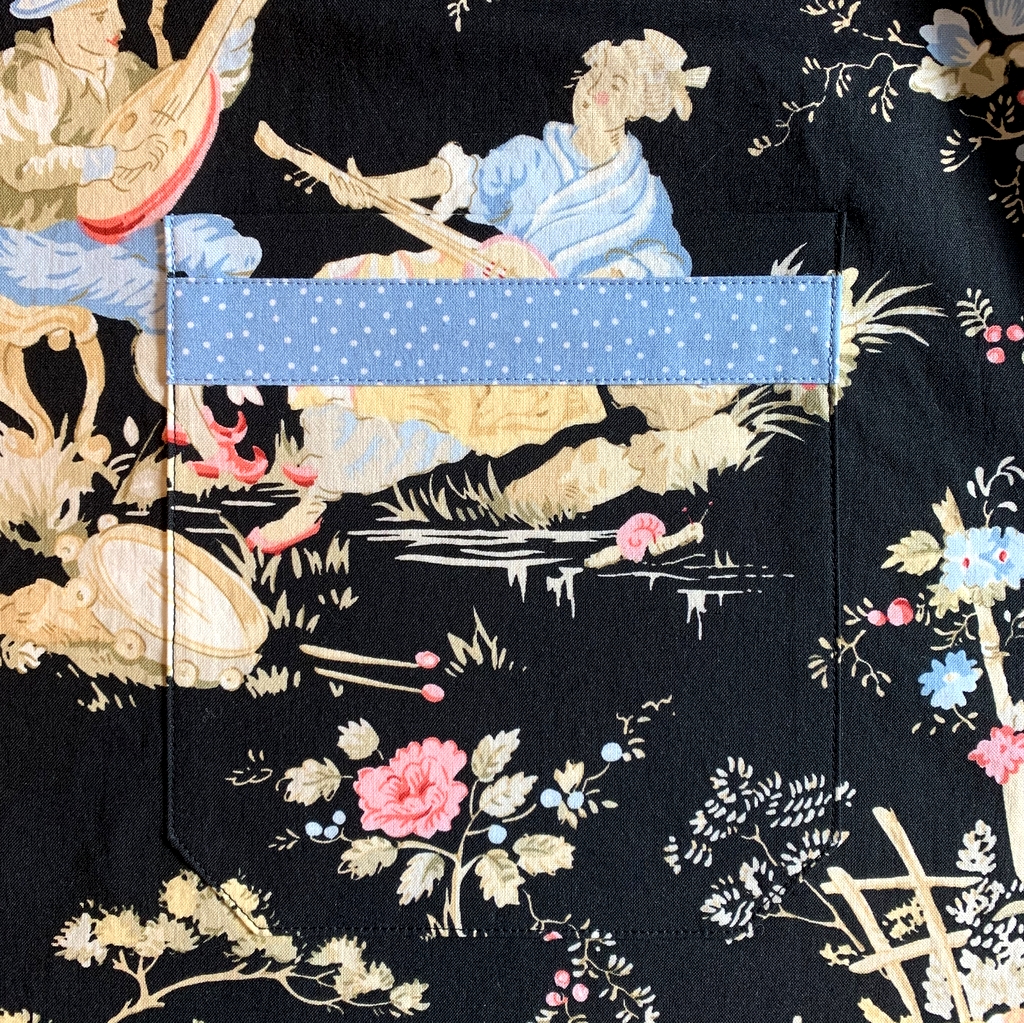
(You’ll notice I added an inch-wide strip of my contrasting polka-dotted fabric to the pockets for some extra design appeal.)

Here’s the pocket stitched in place:

I did the same thing with the pocket on the left side:

I’m very pleased with the way my new robe turned out. Can you picture me sitting out on the back deck tomorrow morning enjoying my morning coffee? Here’s my dress rehearsal:


Posted in family, garment sewing, update | 18 Comments

It’s a Wrap: Scattered Stars

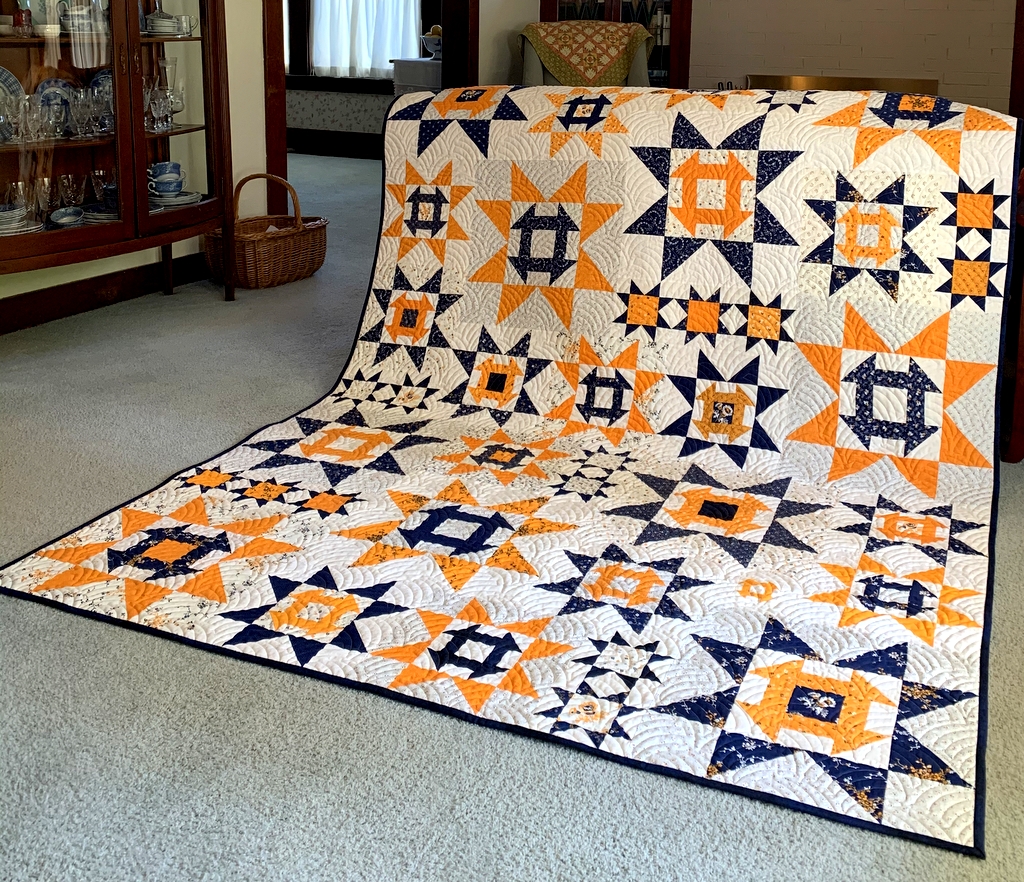
Finally! I got the label made today for my cheddar and indigo quilt, Scattered Stars, so I can officially declare it finished:


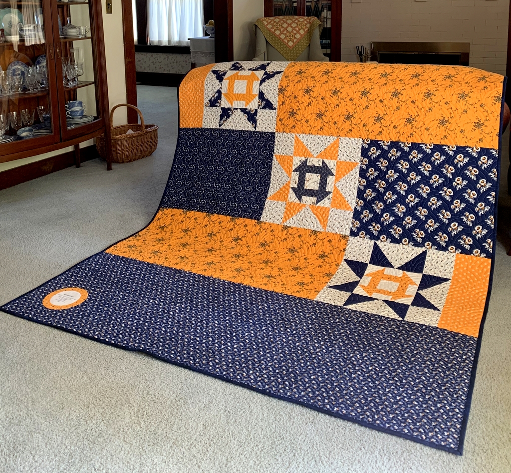
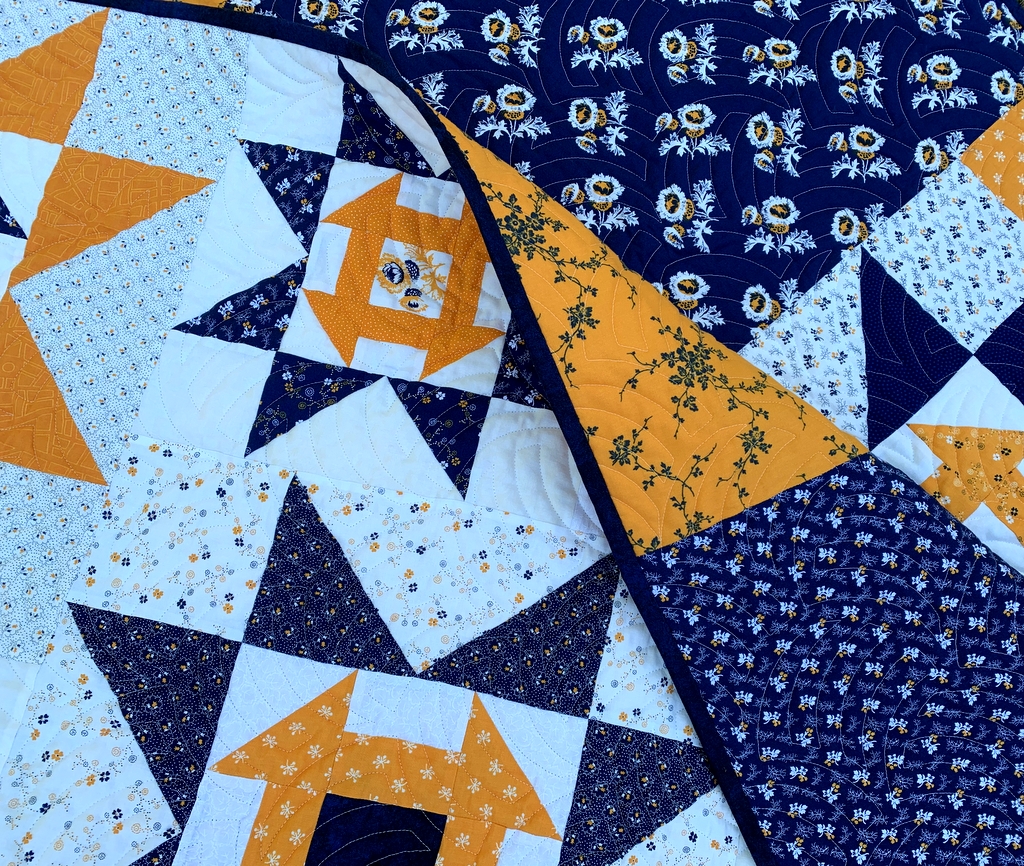
Here’s a look at the back:

Scattered Stars finished at 66″ x 88″.

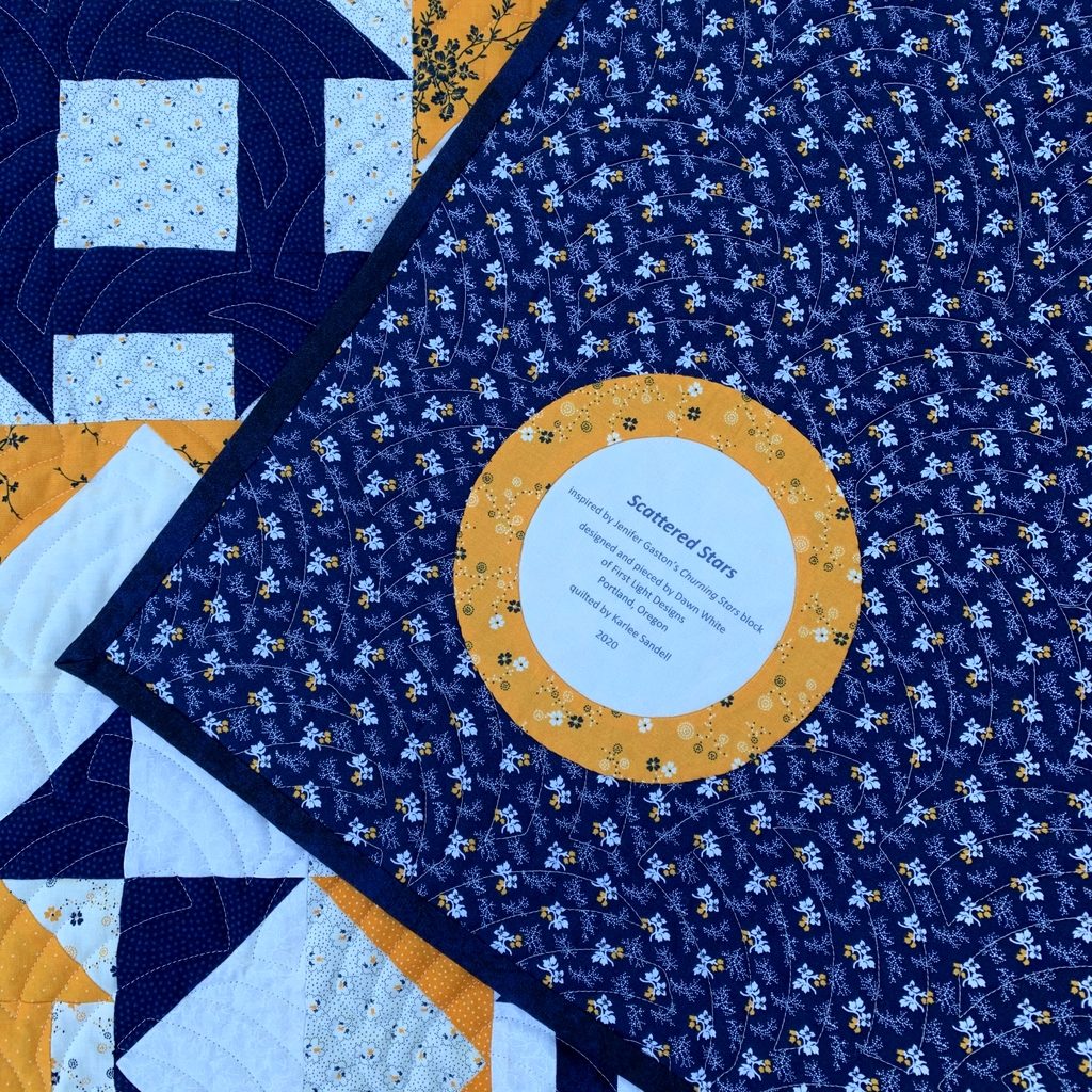
For the label I made an inset circle and then enclosed it in another circle:


Here’s a close-up:


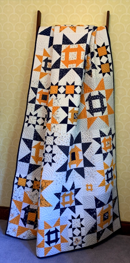
I tried arranging Scattered Stars artfully on a quilt ladder, with mixed results:

At least you get a good look at the beautiful quilting done by Karlee Sandell of SewInspired2Day.

The quilt motif is “Woven Wind,” a contemporary version of the classic Baptist Fan design.

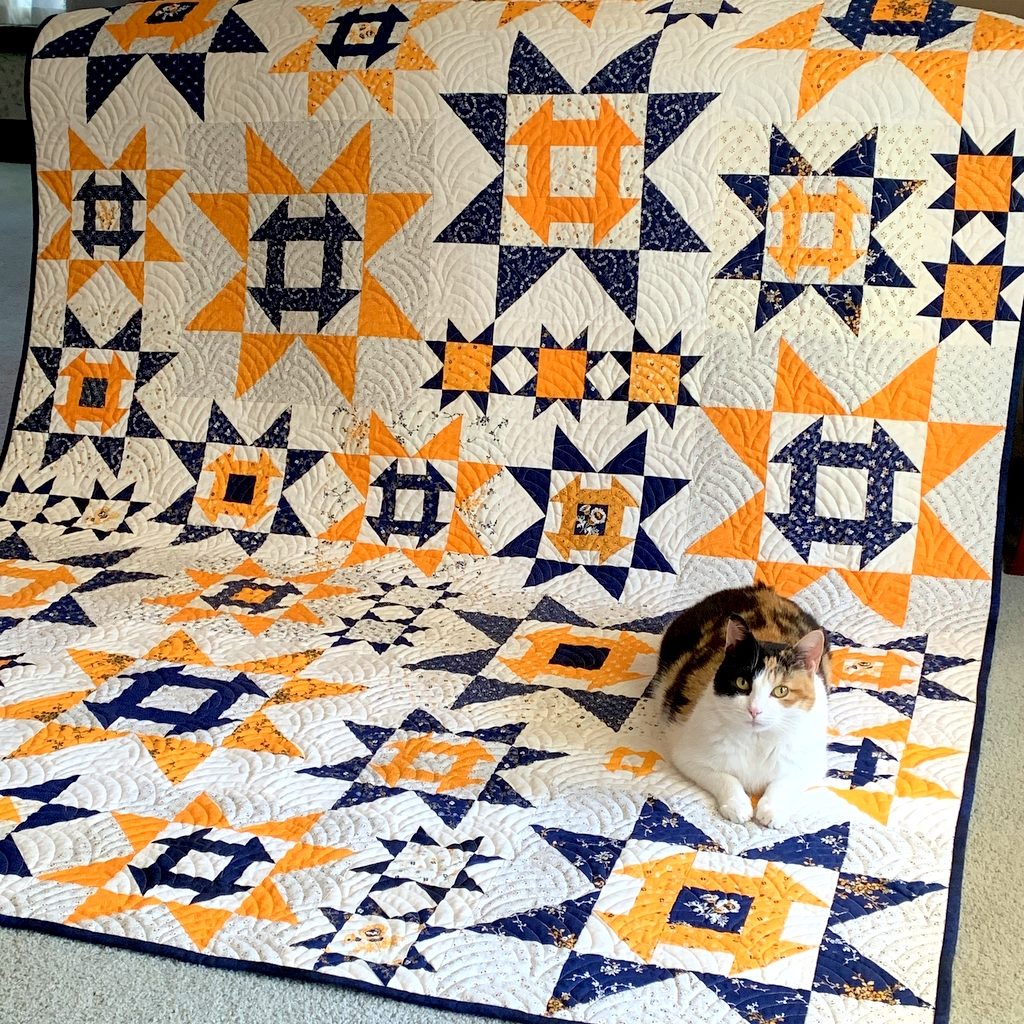
Coco photobombed my quilt at every step in its construction so it seems only right that she should show up for the final reveal:

Thank you for following along on my quiltmaking journey!


Posted in cats, cheddar and indigo, Churning Stars quilt block, quilt labels, update | 16 Comments